

The Two Grid Column enables you to render Grid items in different number of columns.

Within these settings, you can set your desired number of columns to be rendered, the background color of the section, overlaying background text, font styling of the text, color, and border radius of the grid images in both desktop and mobile device screens.
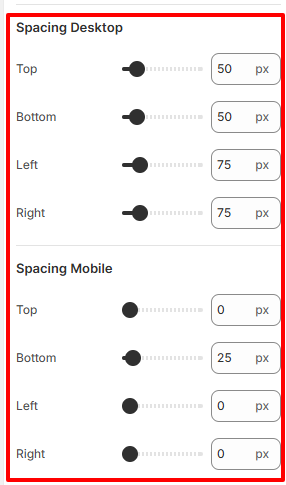
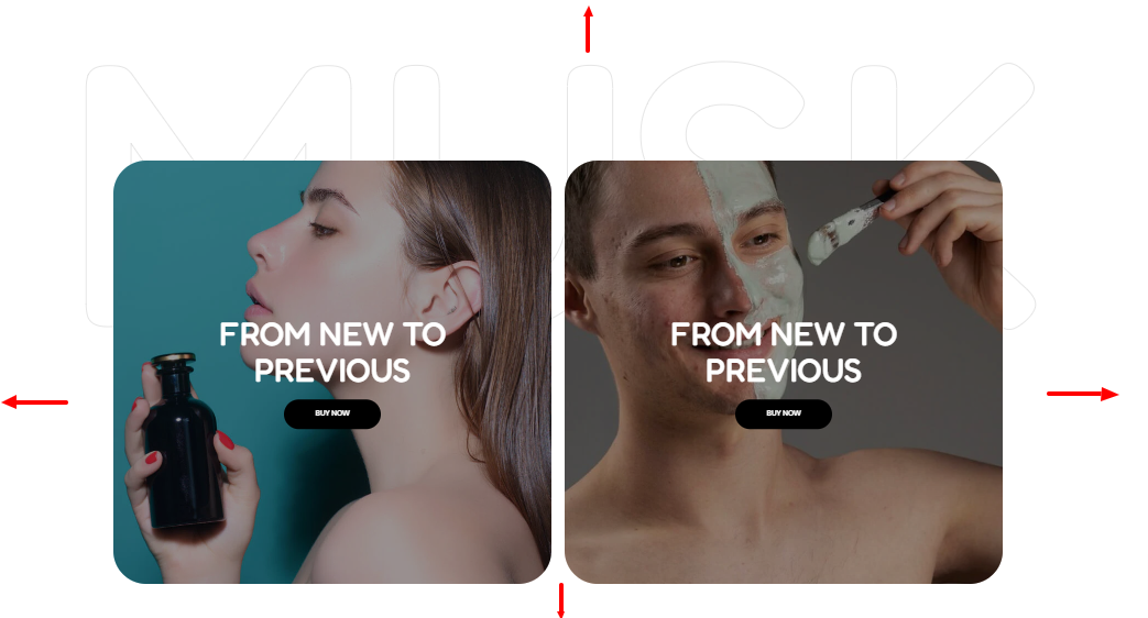
The spacing settings enable you to add spacing around the Two Column Grid as illustrated below
The Item block within the Two Column Grid enables you to add content such as the titles, images and text to your Grid.
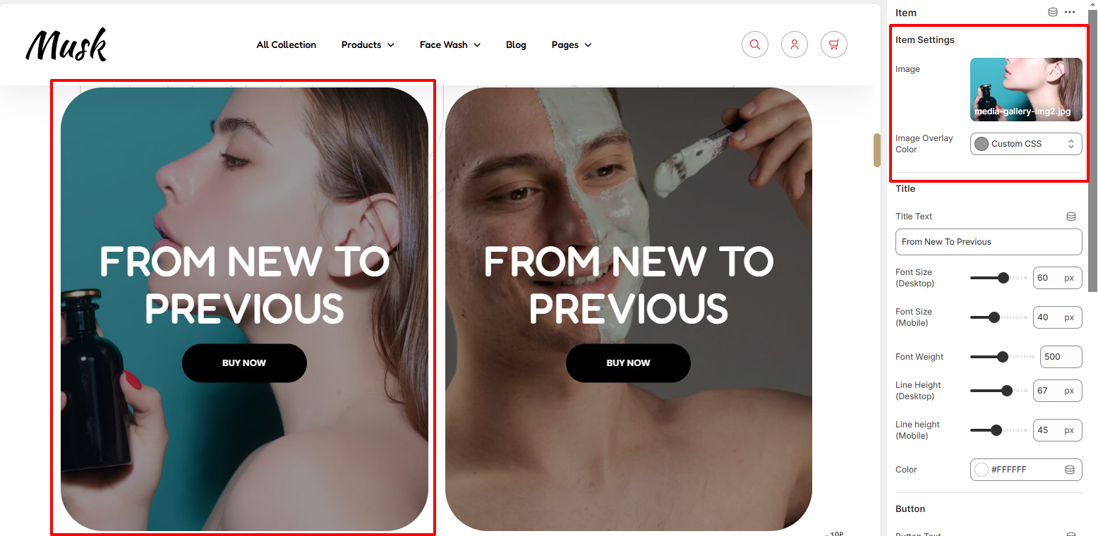
Within the setting here, you can set your Grid image as well as overlay color on it.
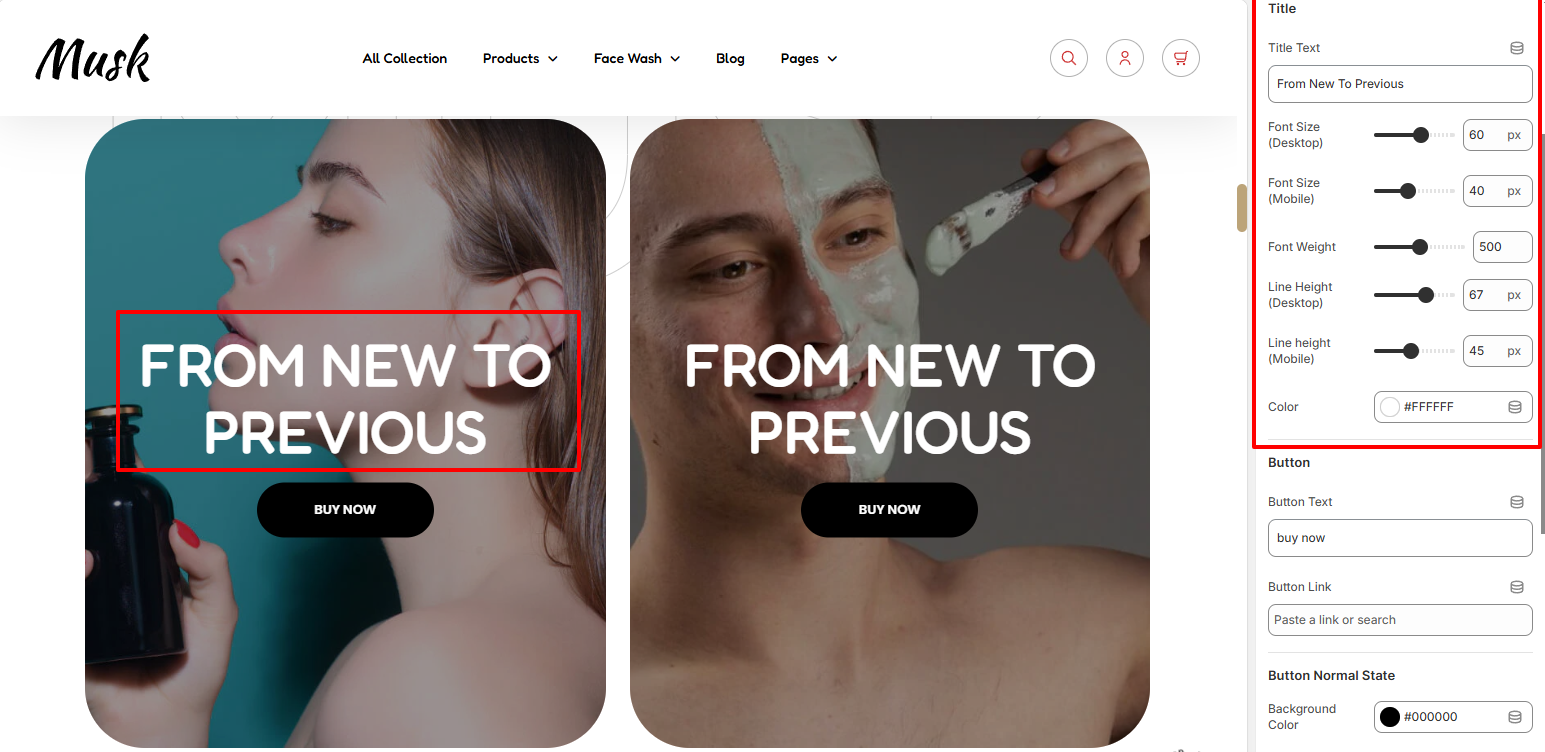
The title segment enables you to add the text to be rendered in your Grid item as well as add color styling and font styling such as he font size, font weight, and line height to it.
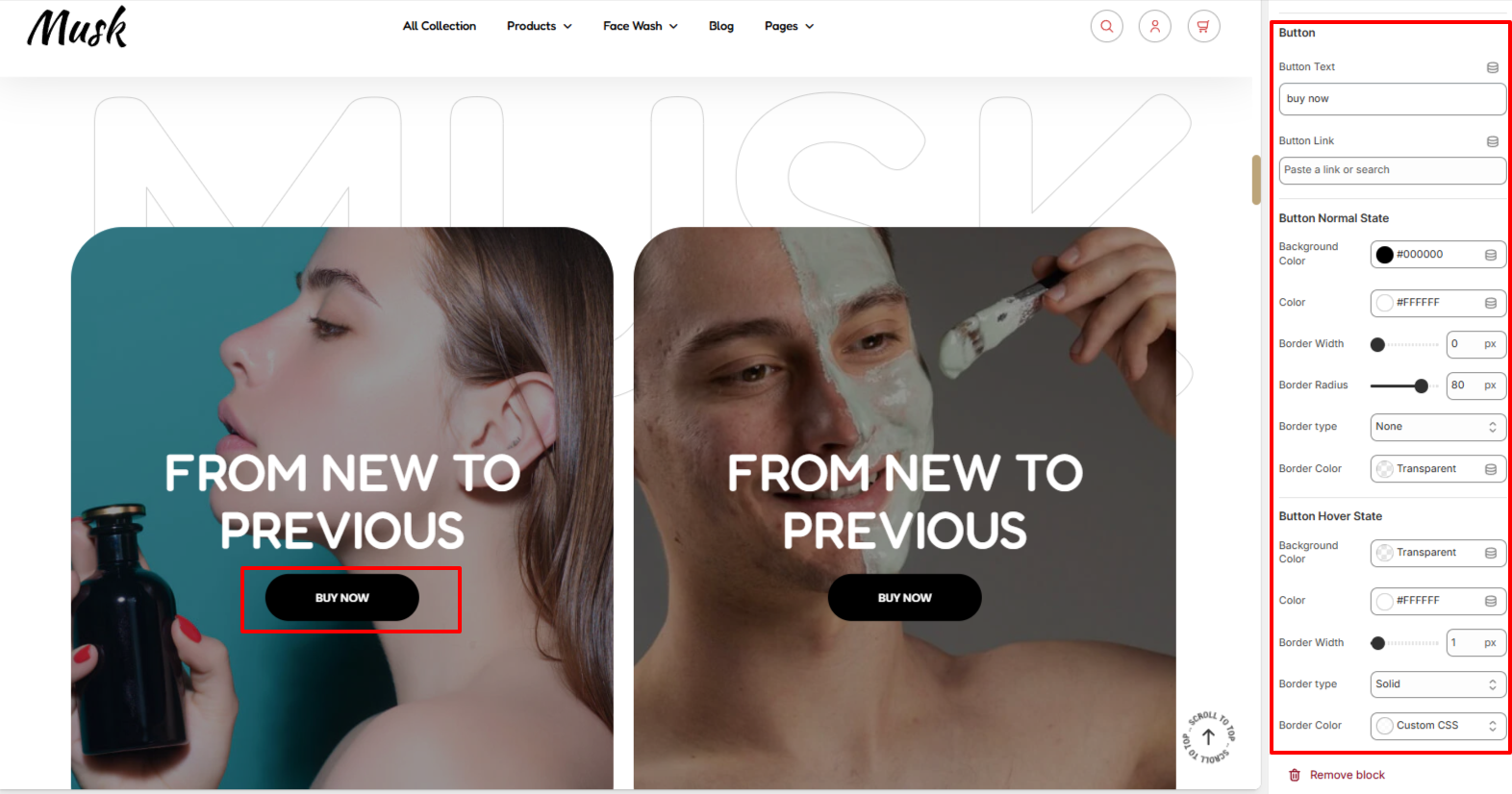
The Button setting enables you to add the button text and set the button link. In addition, within the settings here, you can apply various styling to the Button such as color, background color, and border styling in both normal and hover states.