
The Collection Page section enables you to render products within your collection as well as display a filter in it.
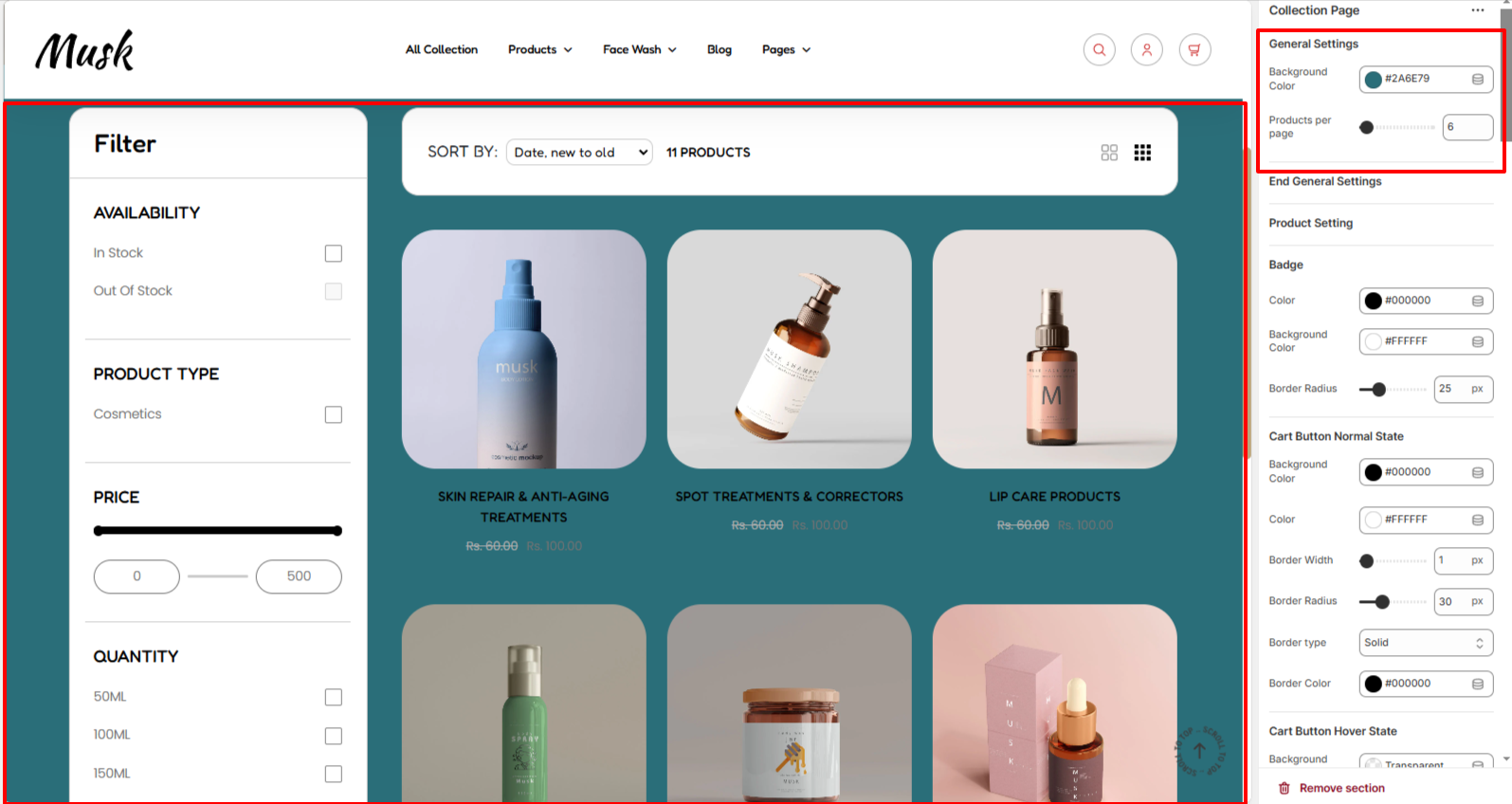
The General Settings segment enables you to set a background color to the Collection page section and also allows you to set the number of products that are to be rendered within the collection.
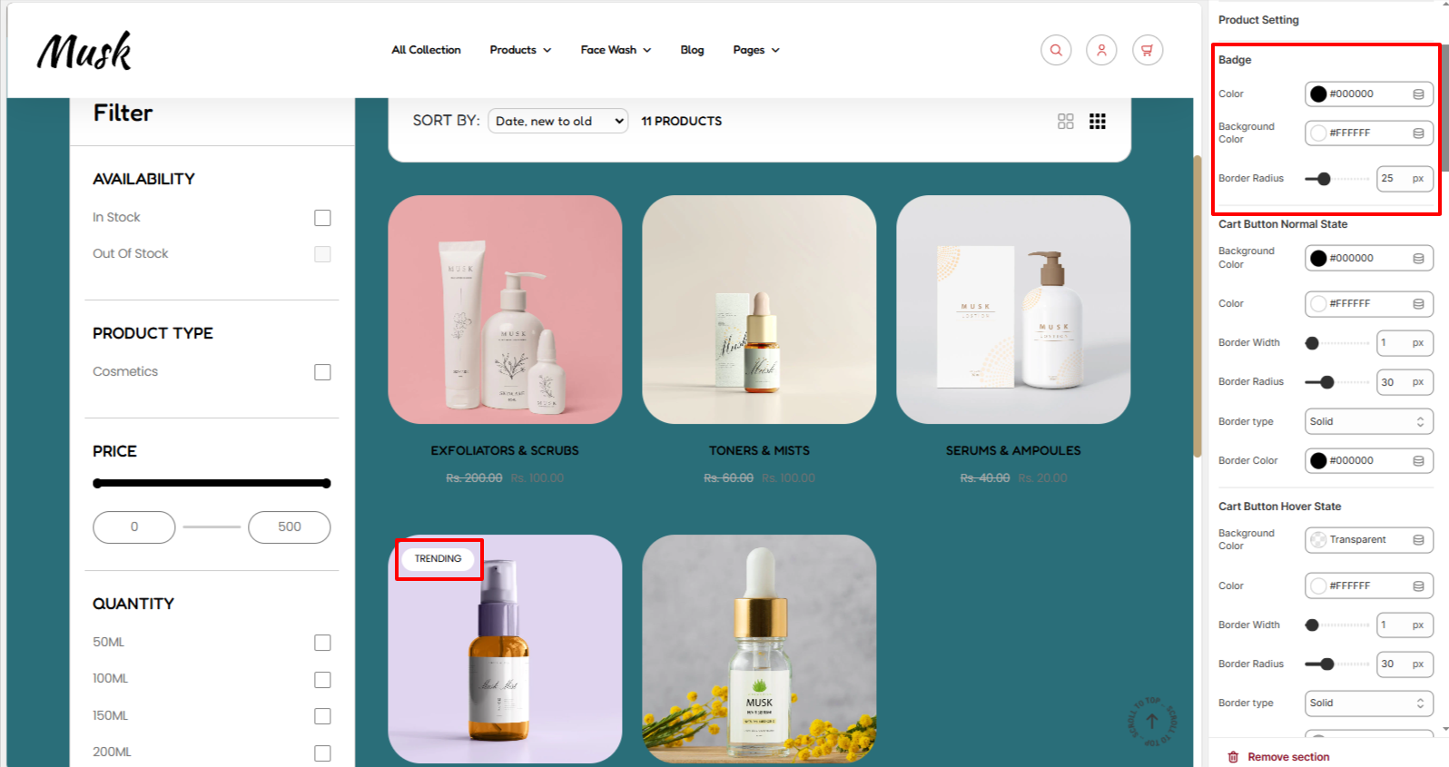
The Badge settings enable you to add styling to the badges rendered on products within the collection. Styling adjustments that can be carried out include altering the color of text within the badge, background color to the badge, as well as the border-radius.
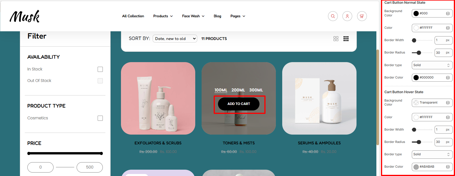
The Cart Button settings enable you to carry out various customizations to the Add to cart button displayed in the products within the collection page. These customizations include altering the background color of the button, the color of the text within the button, border width, border type, and border color of the button, in both normal and hover states.
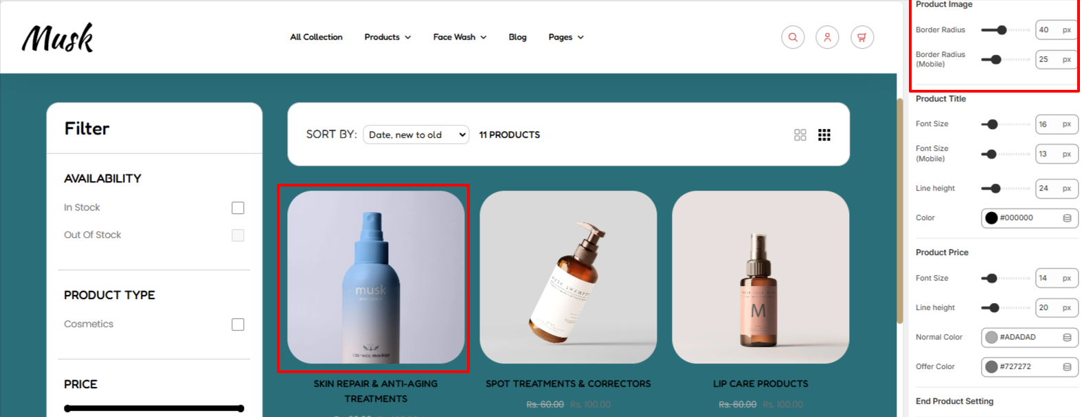
Within the Product Image region, here you can set your desired border-radius to the product images rendered within the collection page.
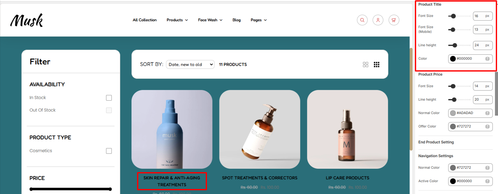
The Product Title segment enables you to carry out styling adjustments to the product titles of the products rendered within the collection page. These adjustments include the font size, line height, and color of the product titles.
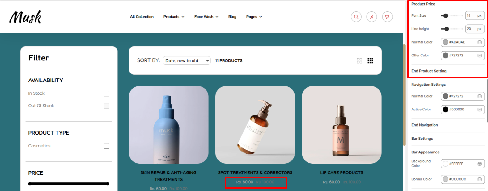
Within the Product Price segment, here you can carry out various changes to the price such as setting the desired font size, line height, and color of the price, as well as setting your desired offer price color.
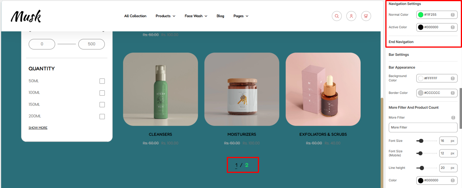
Within the Navigation settings, here you can set the color of the pagination numbers for both normal and active states.
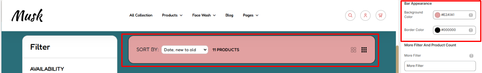
The bar appearance settings enable you to set a background color and border color to the top bar within the collection page.
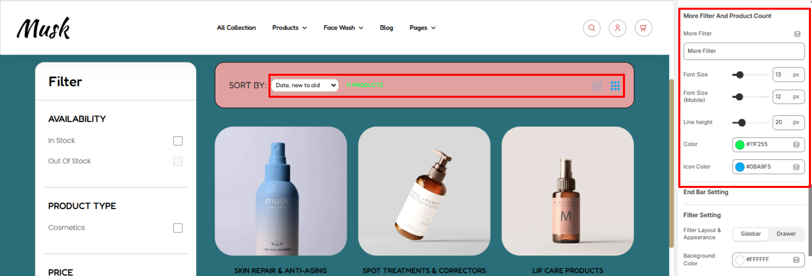
The settings here enable you to adjust styling aspects of the additional filters such as the font size, and line height, as well as the product count color, and filter icon color.
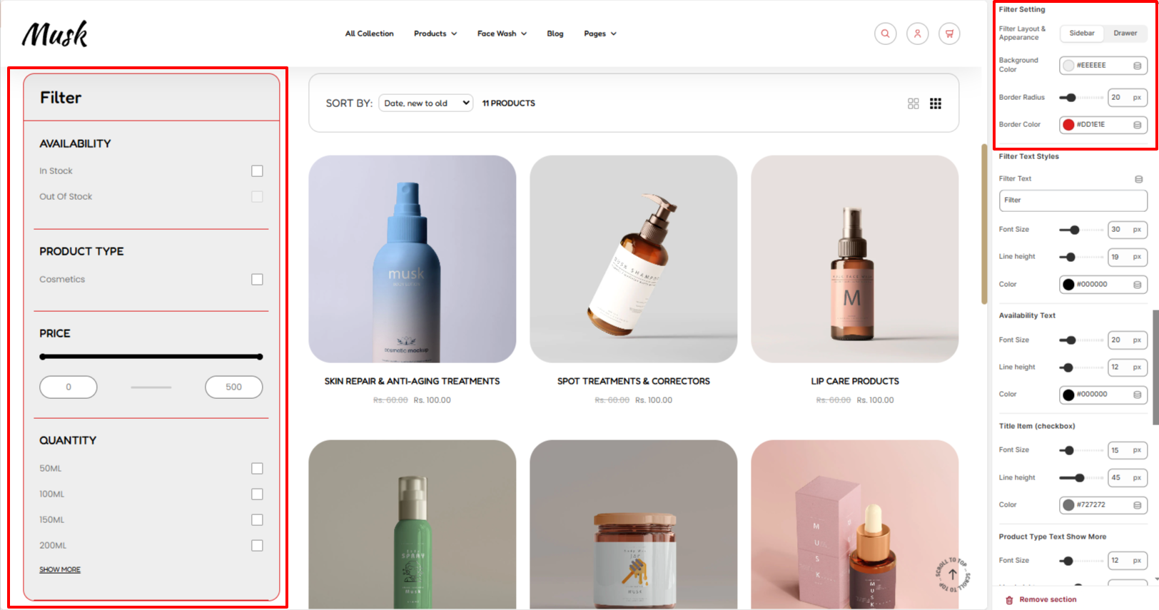
Within the Filter setting, here you can specify how you wish to have the filters within the collection page section to be rendered. Either as a sidebar or drawer appearance.
In addition, you can set your desired background color , border radius, and border color to filters region.
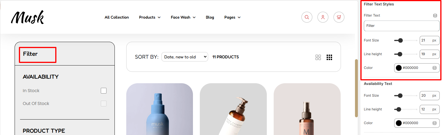
The filter text styles enable you to add text to your Filter region as well as apply various styling aspects to it such as the font size, line height, and color.
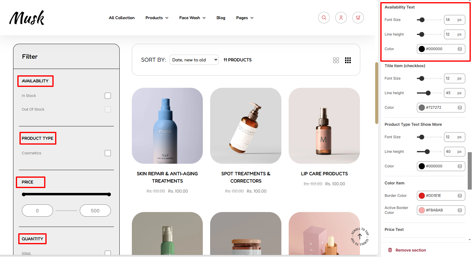
The Availability Text settings enable you to apply various styling to the filters Heading texts. These stylings include the font size, line height, and color of the texts.
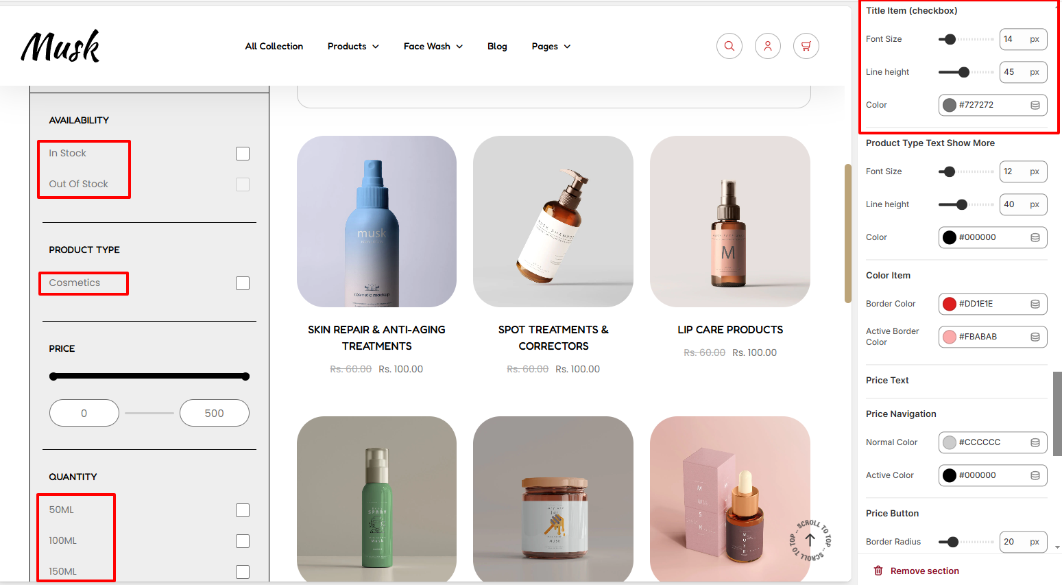
The Title item settings enable you to carry out various styling adjustments to the title filters with checkboxes. There are various adjustments that can be made to these texts in terms of the font size, line height, and color to the text.
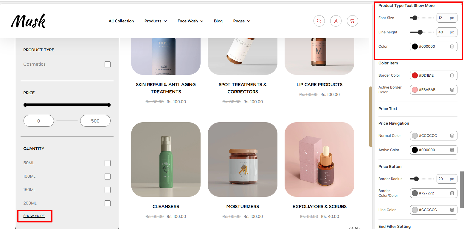
The settings here enab;e you to carry out changes to the styling of the Show More text within the filter. Various adjustments can be carried out here such as altering the font size, line height, and color of the text.
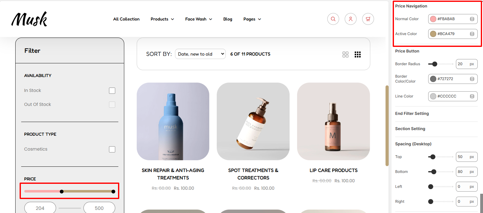
Within the Price Navigation settings, here you can set the color of the Pricing slider in normal and active pricing ranges.

The Price Button settings enable you to make adjustments to the border radius and border color of the fields with the price values and also the color the price values. In addition, you can also set a color to the line between the price values.
The spacing settings enable you to set padding around the Collection page section, both within desktop and mobile devices.