
The Blog Post section enables you to add blog post content to the default Blog post layout.
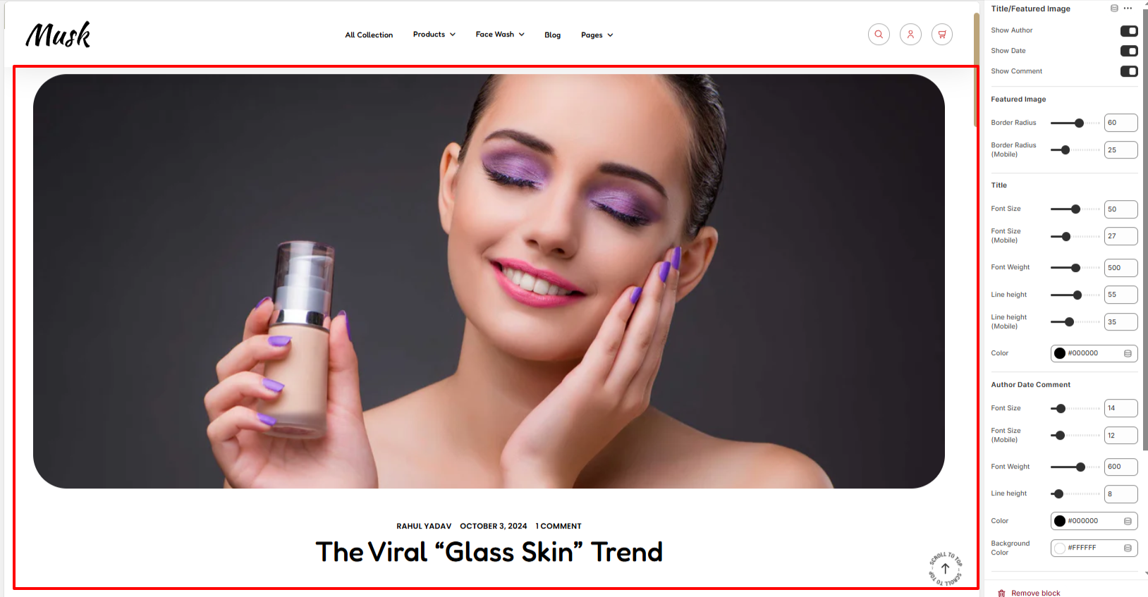
The Title/Featured Image block enables you to render the blog post title, and featured image, as well as display the blog post author, date, and number of comments within the post.
Various settings are available within the block.
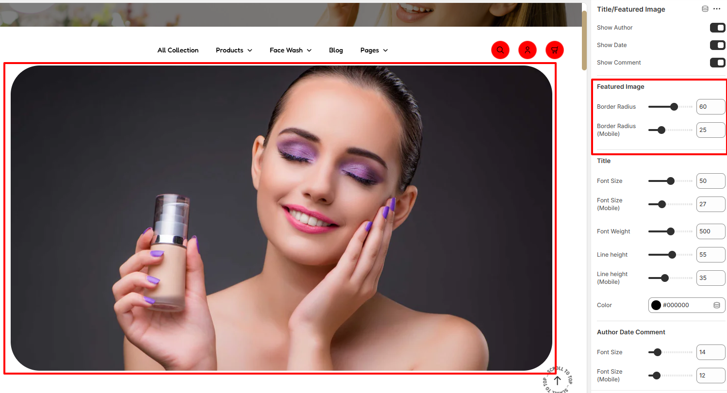
The Featured Image settings enable you to add a border radius to the featured image.
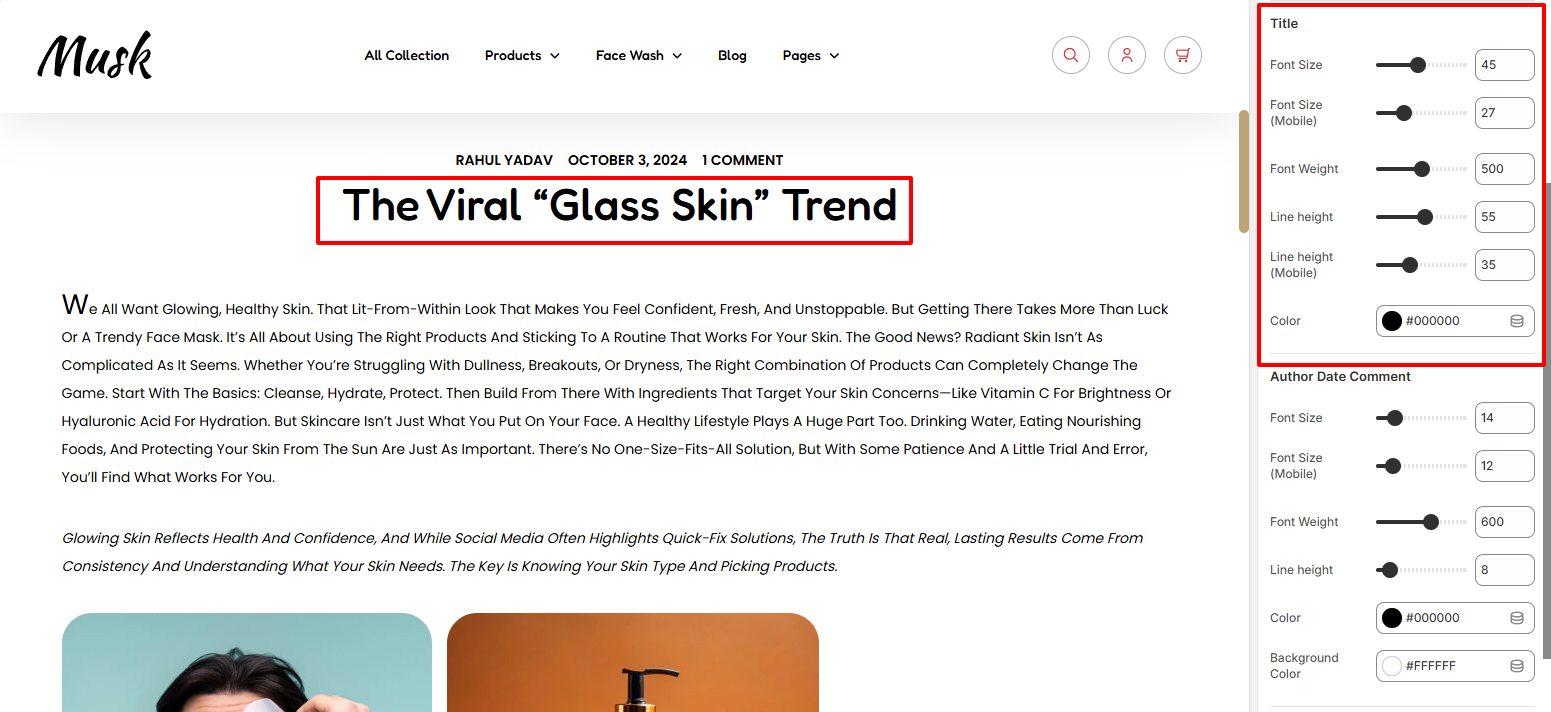
The Title section enables you to adjust the title styling such as the font size, font weight, line height, and color of the text.
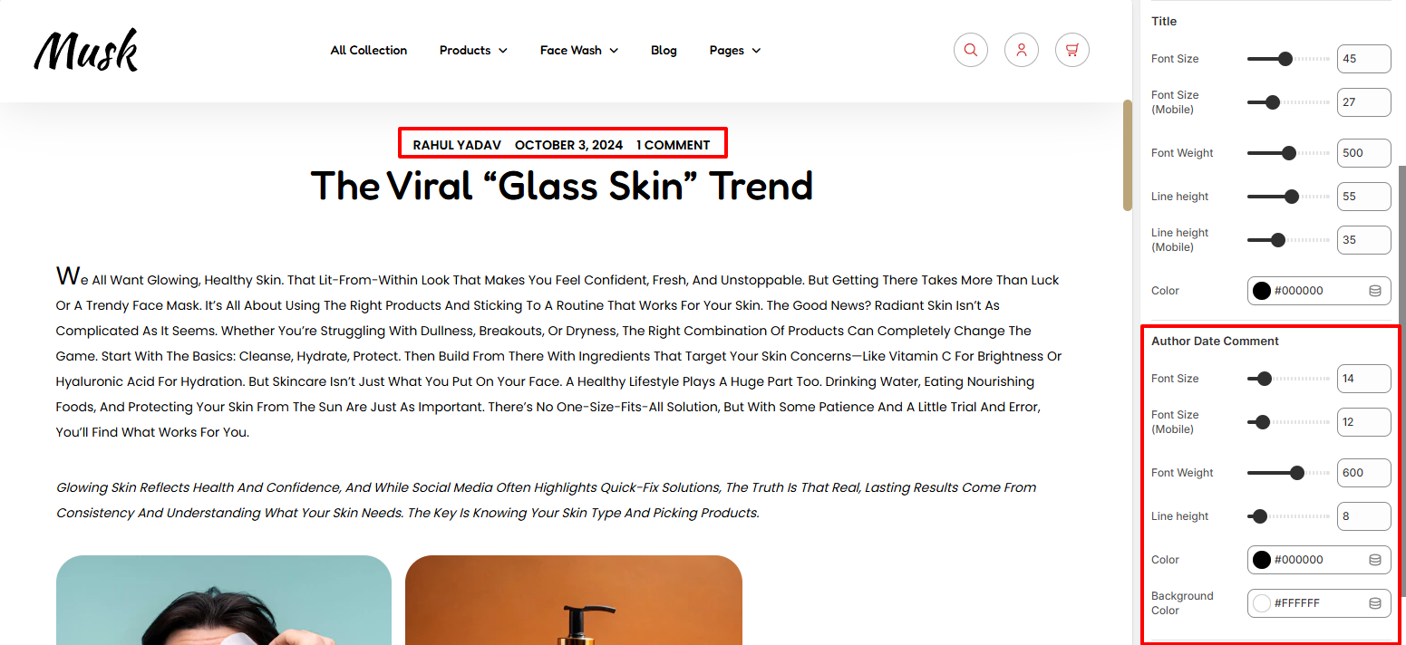
The Author Date Comment enables you to adjust the styling to the author, date, and the comments text. Various adjustments can be made relating to the font size, font weight, line height, color, and background color to the text.
The Padding settings enable you to add padding to the top and bottom of the title and featured image.
The Content/Share Block renders the blog post contents as well as share icons beneath the contents.
There are various settings available within this block that include:
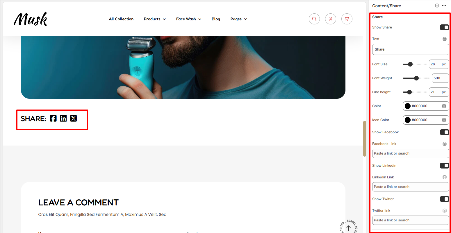
The Share settings enable you to toggle the share display.
Within the settings, you can also set the share text and adjust various styling aspects to it such as the font size, font weight, line height, and color.
The settings also include fields to add Facebook, Twitter, and Linkedin links, along with the option to toggle their display. You can also adjust the social icon colors from the Icon Color field, as well as their sizes from the font size field.
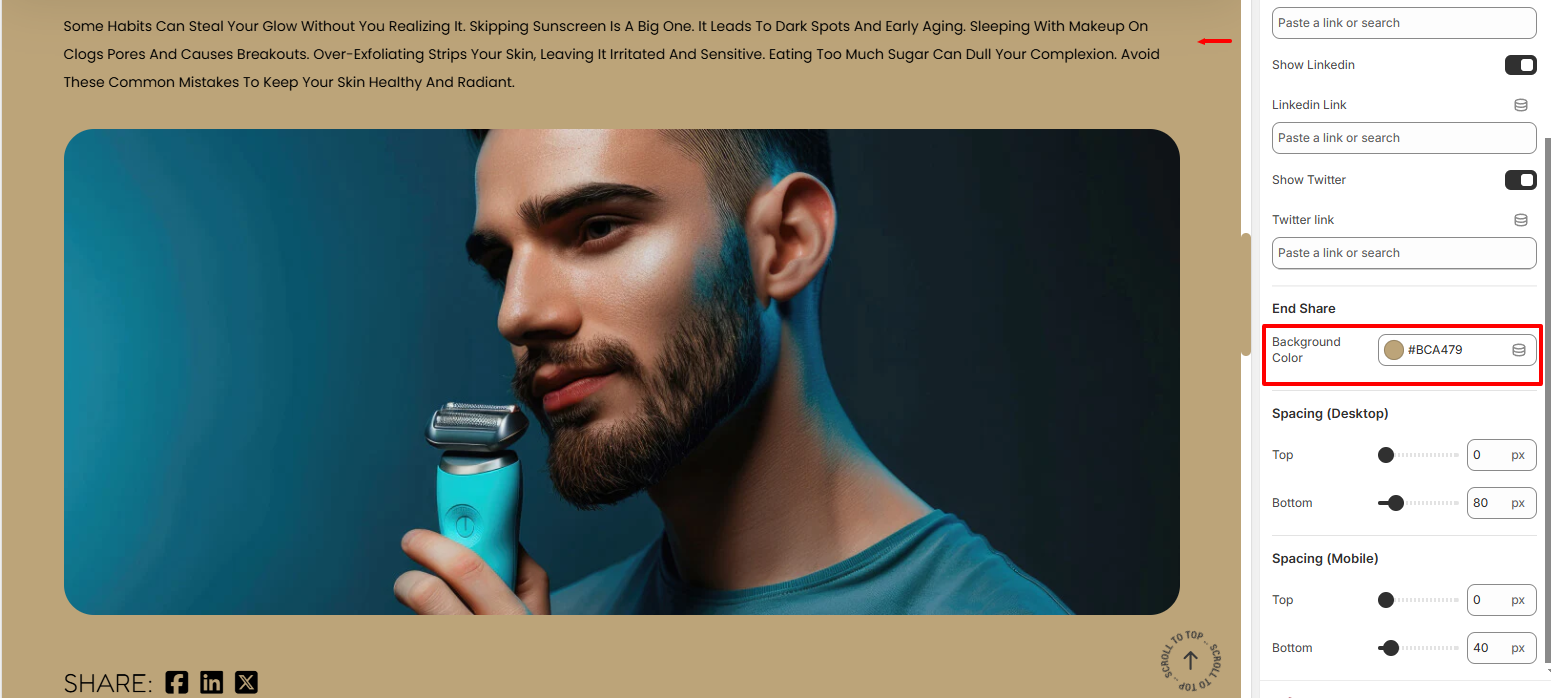
The Background color setting enables you to set a background color to the blog post content and share region.
The Spacing settings enable you to add padding to the top and bottom of the content/share section within a blog post
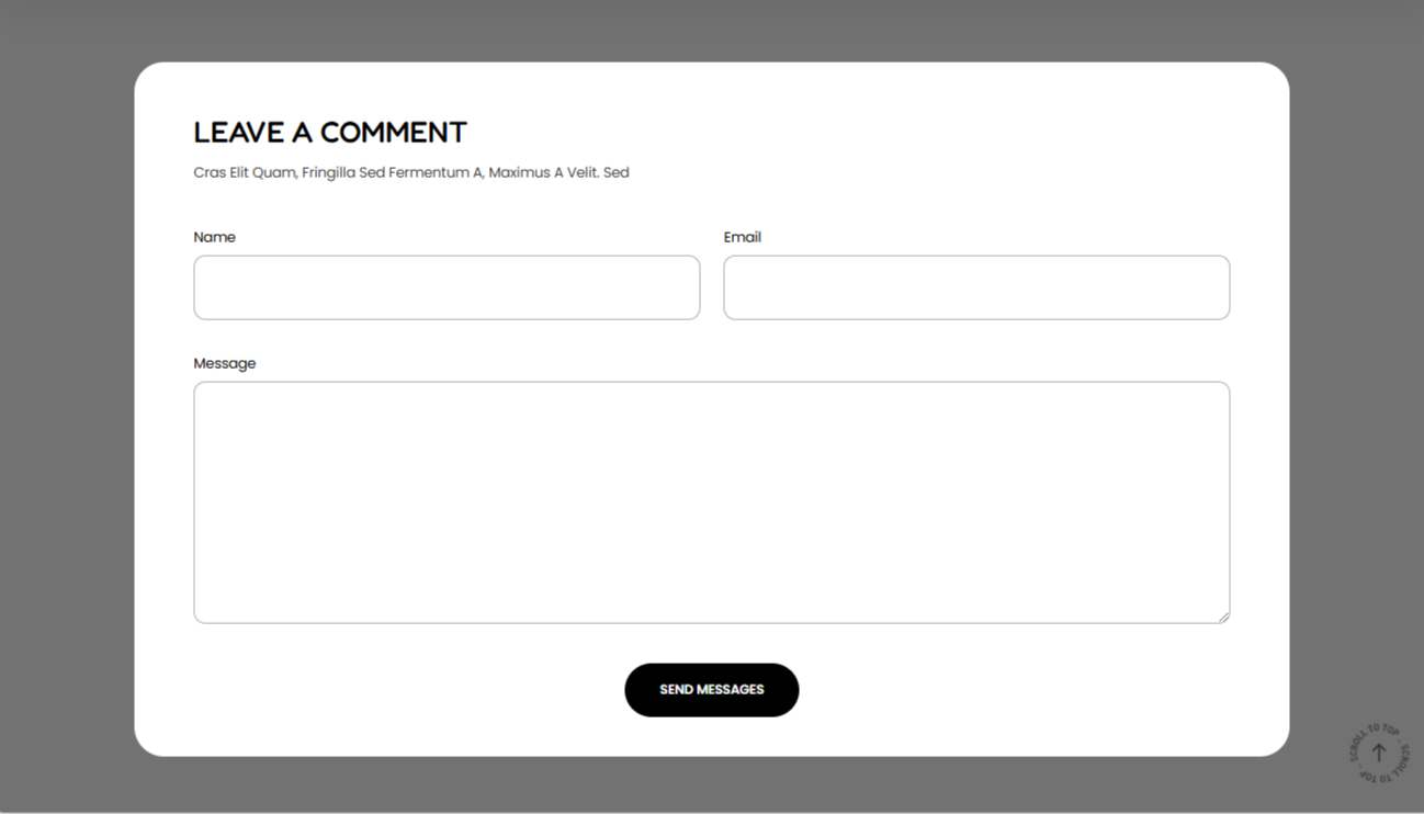
The comment block enables users to submit comments within a blog post.
Various settings are present in this block:

The Comment Setting enables you to set a background color to the Comments region.
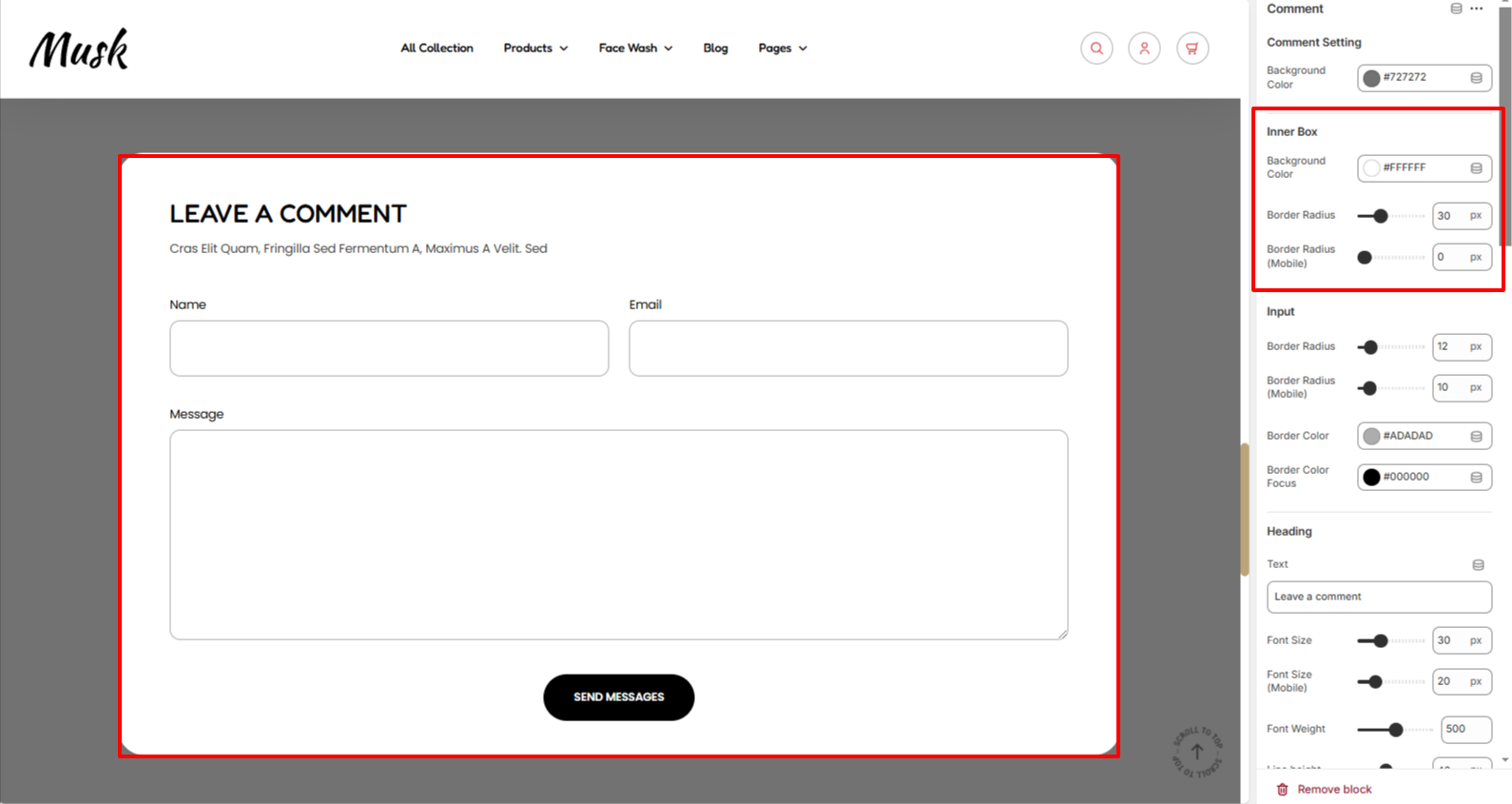
In the Innerbox settings, here you can set a background color and border radius to the region that contains the comment form.

The Input settings enable you to set a border radius to the comment fields, as well as specify a border color to it in normal and focus states.
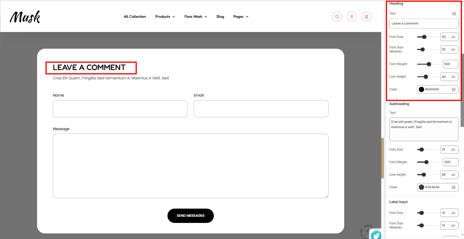
The Heading setting enables you to set a heading to the Comment section as well as carry out styling adjustments to it such as the font size, font weight, line height, and color.
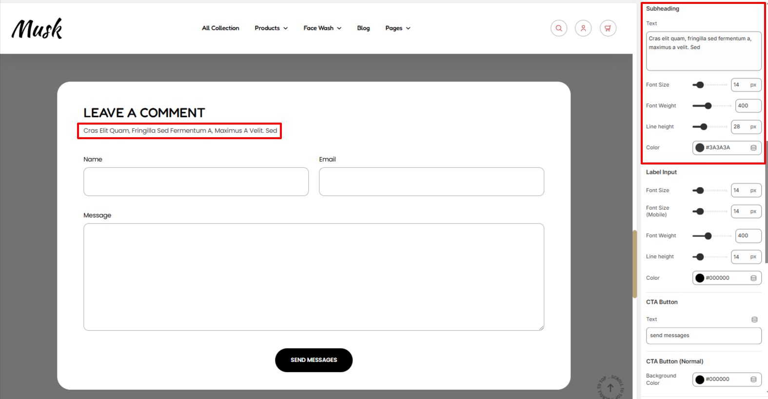
Within the Subheading setting, here you can set your desired subheading text as well as set various styling to it such as the font size, font weight, line height, and color.
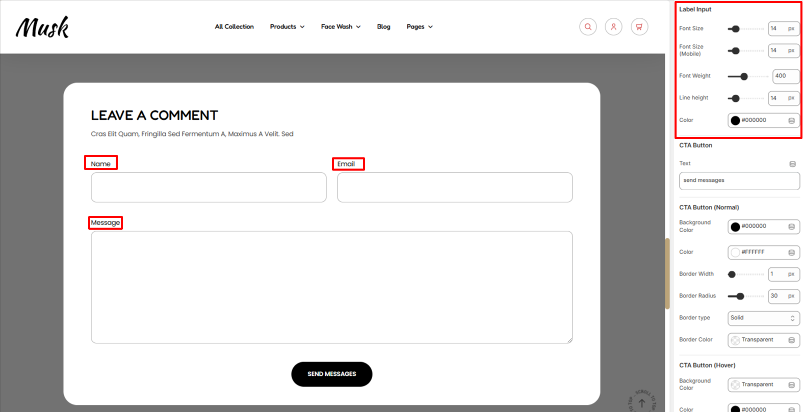
The Label Input settings enable you to adjust various styling aspects to the comment form labels such as the font size, font weight, line height,and color.

The CTA Button settings enable you to set the text to be rendered on the comment form button, as well as set various styling aspects to the button such as the background color, color of the text, border width, border radius, border type, and border color to the button in normal and hover states.
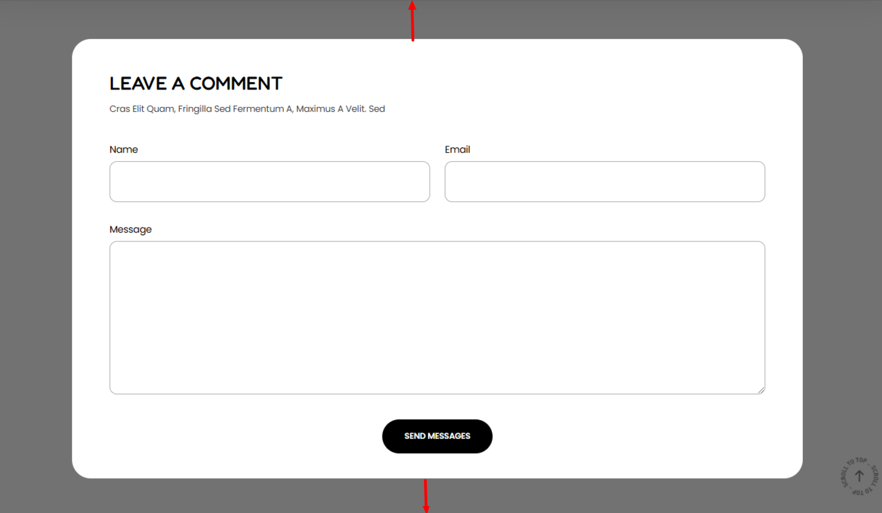
The Spacing settings enable you to set a top and bottom padding to the comment form.