

The Image WIth Text Overlay section enables you to add content about your store, overlaying a background image.
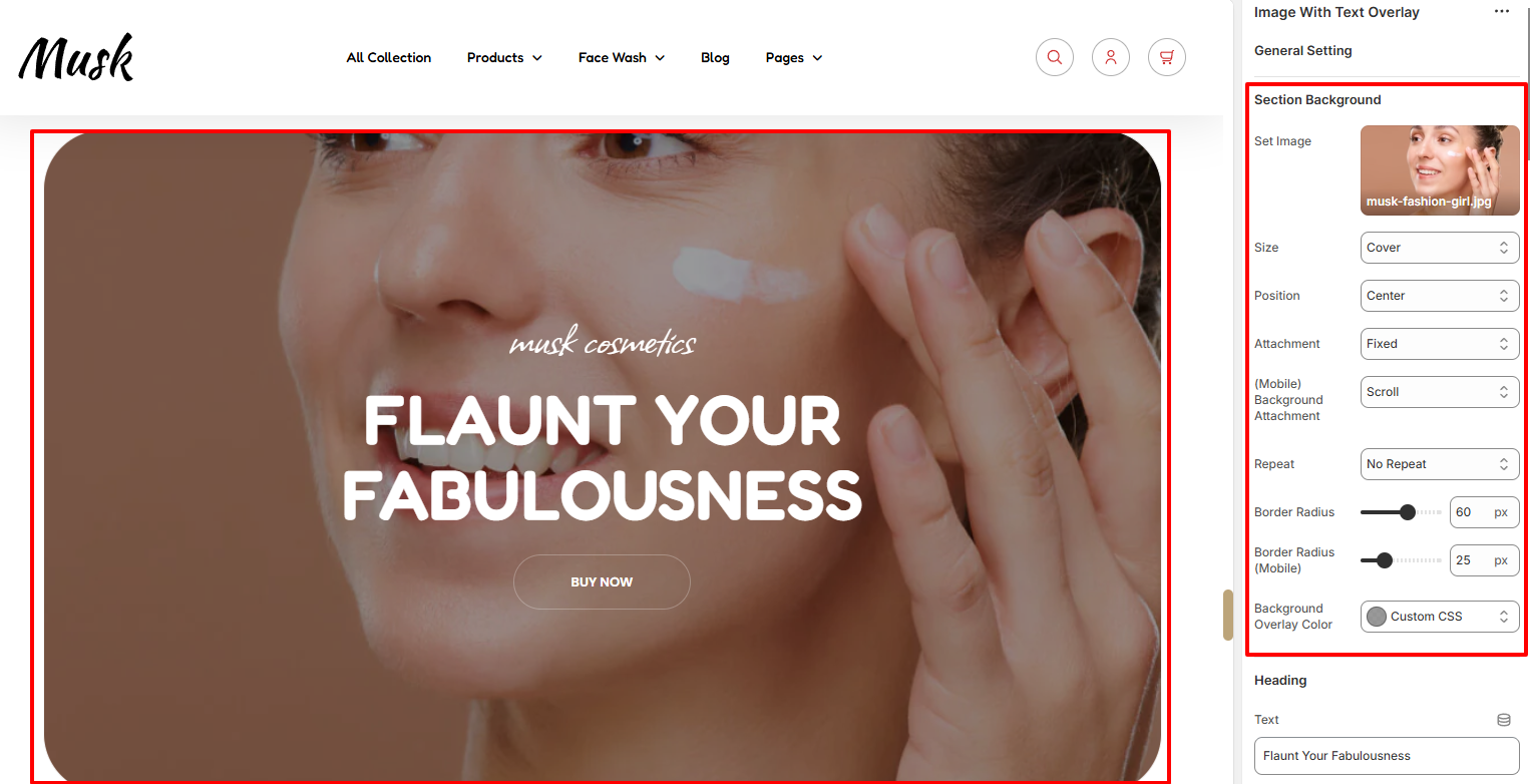
Within the Section Background settings, here you can set your desired background image as well as specify various styling properties to it such as the background size, position, attachment, Background repeat, border radius, and the Background overlay color.
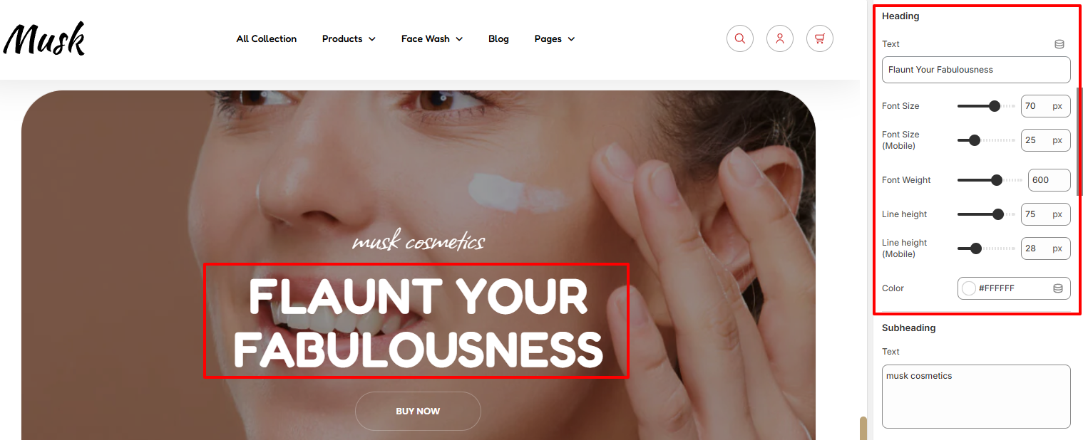
In the Heading settings, here you can add your desired text to serve as the heading to the section as well as set its font size, fone height, line height, and color.
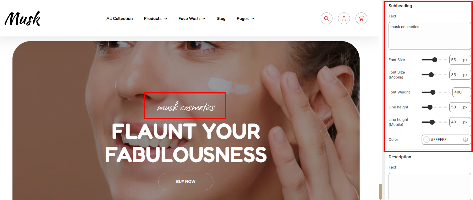
The Subheading settings enable you to add your desired text to be rendered above the header, as well as set its font size, fone height, line height, and color.
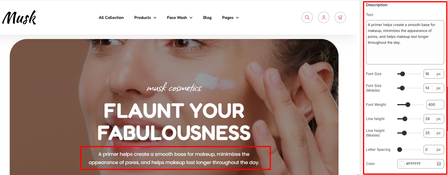
The Description setting enables you to add your desired text beneath the header. You can also apply various styling properties to it such as the font sixe, font weight, line height, and color to the description.
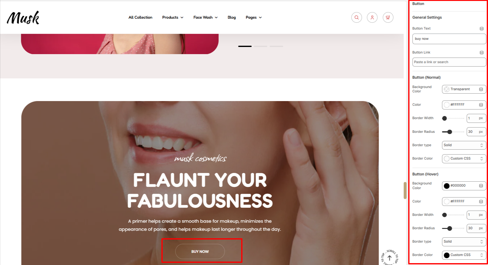
Within the button settings, here you can add your desired button text to be rendered in the button as well as your desired button link.
In addition, the settings here also enable you to set your button background color, border width, border radius, border color, and color of the text in the button under Normal and Hover states for Desktop.
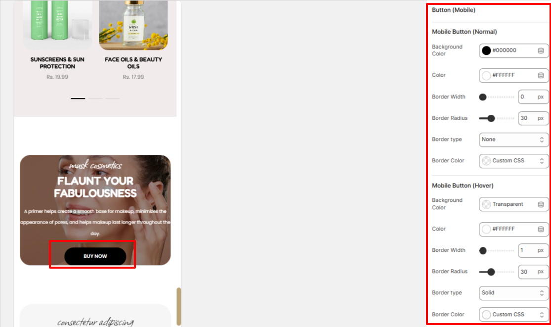
The Button (Mobile) settings enable you set the button background color, border width, border radius, border color, and color of the text in the button under Normal and Hover states for mobile devices.
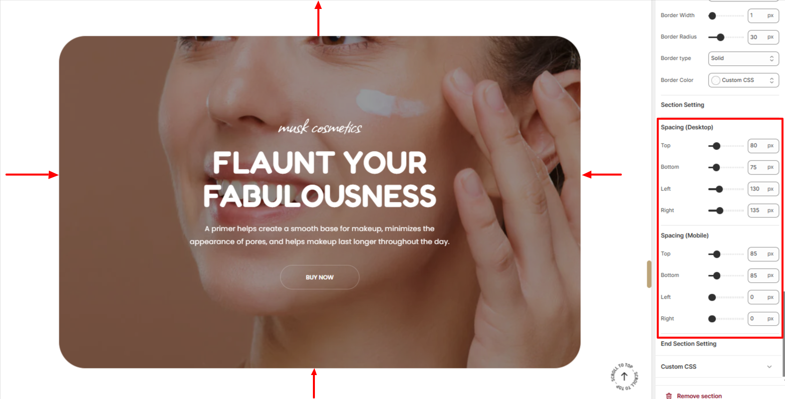
The Spacing settings enable you to add spacing around the Image With Text Overlay section, both on desktop and mobile devices.