
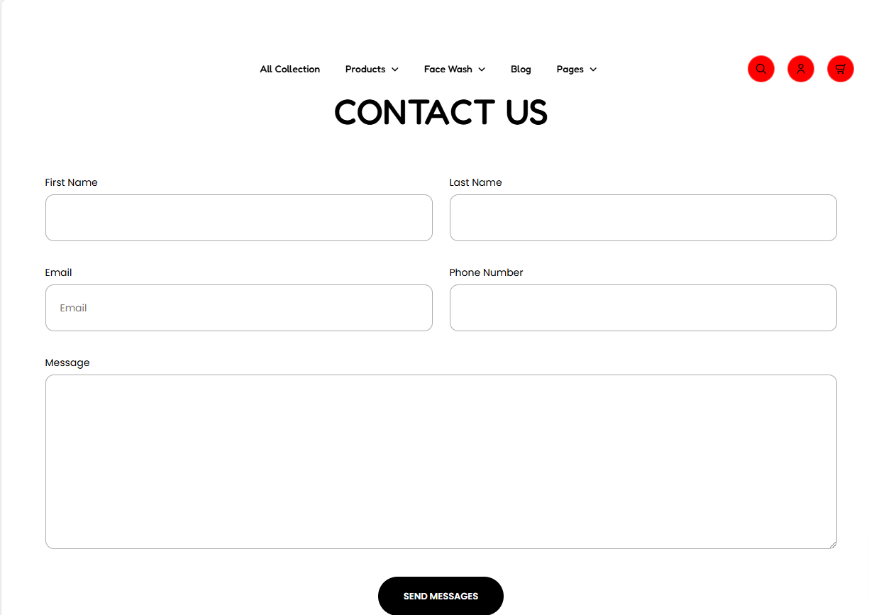
The Contact Form section enables you to add a form that customers can use to send questions or other messages, to the store owner.
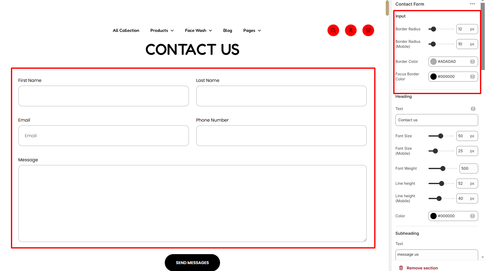
Within the Input settings, here you can set a border radius and border color to the form fields. In addition, you can set a border color to the form fields when a field is on focus.
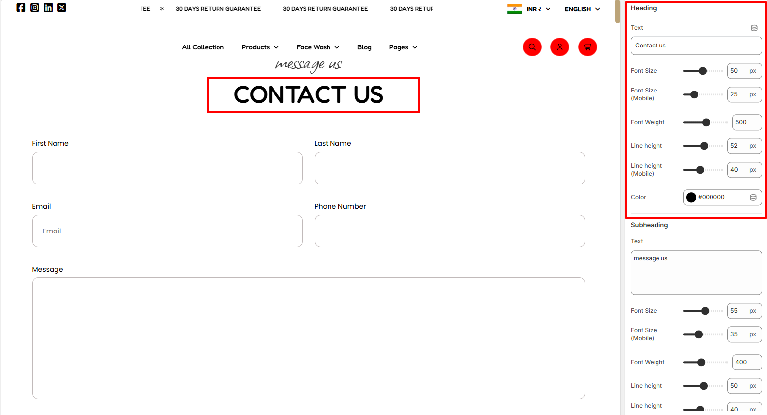
The Heading segment enables you to add a heading to your contact form as well as apply various styling to it such as font size, font weight, line height, and color.
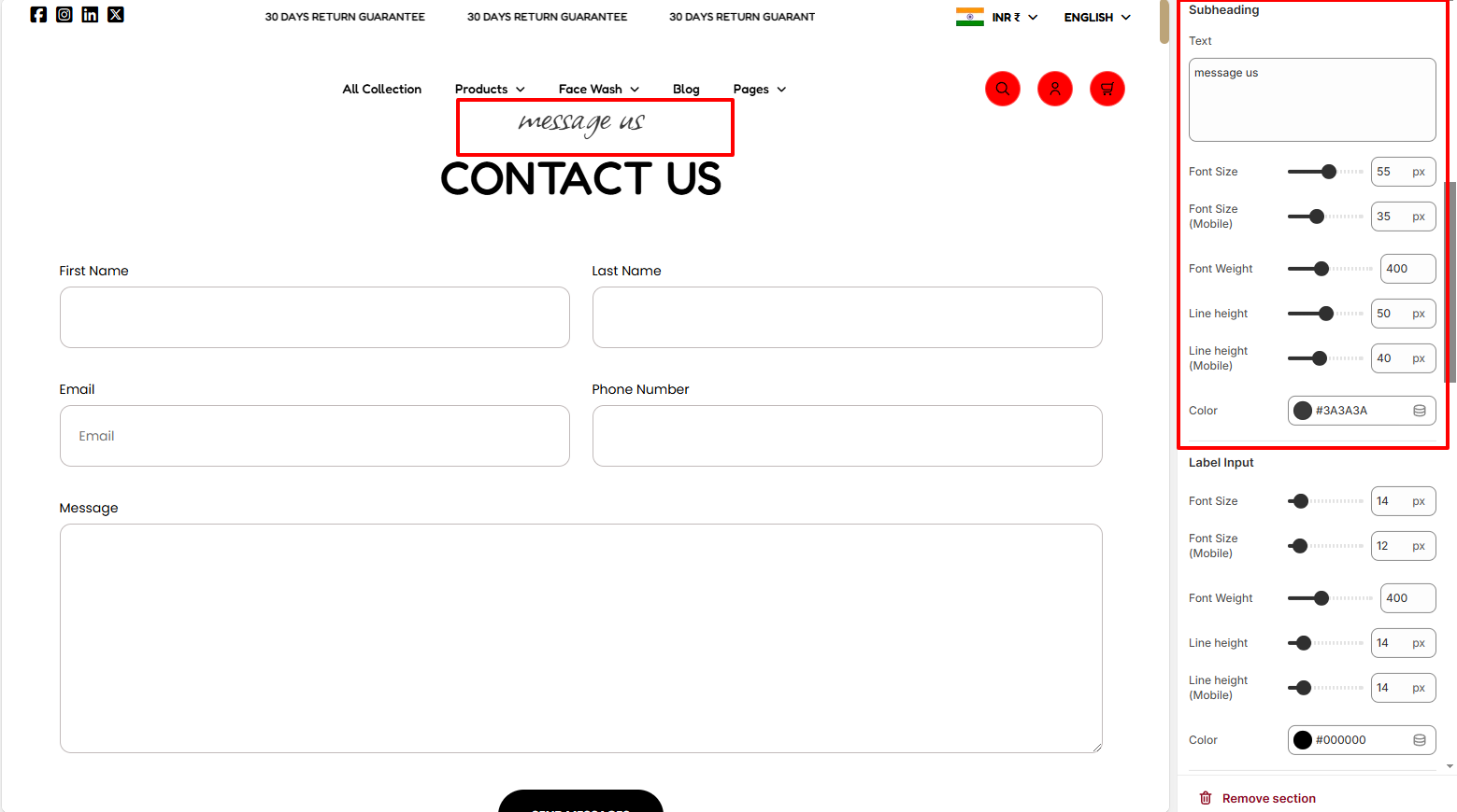
The Subheading region enables you to set a subheading text to be rendered above the header, as well as apply various styling to it such as the font size, font weight, line height, and color.
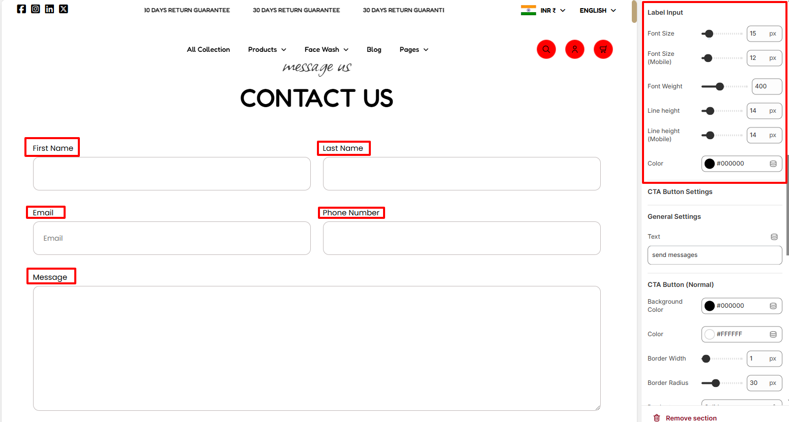
The Label Input segment enables you to adjust various styling to the labels within the form such as the font size, font weight, line height, and color.
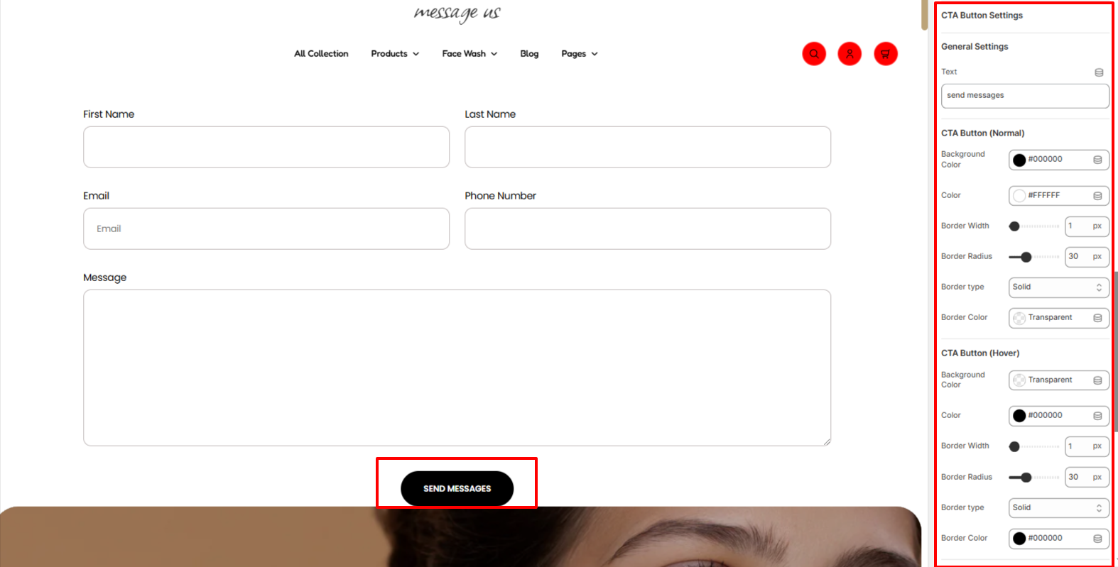
The CTA button settings enable you to set your desired text to the send button within the form. In addition, you can adjust various styling aspects to the button such as the background color, color, border width, border radius, border type, and border color in normal, and hover states.
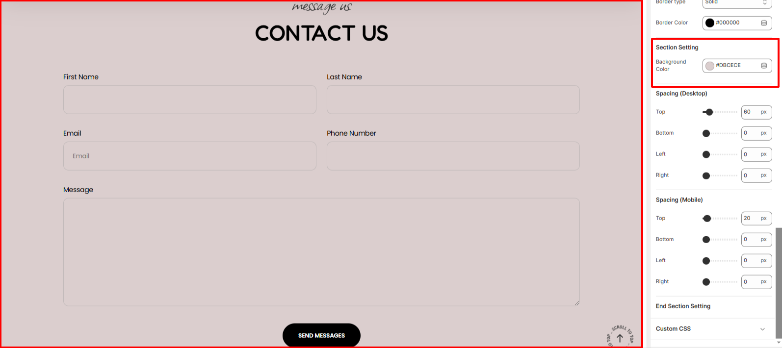
Within the section setting, you can set a background color to the contact form section.
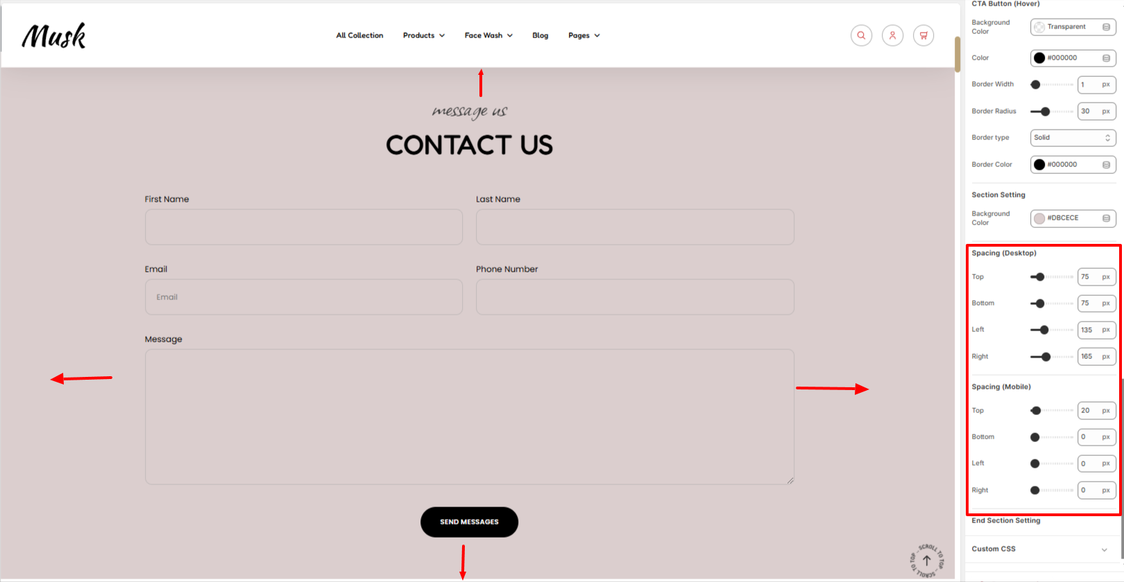
The Spacing settings enable you to add padding around the contact form.