
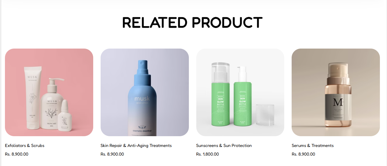
The Related Product section is added to products template to render and automatically generated list of products similar to the one in view.
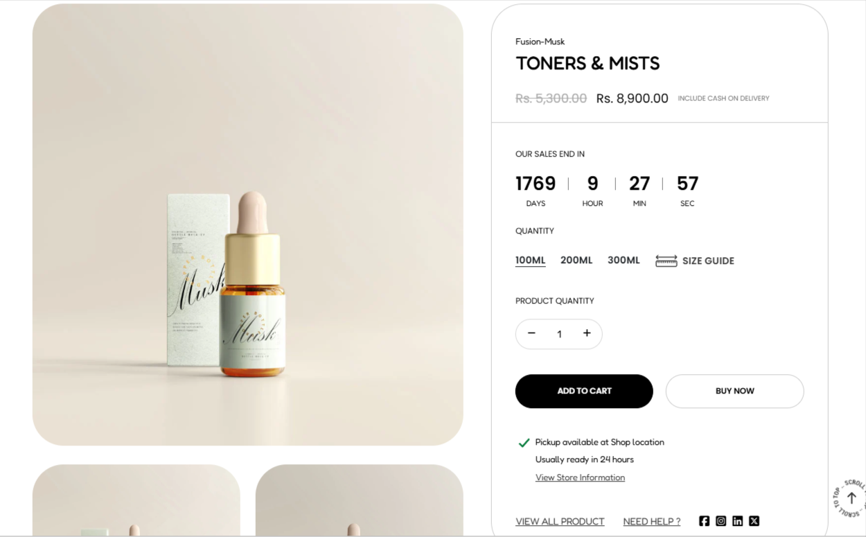
The Product Information section is used in product templates to render details about a product.
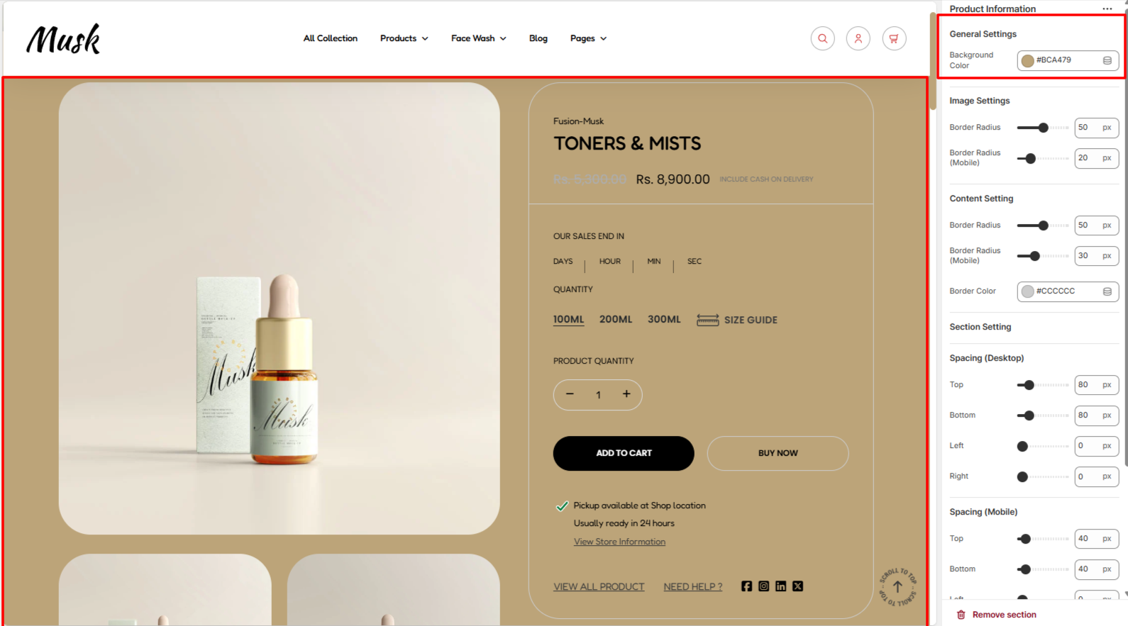
Within the General settings, here you cna set the background color to the product information section.
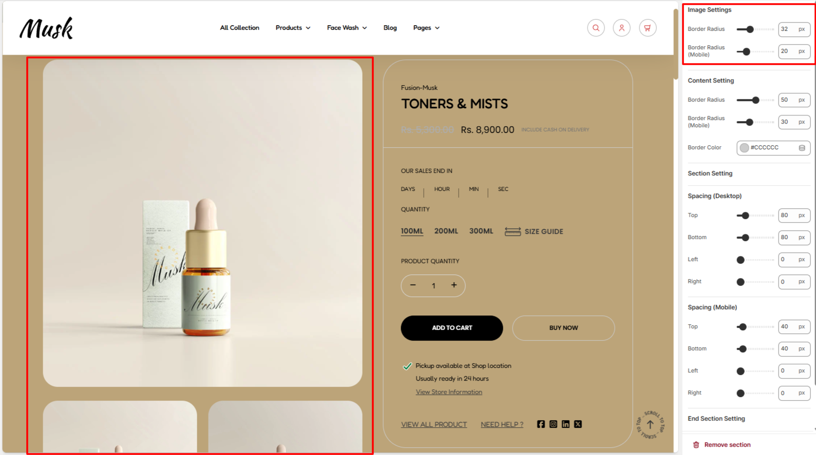
The Image Settings enable you to set a border radius to the product images.
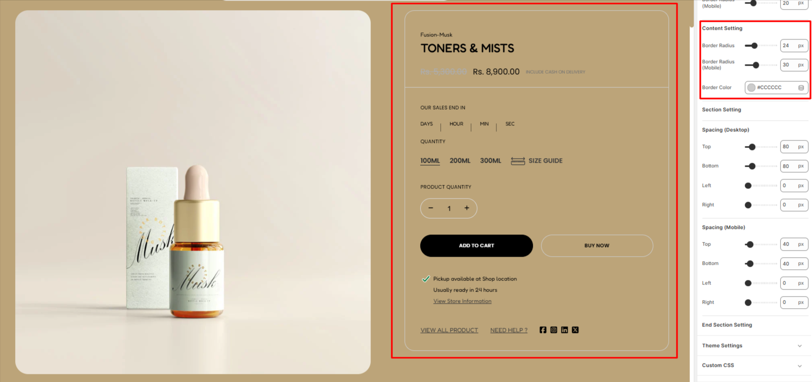
Within the Content Setting, her eyou can set a border radius and border color to the border rendered around the Product Information content area.
The Spacing settings enable you add padding to the Product Information section within both desktop and mobile devices.
This block helps in adjusting the styling of the product title and product price within the Product Information section.
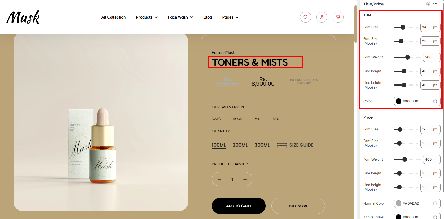
Within the Title settings, here you can adjust various product title aspects such as the font size, font weight, liene height, and color.
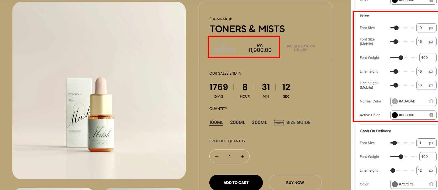
Within the Price settings, here you can adjust various product price aspects such as the font size, font weight, liene height, normal price color and active price color.
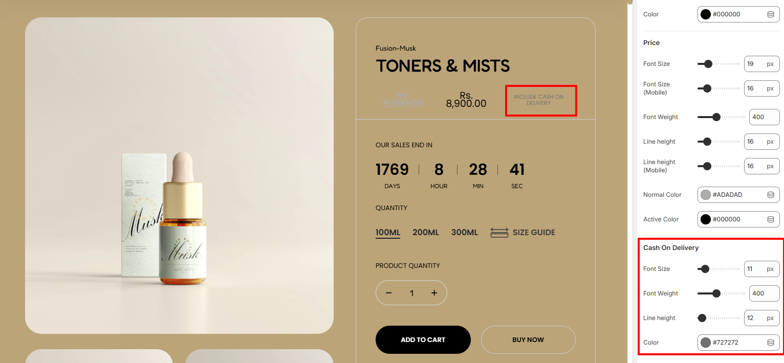
The Cash On Delivery settings enable you carry out adjusttements to the Cash on delivery text in terms of the font size, font weight, line height, and color of the text.
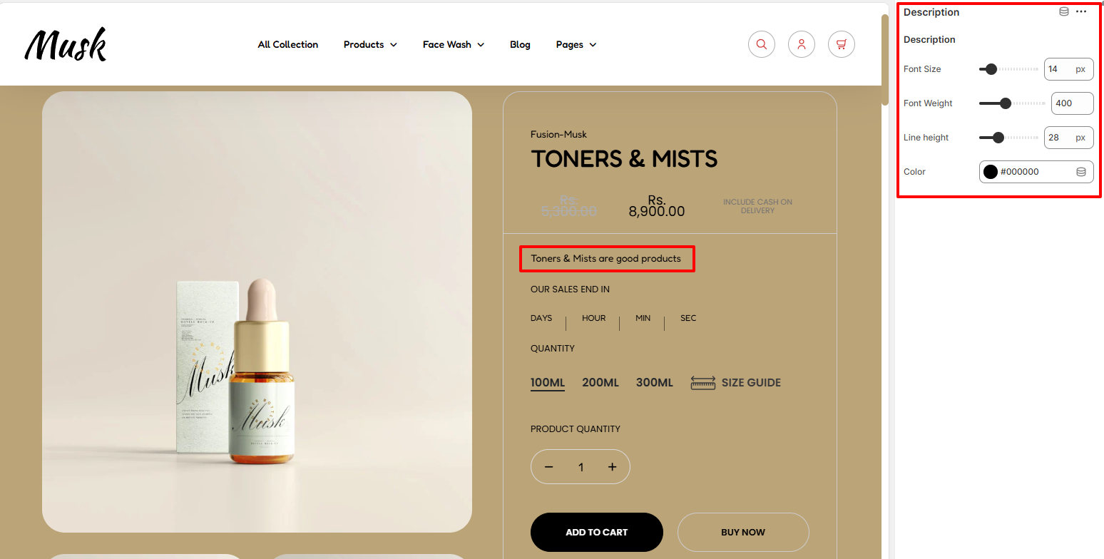
The Description block renders the products’description the description is added in the product.
Within its settings, you can adjust the font size, font weight, line height, and color of the description text.
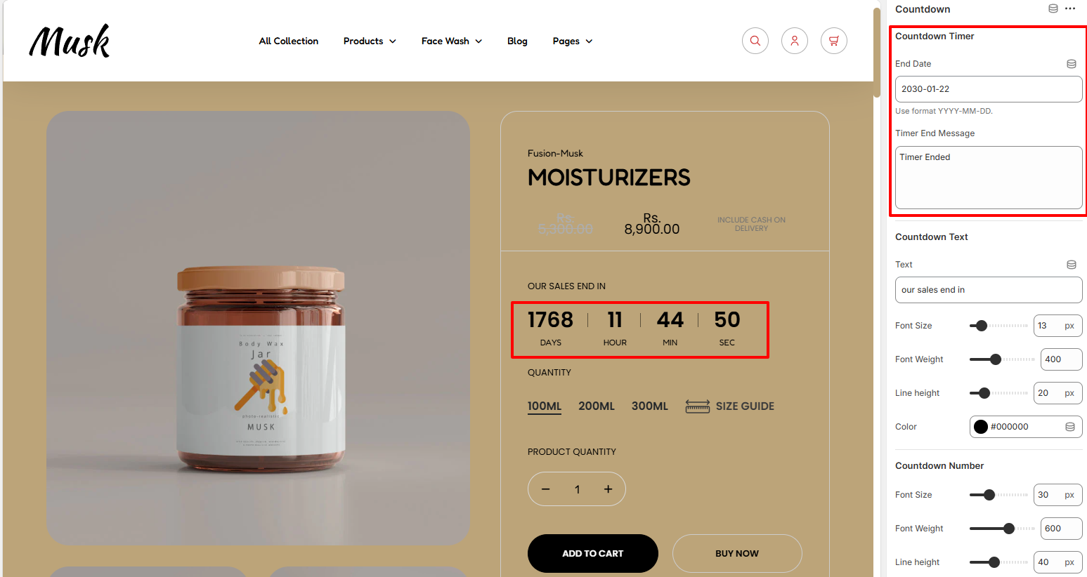
Within the Countdown Timer settings, here you can set your desired end date for the countdown timer as well as the message to be rendered once the countdown period expires.
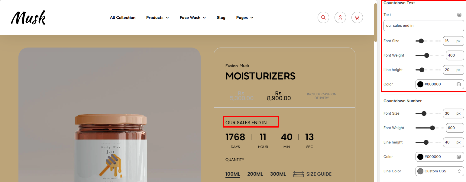
In the CountDown Text region, here you can set your desired Countdown text to be rendered above the countdown, as well as set various styling aspects to it such as the font size, font weight, line height, and color to the text.
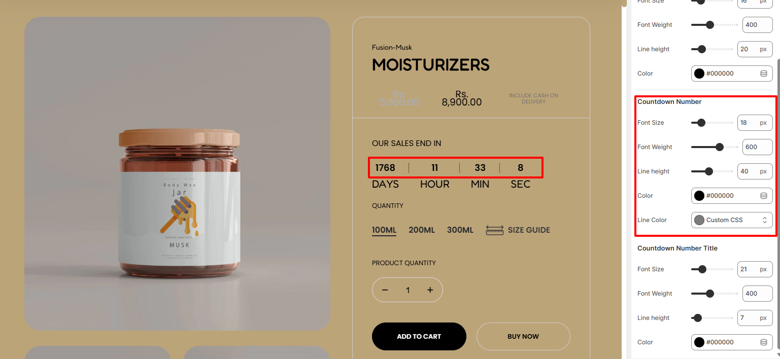
Within the Countdown Number region, here you can carry out adjustments to the countdown number in terms of the font size, font weight, line height, color and also the line color between the numbers.
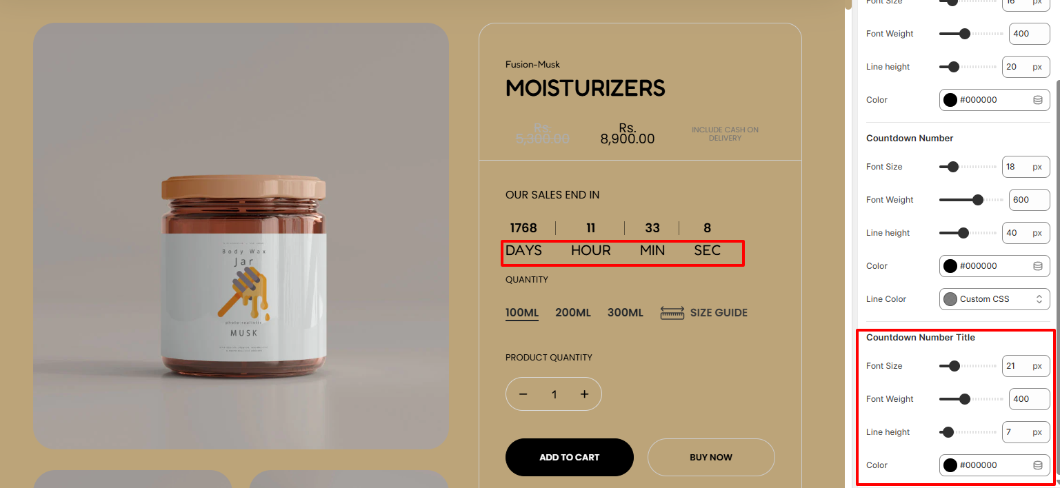
The Countdown Number Title settings enable you to carry out adjustments to the countdown time titles in terms of the font size, font weight, line height, and color of the titles.
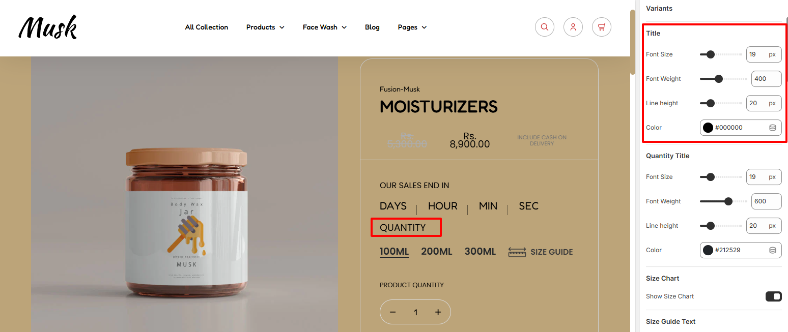
The Title settings enable you carry out adjustments to the Quantity label in terms of the font size, font weight, line height, and color.
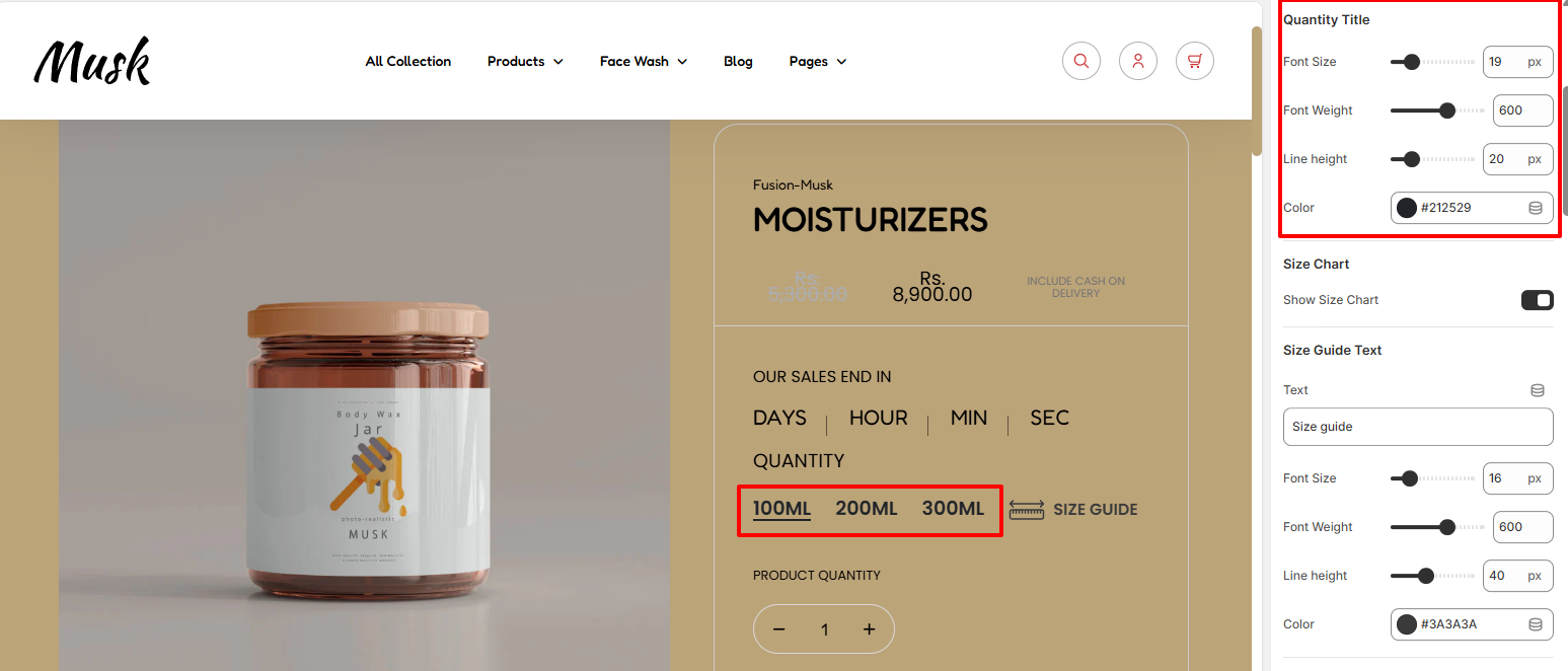
Within the Quantity Title settings, here you can carry out adjustments to the font size, font weight, line height, and color of the quantity values titles.
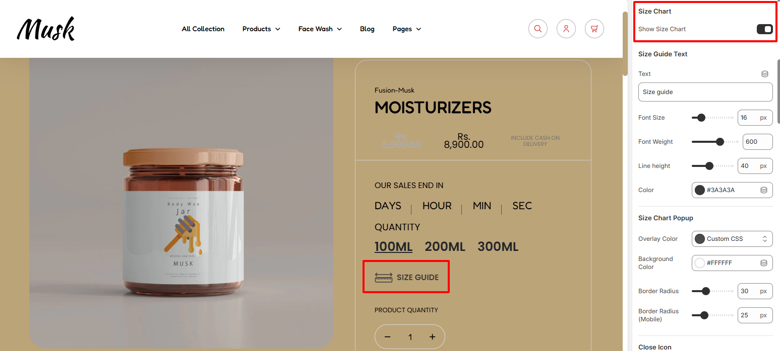
The Size Chart setting enable you to enable or disable the Size Chart display within the products.
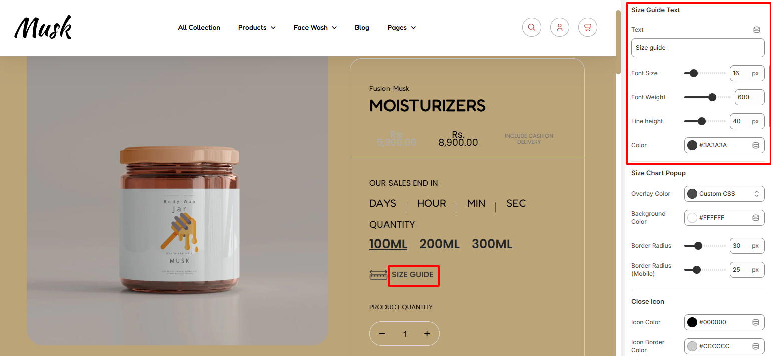
Within the Size Guide Text settings, here you can set your desired Size Guide text, as well as carry out styling adjustments to it such as altering its font size, font weight, line height, and color.
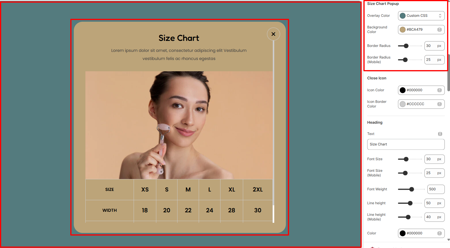
Within the SIze Chart Popup settings, here you can set the overlay color to the size chart popup as well as the background color and border radius to the Size Chart.
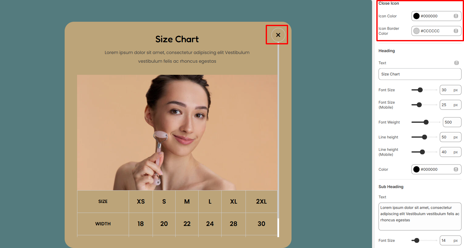
The Close Icon settings enable you to set a color to the close icon within the the Size Chart, as well as a border color to it.
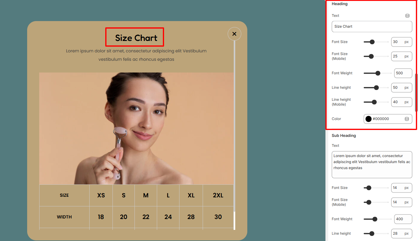
Within the Heading settings, here you can set your desired heading text for the Size Chart, as well as carry out adjustments to it such as altering its font size, font weight, line height, and color.
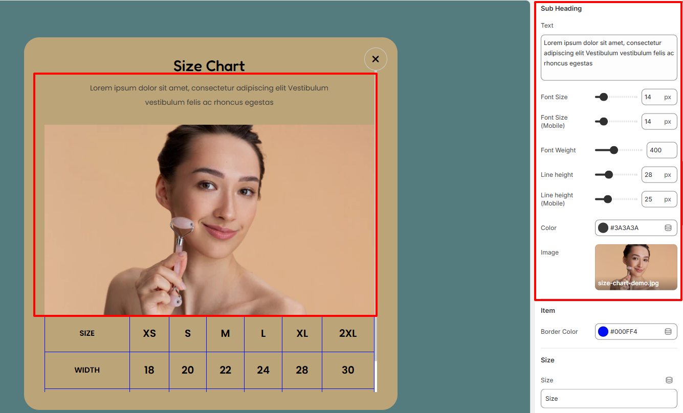
The Subheading settings enable you to set your desired subheader text and also customize its styling in terms of font size, font weight, line height, and color. In addition, you can also set the image to be rendered beneath the subheading text.
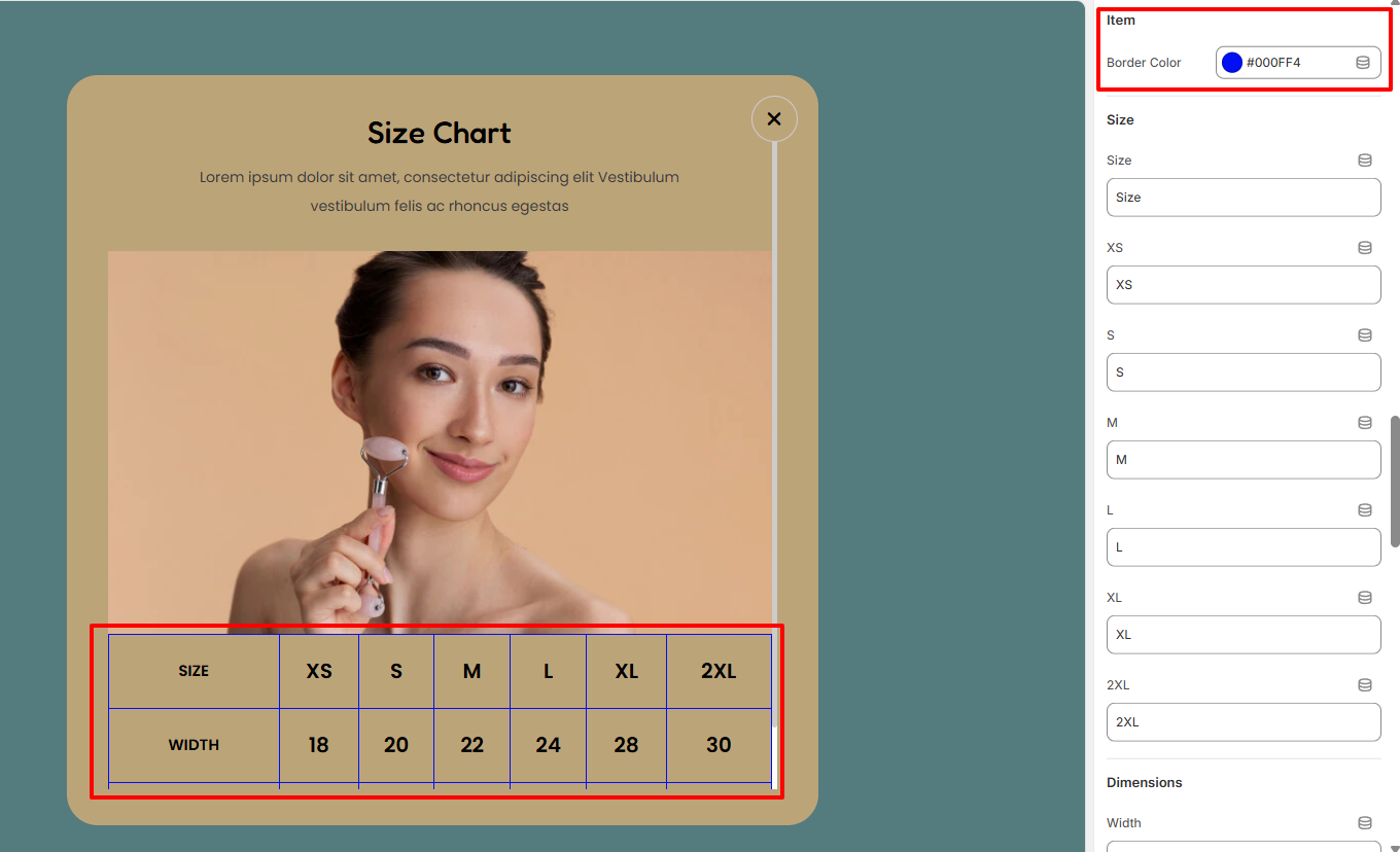
Within the Item settings, here you can set the border color to the sizes and dimensions within the Size chart.
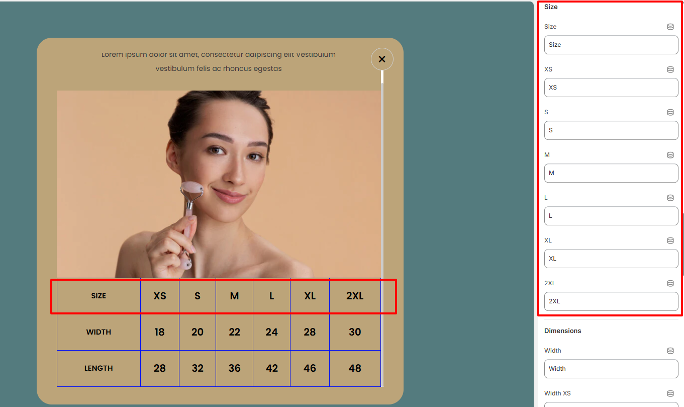
Within the Size settings, here you can set your desired Sizing text to be rendered within the Sizing guide as well as the various sizing values that you desire to have in place.
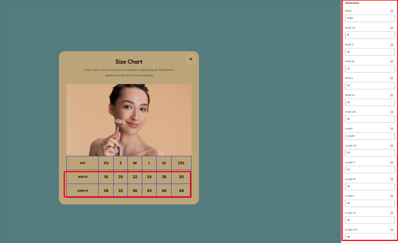
In the Dimensions settings, here you can set your desired Length and Width values for the different sizes in the Size Chart.
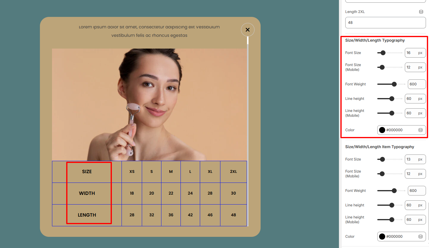
Within the settings here, you can alter the font size, font weight, line height, and color of the Size, Width, and Length labels within the Size Chart.
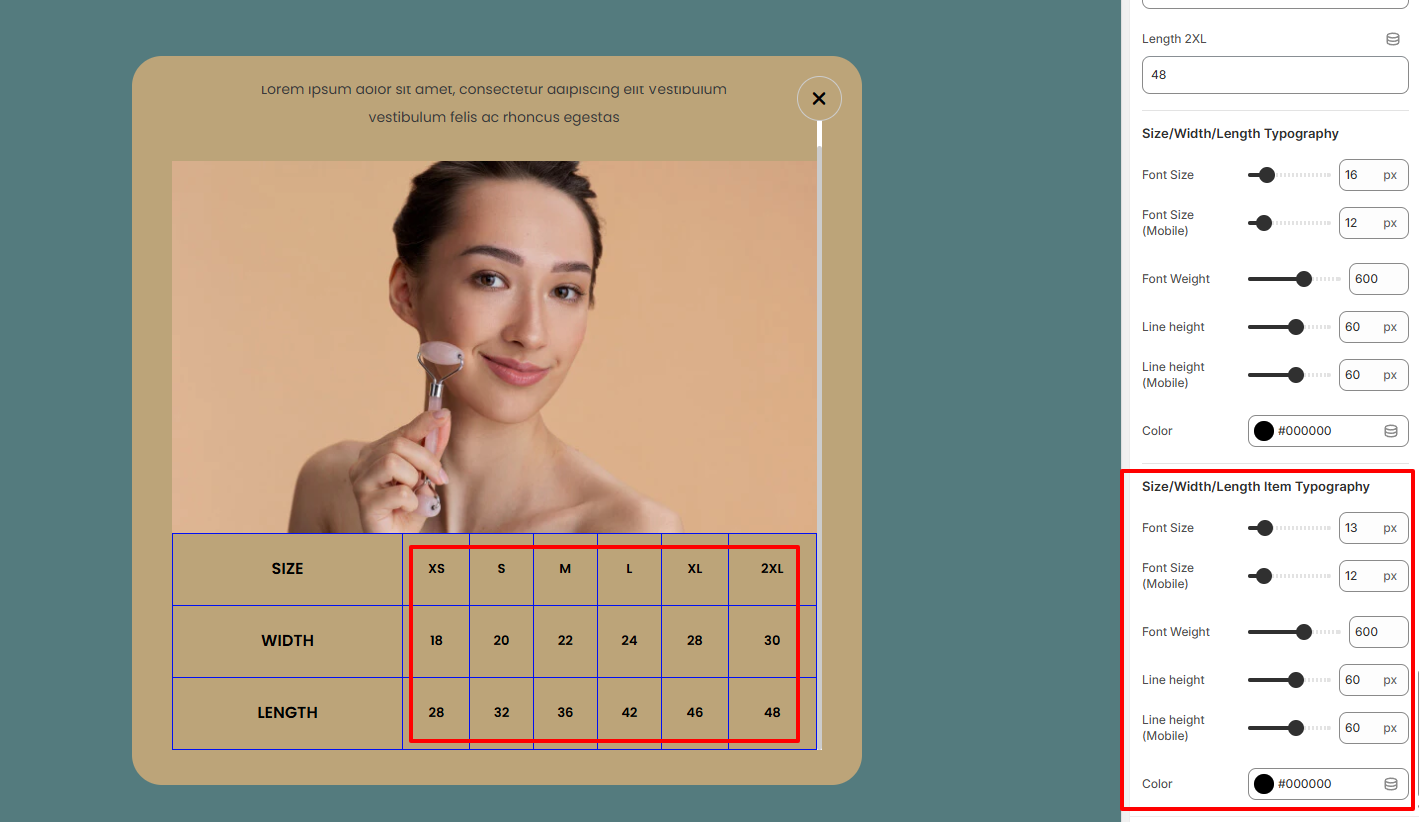
In the settings here, you can carry out adjustments to the Size Chart values in terms of the font size, font weight, line height, and color.
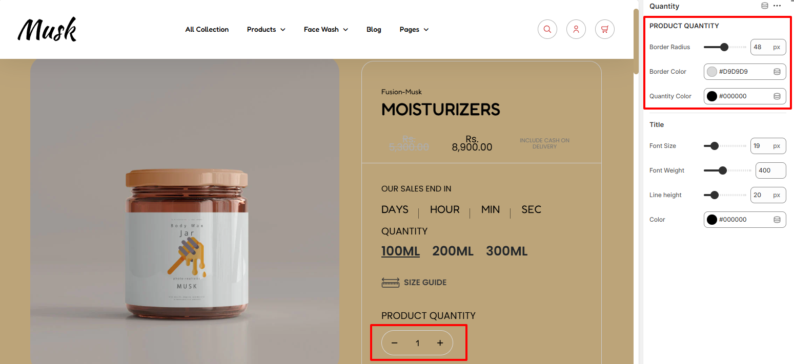
Within the Product Quantity region, here you can carry out customizations such as altering the border radius, border color to the quantity increment input button, as well as the quantity color.

The Title settings enable you to carry out adjustments such as altering the font size, font weight, line height, and color to the Product Quantity text.
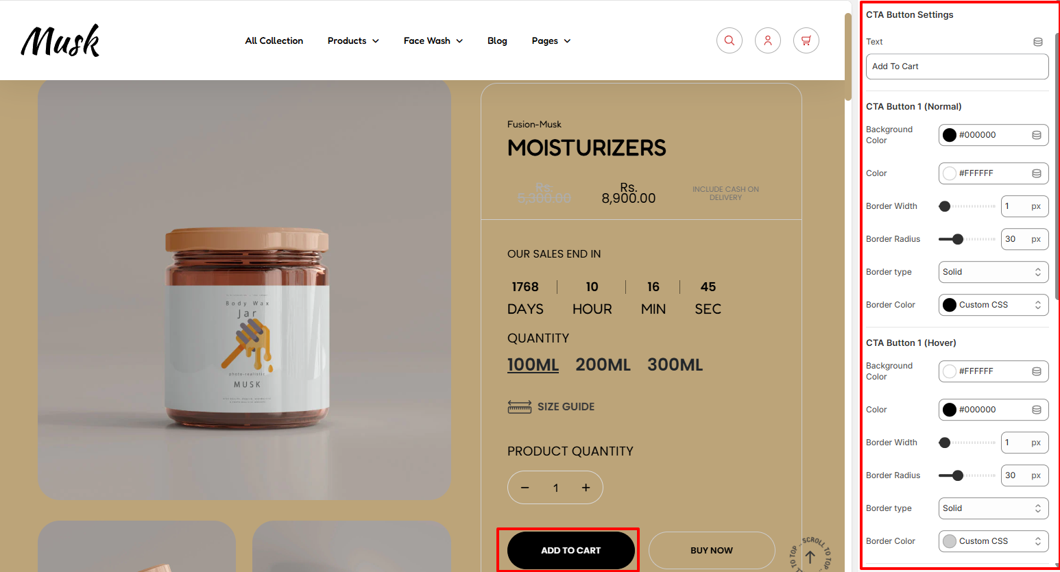
Within the settings here, you can set your desired text for the Add to cart button as well as set your desired styling to the button in terms of the background color, color of text in the button, border width, border radius, border type, and border color in both normal and hover states.
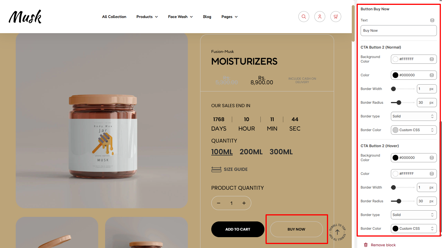
In the Buy Now button settings, here you can set your desired text for the Buy Now button as well as set your desired styling to the button in terms of the background color, color of the text in it, border width, border radius, border type, and border color, in both normal and hover states.
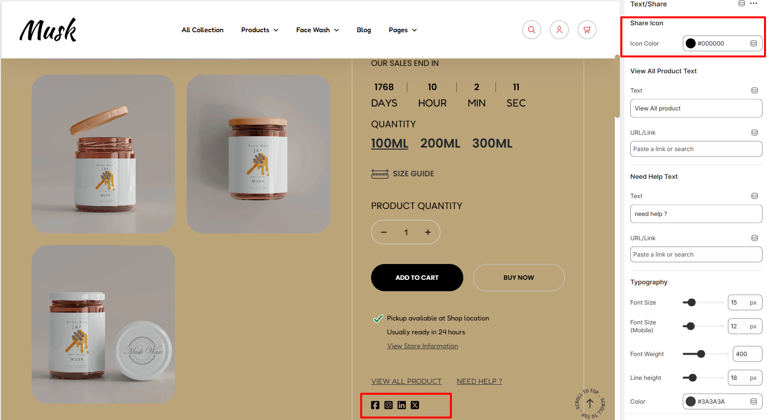
The Share Icon settings enable you to define a color to the Share icons at the button of the section.
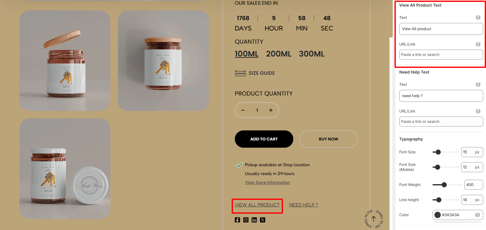
The View All Product Text enables you to alter the default View All product text, as well as set the URL you wish to be hyperlinked to it.
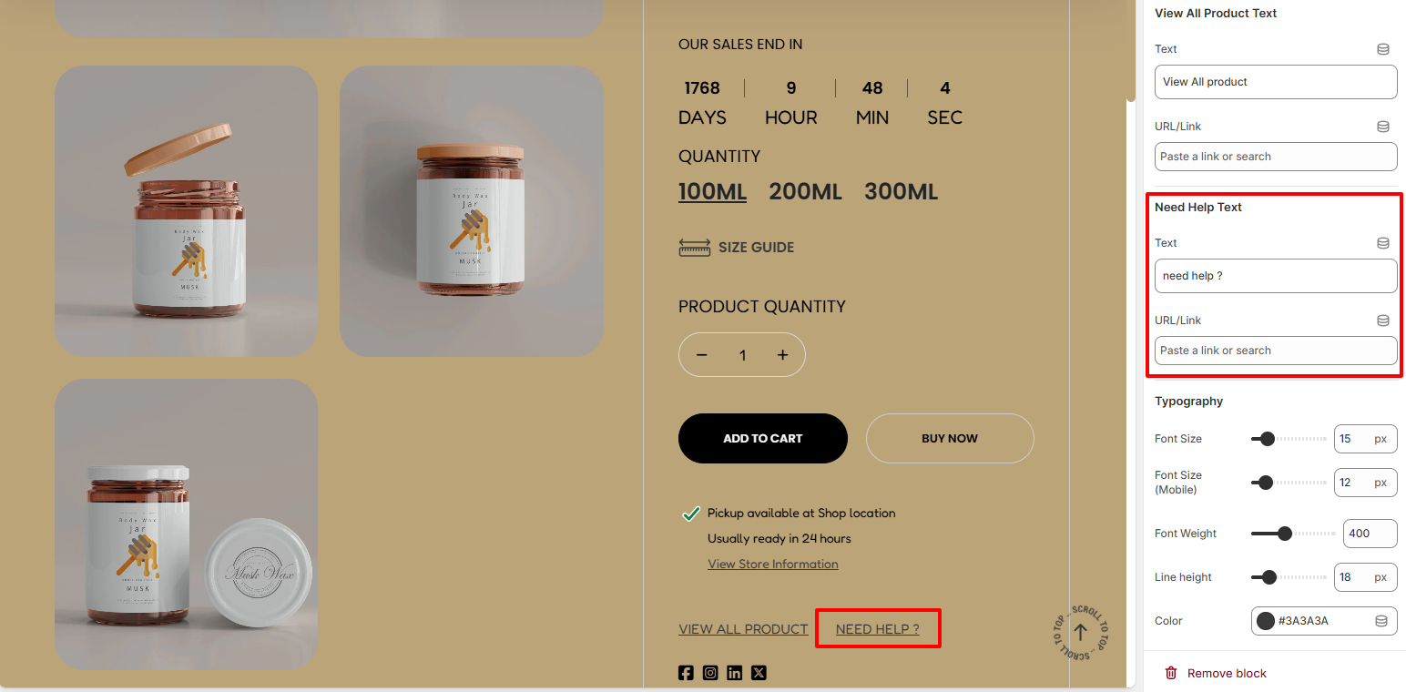
The Need Help Text settings enable you to alter the default Need Help Text as well as set the Hyperlink URL that you desire to it.
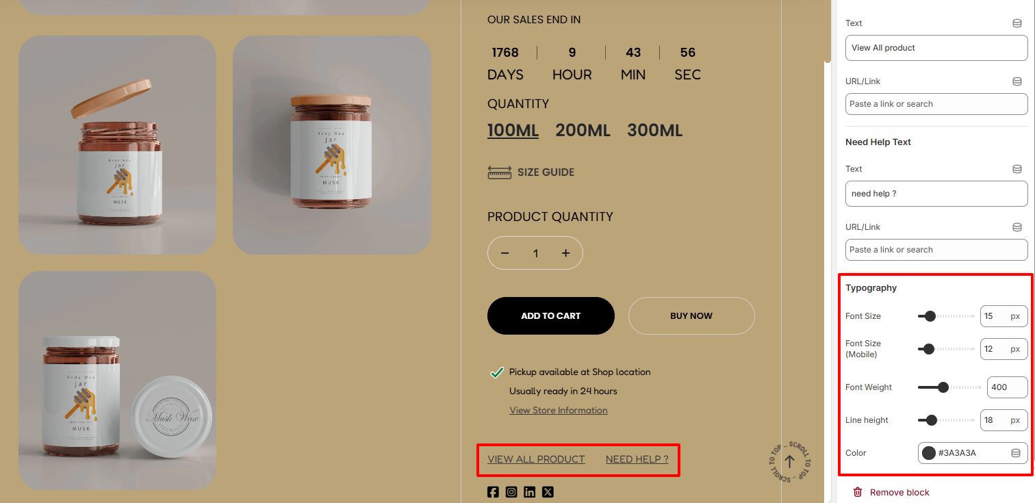
Within the Typography settings, here you can carry out adjustments to the “View All Product” and “Need Help?” text in terms of the font size. Font weight, line height, and color of the text.