
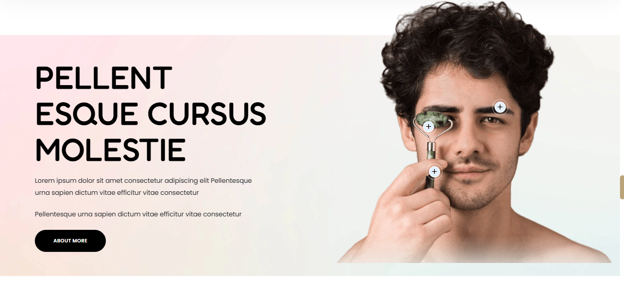
The Image With Text section can be used to render details you wish to highlight about your store items. You can also add products to the section, of which will be displayed in Tooltips.
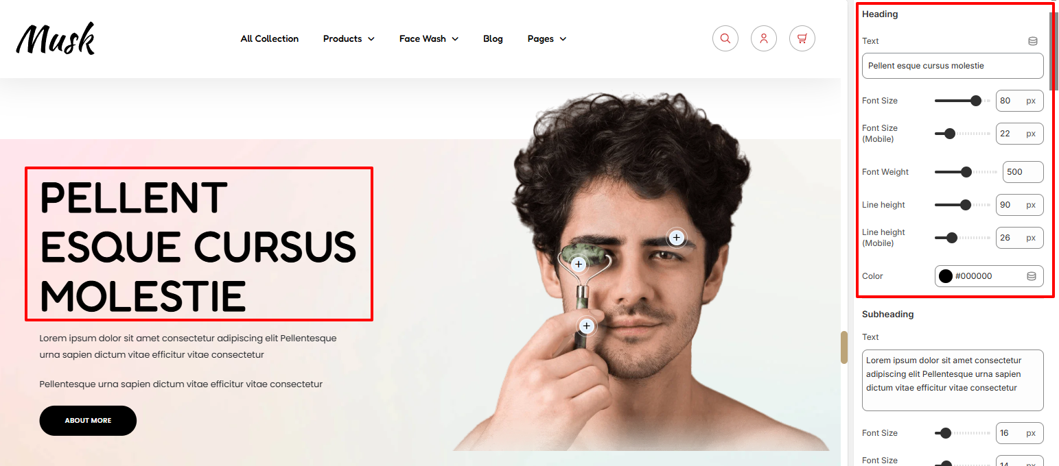
The Heading settings enable you to specify the section title as well as style it. Various styling aspects can be applied to the heading such as the font size, font weight, line height, and color.
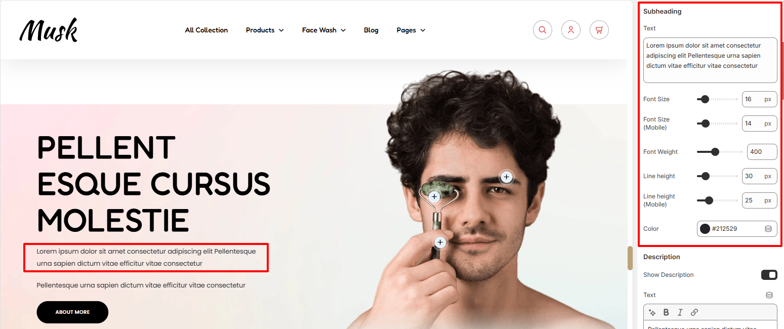
The Subheading settings enable you to add your desired text beneath the heading and apply styling to it. You can for example apply font size, font weight, line height, and color modifications to the text.
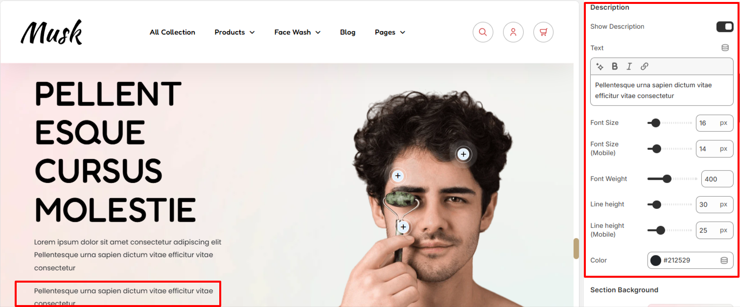
Upon enabling the “Show Description” setting, you can proceed to add your desired description text to be rendered within the section. You may also carry out various styling adjustments to it such as font size, font weight, line height, and color adjustments.
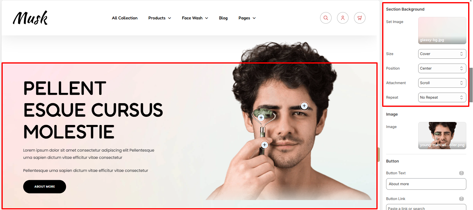
In the Section Background settings, here you can set a background image to the Image With Text Background, as well as define various background aspects such as the background size, background-position, background-attachment, and background-repeat.
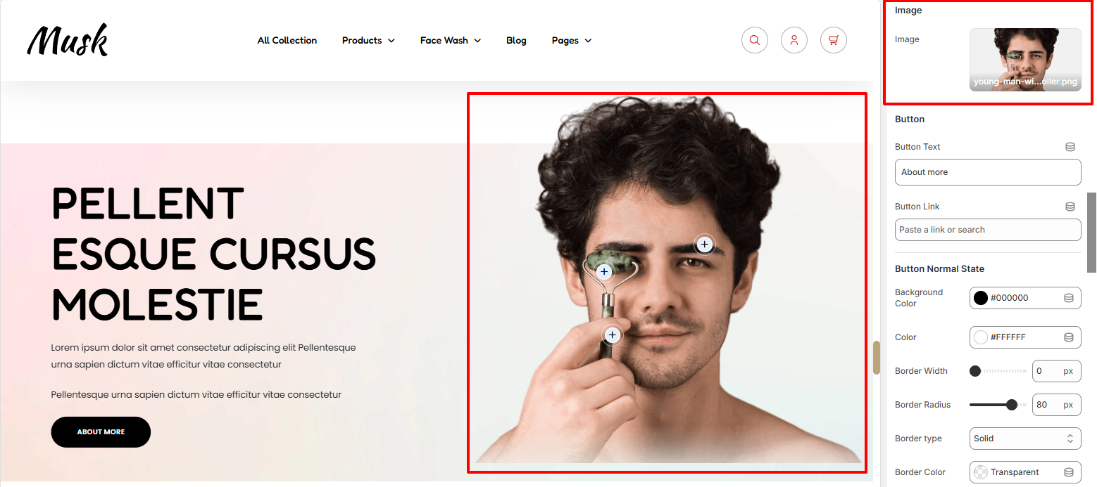
The Image setting enables you to set the Image that is to be rendered next to the text.
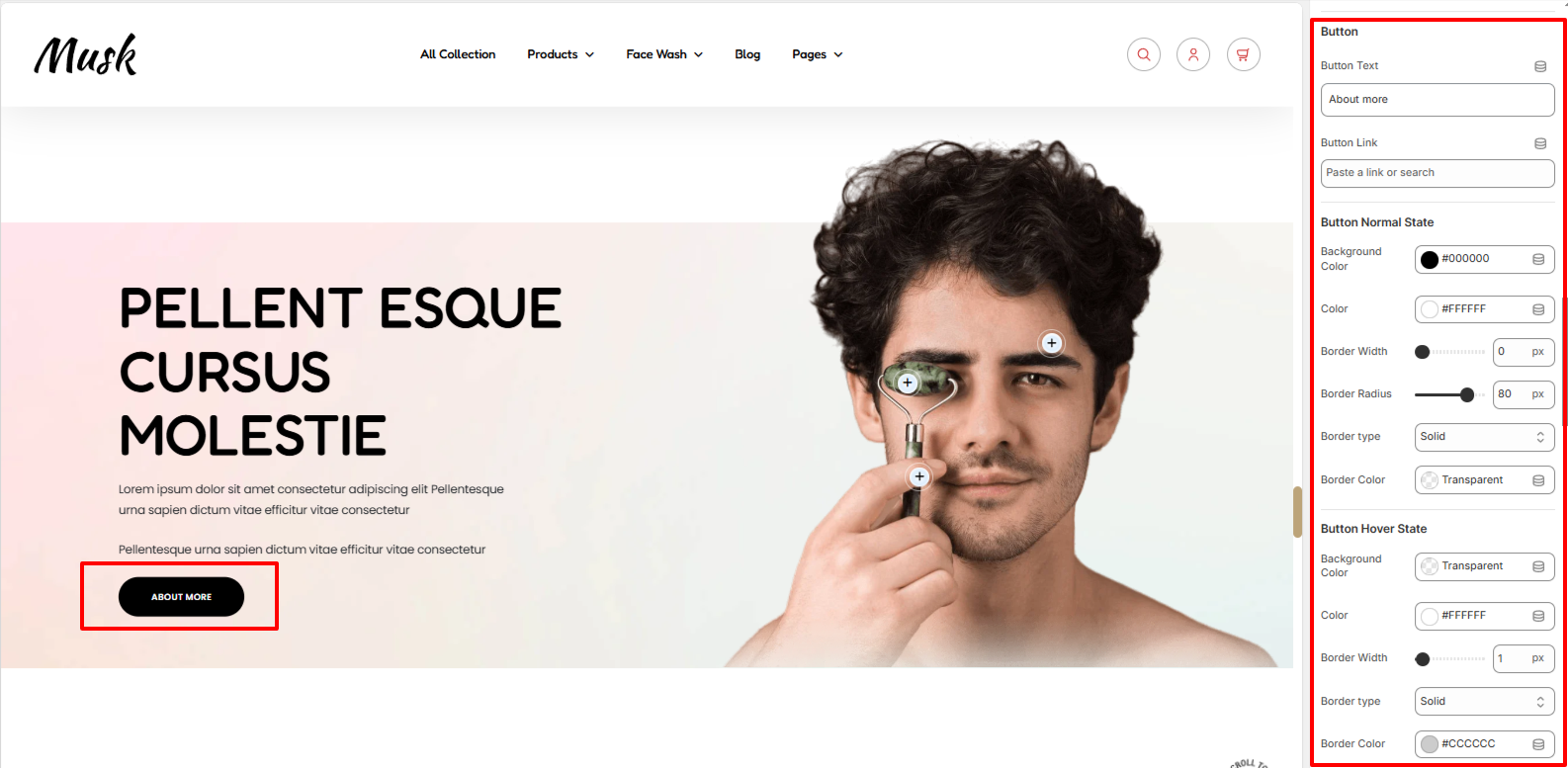
In the Button settings, you can specify the text displayed on the button and set the link for the desired redirection.
In addition, you can also apply various styles to the button such as the background color, the color of text in the button, border width, border type, and border color under normal and hover states. You may as well set a border radius to the button in a normal state.
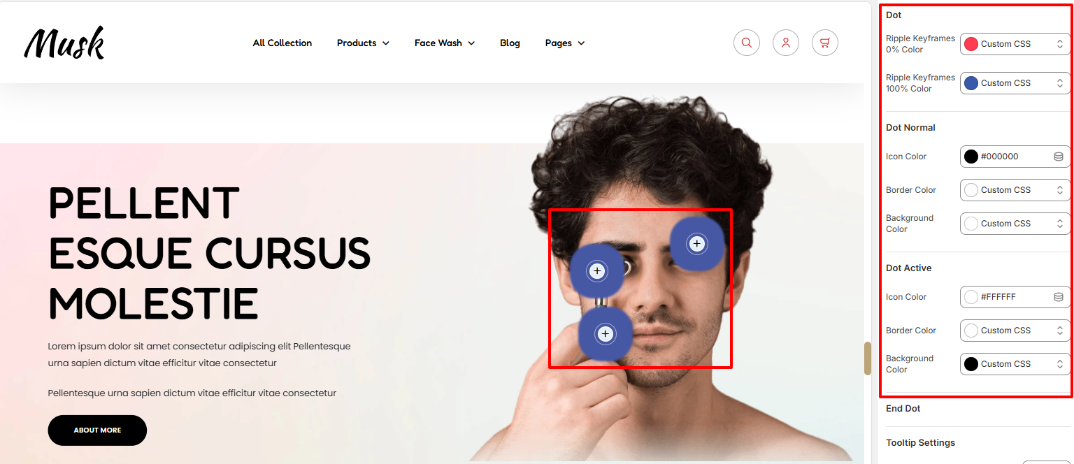
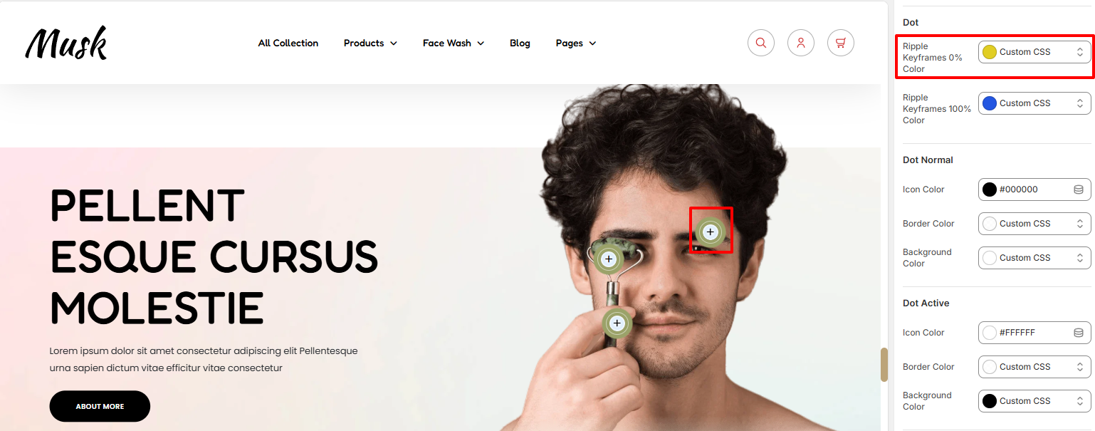
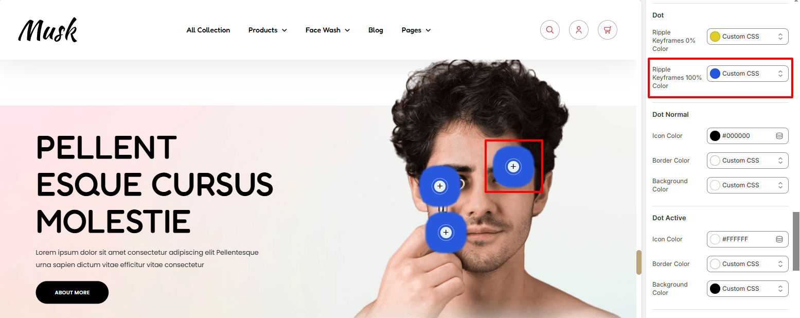
The Dots segment signifies the products that have been added to the Image With Text section. Upon clicking the dots, the respective products are rendered. A Ripple effect is also present within the dots.
There are various settings present in this segment that include:
Ripple Keyframes 0% Color: This is the color rendered when the Ripple effect is beginning or at a percentage around 0%.
Ripple Keyframes 100% Color: This is the color rendered at the completion of the ripple effect, or else at 100%.
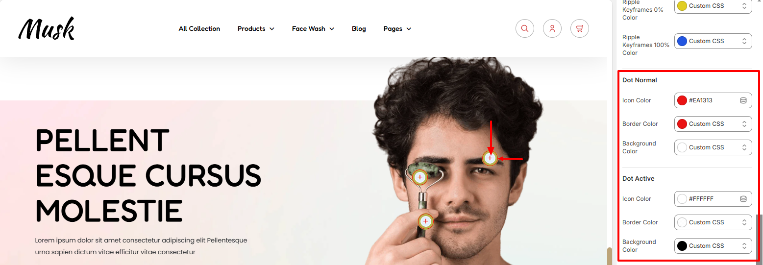
Within this segment, you can apply various styling aspects to the icon color within the dot, as well as the dot border color and background color in both Normal and Active states.
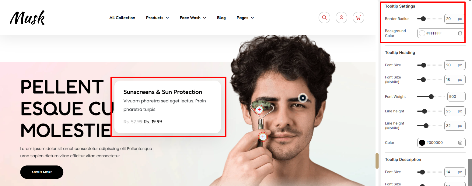
Within the Tooltip settings, here you can set the border radius and background color to the Tooltip rendered upon clicking the Dot.
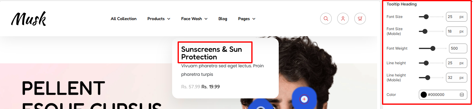
Within the Tooltip Heading, here you can set various styling aspects to the Tooltip heading which is the product title. Some of the styles that can be applied include color of the heading, font size, font weight, and line height.
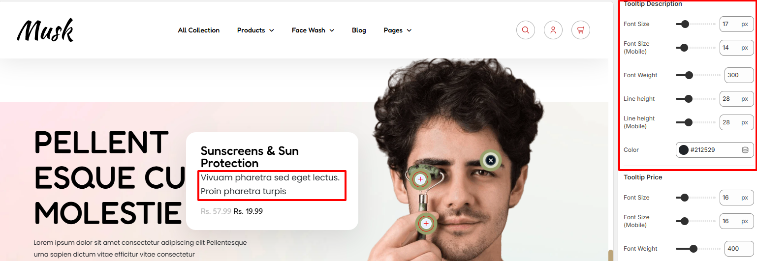
On the ToolTip Description, here you can apply various styling to the description text rendered within the ToolTip, which is the product description. Some of the styles that can be applied include color of the text, font size, font weight, and line height.
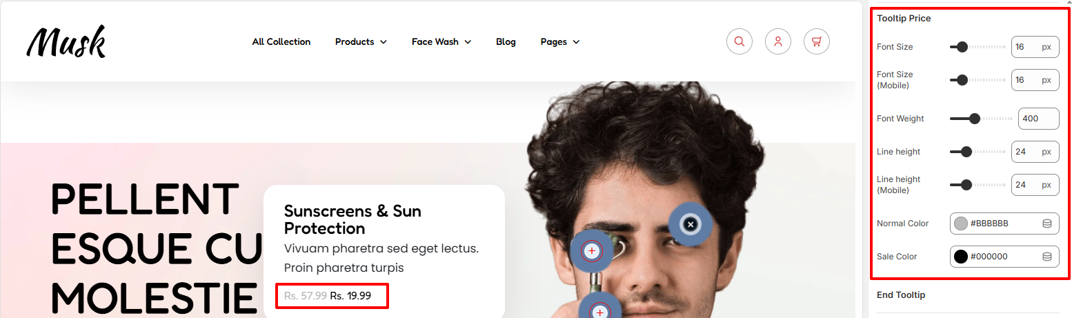
The Tooltip price represents the price of the product.
Within the Tooltip price segment, here you can apply various styling to the price such as setting the normal price color, the sale price color, font size, font weight, and line height.
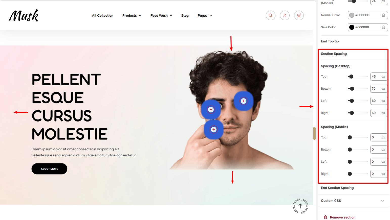
The Section Spacing settings enable you to add padding to the Image With Text section.
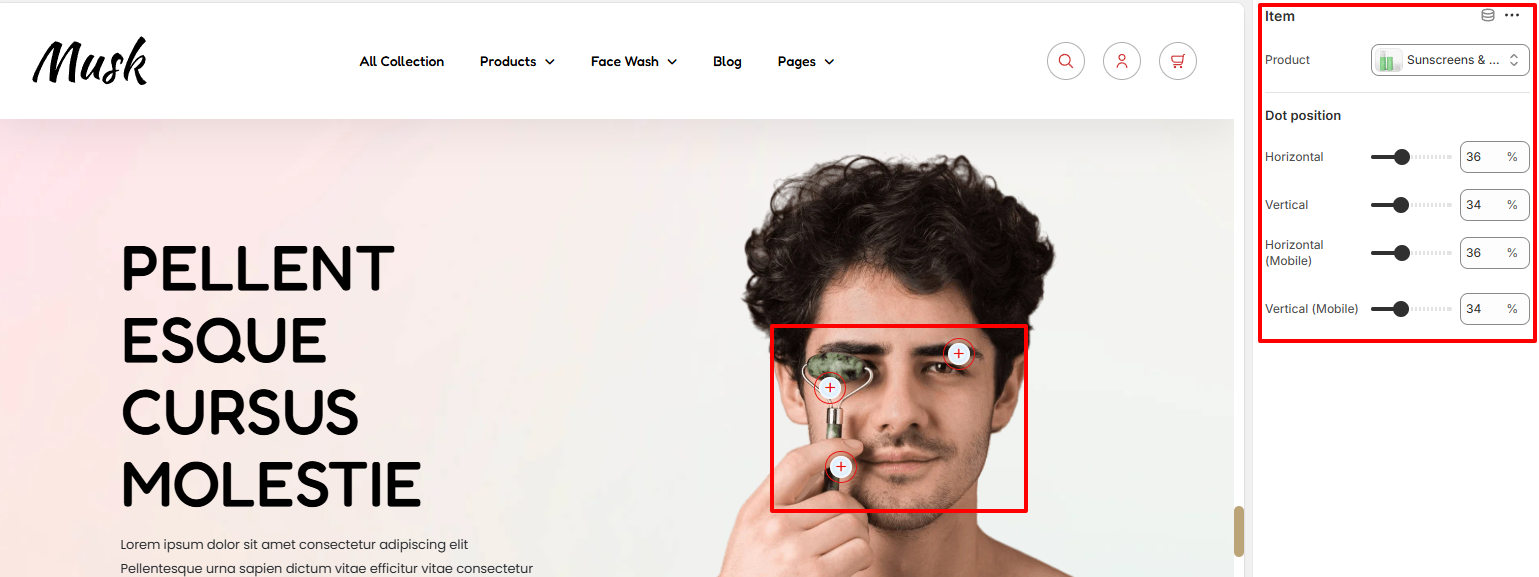
The Item block enables you to add products within the Image With Text Section.
In addition, you can also adjust the Dot positioning within the section.