
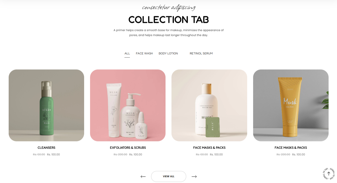
The collection tab section renders a group of collections in a tabbed format, and their respective products in either in a Grid or Slider format.
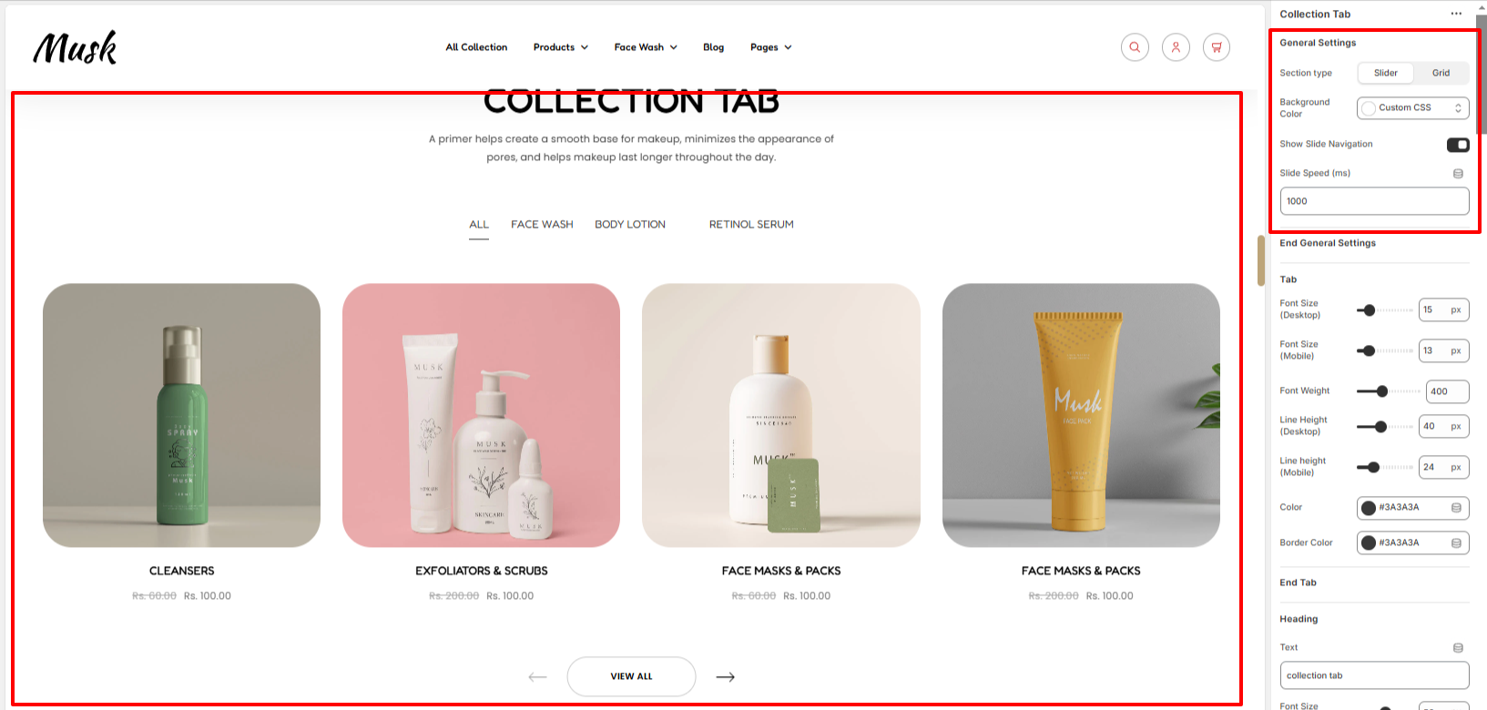
The General settings enable you to specify whether the collection tab is to be rendered as a Slider or Grid, enable the slide navigation and speed, as well as specify the background color to the collection tab.
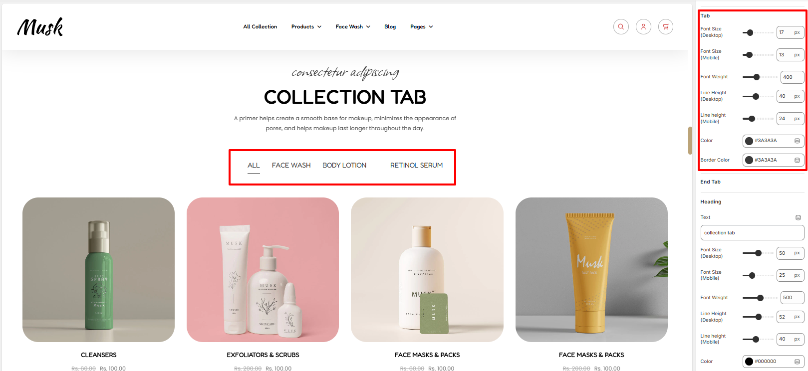
Within the tab settings, here you can set your styling such as the font size, font weight, line height, color and border color to the tabs rendered.
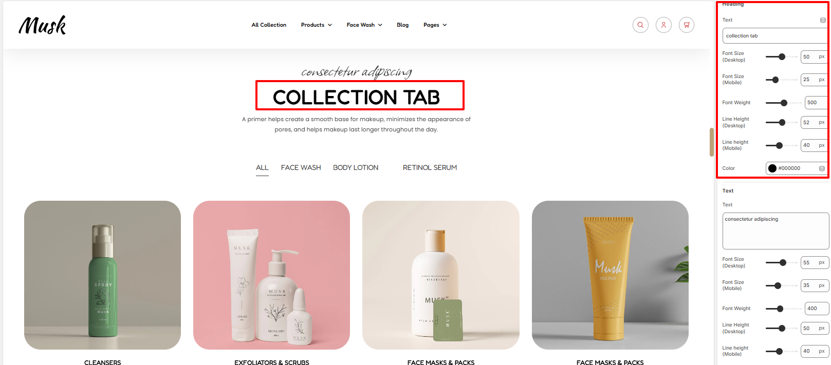
Within the heading section, you can add your Heading text and set various stylings to it such as the font size, font weight, line height and color of the header.
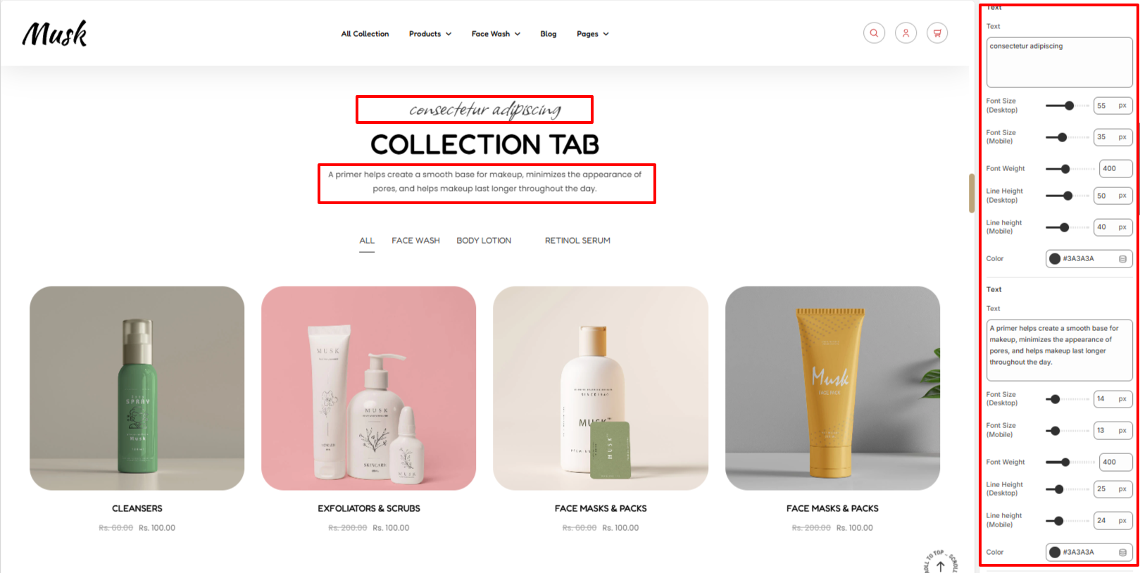
The text region enables you to add text above and below the header. You can also apply styling to the text such as font size, font weight, line height, and color of the text.
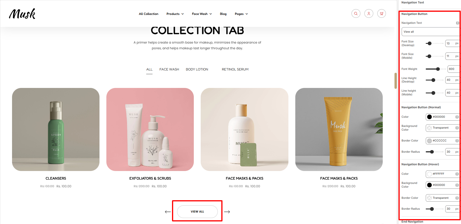
The Navigation text region enables you to add your Navigation button text and set styling to it such as the font size, font weight, and line height.
In addition, you can also set the color of the button text, background color to the button, border color and border radius to the button in different states.
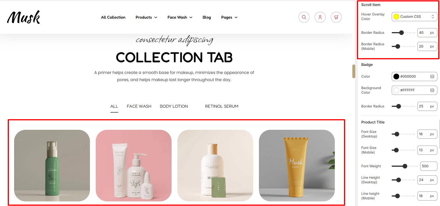
With the Scroll item segment, here you can set the overlay color to the images, as well as a border radius.
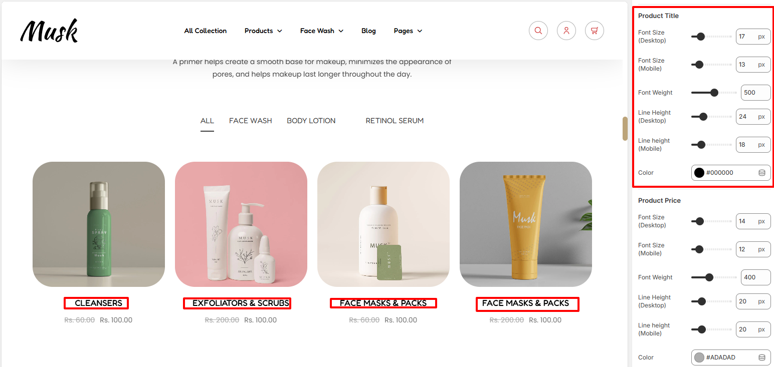
Within the Product Title section, here you can set up styling for your products titles such as the font size, font weight, line height and color.
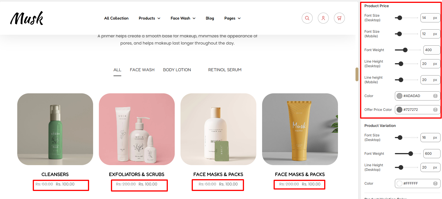
The product price segment enables you to specify styling to the product prices. You can alter the prices colors, font size, font weight and line height.
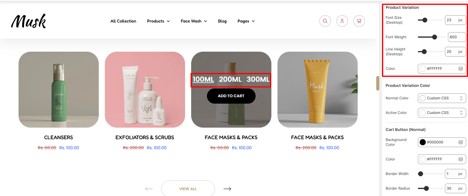
Within the Product variation segment, here you can set styling to the variations such as font size, font weight and color.

Within the Cart Button settings, here you can set the background color to the Add to cart button, border styling and color of the text in the button in normal and hover states.
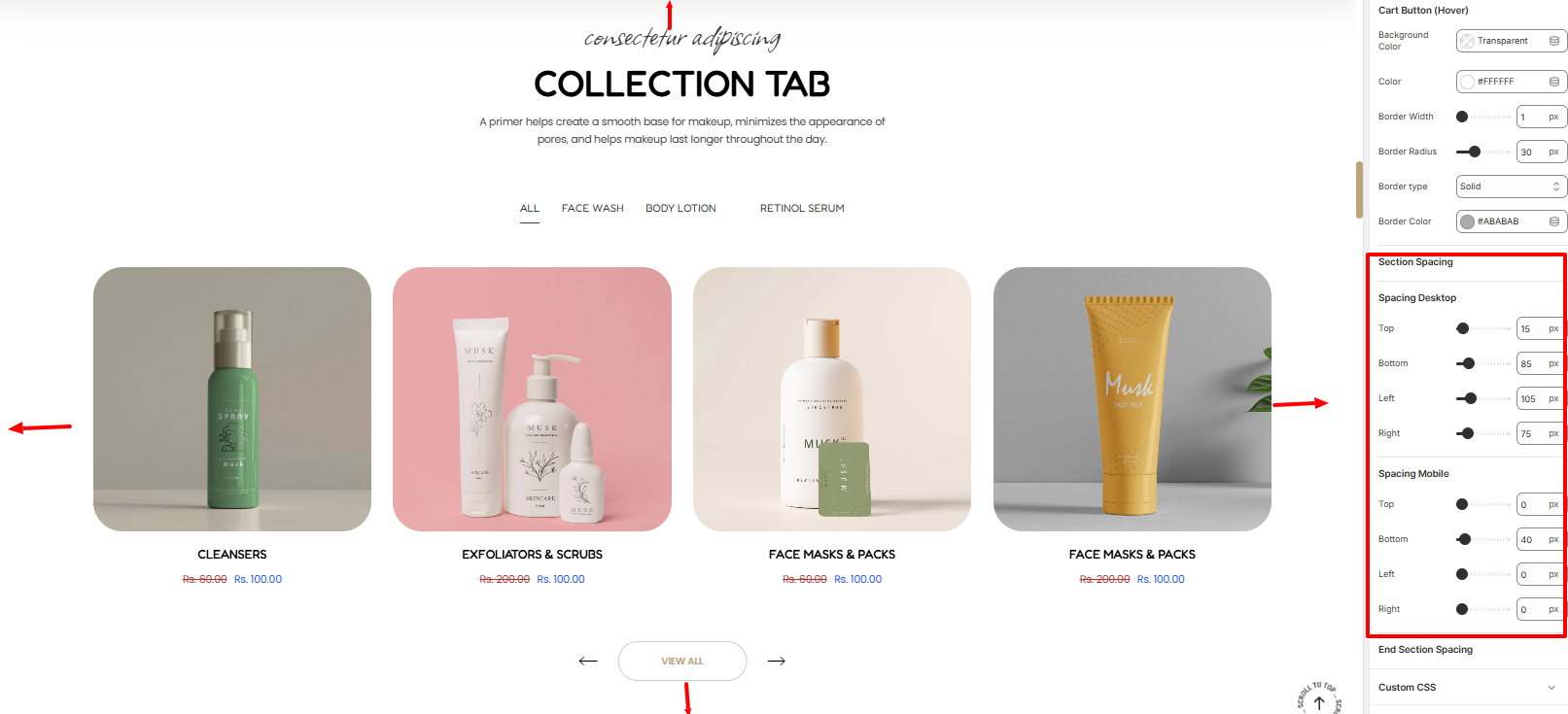
Adds padding to the Collection Tab section.
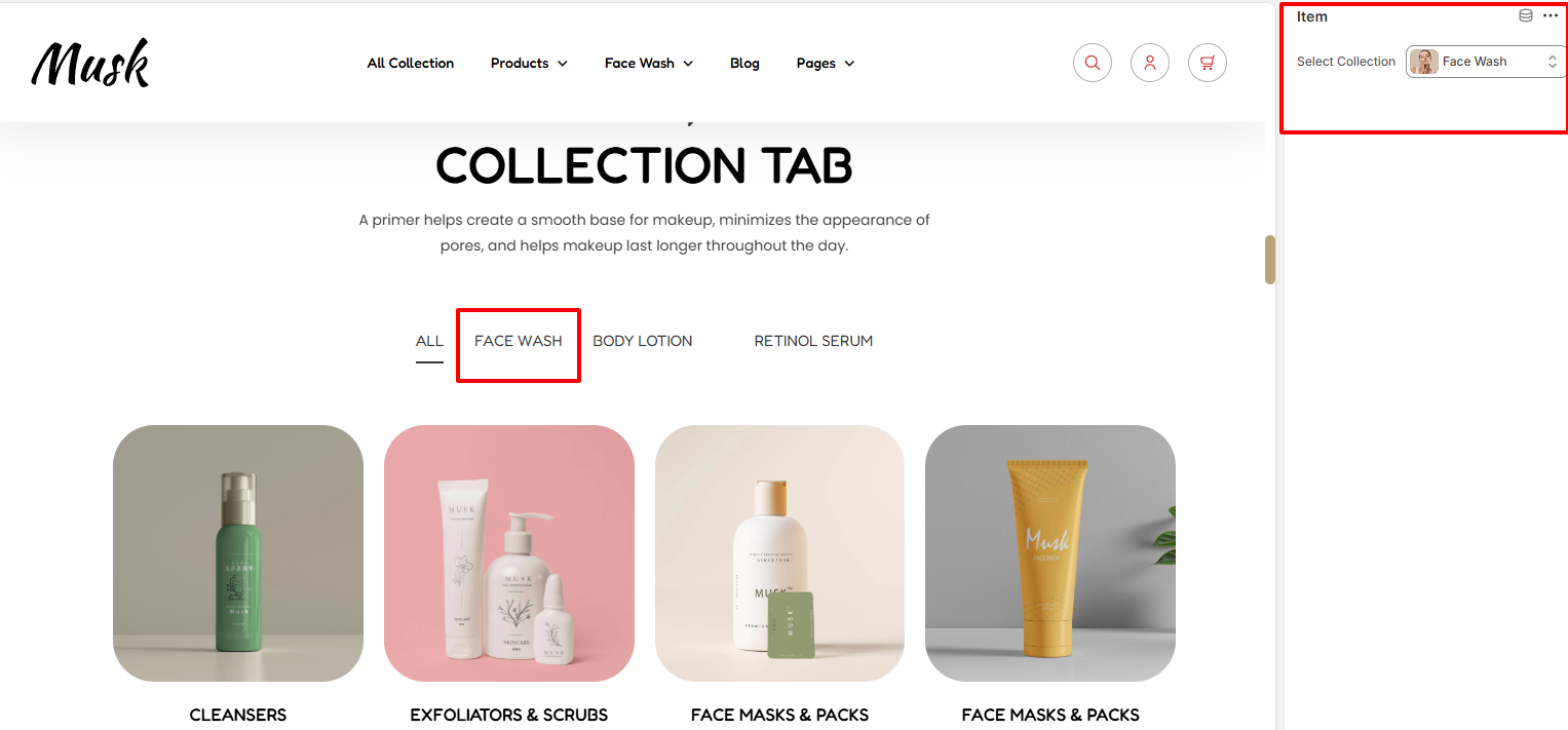
The Item block in this section enables you to set the collection that you need rendered.