
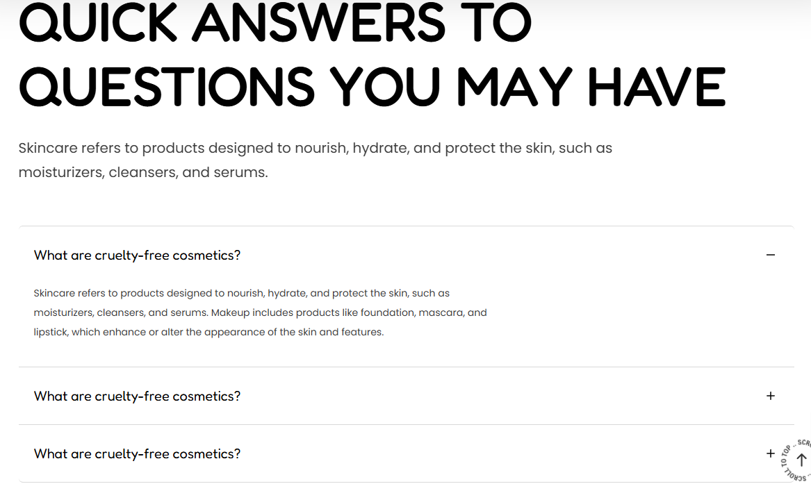
The Collapsible section is used in rendering information that you wish to display in an accordion format. These can for example be answers to questions related to products within your store.
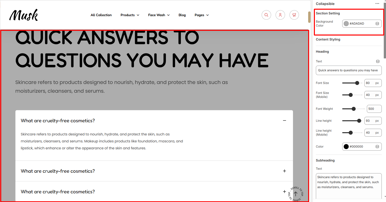
The Section settings enable you to set a background color to the Collapsible section.
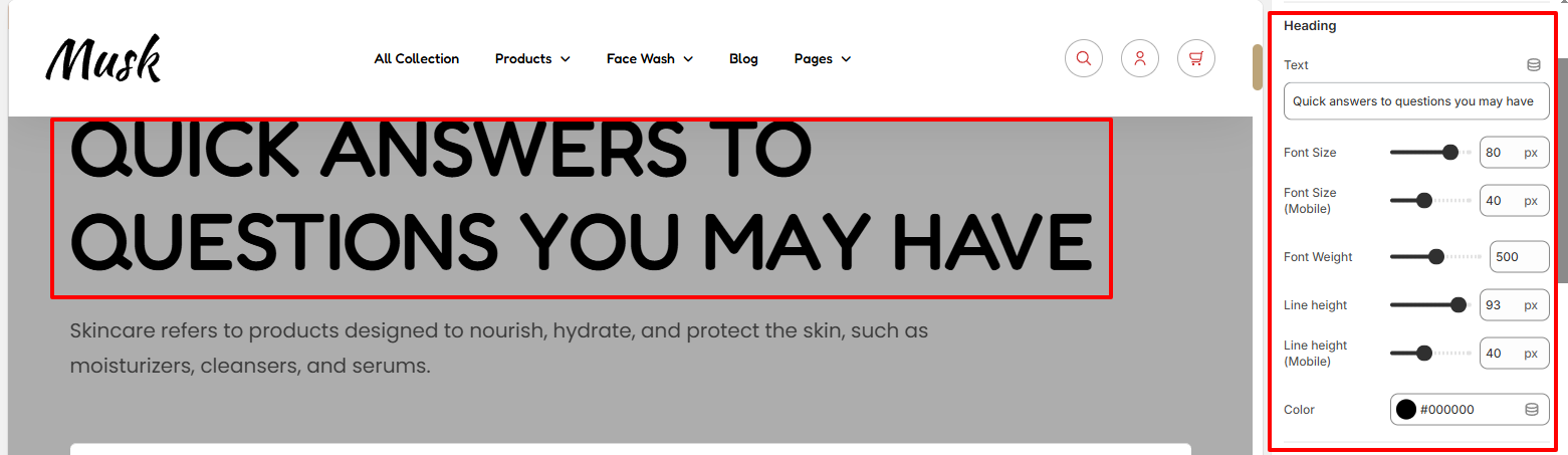
Within the Heading settings, here you can set your desired heading text that is to be rendered within the Collapsible section.
In addition, you can carry out various styling adjustments to it such as the color to the text, font size, font weight, and line height adjustments.
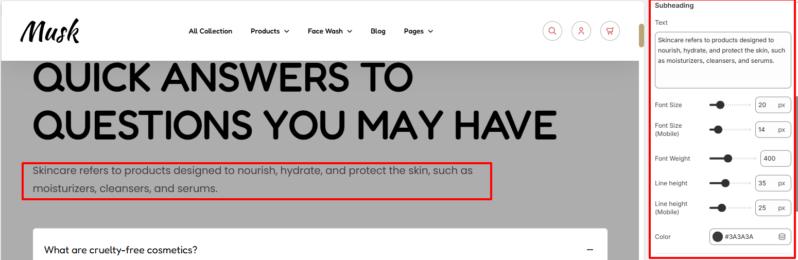
In the Subheding region, you can add your desired subheading to the text field, and also carry out various adjustments to the text such as the font size, font weight, line height, and color of the text within the region.
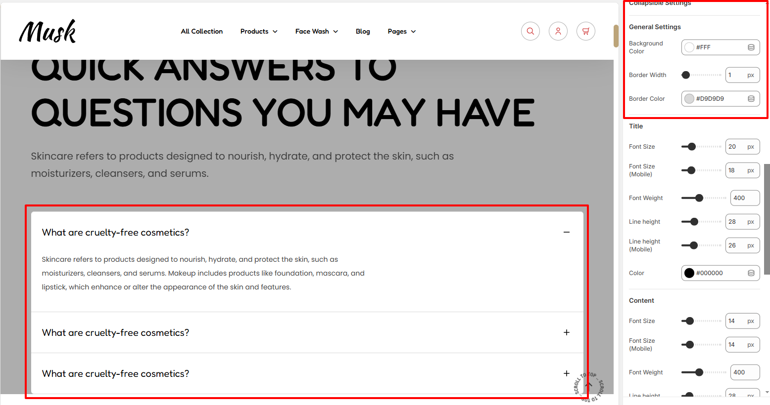
The General settings enable you to set a background color to the Collapsible region, as well as set a border width and border color between the items within the Collapsible section.
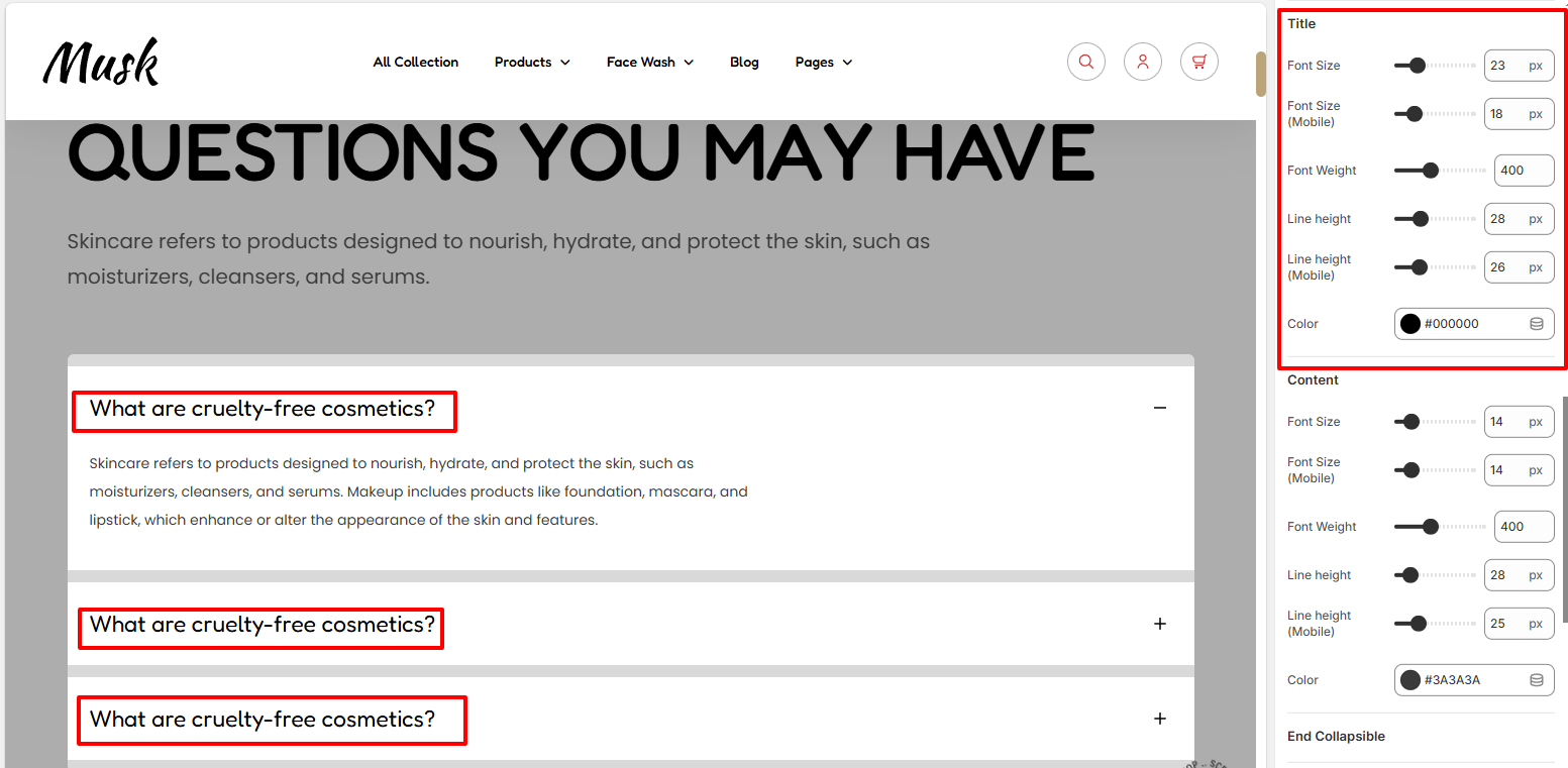
Within the Title settings, here you can carry out styling adjustments to the titles within the Collapsible items. These adjustments include the font size, font weight, line height, and color to the titles.
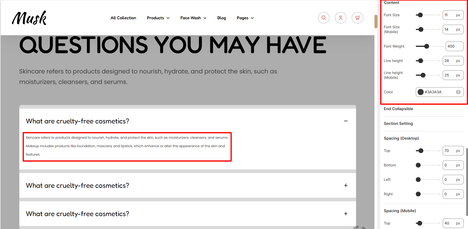
The Content segment enables to carrying out of various styling changes to the text rendered within the collapsible items content area. Some of the adjustments that can be carried out include the font size, font weight, line height, and color to the text.
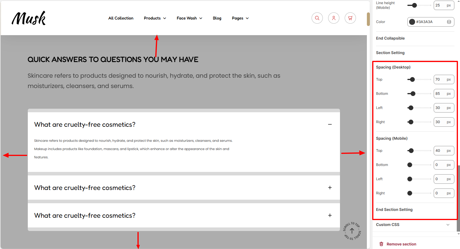
The Spacing settings enable you to add some padding around the Collapsible section.
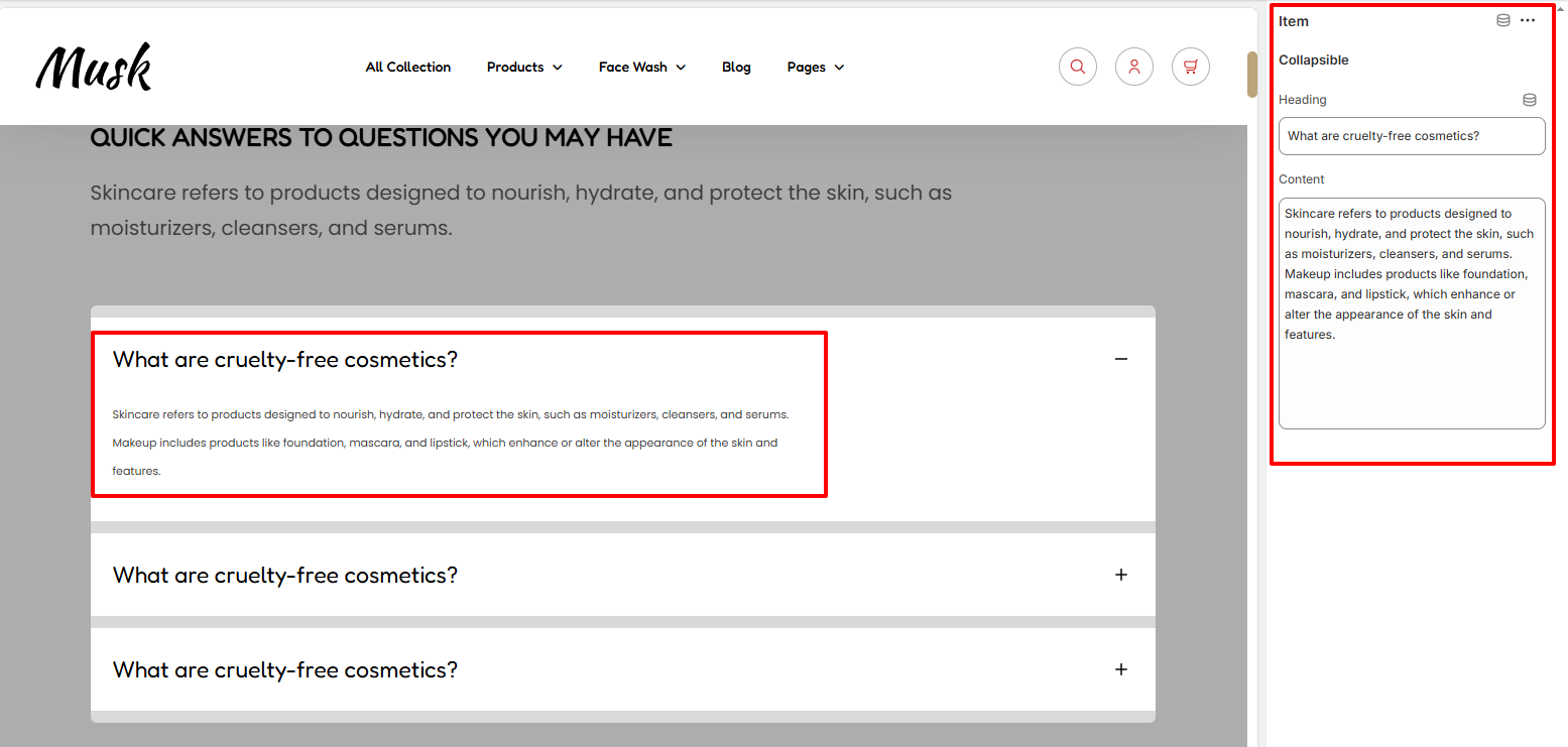
The Item block within this section enables you to add details such as the Header and contents of the items to be rendered within the Collapsible section.