

The Countdown Timer renders a countdown of for example a product promotion within your site.
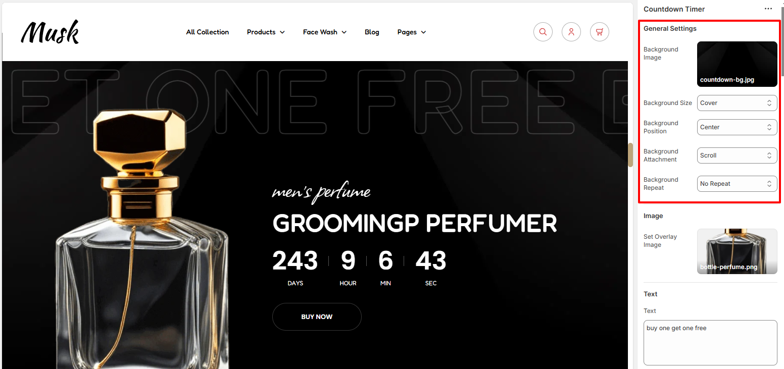
Within the Generall settings, you can set the background image to the Countdown Timer as well as as Background size, background positioning, background attachment behavior, and also specify whether the Background will be repeated or not.
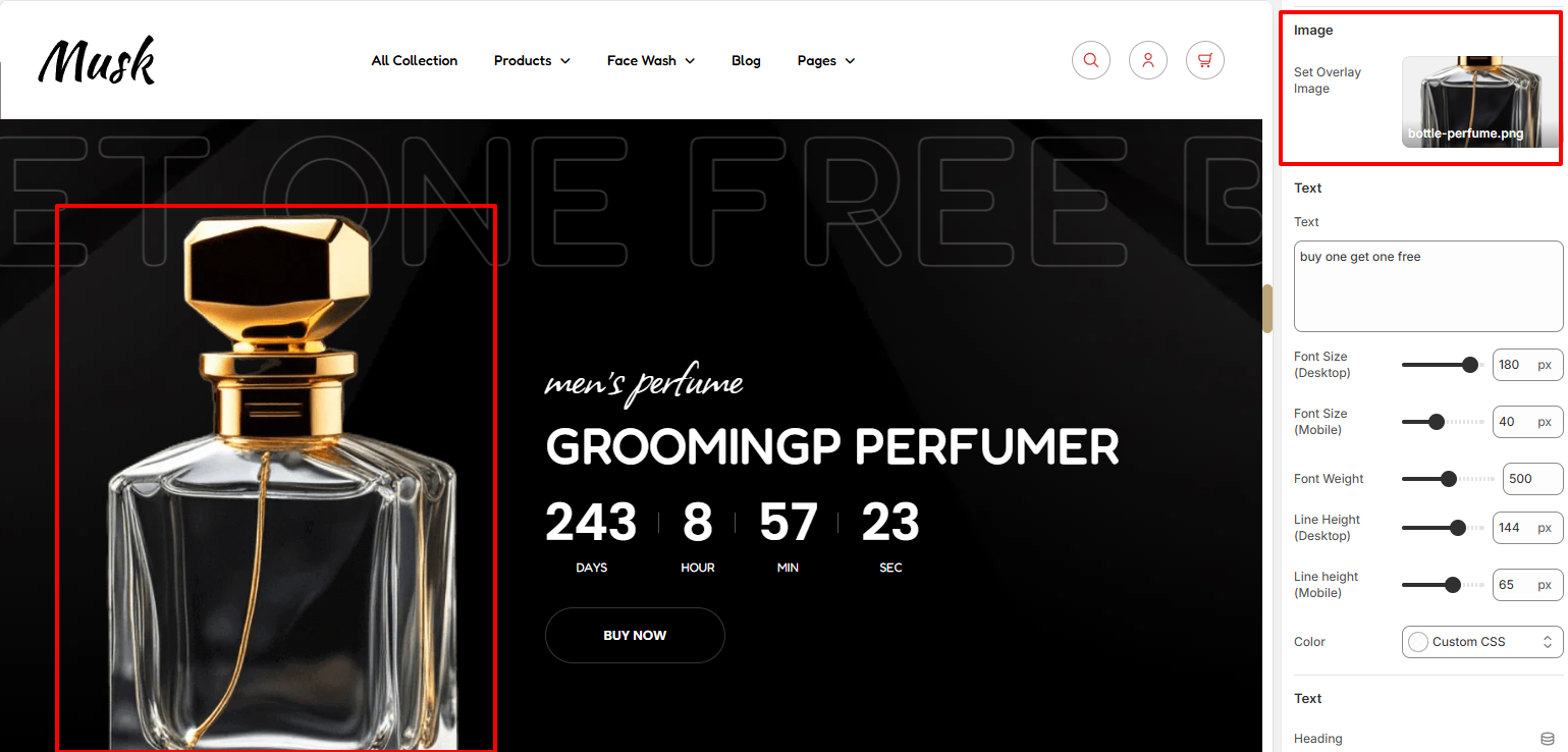
The Image section enables you to set an Image on the Countdown Timer.
There are three Text regions within the Countdown Timer section.
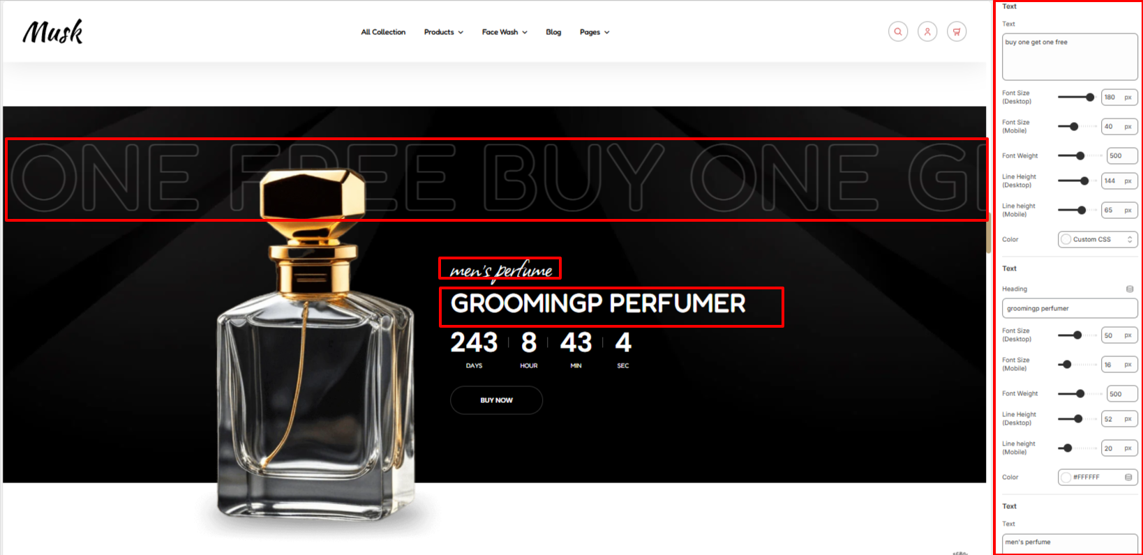
The first Text segment enables you to set the Background Text, the second segment enables you to set the Heading text, and the third text segment enables you to set the text rendered below the header.
Within the Text segments you can also apply various styling to the text such as the font size, font weight, line height and color to the texts.
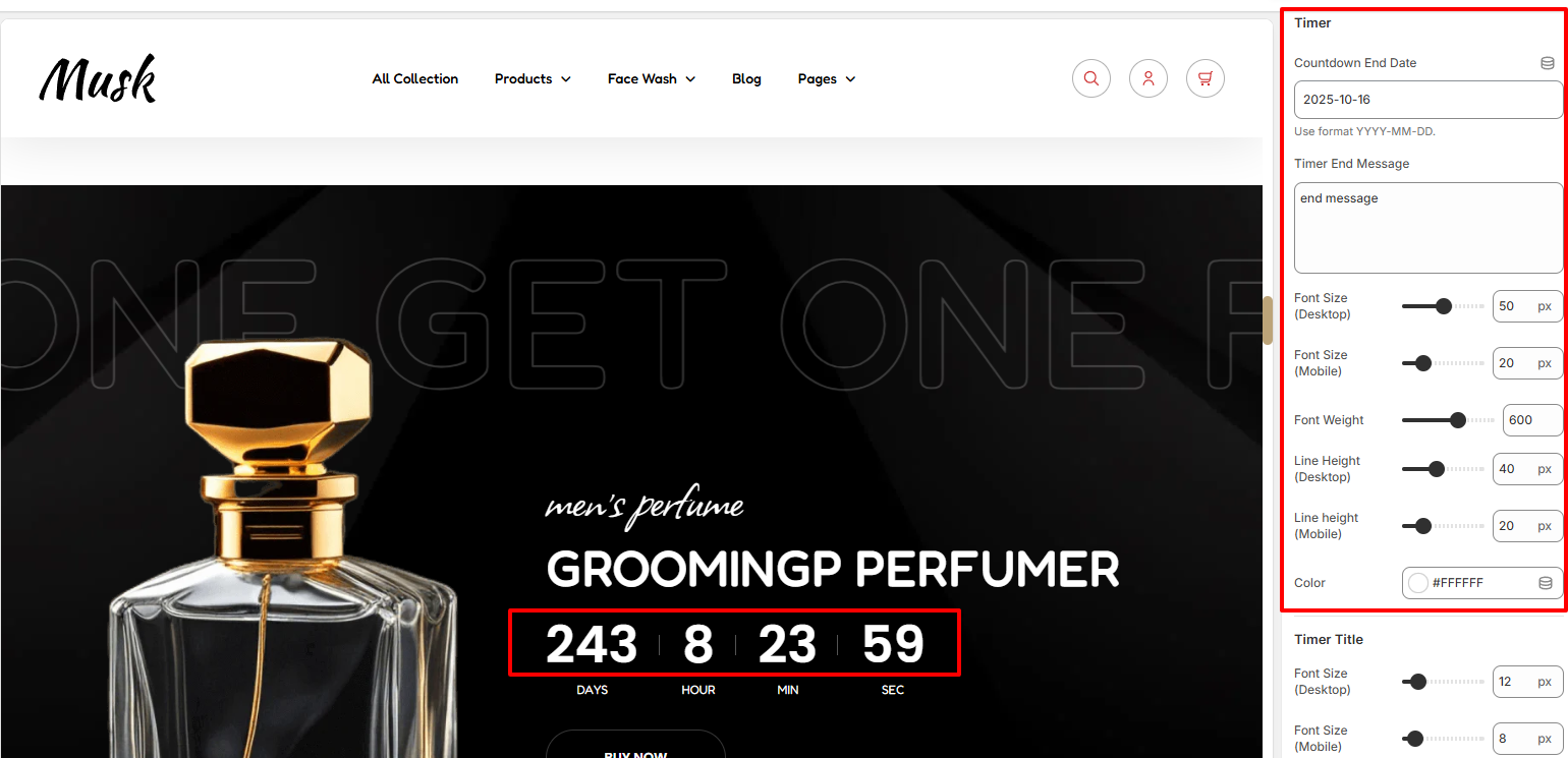
The Timer section enables you to set a Counterdown end date as well as set the message to be rendered once the countdown time elapses.
In addition, you can as well apply styling to the countdown such as the font size, font weight, line height and color.
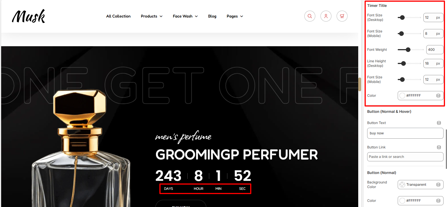
The Timer Title segment enables you to apply styling to the Timer titles in terms of color, font size, font weight and line height.
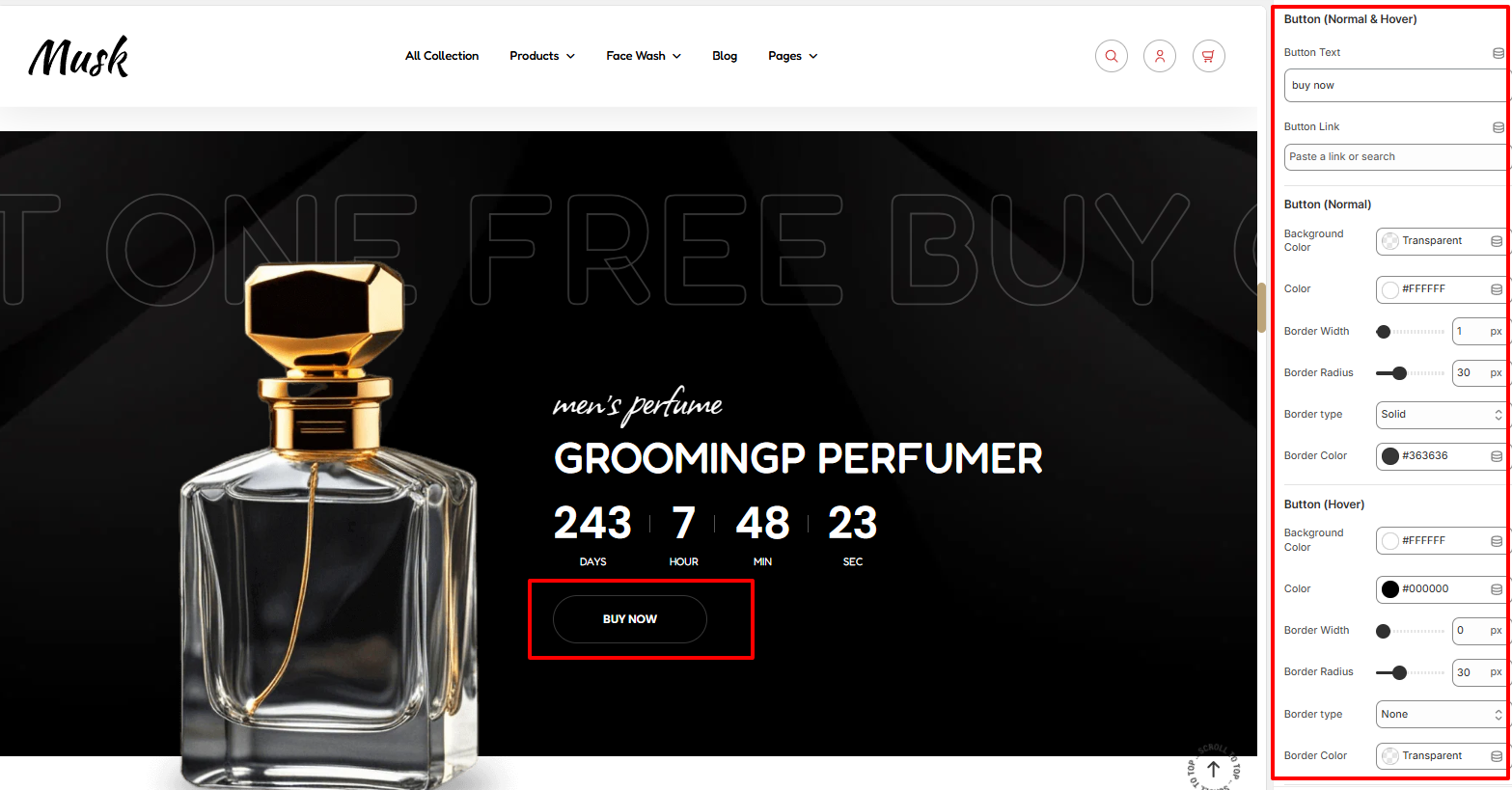
Within the Button segment, here you can set the text and link to the button rendered within the Countdown timer.
In addition, you can also apply various styling to the button and text within it such as the color, background color, border width, border radius, border type and border color in both normal and hover states.
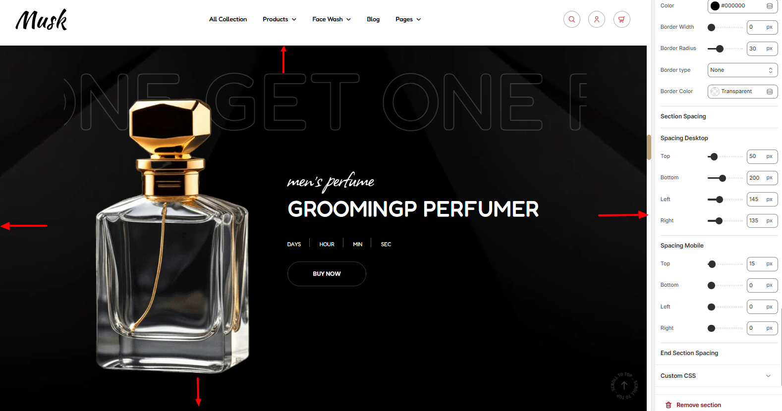
Within the Spacing segment, here you can set some padding to the Countdown timer on the page, within desktop and mobile device screens.