
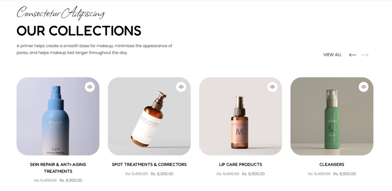
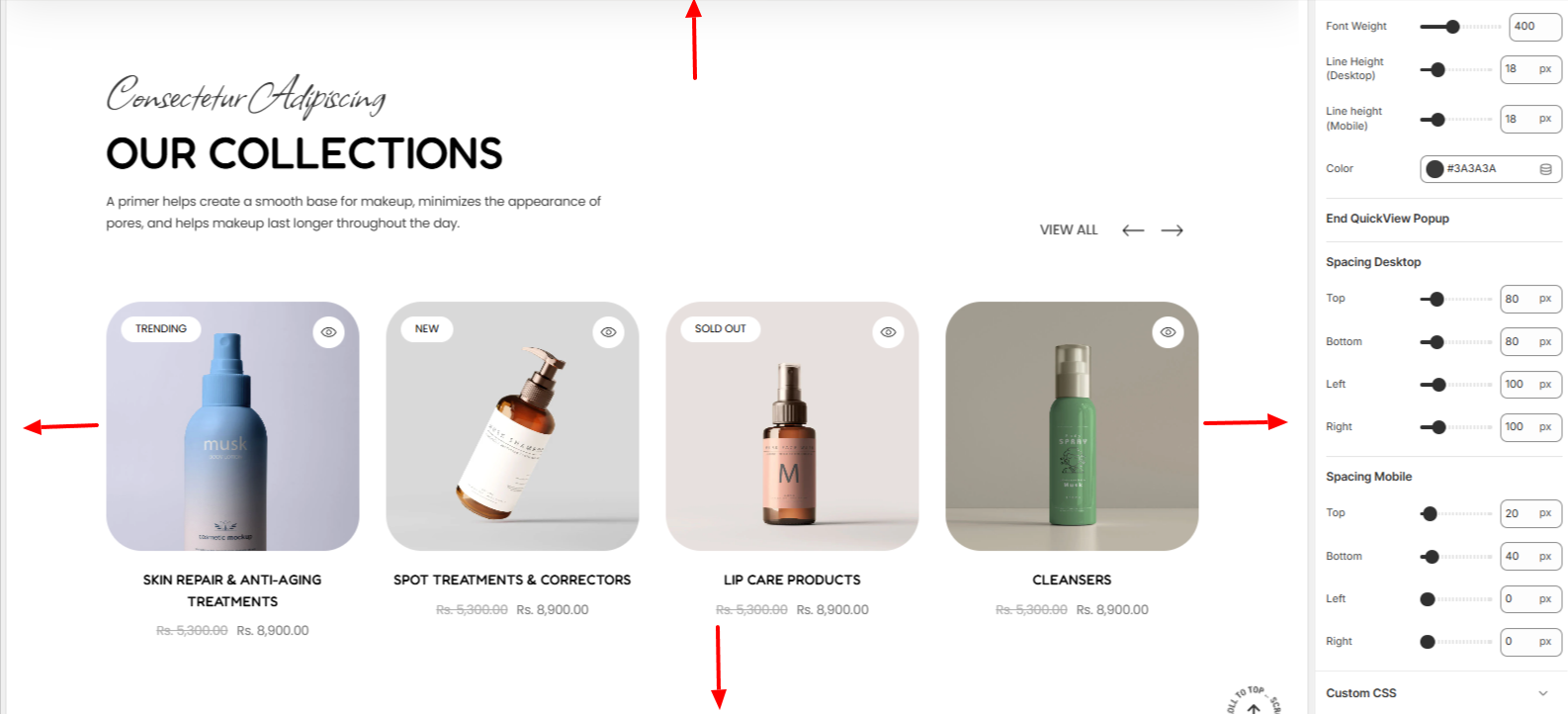
The Featured Collection section can be used to illustrate a collection of your preference within your page.
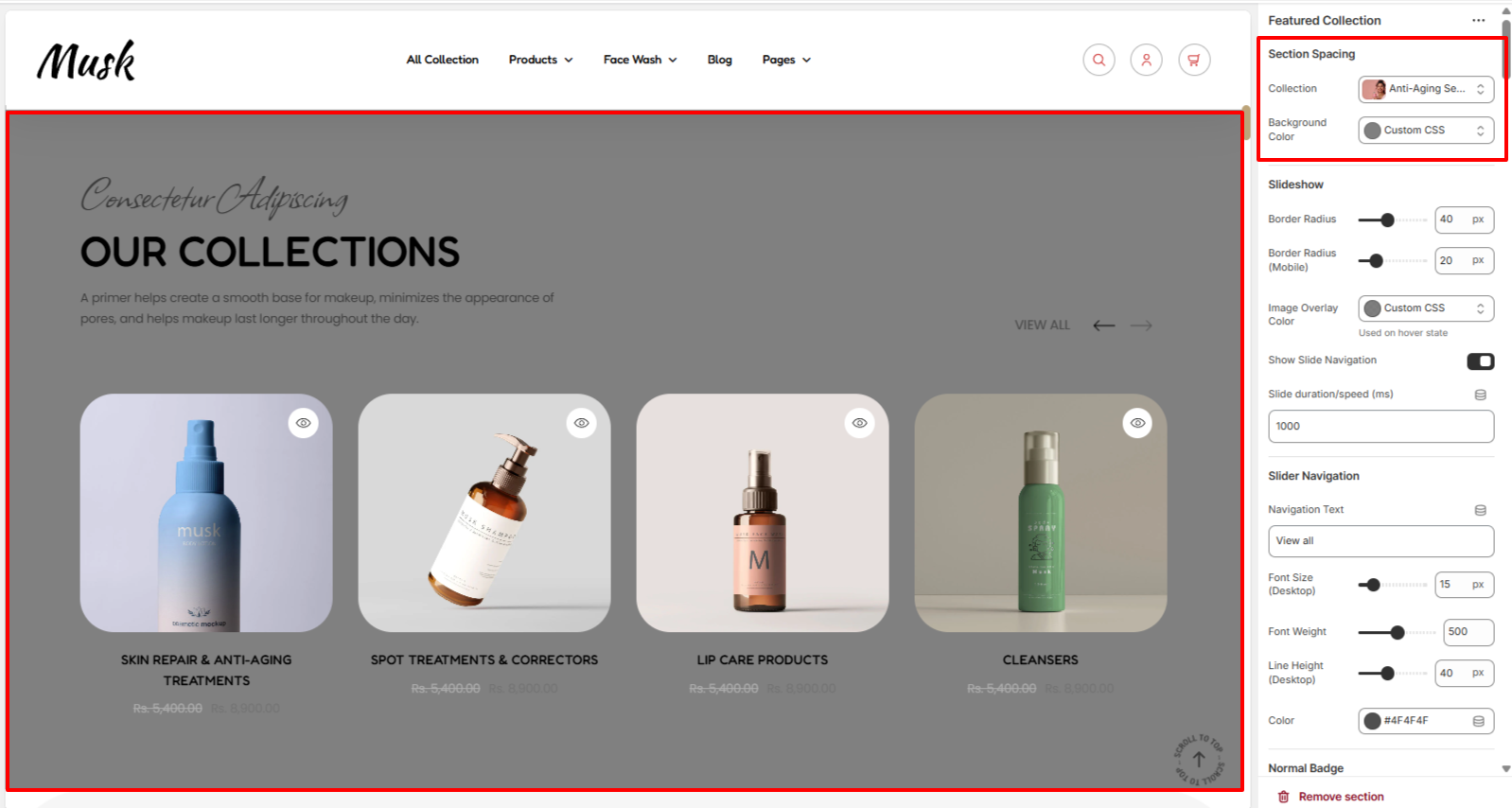
Within the Section Spacing settings, here you can set the collection that you desire to have displayed as well as a background color to the Featured Collection section.
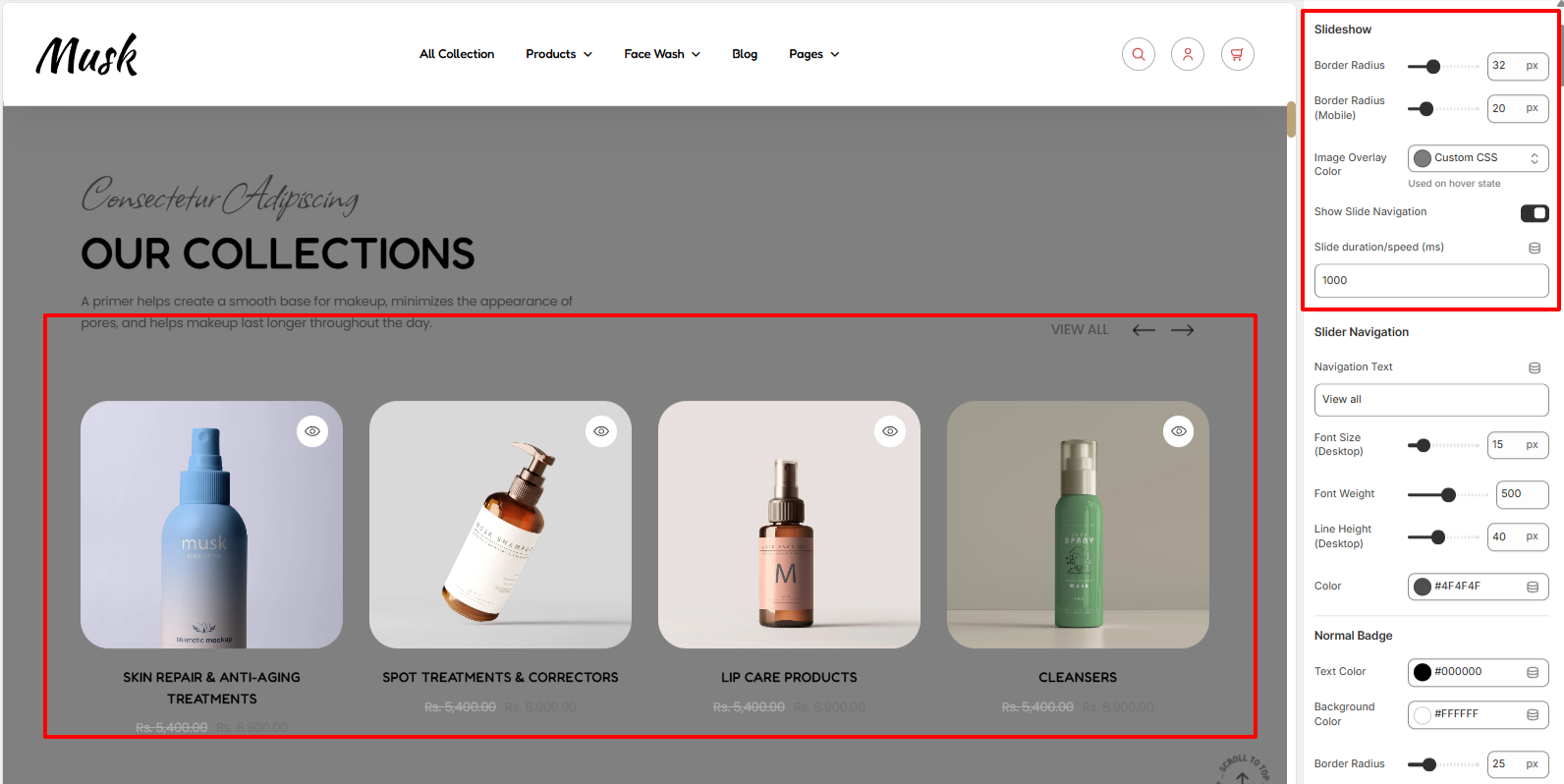
The Slideshow settings enable you to set a border radius and overlay color to the product images of the collection, as well as specify the slider speed and whether the slide navigation arrows are to be rendered.
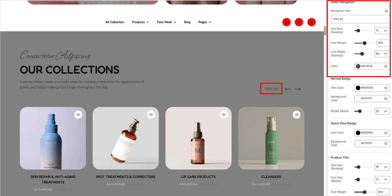
The Slider Navigation settings enable you to alter the navigation text as well as adjust its styling in terms of font size, font weight, line height, and color.
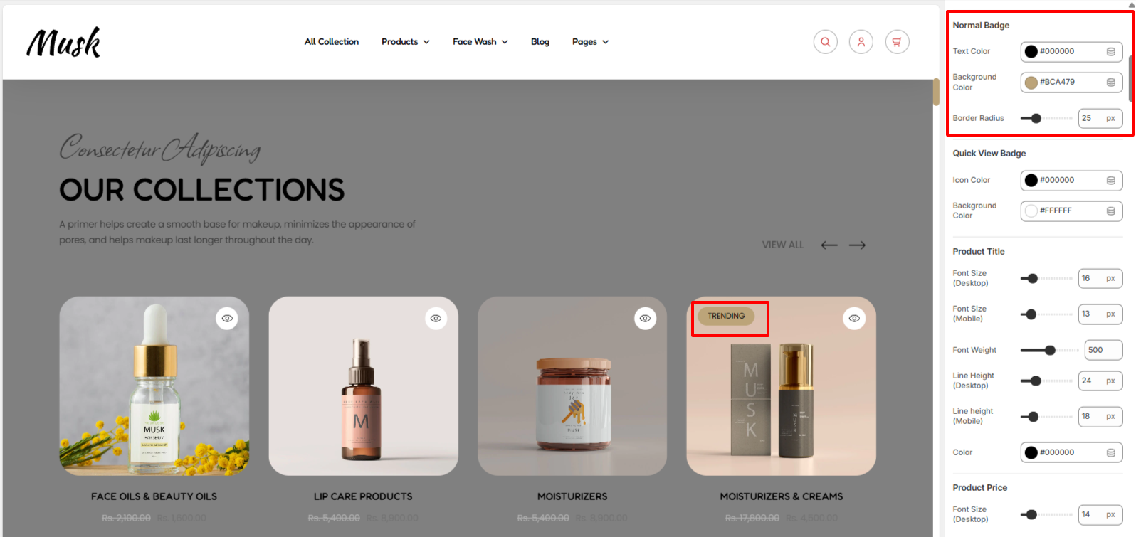
In a case whereby one of the products in a collection has a badge on it, the Normal badge settings can be used to alter its background color, border radius, and text color.

The Quick View badge settings enable you to alter the quick view icon color and background color within the collection’s products.
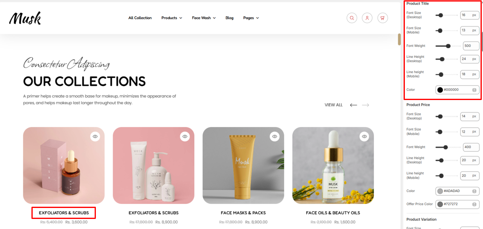
Within the Product Title settings, here you can carry out styling adjustments to the titles of the respective products in the collection. These adjustments include the font size, font weight, line height, and color.
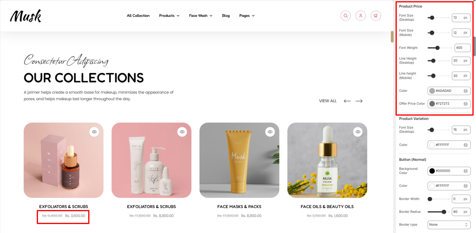
Within the Product price settings, can carry out styling adjustments to the products prices in terms of the font size, font weight, line height, color, and the offer price color.
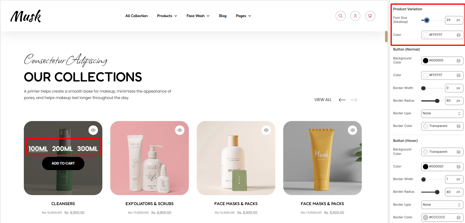
The Product Variation settings enable you to carry out adjustments to the variations rendered within the products in terms of color and the font size.
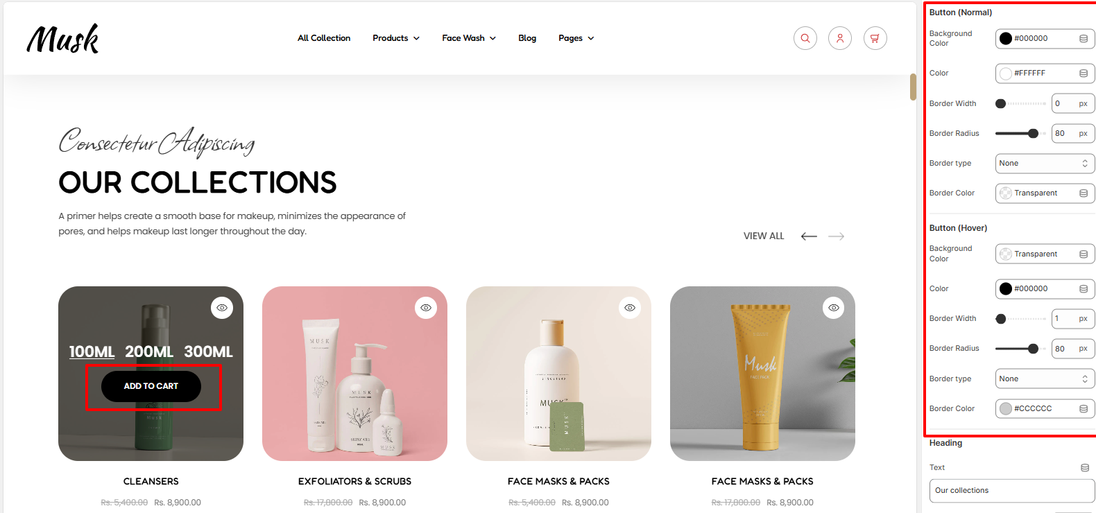
Within the button settings, here you customize the styling of the Add to Cart button rendered within the products in terms of the text color within the button, background color, border width, border radius, border type, and border color of the button in both normal and hover states.
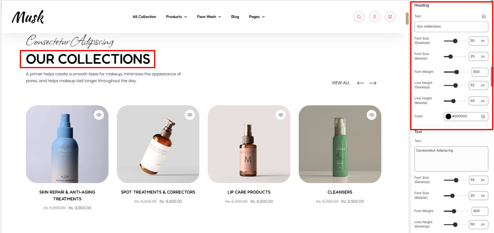
The Heading settings enabled you to alter the Heading text to the Featured Collection as well as the font size, font weight, line height, and color to the text.
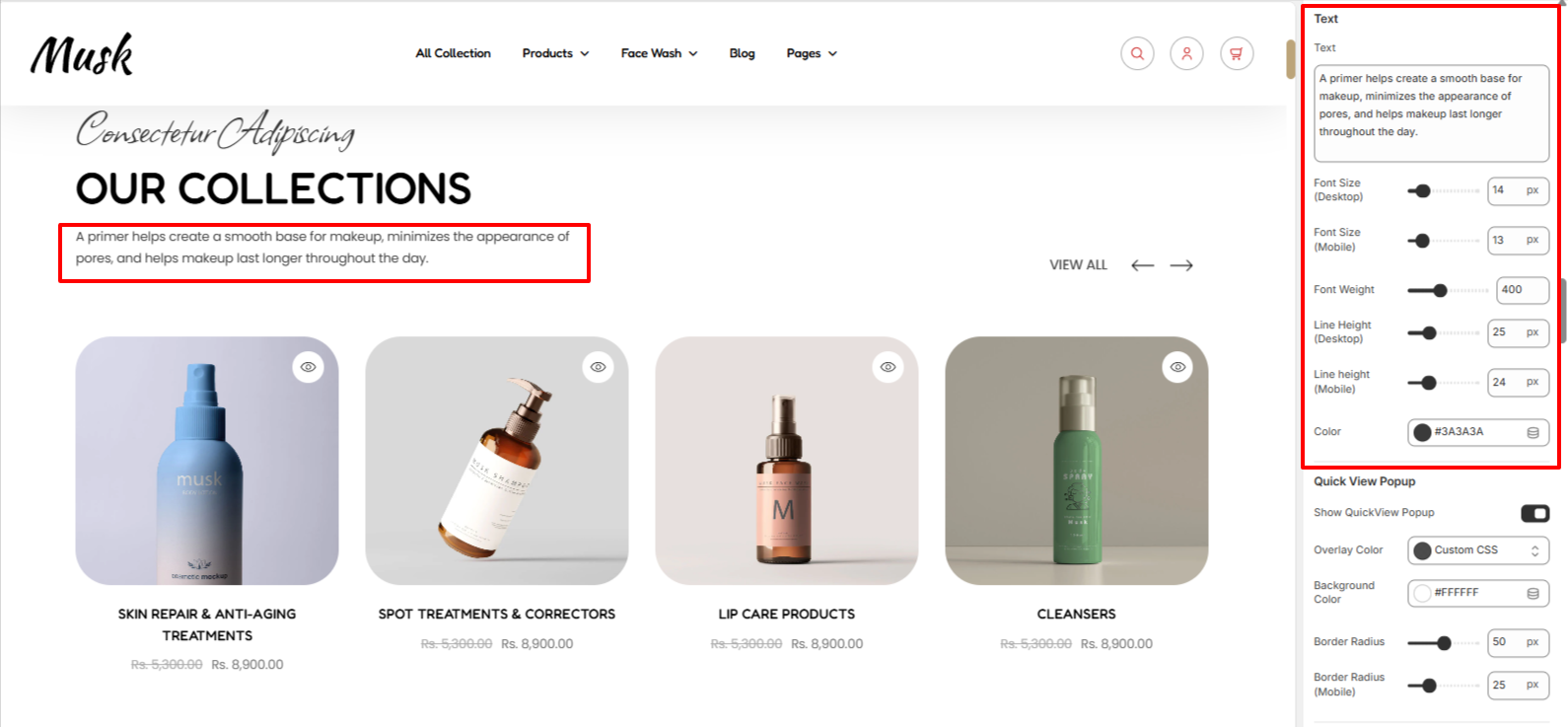
The Text region enables you to add your own desired text to appear beneath the Featured Collection heading, as well as alter its font size, font weight, line height and color.
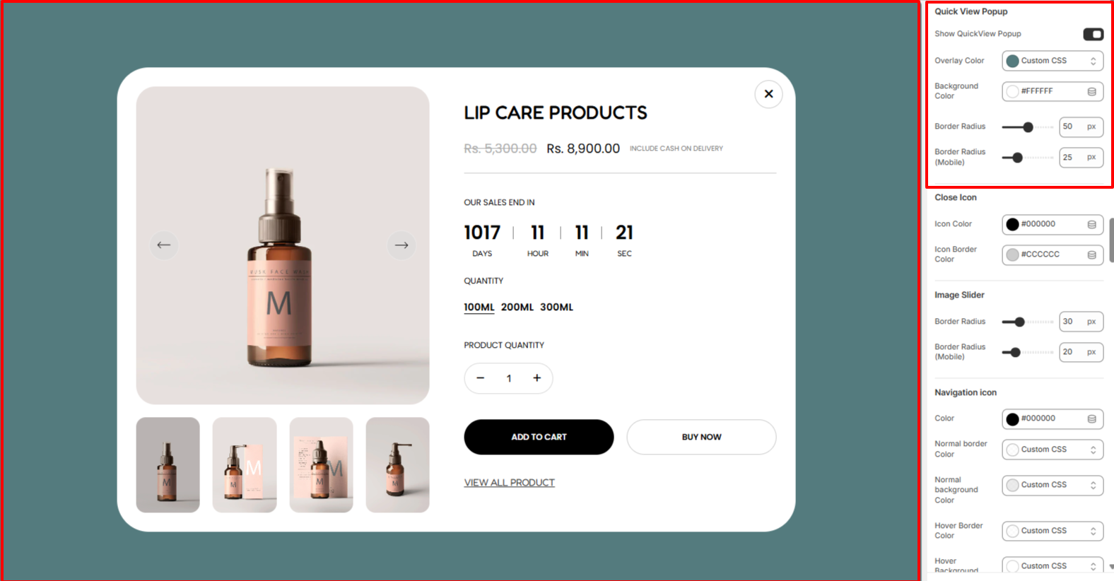
The Quick View Popup settings allow you to enable the Quick View popup display as well as adjust the overlay color, background color, and border radius.
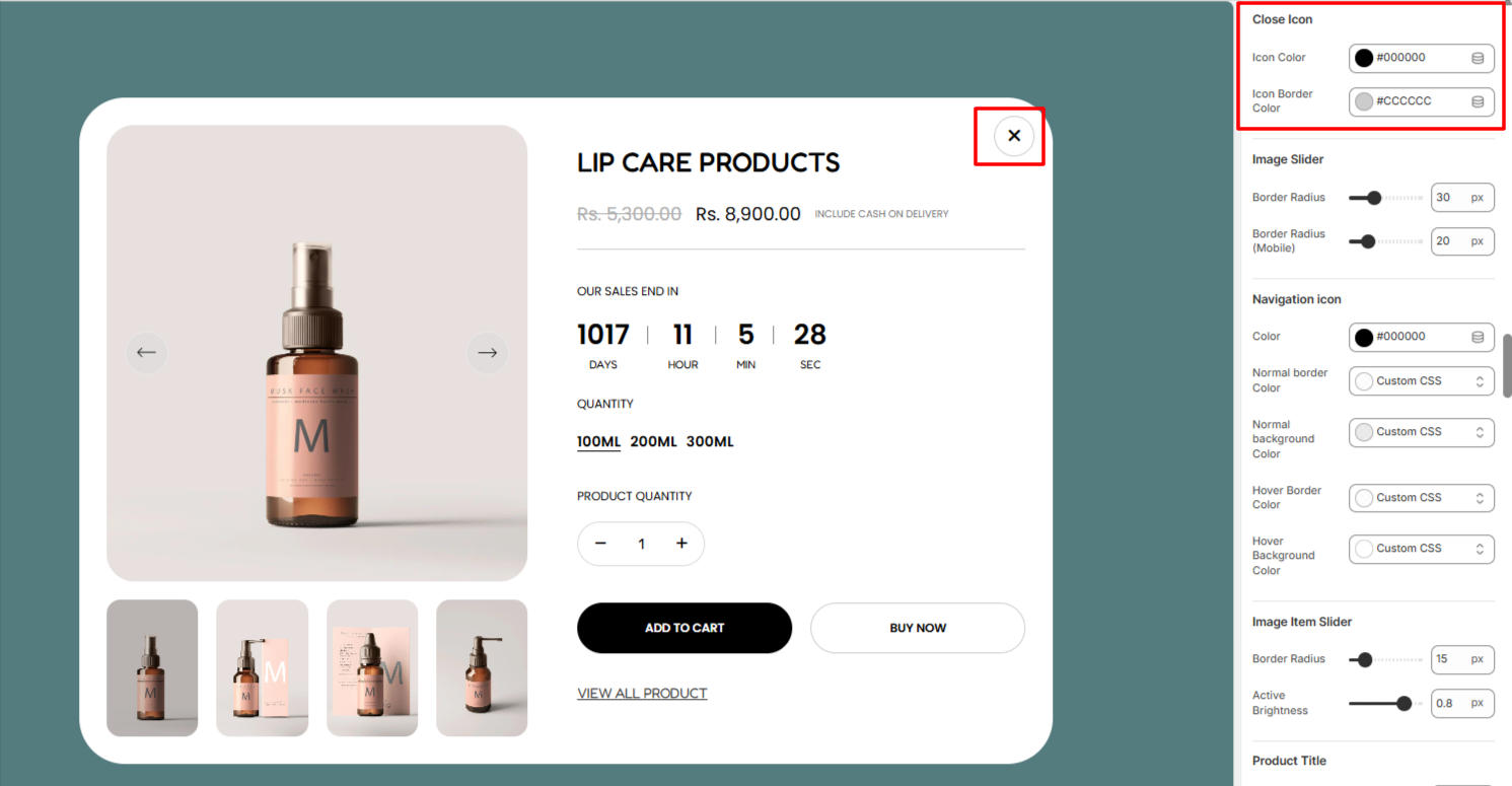
The Close Icon settings enable you to set an icon color and icon border color to the close icon within the quick view popup.
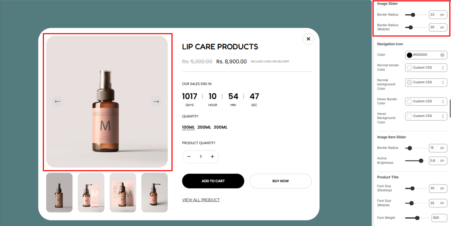
Within the Image Slider settings, here you can set a border radius to the Image slider within the Quick view popup.
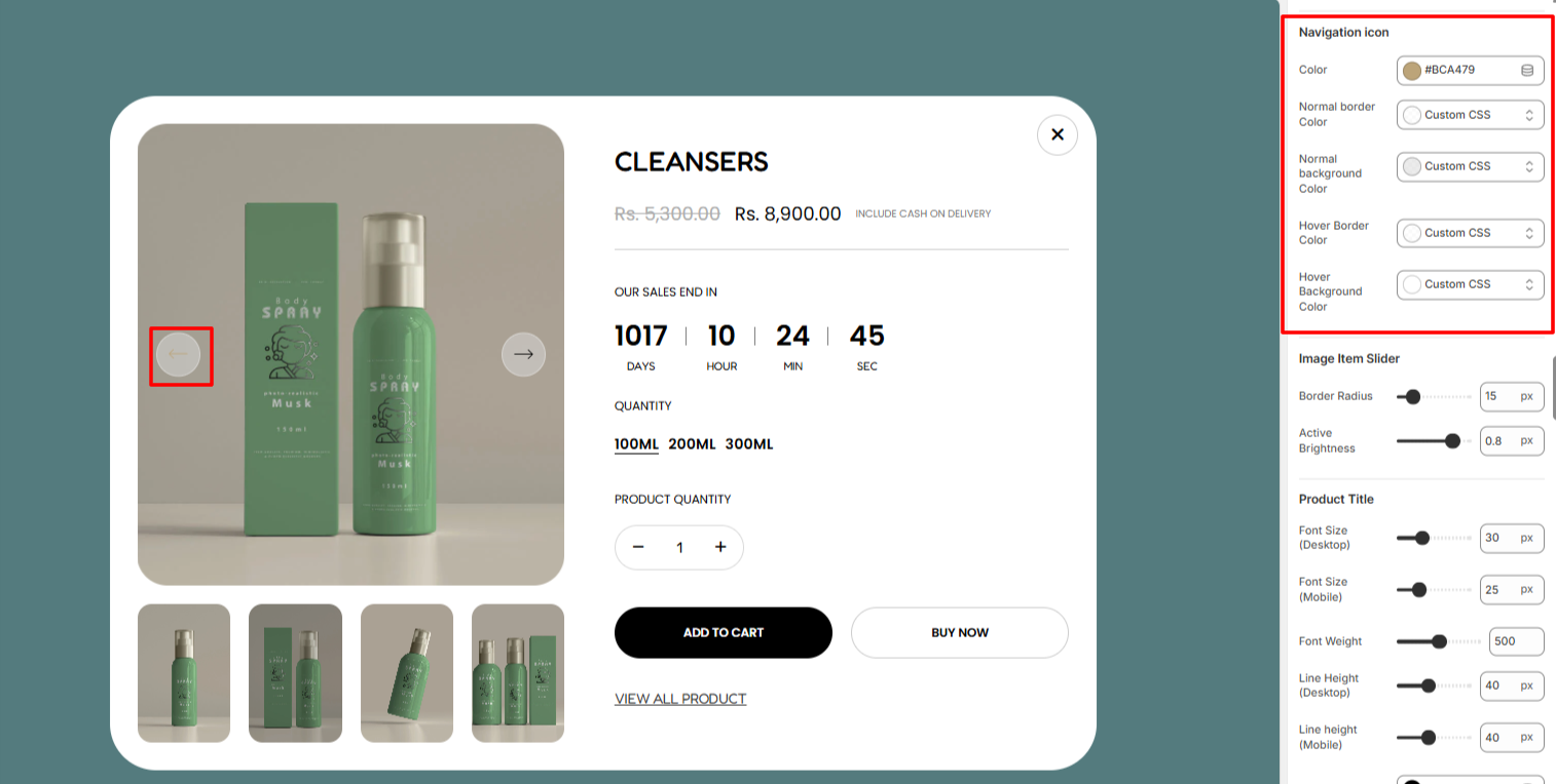
Here, you can set the color of the navigation icon, as well as the normal border color, normal background color, hover border color, and hover background color.
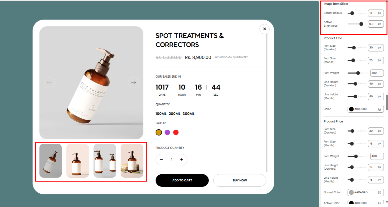
The Image Item Slider settings enable you to add a border radius to the Slider Image items, as well as set an opacity to the active image item.
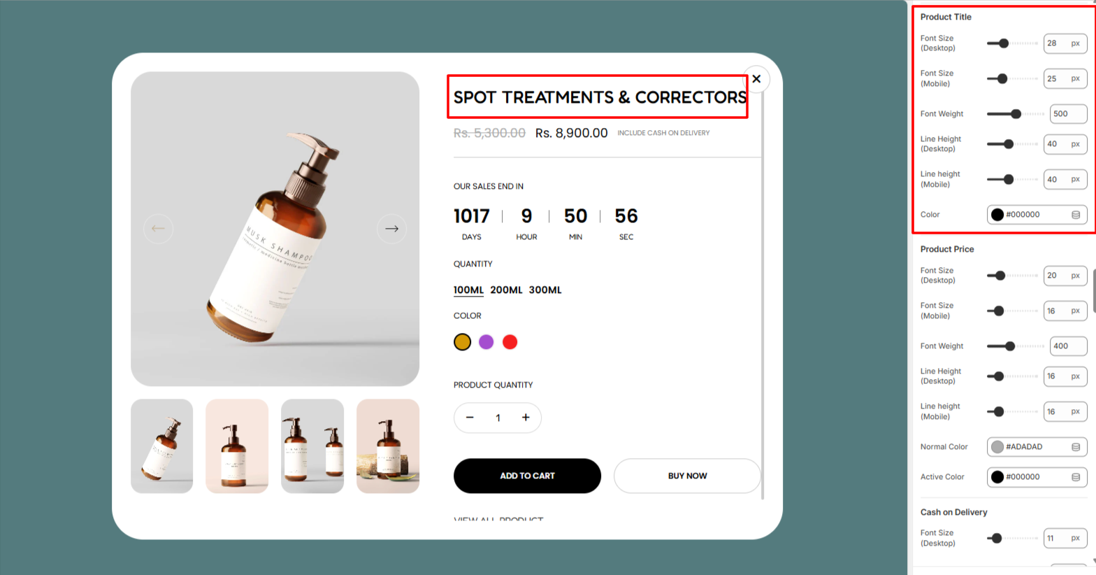
The Product Title settings enable you to adjust the font size, font weight, line height, and color to the product titles in the quick view popup.
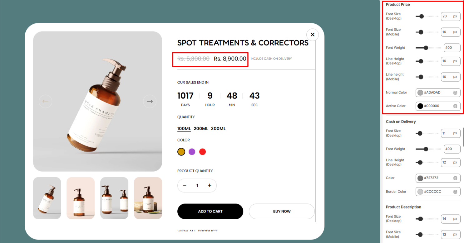
Within the Product Price settings, here you can make adjustments to the font size, font weight, line height, normal and active colors to the product prices rendered within the quick view popup.
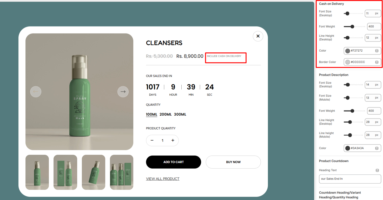
In the Cash on Delivery settings, here you can make adjustments to the Cash On Delivery text rendered within the Quick view popup in terms of the font size, font weight, line height, color, and border color.
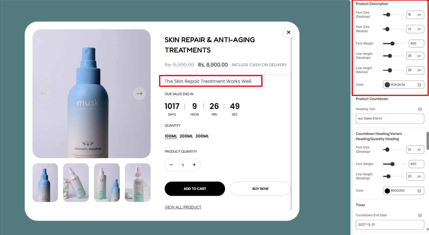
The Product Description enables you to make adjustments to the product description within the quick view popup in terms of the font size, font weight, line height, and color.
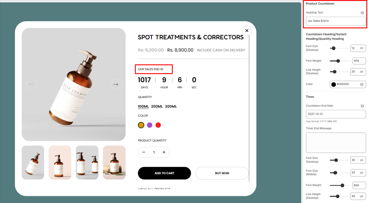
The Product Countdown text enables you carry out alterations to the Heading text above the countdown.
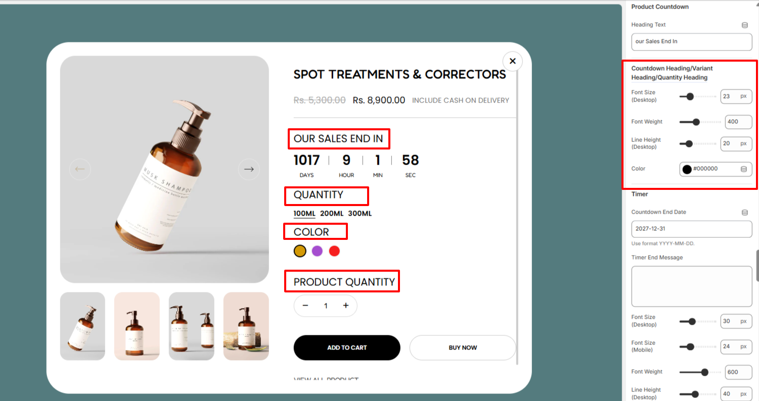
Within the section here, you can make adjustments to the Countdown Heading/Variants Headings, and Quantity headings in terms of the font size, font weight, line height, and color.
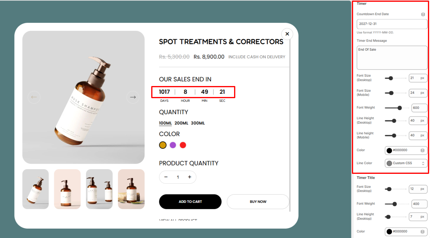
Within the Timer settings, here you can set the date which you wish to have the countdown ending, as well as the text to be rendered once it ends.
In addition, you can also customize the display of the timer in terms of adjusting its font size, font weight, line height, color, and line color between the timer digits.
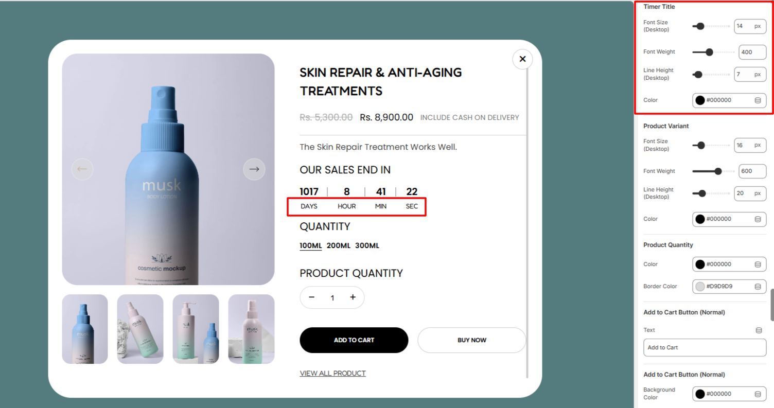
Within the Timer Title settings, here you can make adjustments to the titles of the timer in terms of the font size, font weight, line height, and color.
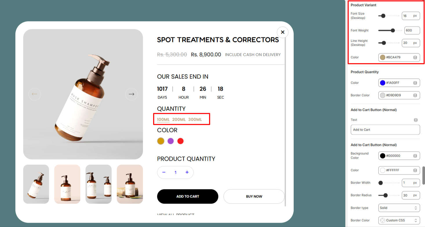
The Product Variant settings enable you make adjustments to the variants in terms of the font size, font weight, line height, and color.
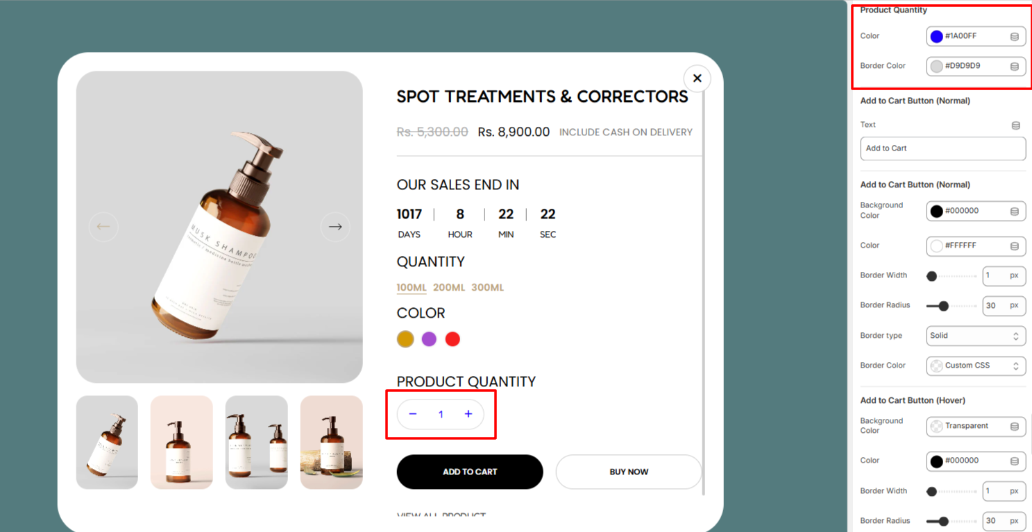
Within the Product QUantity settings, here you can adjust the quantity color and border to the quantity increment button.
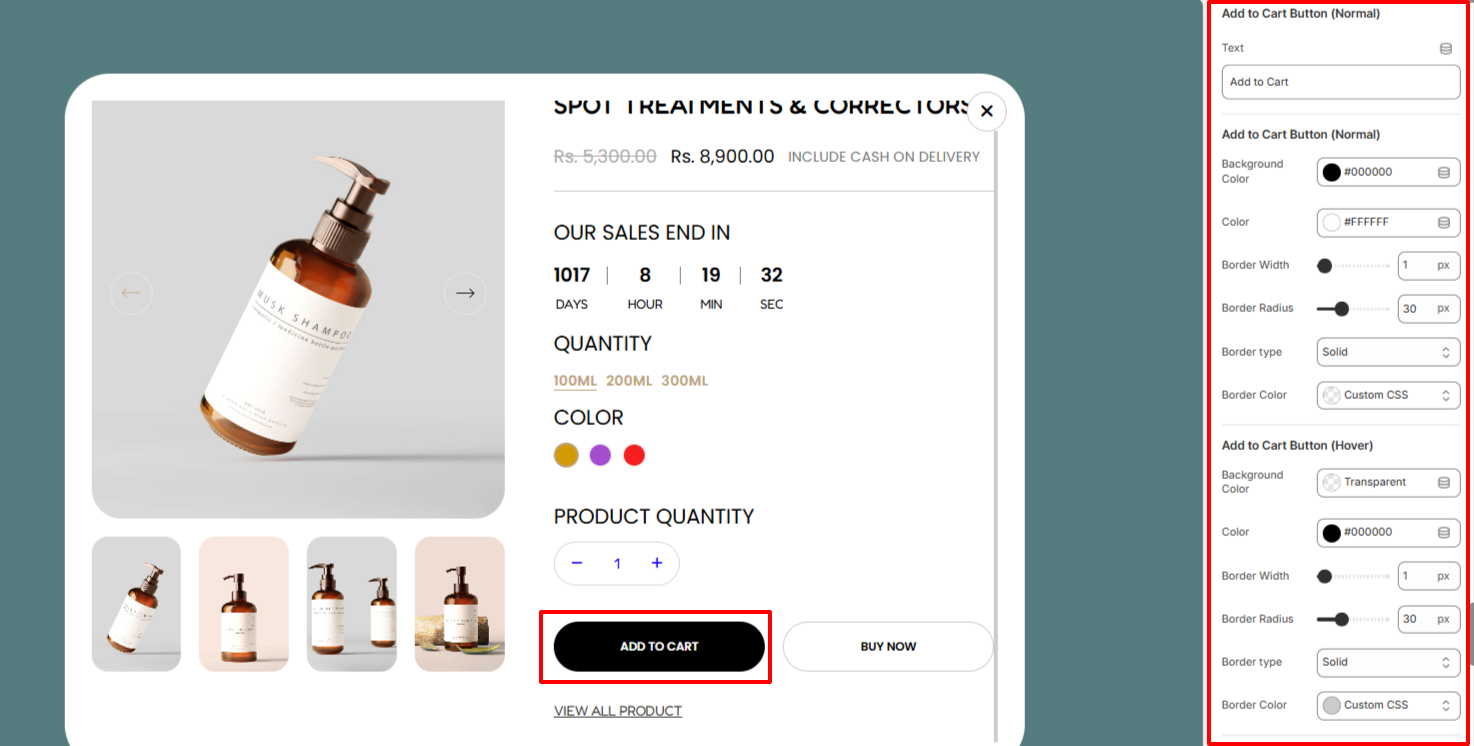
The Add to Cart Button settings enable you to alter the Add to Cart button text, as well as carry out styling adjustments to it in terms of its background color, text color, border width, border radius, border type, and border color in different states (Normal & Hover).
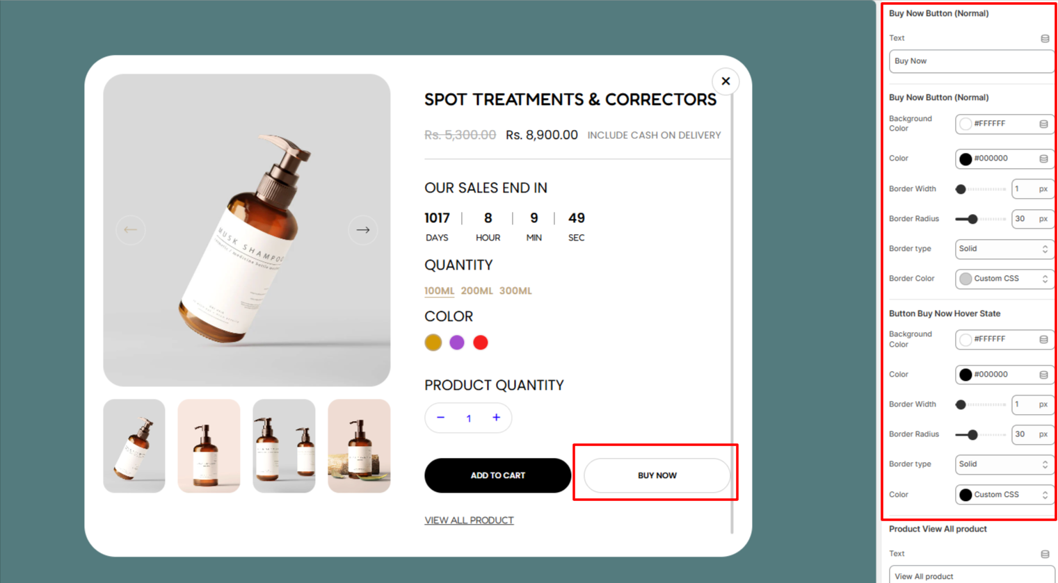
The Buy Now Button Button settings enable you to alter the Buy Now button text, as well as carry out styling adjustments to it in terms of its background color, text color, border width, border radius, border type, and border color in different states (Normal & Hover).
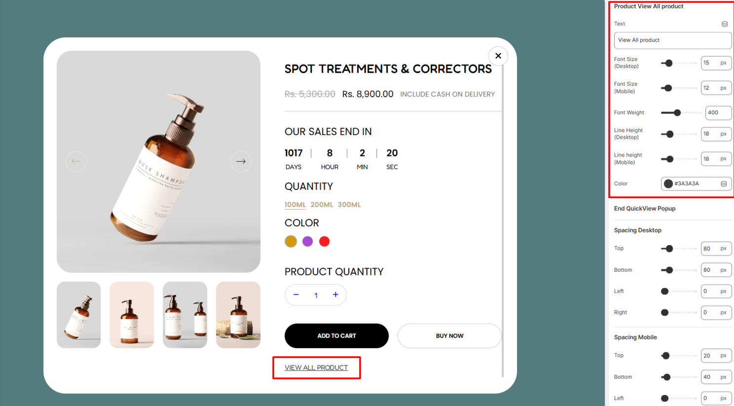
Within the Product View All Product settings, here you alter the default View all product text to that of your preference, as well as adjust the font size, font weight, line height, and color to the text.
The Spacing settings enable you to add padding to the Featured Collection section in both desktop and mobile devices.