
The header section is displayed at the top of your store pages. It is mainly used to render menu navigation items and the logo.
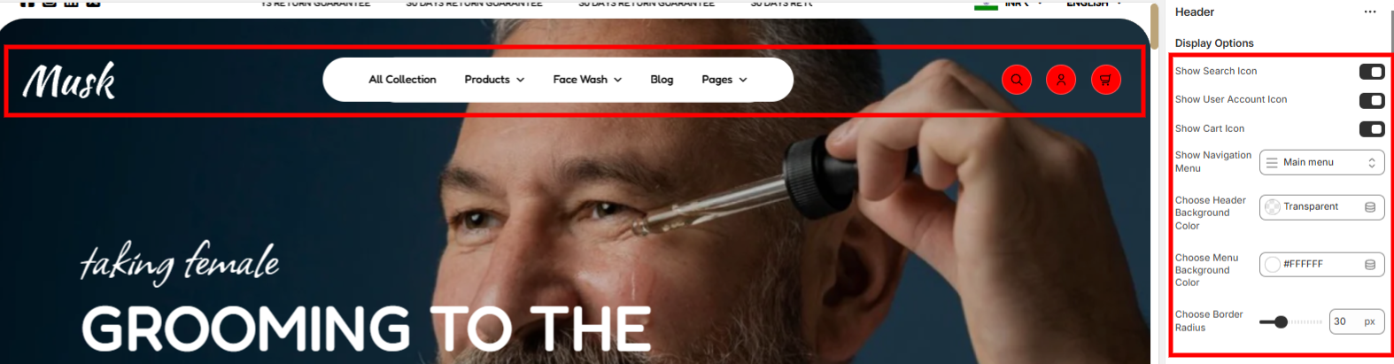
Show Search Icon: When enabled, it displays the search icon within the header.
Show User Account Icon: This enables the rendering of the account icon within the header.
Show Cart Icon: Facilitates the display of the cart icon within the header.
Show Navigation Menu: This enables you to specify the menu to be displayed on the header.
Choose Header Background Color: Used in setting the background color to the header.
Choose Menu Background Color: Enables you to set the background color to the menu rendered within the header.
Choose Border Radius: Used in adding rounded corners to the header or else setting the border radius of the header’s corners.
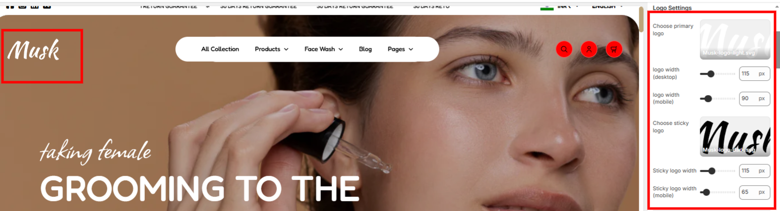
Within the logo settings, you can set both the primary logo and sticky logo (Logo rendered upon scroll), as well as specify the width of the logos.
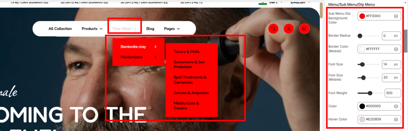
Settings within this section enable you to set a background color to the sub-menu items, border-radius & border color to the submenu, font size, and font weight of both the first level menu items and sub-menu items, the color of the first level menu items and sub-menu items, as well as the hover color, within desktop device screens
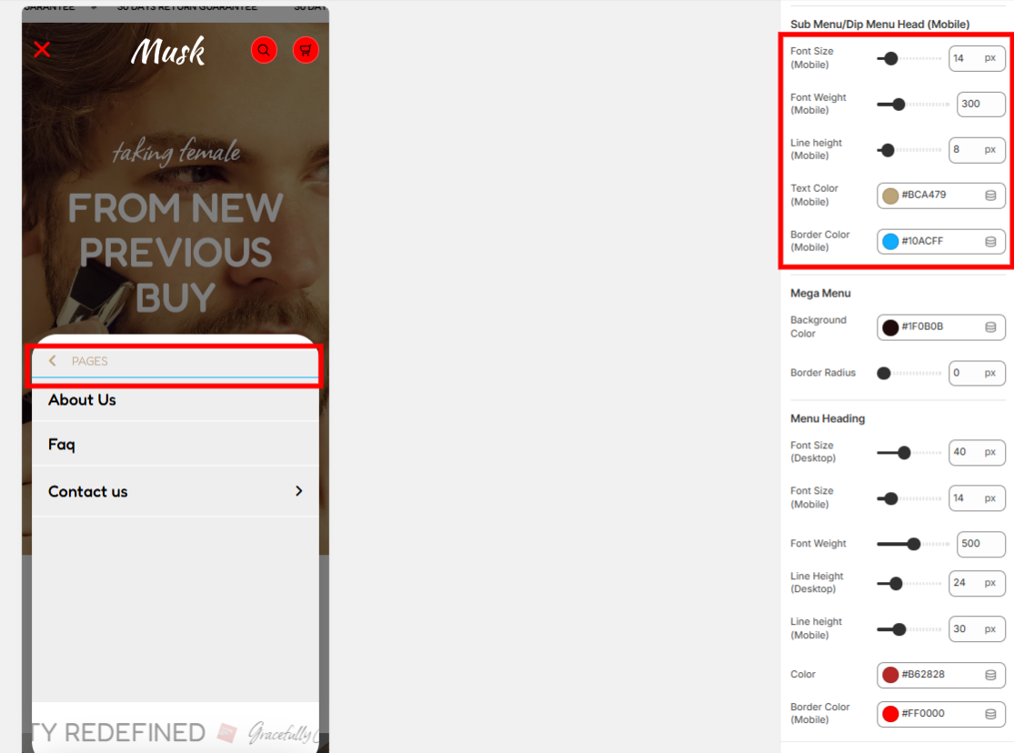
The settings within this section enable you to set the font size, font weight, line height, text color, and border color of the sub-menu items head, within mobile device screens.
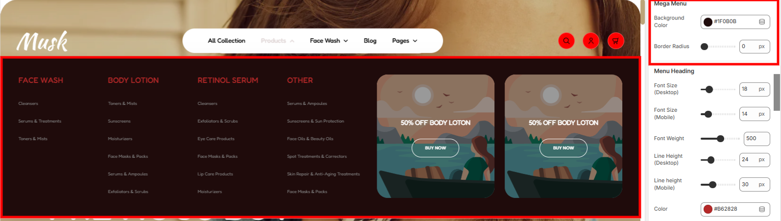
Within this section, you can set the background color and border radius to the mega menu.
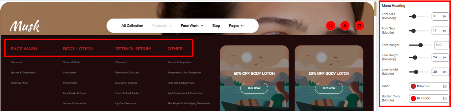
Enables you to adjust the mega menu headings styling aspects such as the font size, font weight, line height, and color on both desktop devices and mobile screens, as well as set the bottom border color to them on mobile.
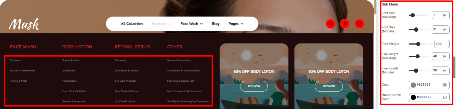
Here you can adjust mega menu sub-menu items styling aspects such as the font size, font weight, line height, color, as well as the hover/active color.
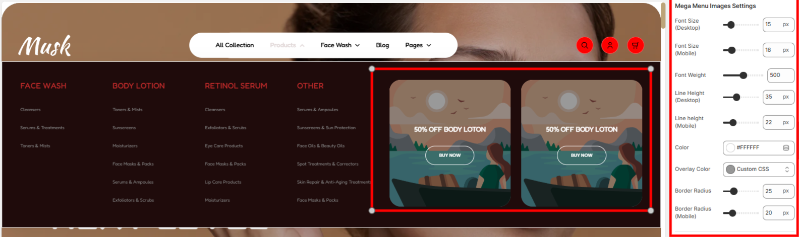
This section enables you to adjust mega menu images and mega menu images' primary & secondary heading styling aspects such as font size, font weight, line height, color, overlay color, and border radius.
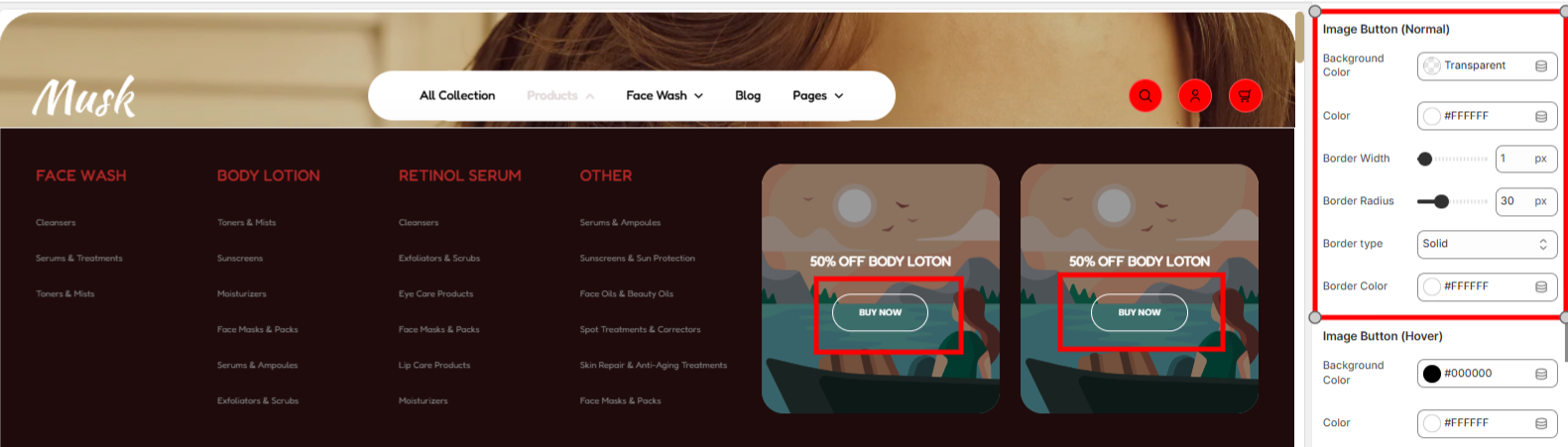
This enables you to carry out styling adjustments to the Mega Menu images buttons in a normal state. Various styling adjustments can be carried out, such as altering the background color of the buttons, the color of the button texts, as well as the border width, border radius, border type, and border color of the buttons
The settings here enable you to carry out styling adjustments to the Mega Menu images buttons in a hover state. Various styling adjustments can be carried out, such as altering the background color of the buttons, the color of the button texts, as well as the border width, border radius, border type, and border color of the buttons.
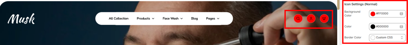
These settings enable you to set the background color to the icons, the color to the icons as well as the border color of the icons in a normal state.
The settings here enable you to set the background color to the icons, the color to the icons as well as the border color of the icons in a hover state.
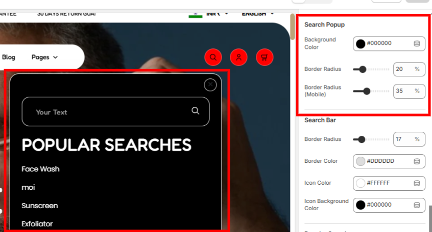
Enables you to set a background color and border radius to the search popup.
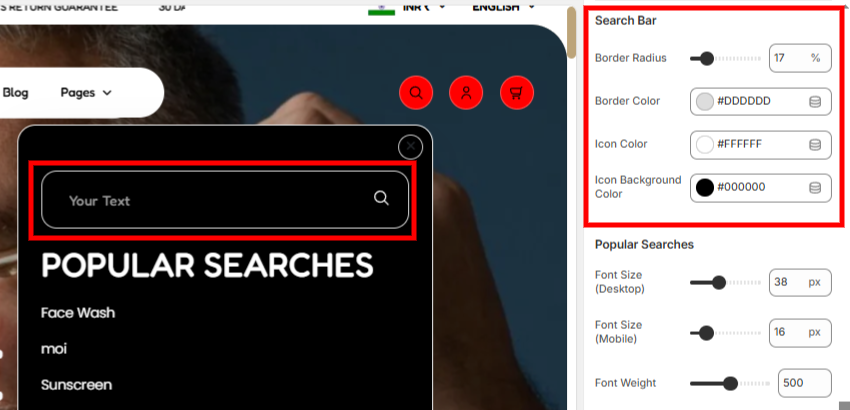
The search bar settings help in adjusting the search bar styling aspects, such as the border radius, border color, icon color and icon background color of the icon within the search bar.
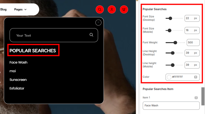
The popular searches settings help in adjusting styling aspects related to the “Popular Searches” text such as the font size, font weight, line height, and color of the text.
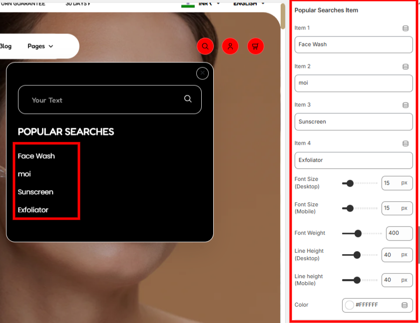
The settings here enable you to add your desired Popular Searches Items, as well as apply styling aspects such as the font size, font weight, and color to them.
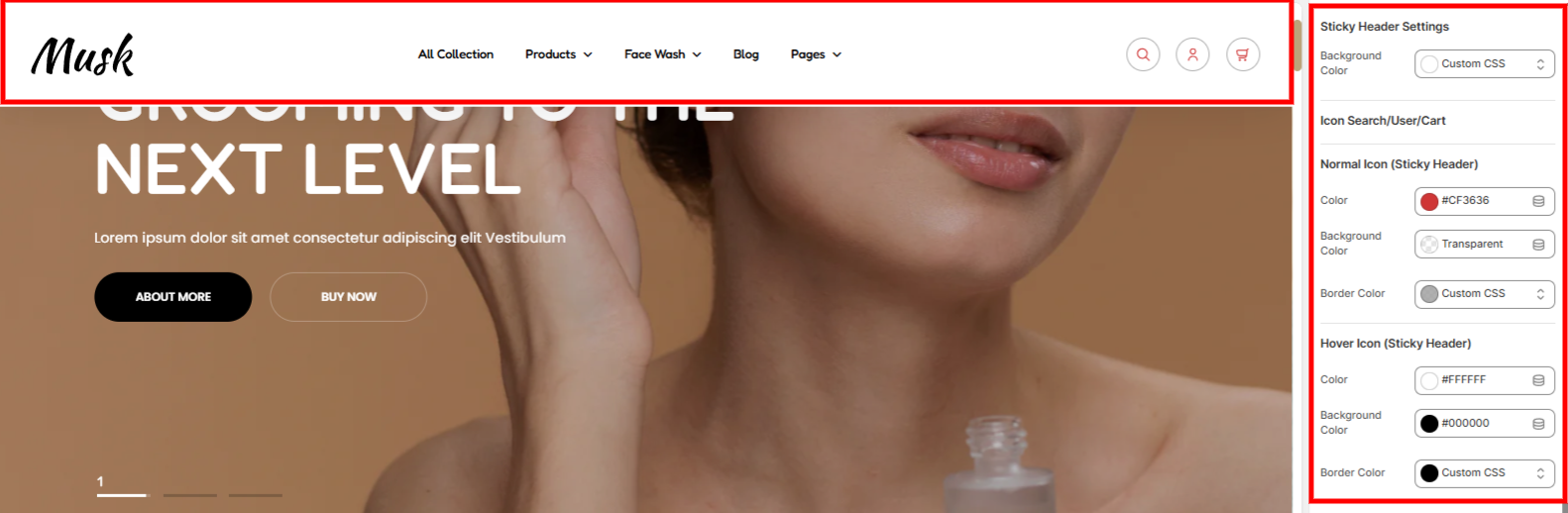
This section setting provides a background color setting that enables you to set a background color to the sticky header.
Icon Search/User/Cart: Within the section, you can adjust the icon color, background color and border color, within the sticky header, in both normal and hover states.
This section setting provides a background color setting that enables you to set a background color to the sticky header.
Icon Search/User/Cart: Within the section, you can adjust the icon color, background color and border color, within the sticky header, in both normal and hover states.

Used in setting the hamburger color on mobile.
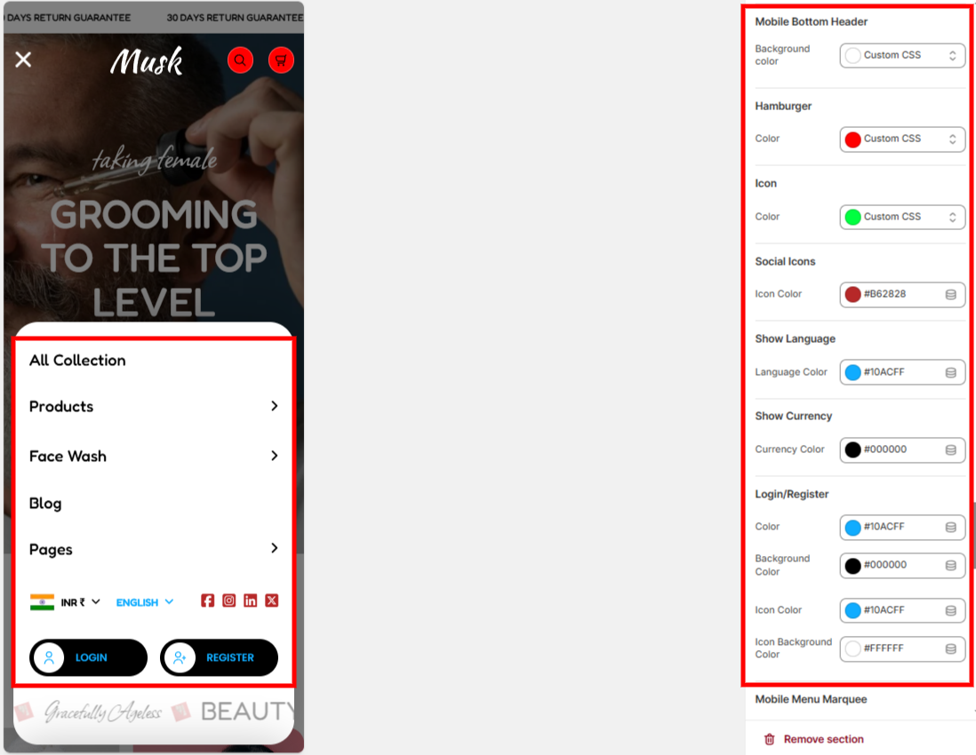
Within this section, you can set the background color to the modal popup rendered upon clicking the hamburger menu, icons color, language & currency colors as well as the Login/ Register colors.
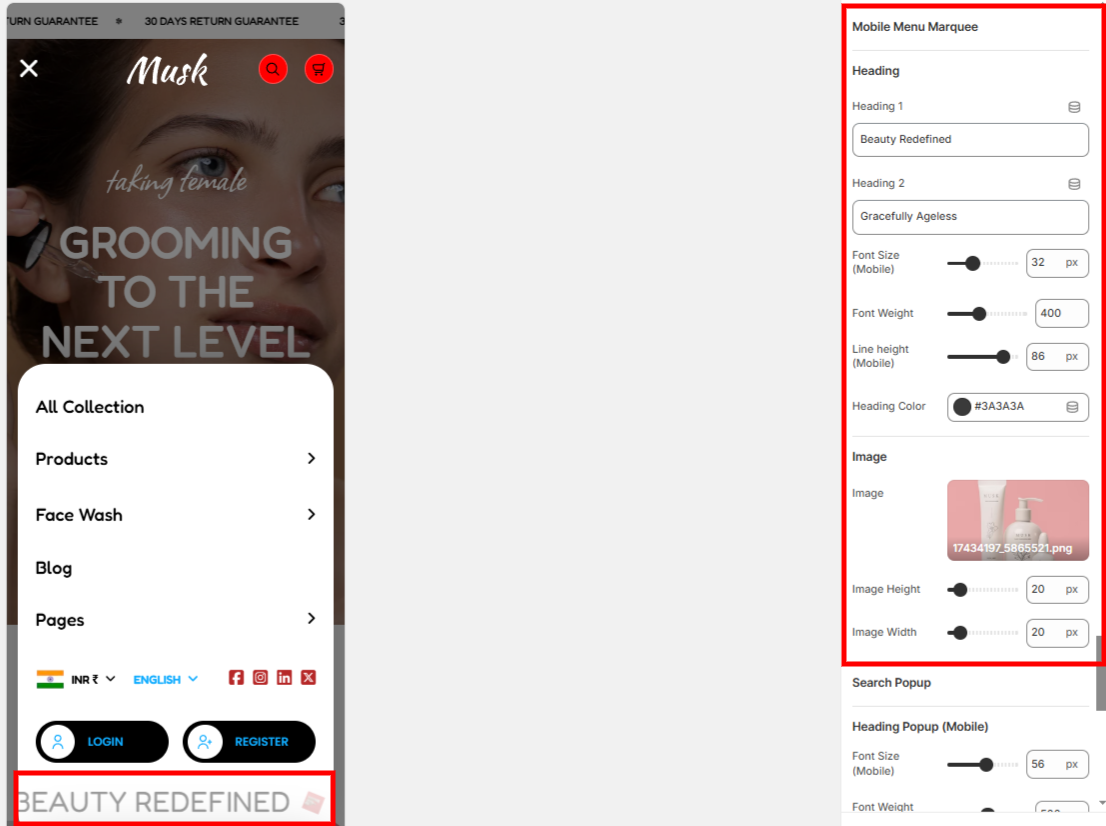
The settings here enable you to set the mobile menu Marquee text, image and set various styling aspects such as the font size, font weight, line height, color, image width and image height.
Within this section, you can adjust various styling aspects of the search popup on mobile such as the font size, font weight, line height, text color, and border color.