
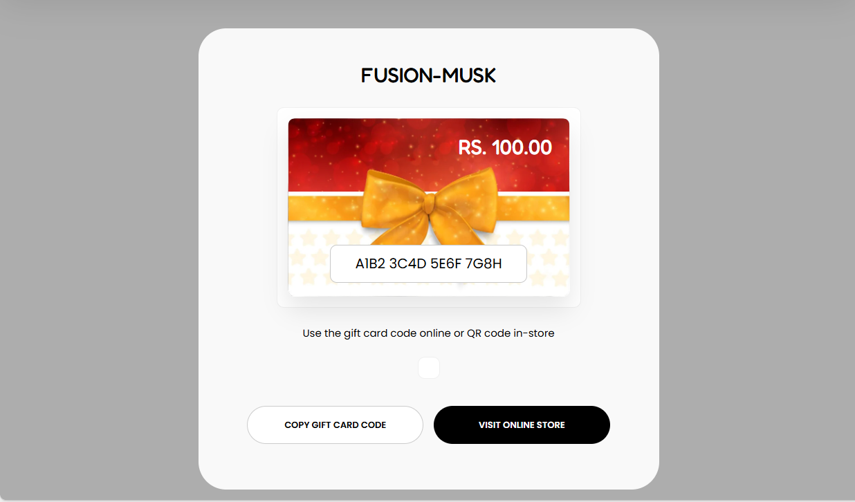
The Gift Card section enables you to render a Gift Card that you have setup within your store, for future purchase from your store.
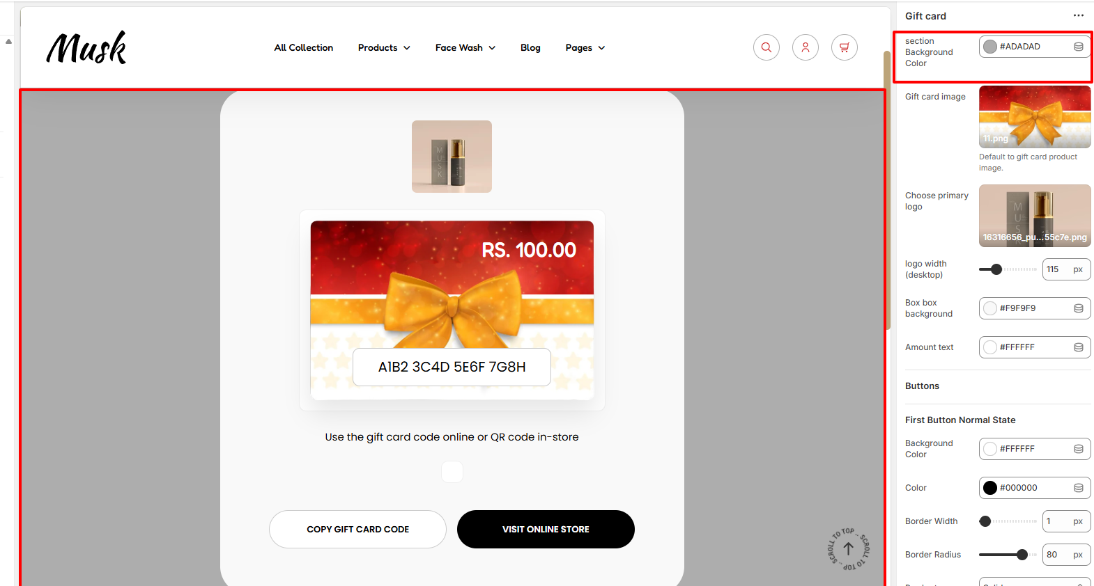
Within the Section Background Color, here you can set your desired background color to the Gift Card section.

Within the Gift Card Image section, here you can set your desired image for the Gift Card.
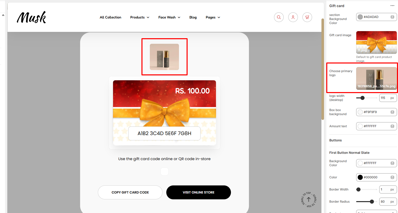
Here you can set a logo image to be rendered above the Gift Card Image
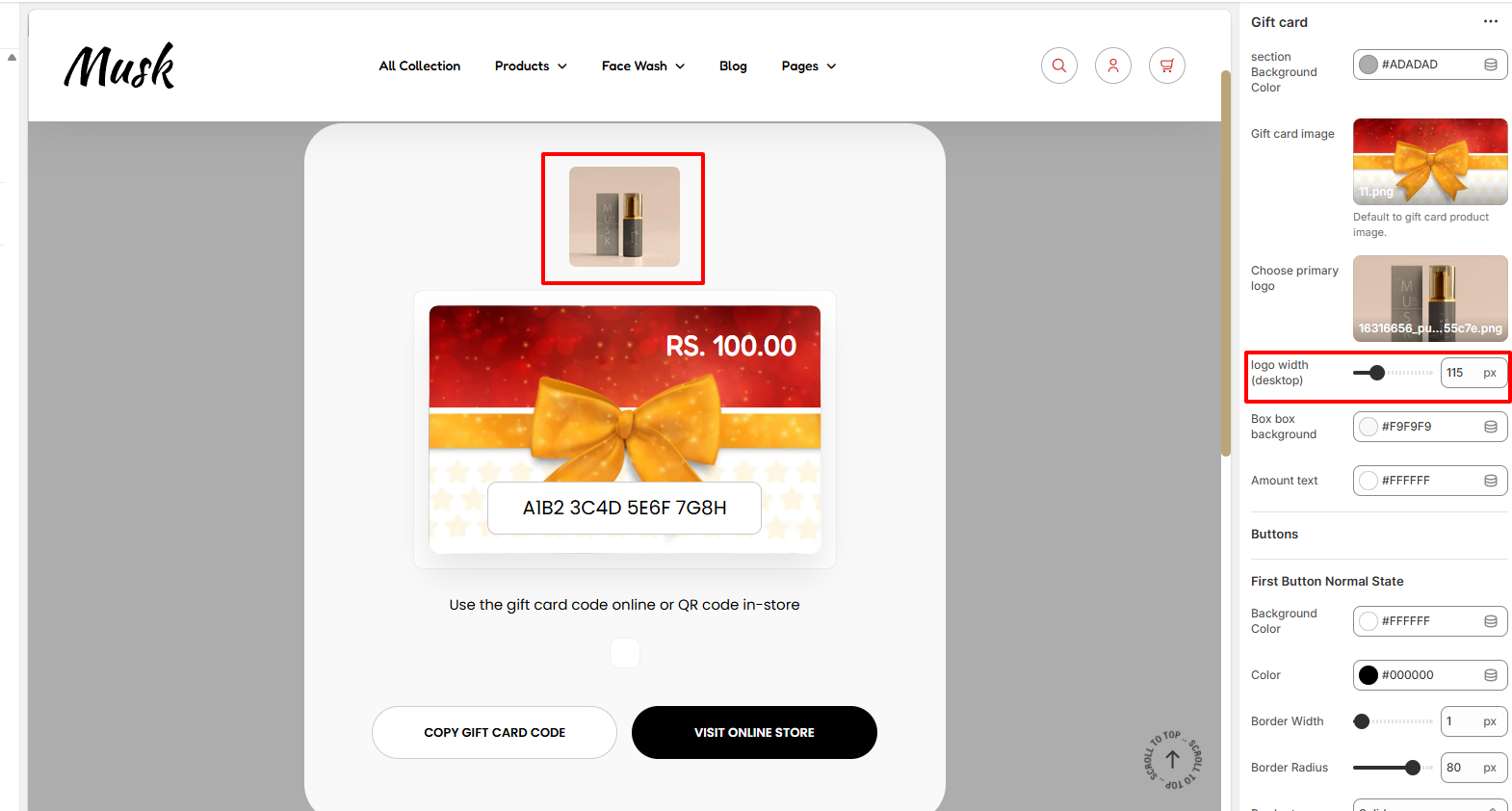
The Setting here enable you to set your desired width for the Primary logo within Desktop device screens.

The Box Background setting enables you to set a background color to the Gift Card inner box.

Enables you to modify the color of the amount text.
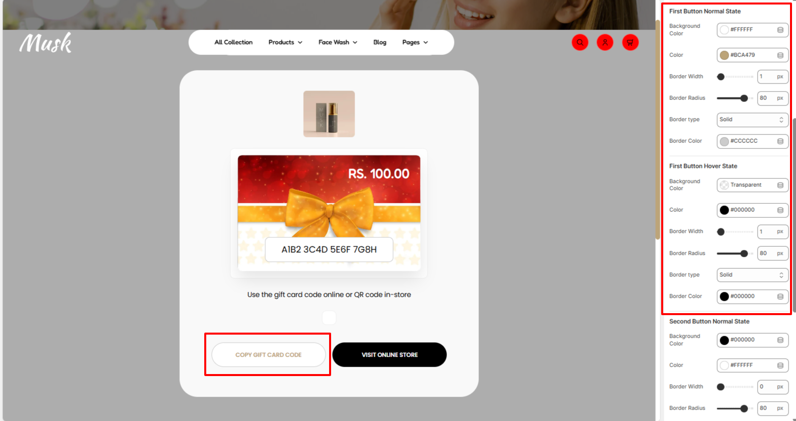
The First Button settings enable you to modify the color of the text in the first button within the Gift Card, background color, border width, border radius, border type, and border color to the first button, in both normal and hover states.
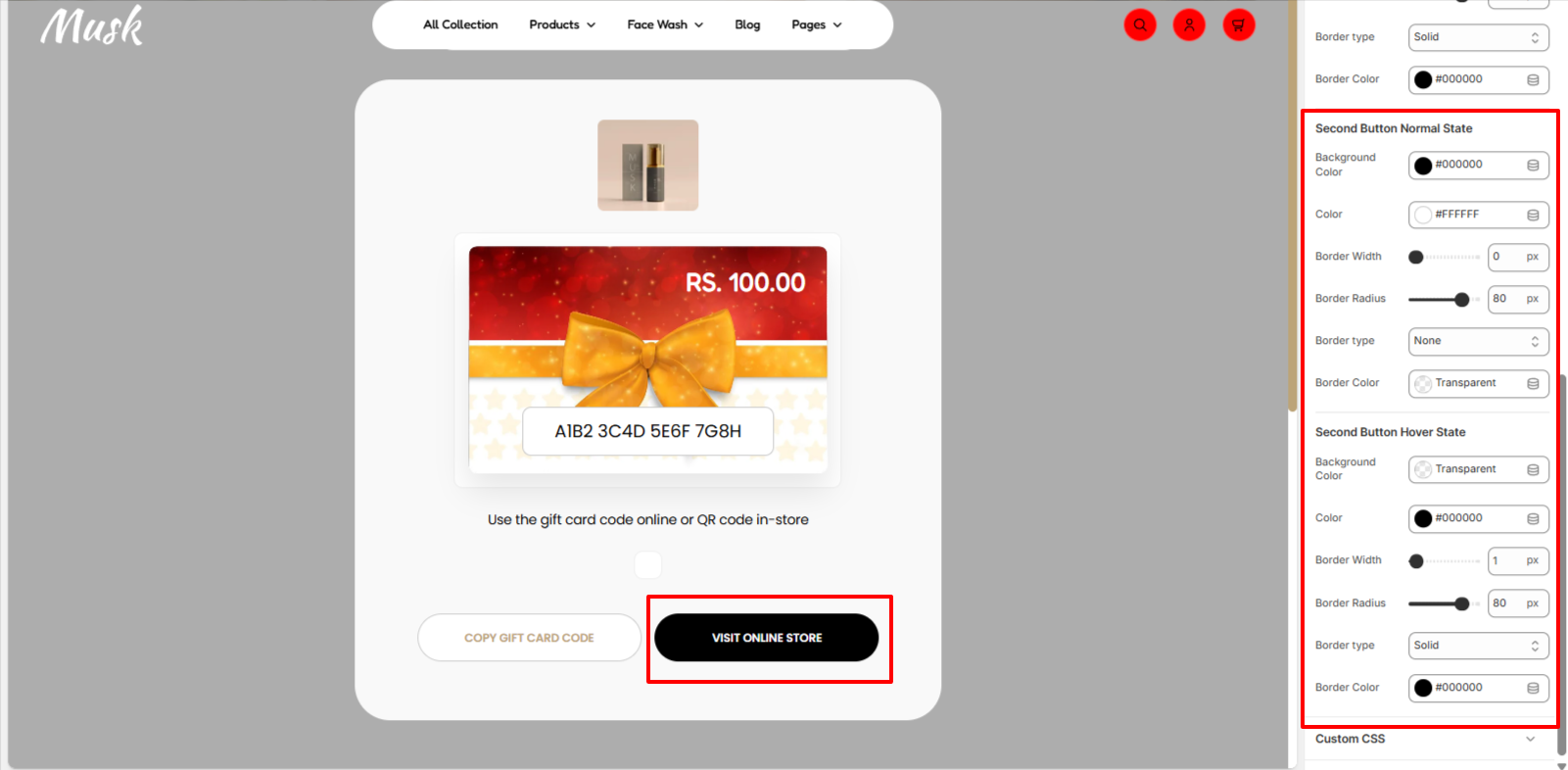
The Second Button settings enable you to modify the color of the text in the second button within the Gift Card, background color, border width, border radius, border type, and border color to the second button, in both normal and hover states.