

The Top Collection segment can be used to illustrate the top collection products. The Top collection is set within the settings of the section.
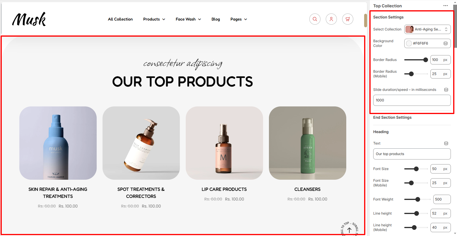
Within the Section Settings, here you can set the top collection you intend to have its products rendered.
In addition, you can also set the background color to the Top Collection section as well as the top border radius to the section.
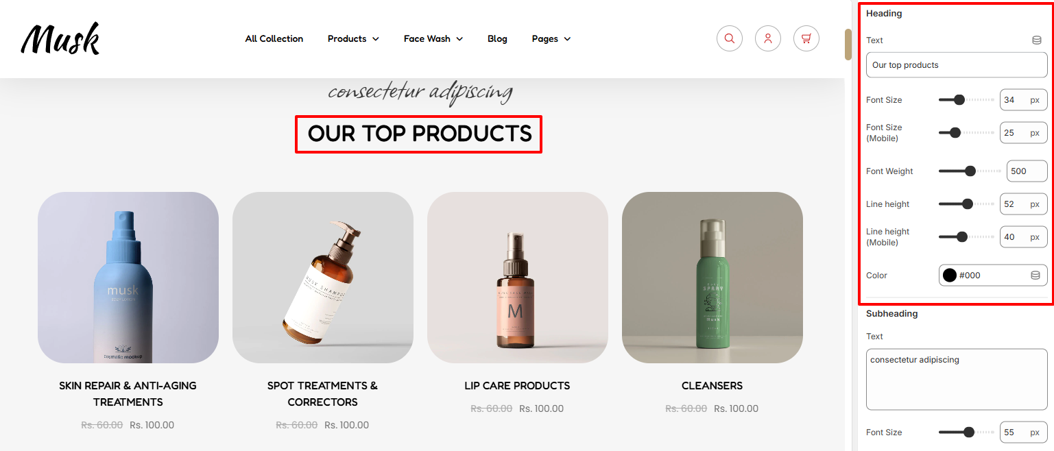
The Heading area enables you to set a Heading to the Top Collection section as well as carry out various styling adjustments to it such as the color, font size, font weight, and line height.
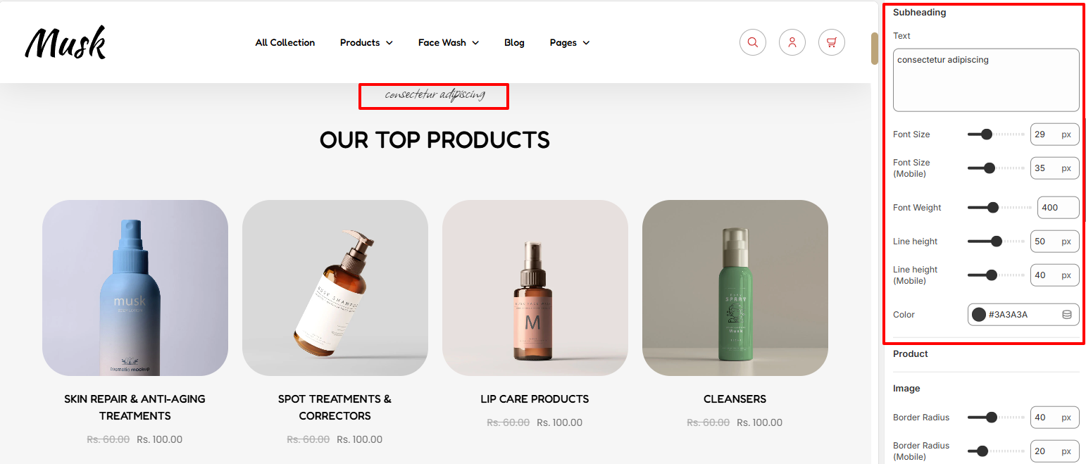
The Subheading region enables you to specify your desired subheading text as well as customize its styling by altering the font size, font weight, line height, and color.
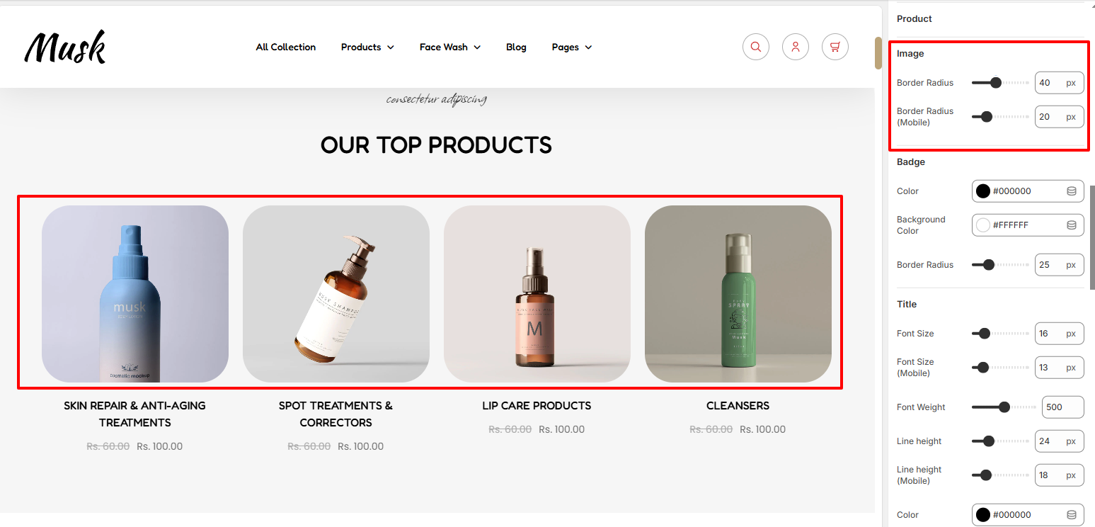
The Image segment allows you to set a border radius to the product images rendered within the Top Collection.
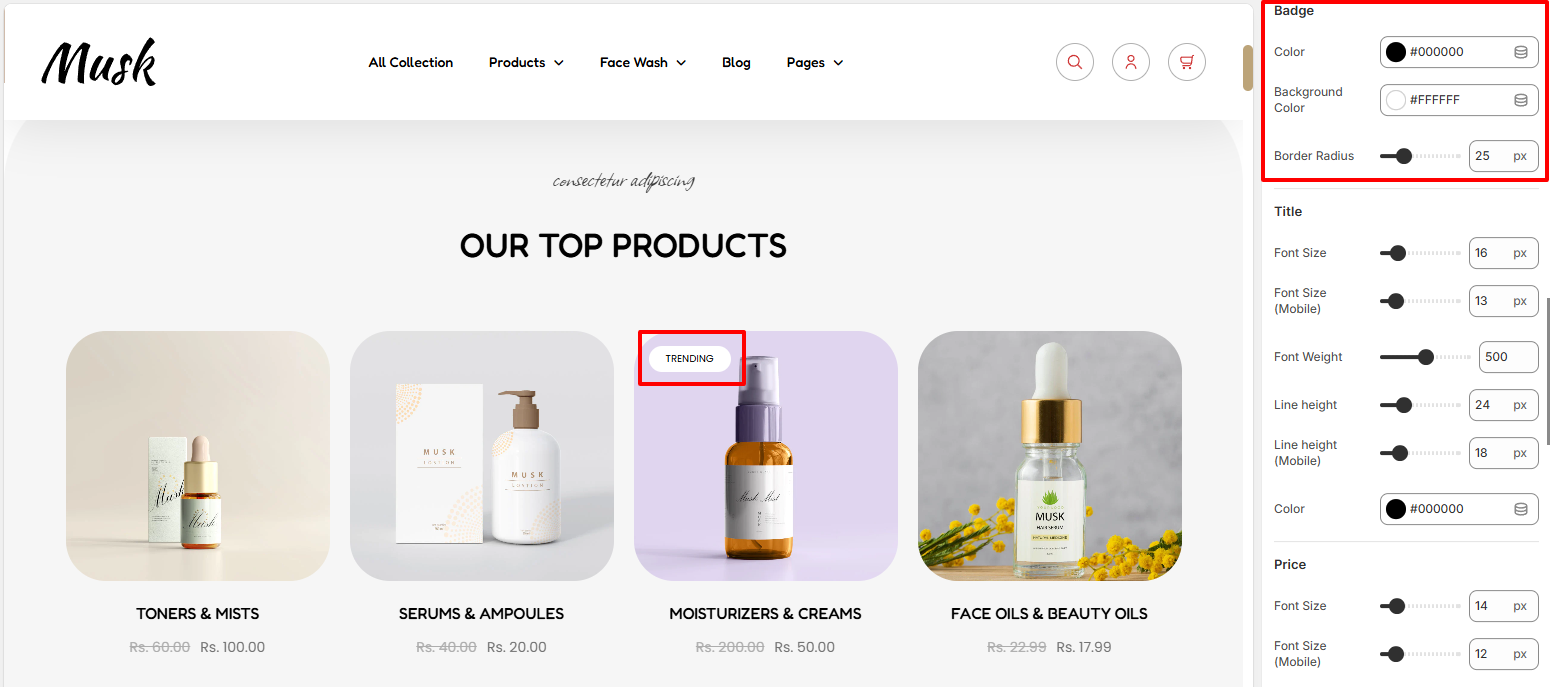
The Badge region enables you to set a background color and border radius to badges on products within the collection, as well as a color to the text within the badges.
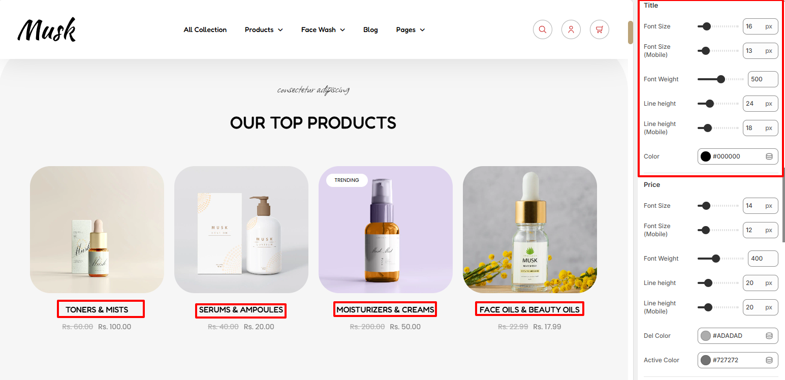
Within the Title segment, here you can carry out adjustments to the various font aspects of the product titles in the top collection such as the font size, font weight, and line height. In addition, you can also make adjustments to the color of the product titles text.
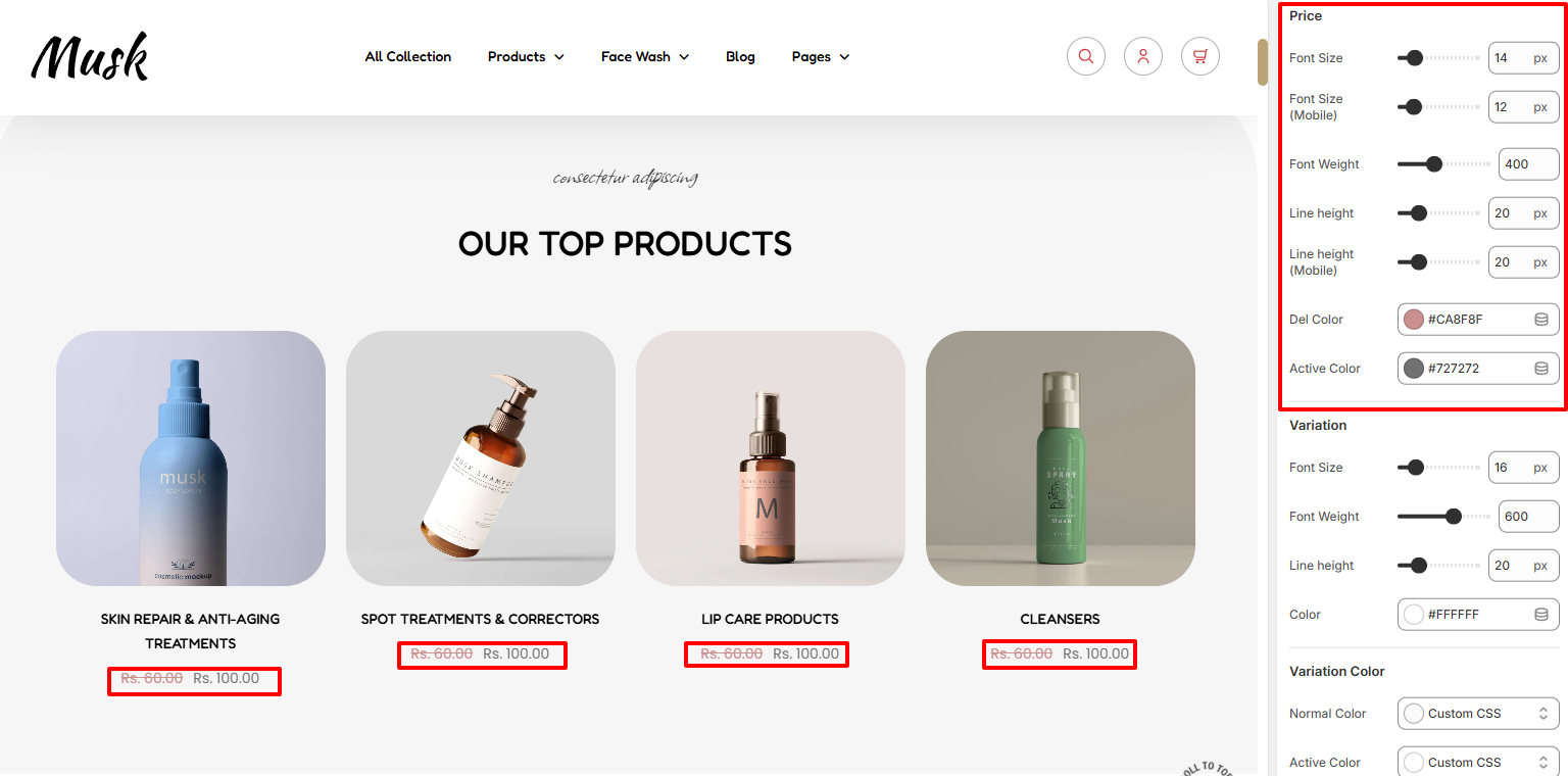
The Price region settings enable you to carry out styling adjustments to the prices rendered in terms of font size, font weight, and line height. In addition, you can also set the color to the active price as well as the markdown price.
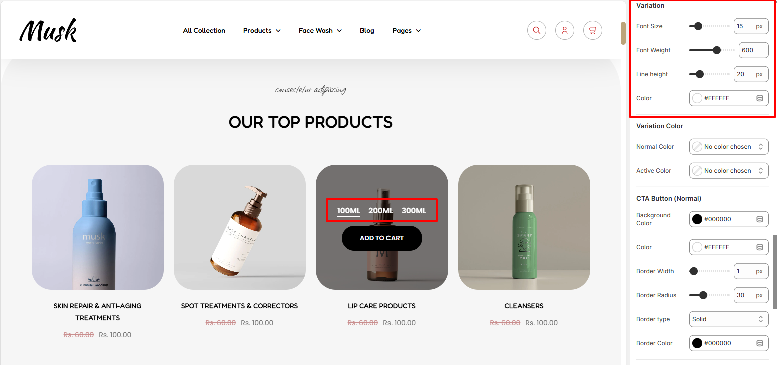
Within the Variation settings, here you can make various adjustments to the variations such as the font size, font height, line height, and color to the variation text.
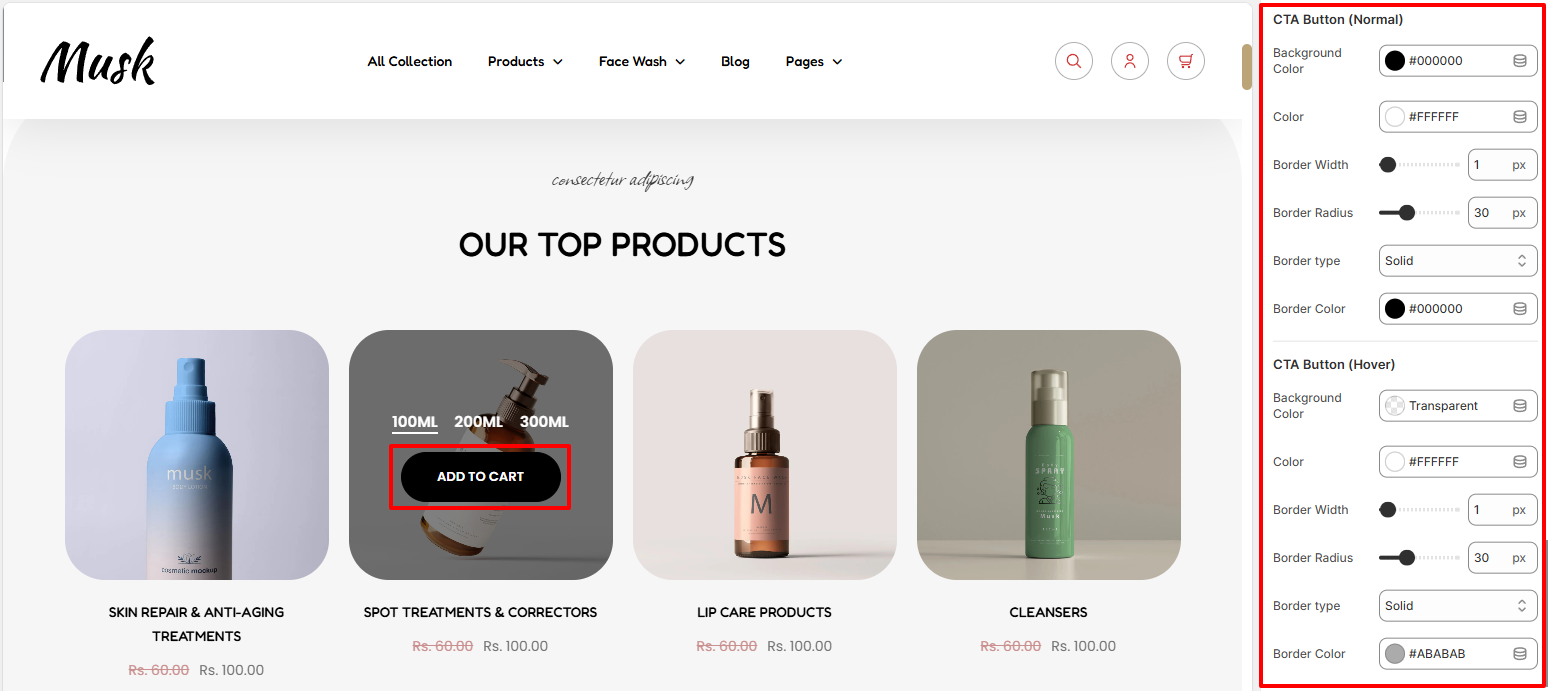
The CTA button settings enable you to set a background color border width, border radius, and border color to the CTA button, as well as a color to the text within the button, in both normal and hover states.
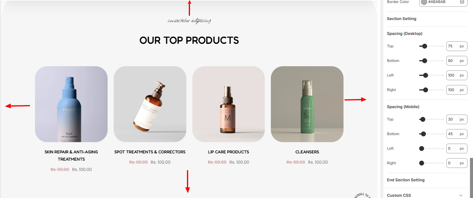
The Spacing settings enable you to add padding to the top, bottom, right, and left of the Top Collection section.