
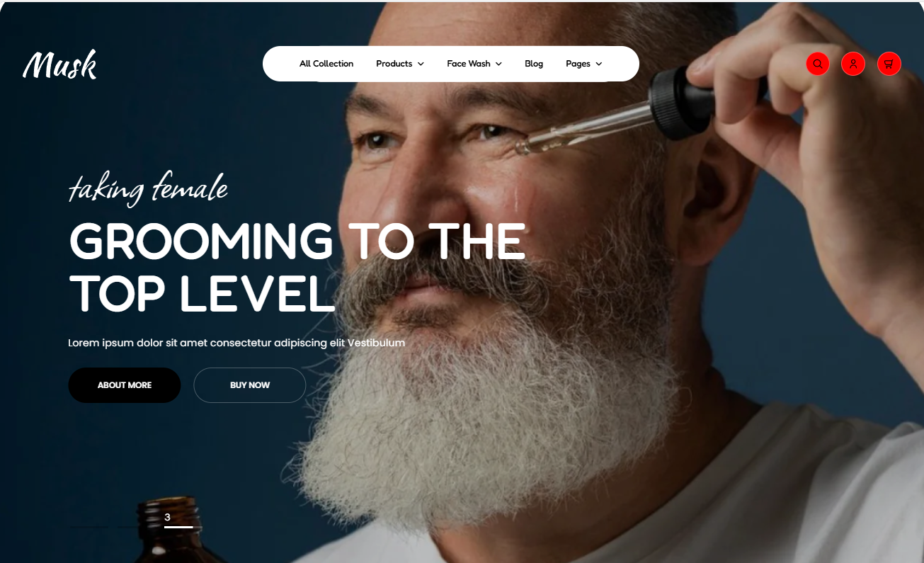
The hero banner helps in rendering visually engaging content in the form of slideshows within your site.
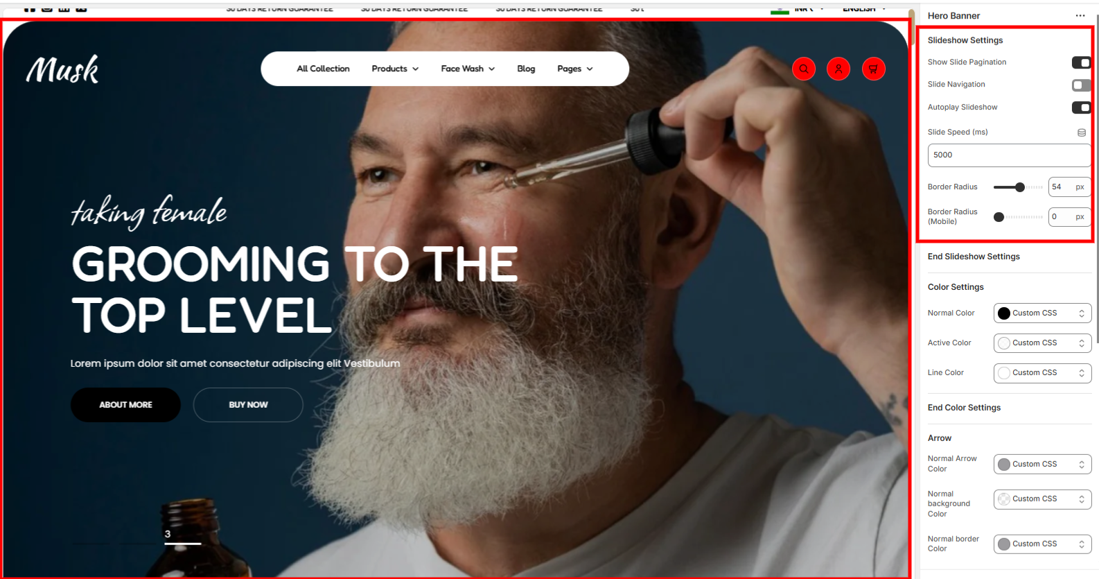
These are general settings that mainly apply to all slideshows within the Hero banner. These settings help in setting the slide pagination, enabling autoplay within the slideshow, setting the slides’ speed, and the border radius of the slideshow.
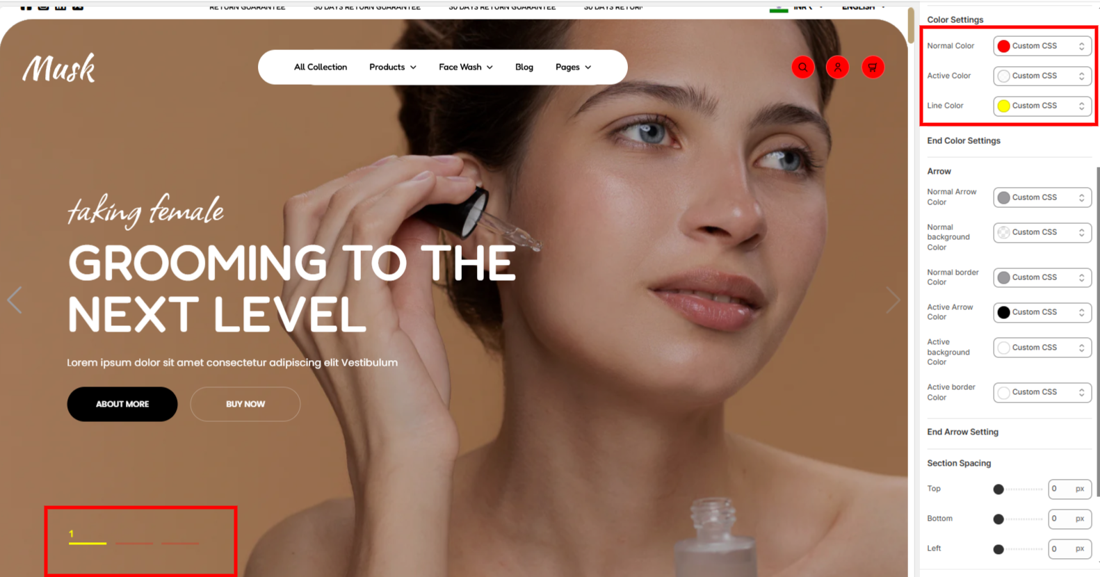
Adjusts the colors of the swiper pagination under both normal and active state.
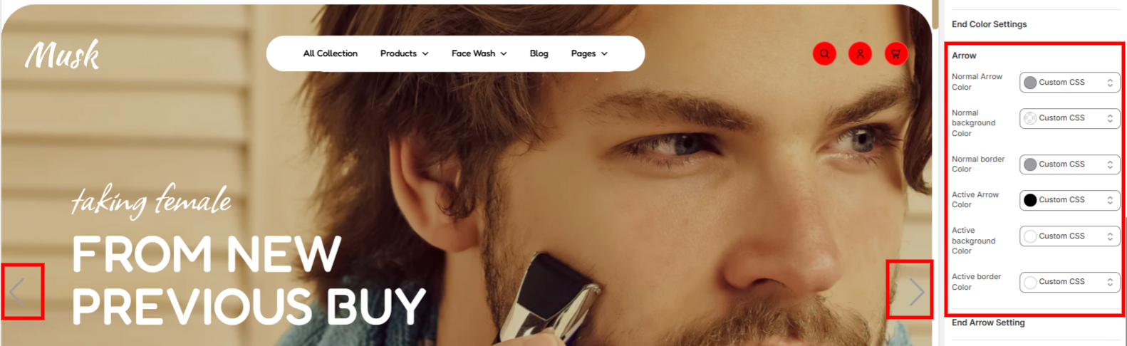
Arrow settings enable in configuring the colors to the arrows as well as the background color of the arrows in both normal and active state.
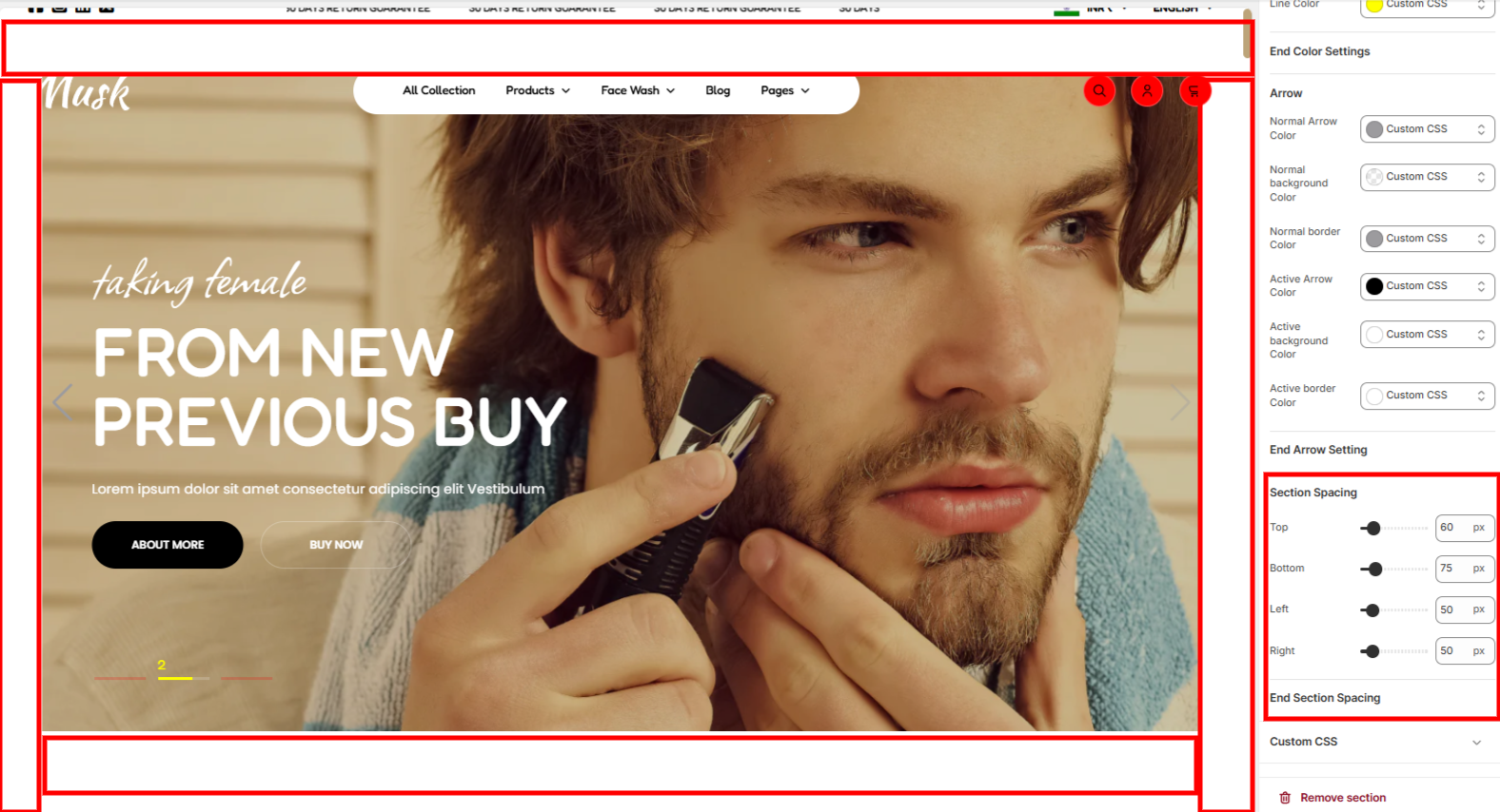
This section enables you to set your desired spacing around the Hero banner.
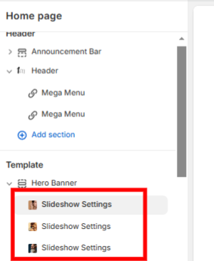
The Slideshow settings enable you to add content related to the individual slides in the Hero banner.
The Slideshow settings do contain various settings
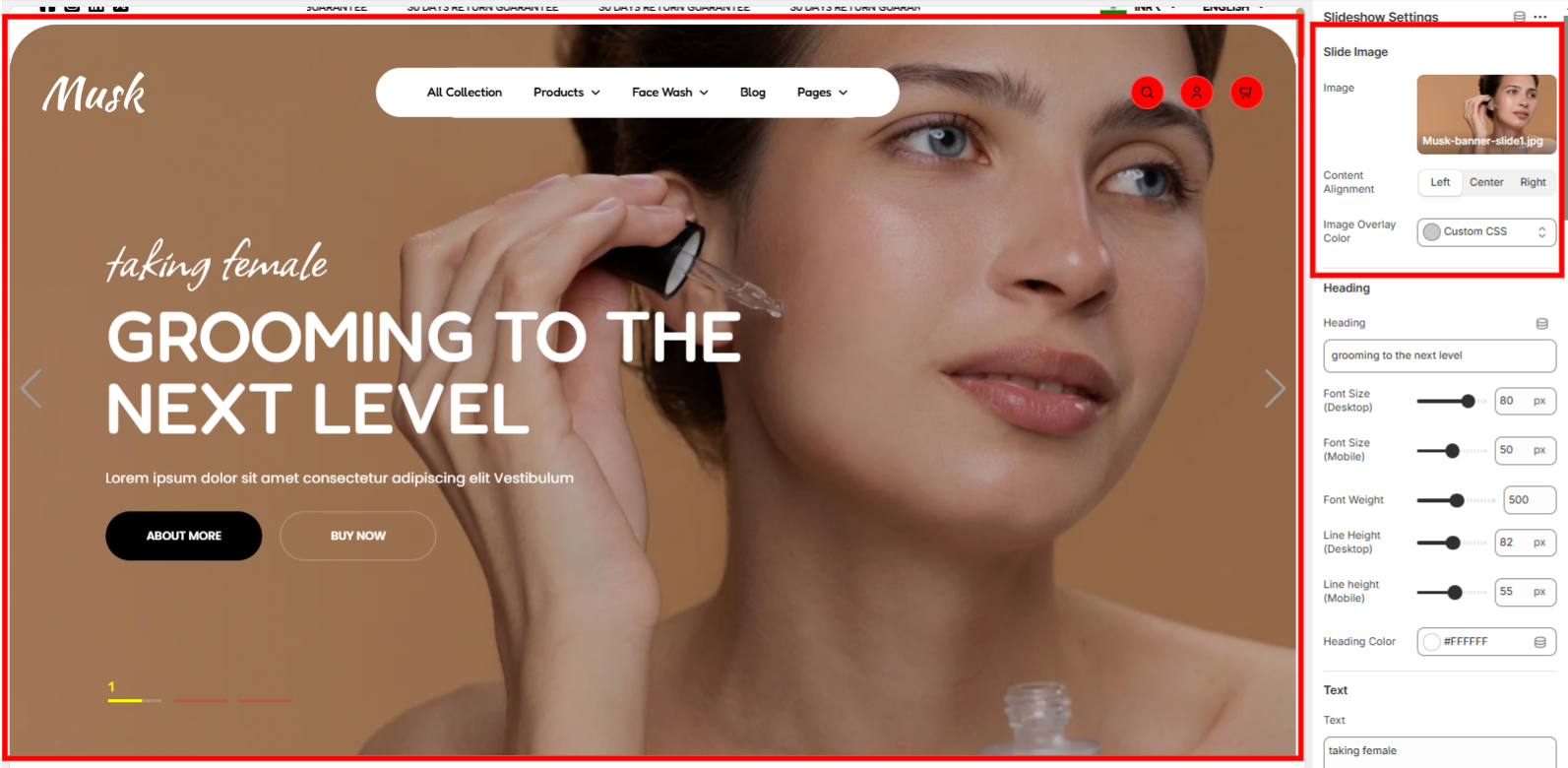
This section enables you to set a slide image, set the overlay color on the image as well as specify how its content will be displayed on the slide.
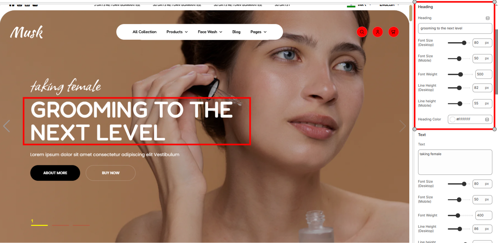
Used in setting the Heading text to be rendered in a slide and also style the text in terms of the font size, font weight, line height, and color.
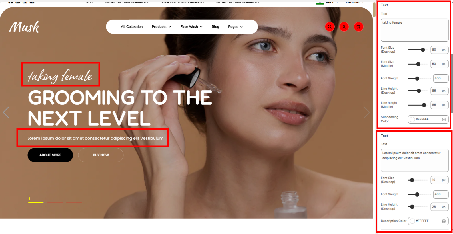
The text section holds two sections that enable you to add the subheading text rendered above the header and another the description text that is rendered below the header. You can also style the texts with the help of options available such as the font size, font weight, line height, subheading color, and description color.
The button setting contains two settings as the enable you add to buttons to the slideshow. These are Button Setting 1 and Button Setting Two.
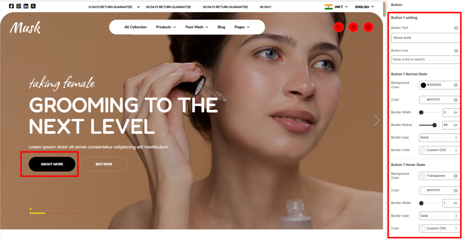
Within this setting, you can add your first button text and link, as well as add some styling to it in terms of color and border styling, under both normal and hover states.
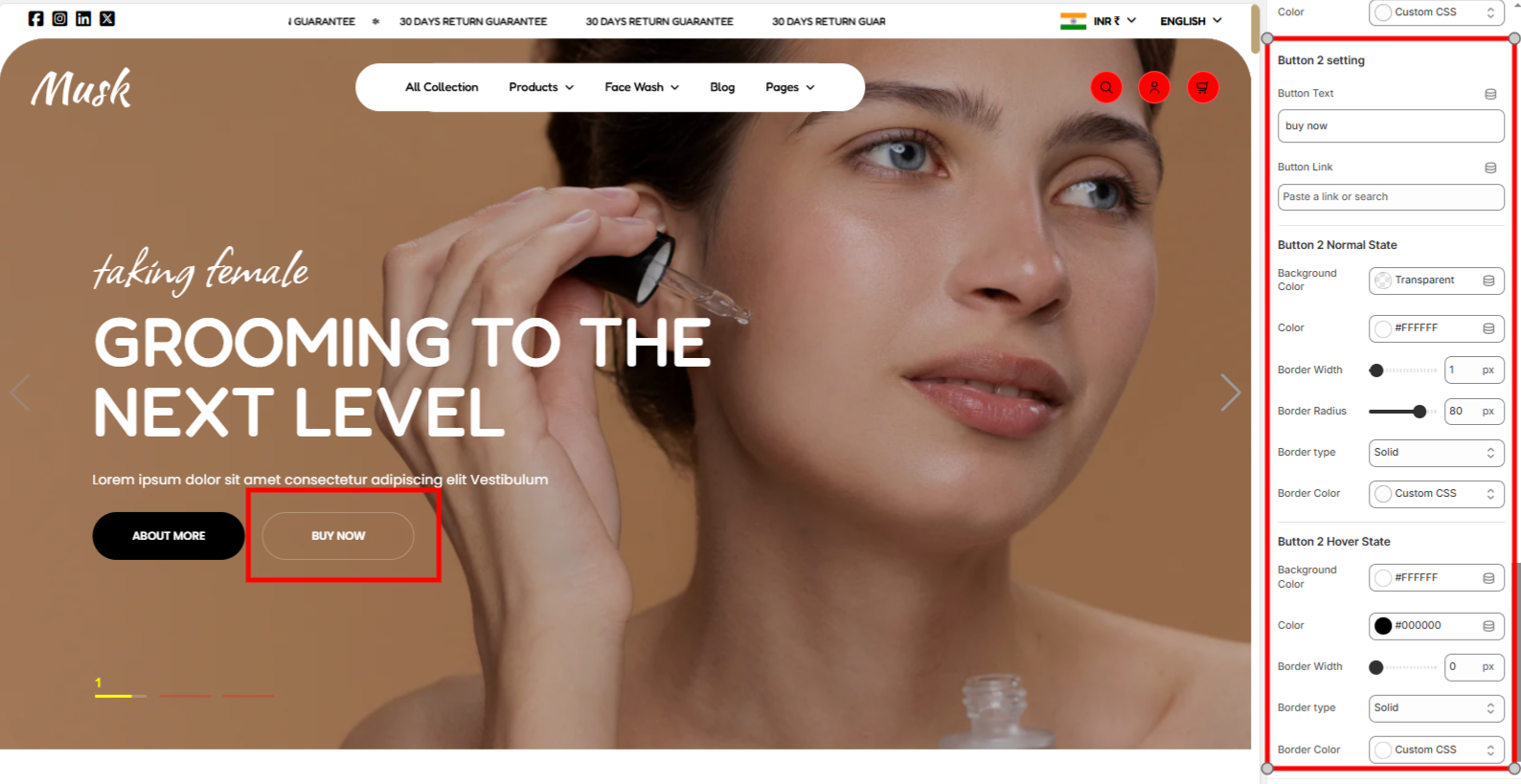
In the Button 2 setting, you can add your second button text and link, as well as add some styling to it in terms of color and border styling, under both normal and hover states.