
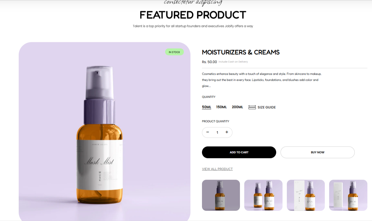
The Featured Product section enables you to display a product that you wish to highlight or feature within your store page in order to grab your customers’ attention.
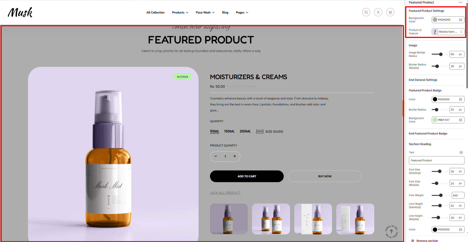
Within the Featured Product Settings, here you can specify the product that you wish to have featured as well as the background color to the whole section.
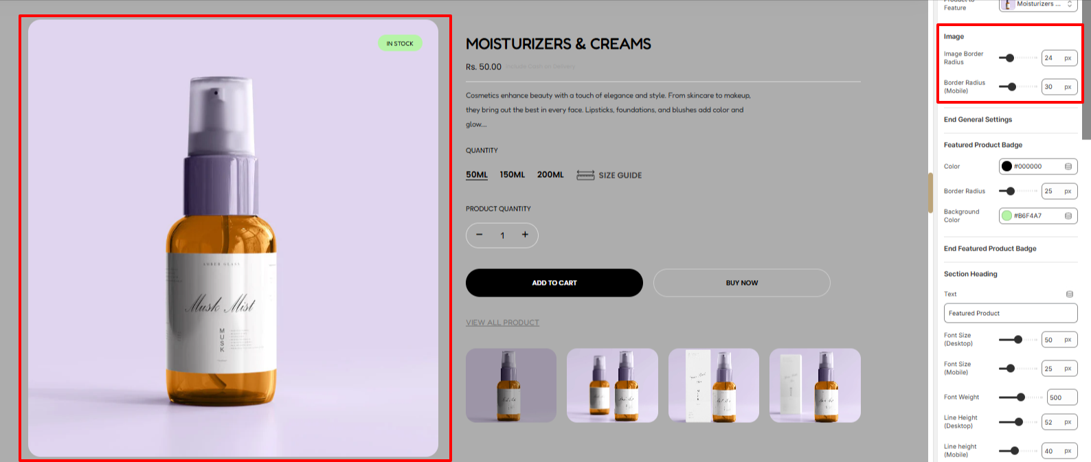
The Image settings enable you to set a border radius to the main image of the featured product.
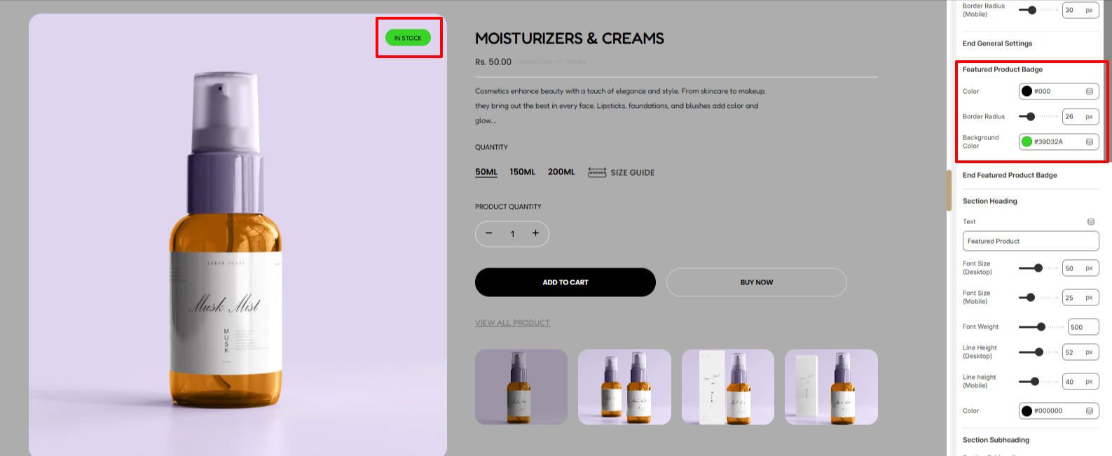
The Featured Product Badge settings help in setting a background color to the badge rendered on the Featured product, border radius, and the color of the text rendered within the badge.
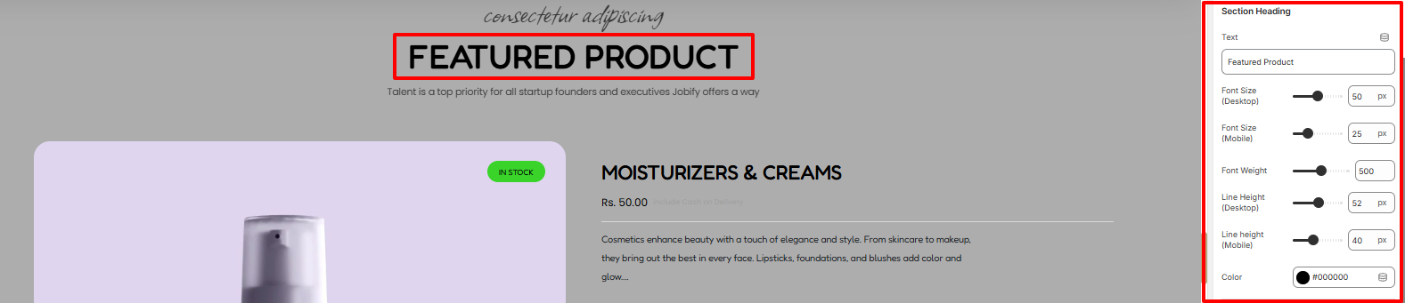
Within the section heading, here you can add your heading text as well as apply various styles to it such as the font size, font weight, line height and color of the text.
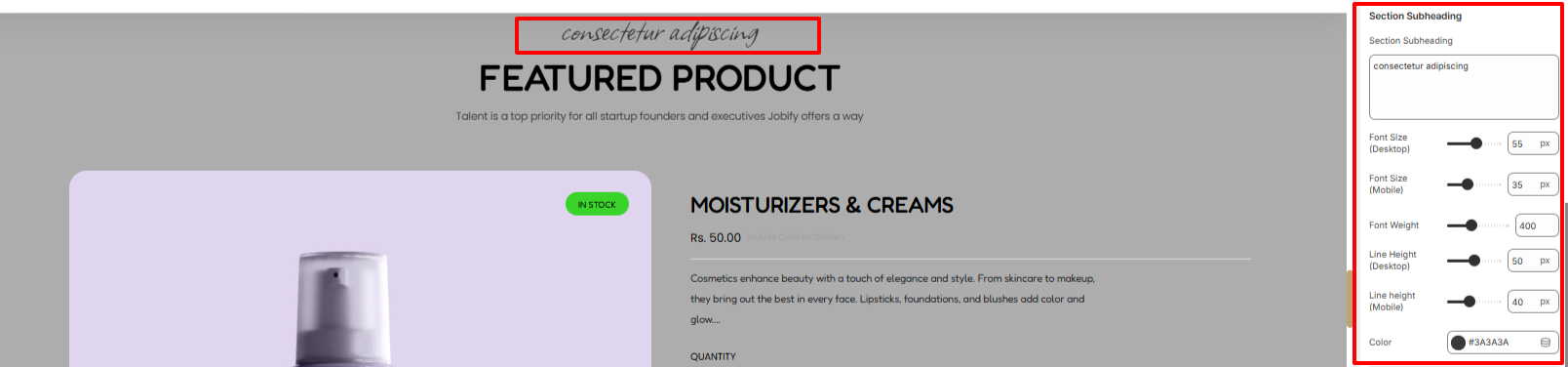
On the Section subheading region, here you can add your desired subheading text as well as apply various style adjustments to it in terms of font size, font weight, line height, and color of the text.
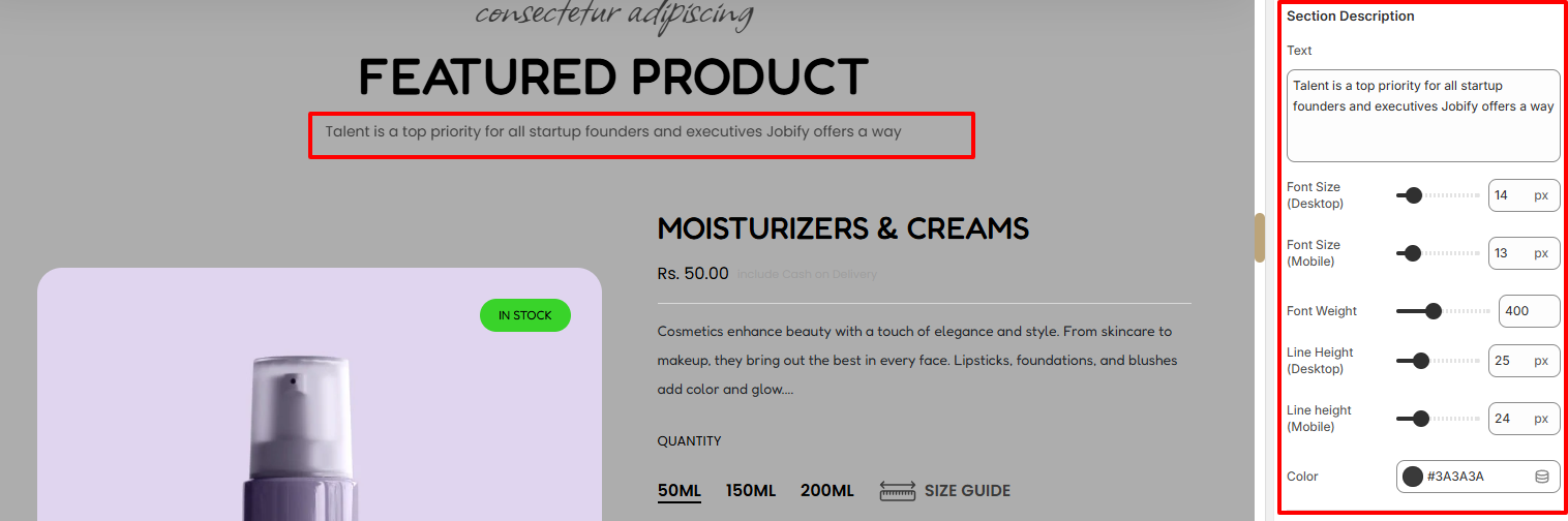
In the Section Description segment, here you can set the description to the Featured Product section and also apply various styling to it such as the font size, font weight, line height and color of the text within the region.
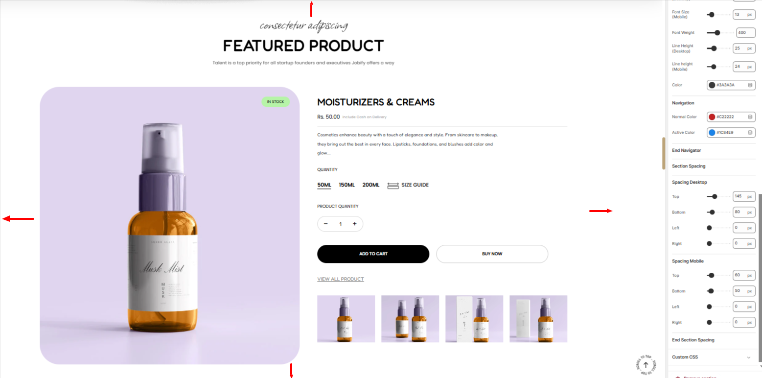
Adds padding to the Featured product on both desktop and mobile screens.
The Title Price Description block renders the Title, Price and Description of the Featured product.
There are various settings present within this specific block. These include:
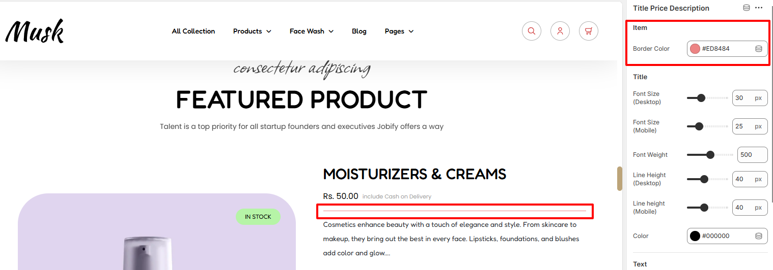
Within the Item setting here, you can set the border color of the border within the Title Price description.
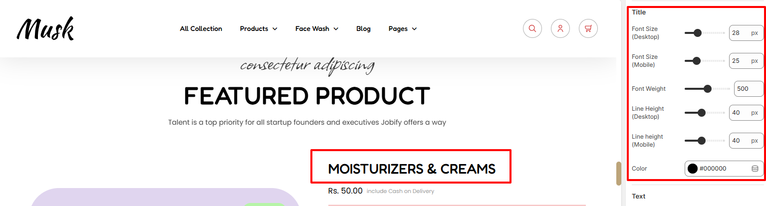
The Title region enables you to apply styling aspects such as font size, font weight, Line Height, and color to the Featured Product title.
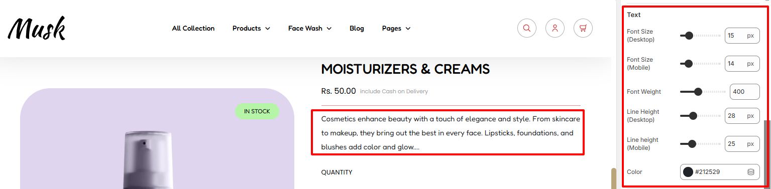
In the Text region, here you can apply styling aspects such as font size, font weight, Line Height, and color to the Featured Product description text.
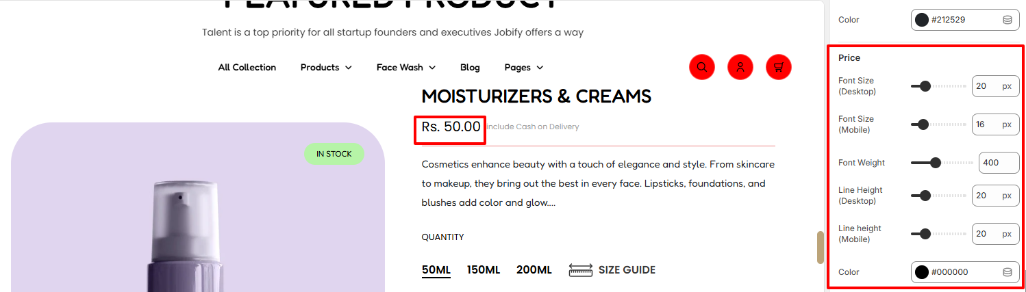
The Price region enables you to apply styling to the Price of the featured Product. Various styling can be applied such as the font size, font weight, line height and color.
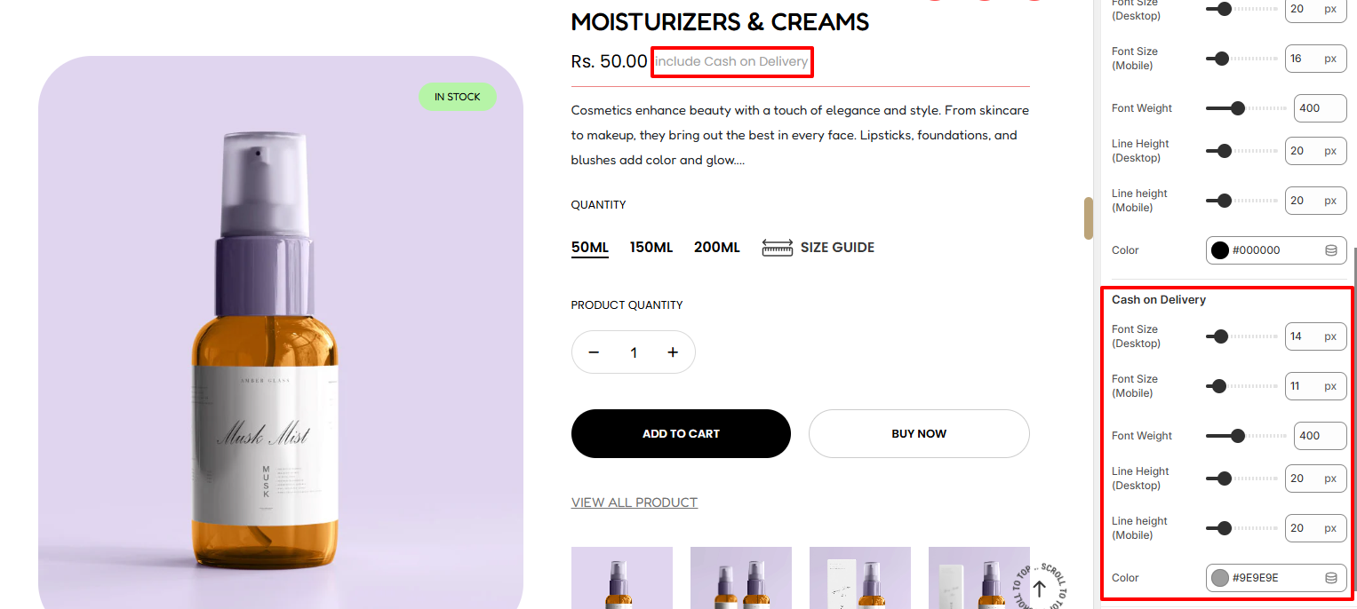
In the Cash On Delivery region, here you can apply various styling such as the color, font size, font weight, and line height to the Cach on Delivery text.
This block is used in rendering the variation details to the featured product.
There are various settings present within it. These Include:
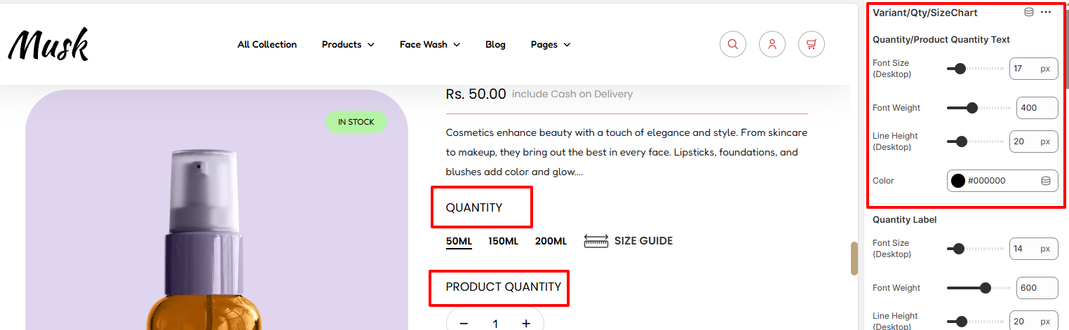
Within this region, you can define various styles for the Quantity & Product Quantity text. SOme of these styling aspects include the font weight, font size, line height, and color of the text.
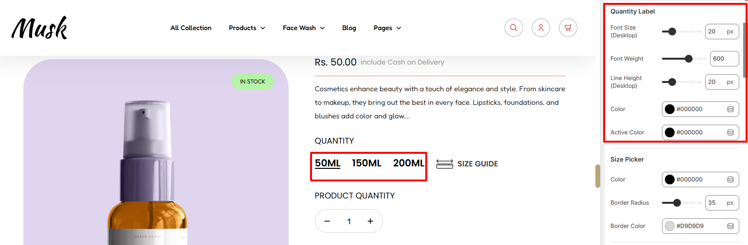
The Quantitly Label area provides options for you to adjust the font size, font weight, line height, and colors to the variants of the featured product.
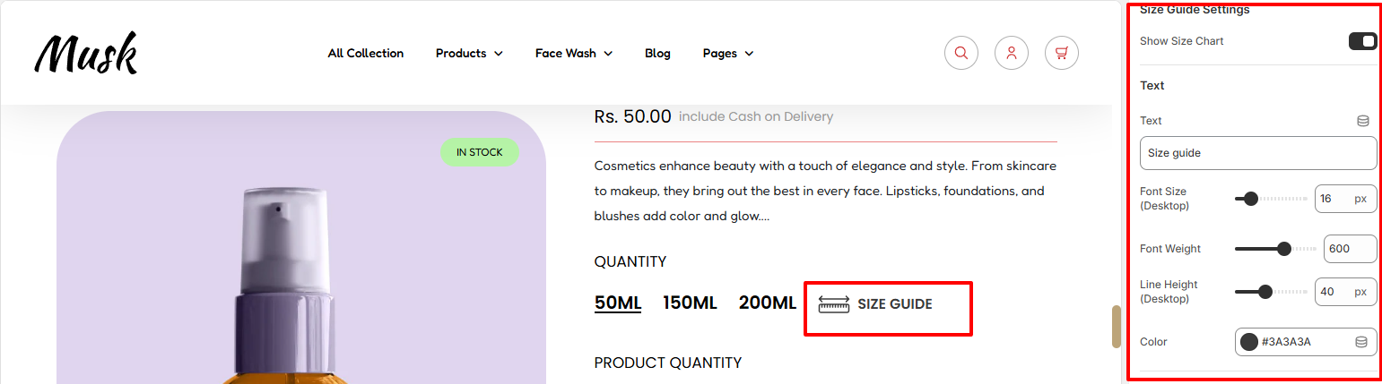
Within this region, you can set a sizing guide text, enable/disable the display of the sizing guide as well as carry out various text styling adjustments to the text. Some of these adjustments include the font size, font weight, Line Height, and color.
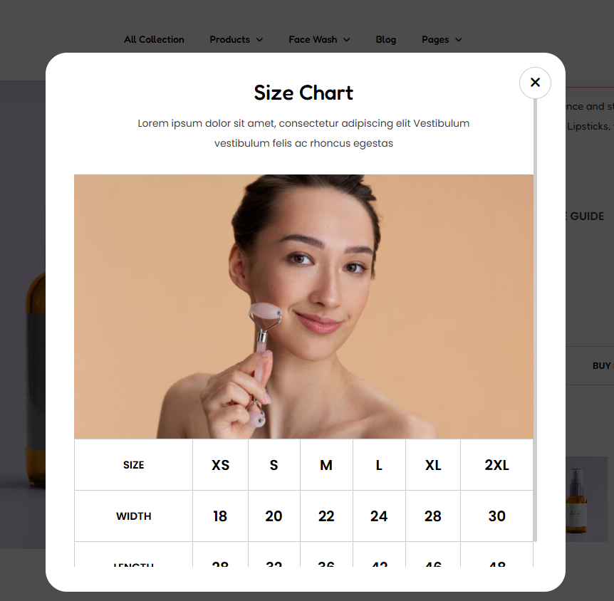
There are various settings used in modifying the popup. These include:
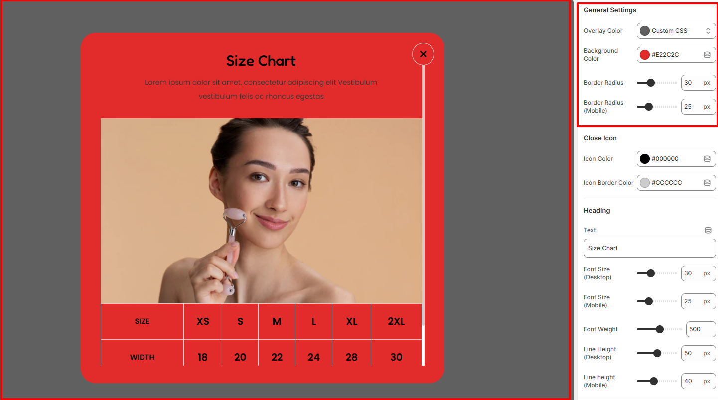
Within this region, you can set the overlay color, Background color, and border radius to the Size Chart Popup.
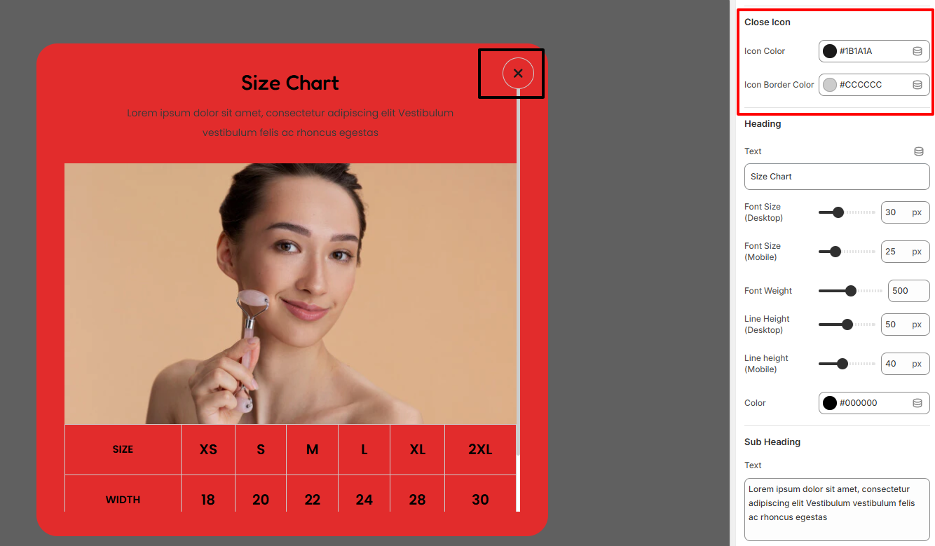
The Close Icon settings are used in modifying the color and border color of the close icon within the popup.
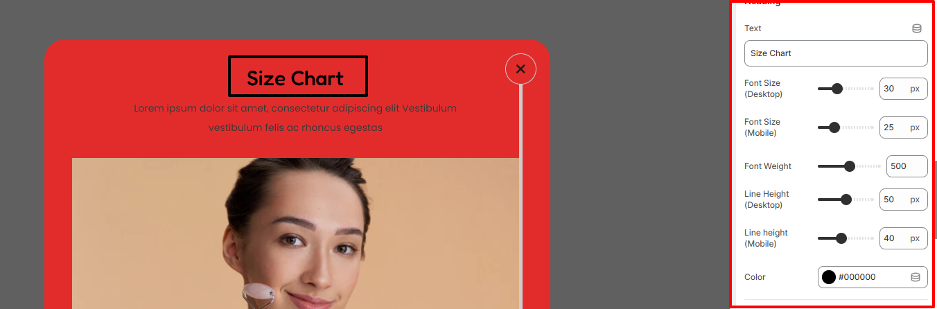
Within the Heading area, you can set the Size Chart heading text, as well as applying various styling aspects to it such as the font size, line height, font weight, and color.
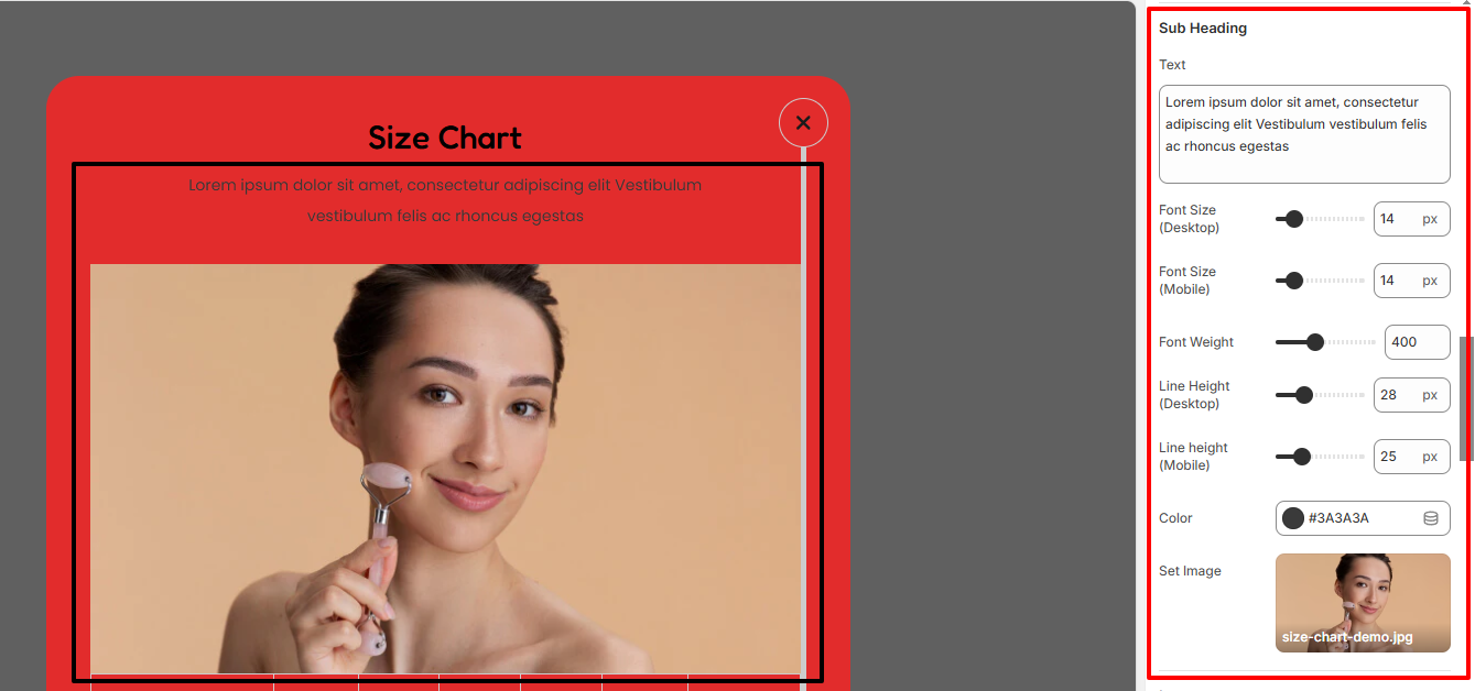
Within the Sub Heading region, here you can specify the text to be rendered as a sub-heading in the Size Chart, as well as the image.
In addition, you can set various styles to the subheading text such as the font size, font height, font weight, line height, and color.
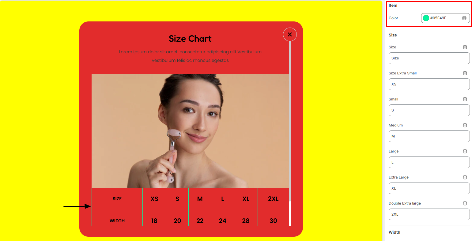
In the Item settings, you can set a color to your sizing chart popup details.
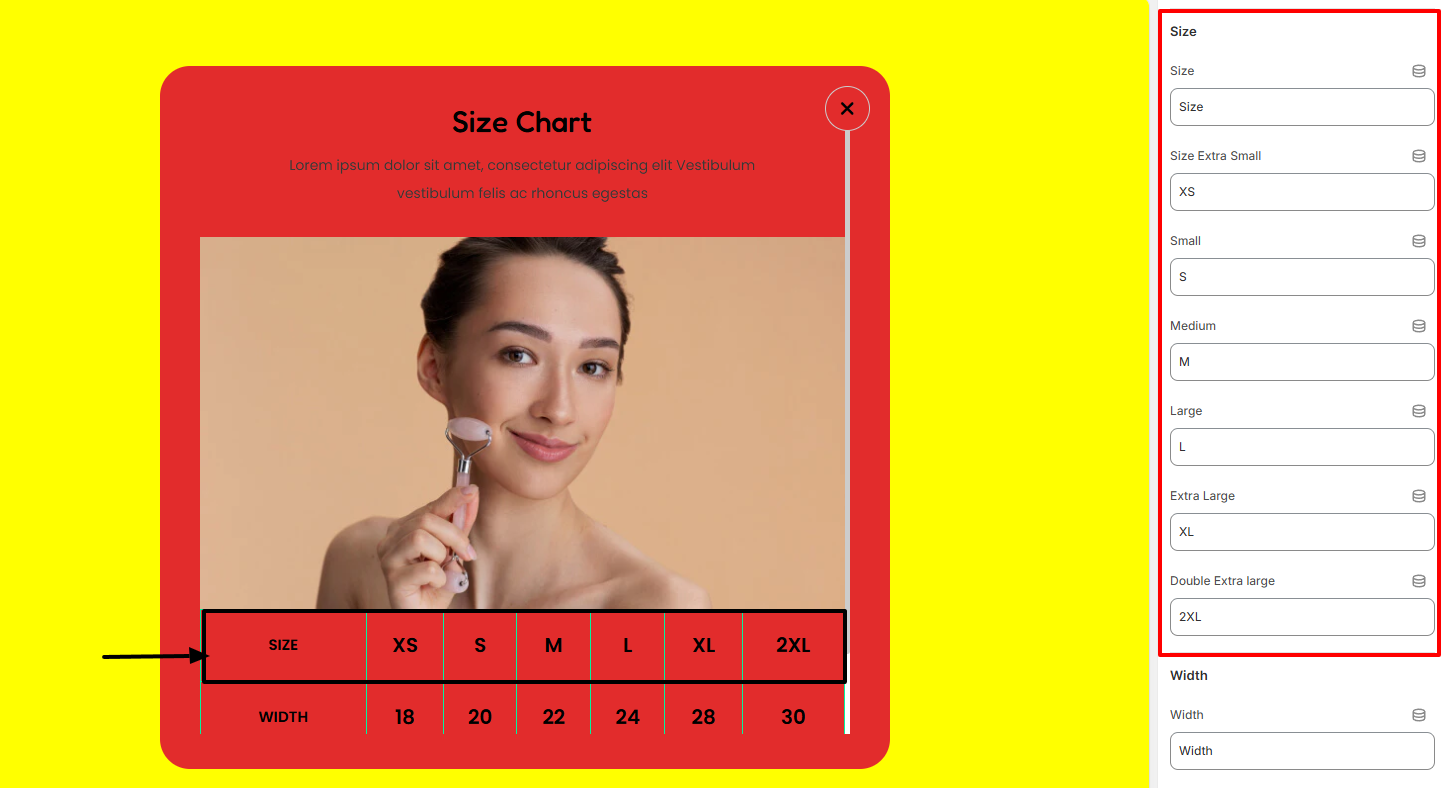
The Size region enables you to set various size details for your featured product size chart.
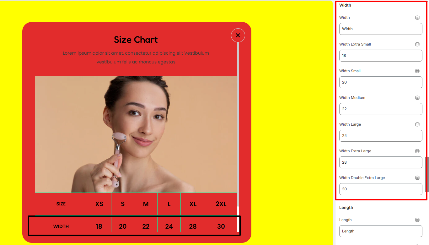
Within the Width section, here you can add the Width details about the Featured product within the size chart.
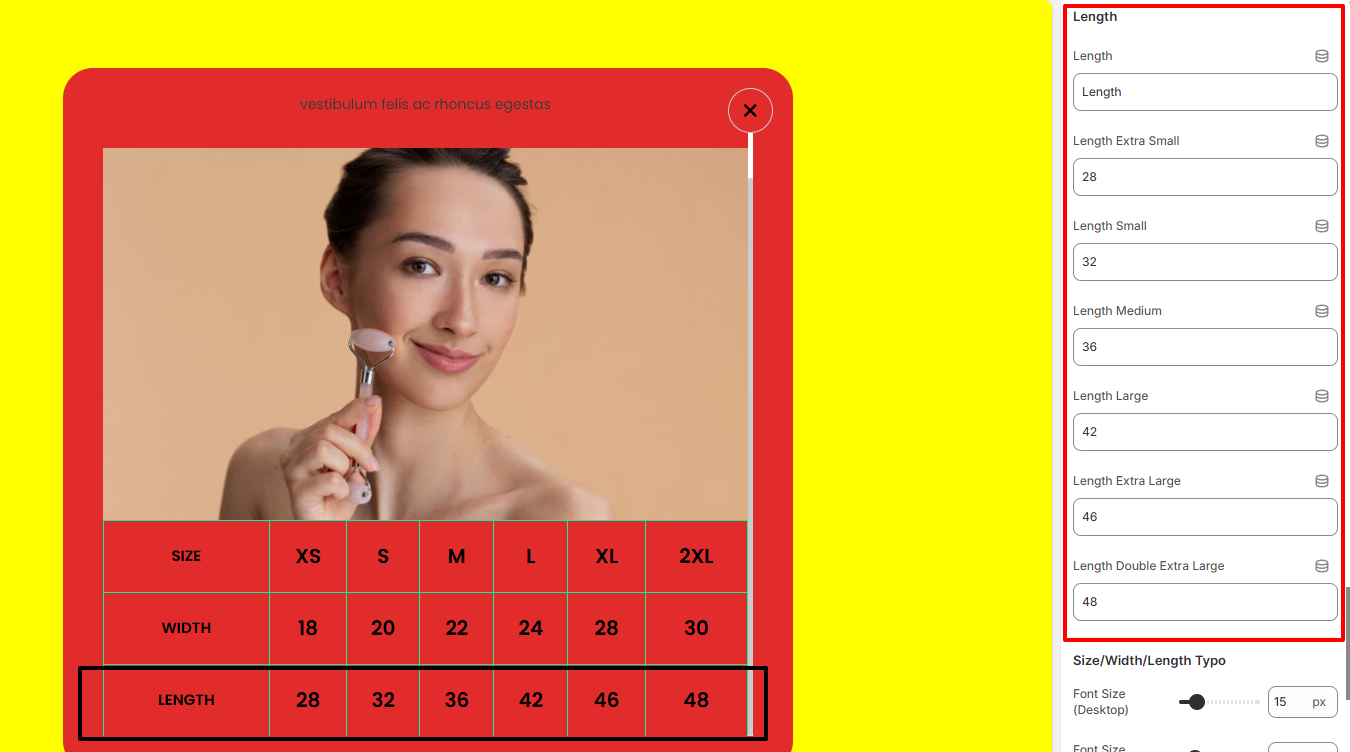
The Length section enables you to add length values for your featured product within the size chart.
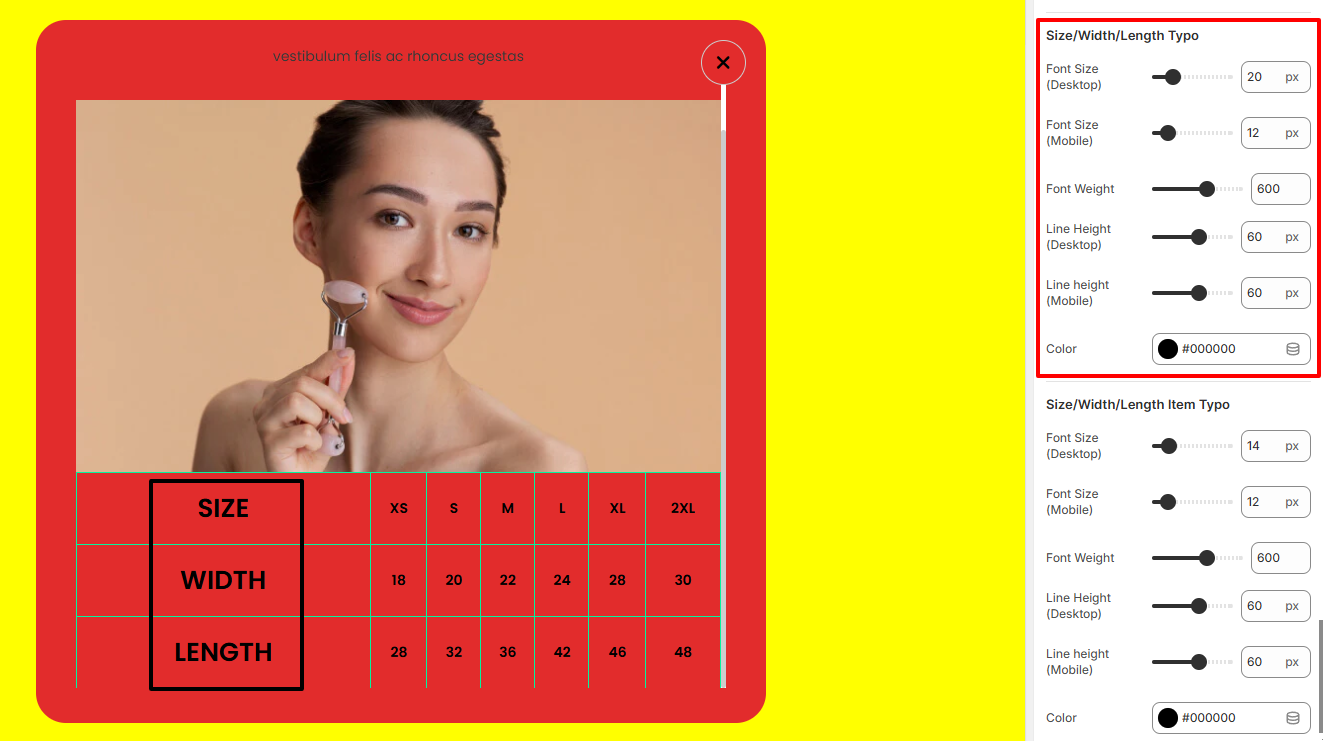
The Size/Width/Length Typo settings enable you to adjust the font size, font weight, line height and color of the Size, Width and Length texts.
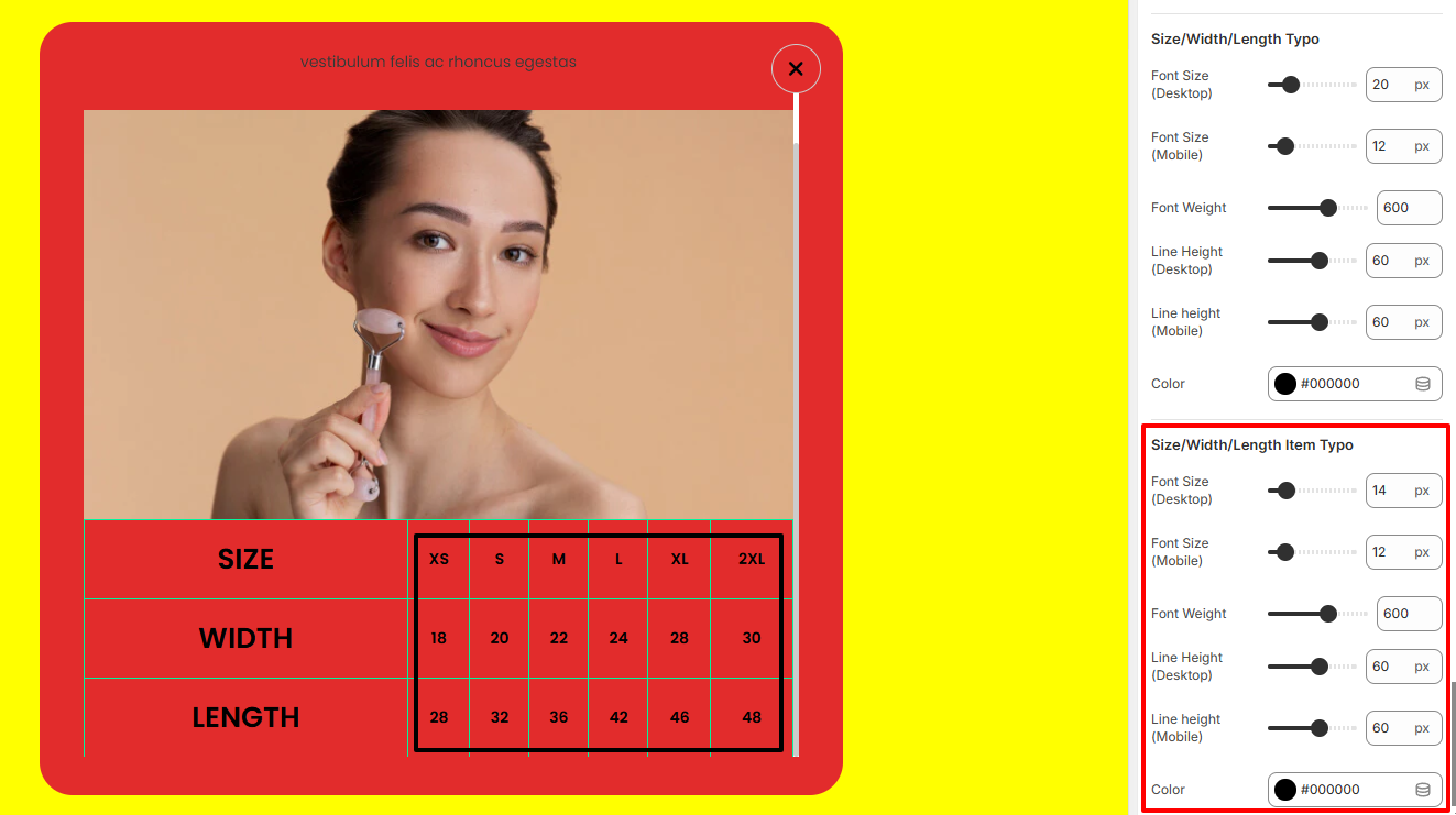
The Size/Width/Length Item Typo settings enable you to adjust the font size, font weight, line height, and color of the values within the Size, Width and Length.
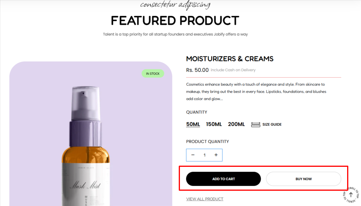
The Button Block adds two buttons to your Featured Product section. These are the “Add To Cart” and “Shop Now” buttons illustrated below:
The block includes various settings as outlined below:
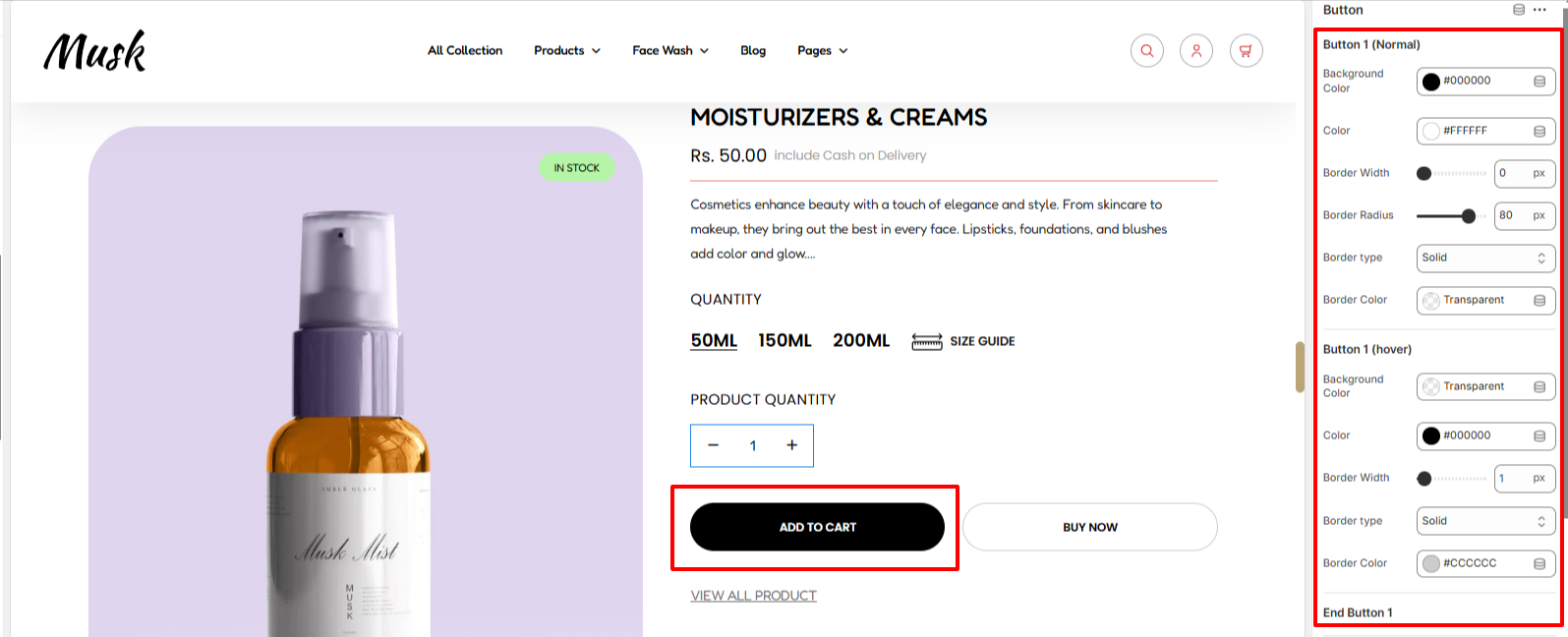
The settings here enable you to set a background color to the first button, text color to the button, border width, border type, and border color under normal and hover states. You can also set the border radius to the button in the normal state.
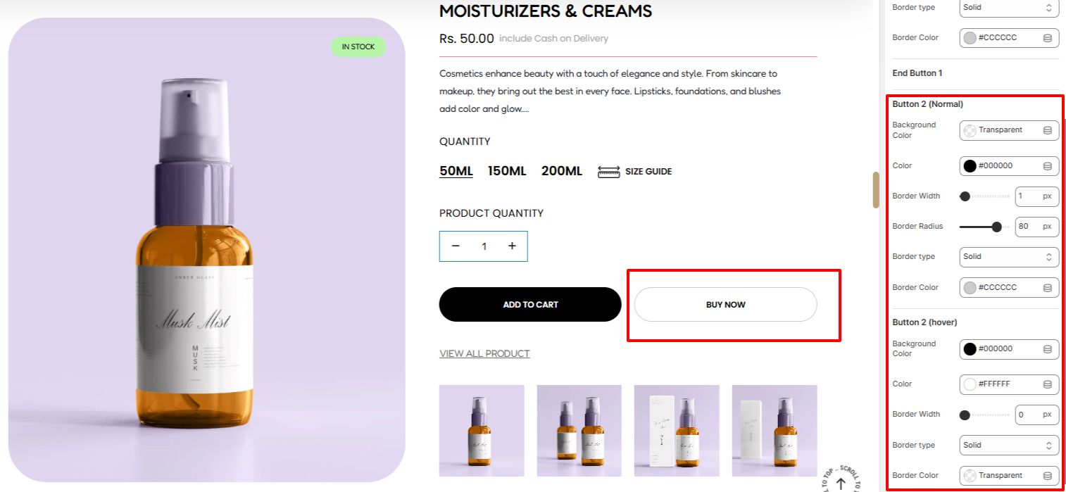
The settings here enable you to set a background color to the second button, text color to the button, border width, border type, and border color under normal and hover states. You can also set the border radius to the button in the normal state.
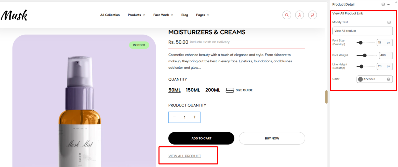
The Product Detail block enables you to add product detail text and apply various styling aspects to it such as the color of the text, font size, font weight, and line height.
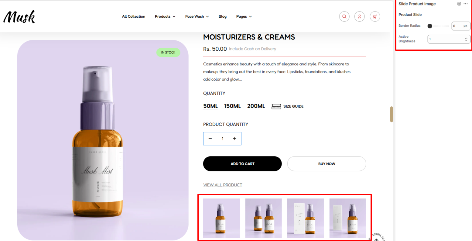
The Slide product Image settings enable you to set a border radius to the featured product slide images as well as adjust the brightness/opacity of the currently active slide image.