

The Our Values section can be used to point out the business values and highlight at least two collections.
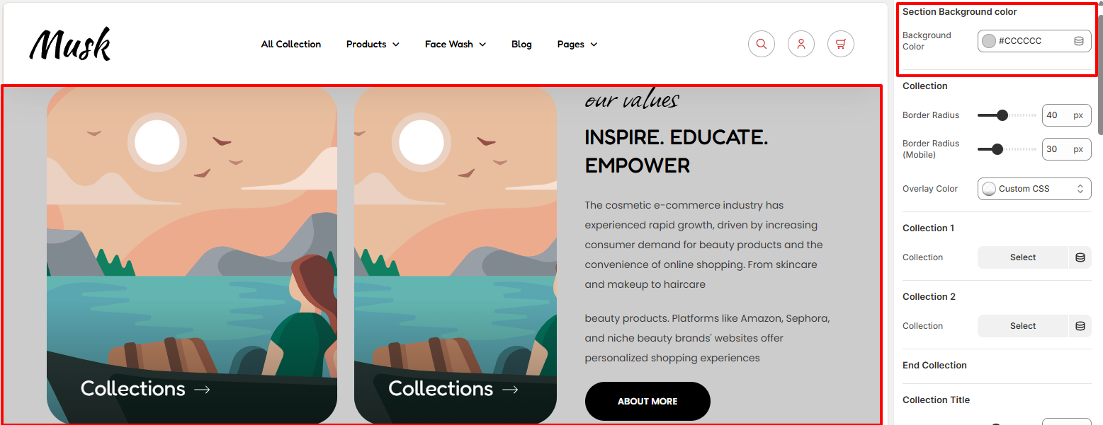
Within the Section Background color settings, here you can set the background color to the Our Values section.
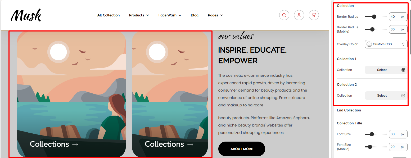
The Collection settings enable you to specify two collections within the section, as well as adjust the border radius and overlay color to the collections.
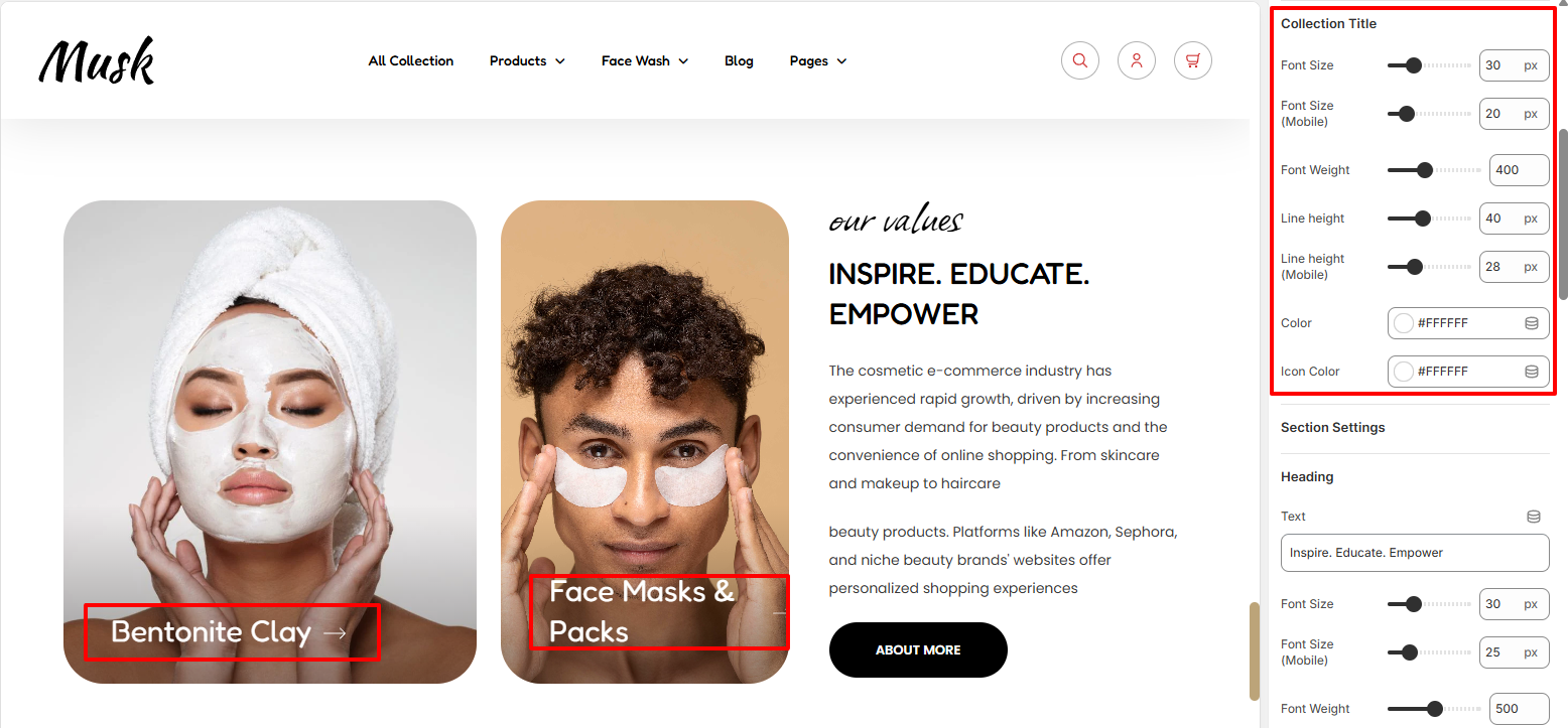
Within the Collection Title settings, here you can make adjustments to the Collection Title in terms of the font size, font weight, line height, color, and also the color of the icon next to the title.
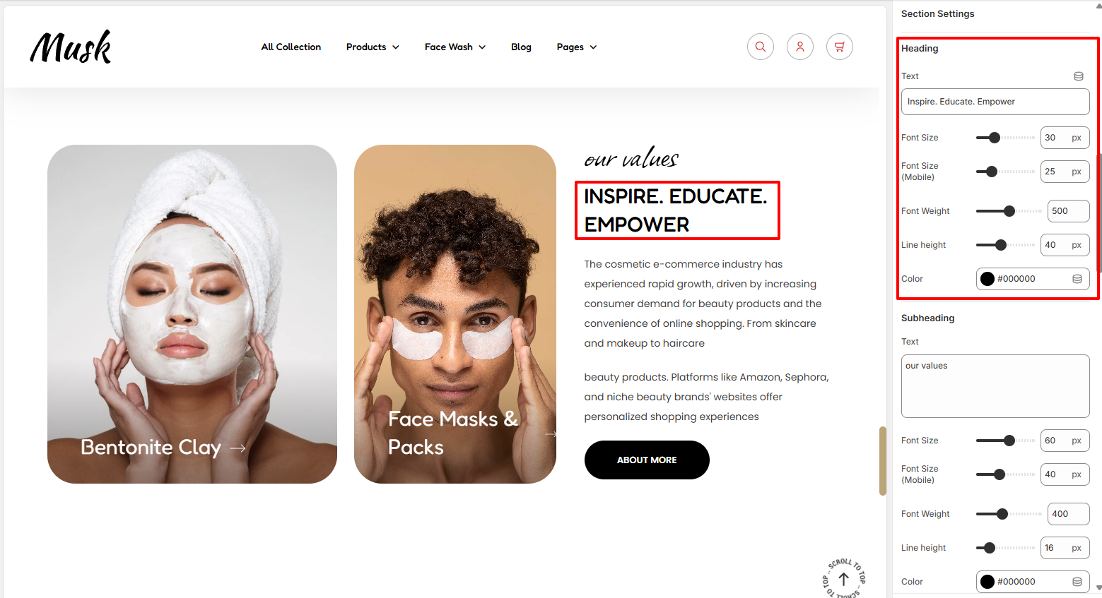
The Heading settings enable you to set your desired heading to the section as well as carry out adjustments to it in terms of the font size, font weight, line height, and color.
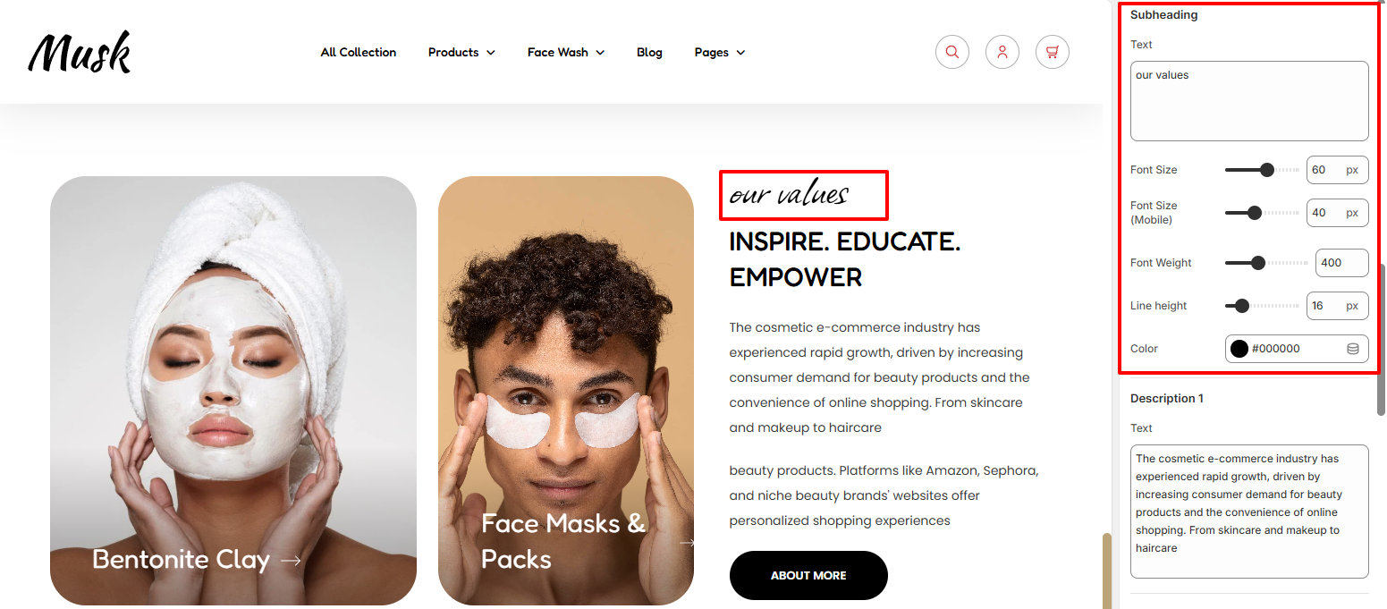
The Subheading settings enable you set your desired subheading text as well as make adjustments to it in terms of the font size, font weight, line height, and color.

Within the Description settings, here you can add your desired Descriptions and also carry out styling adjustments to them in terms of the font size, font weight, line height, and color.
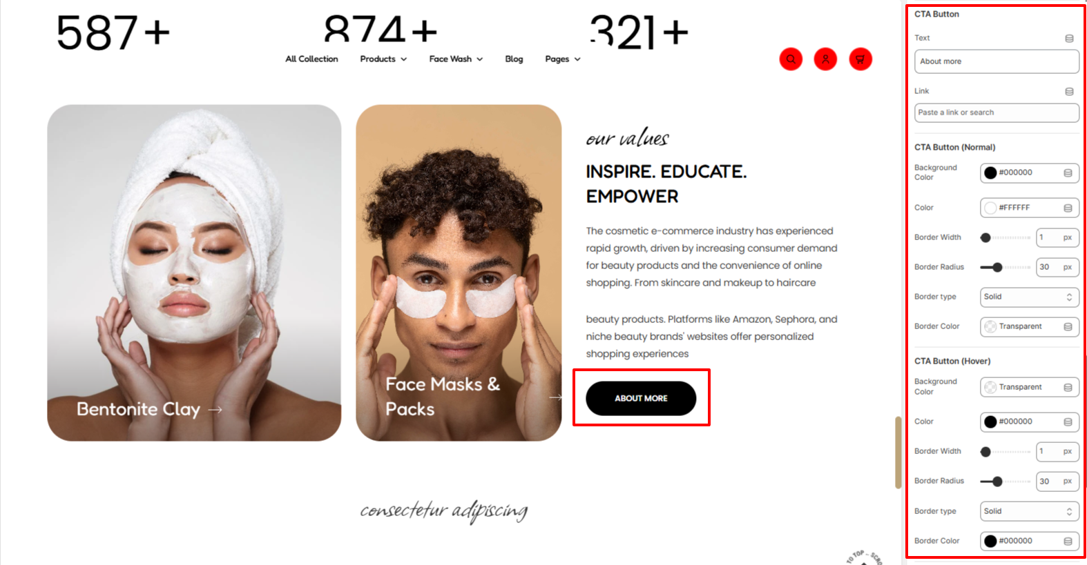
Within the CTA Button settings, here you can set your desired text to be rendered within the button as well as a link for the button.
In addition, you can set the color of the text within the button, as well as the background color of the button, border width, border radius, border type, and border color under normal and hover states.
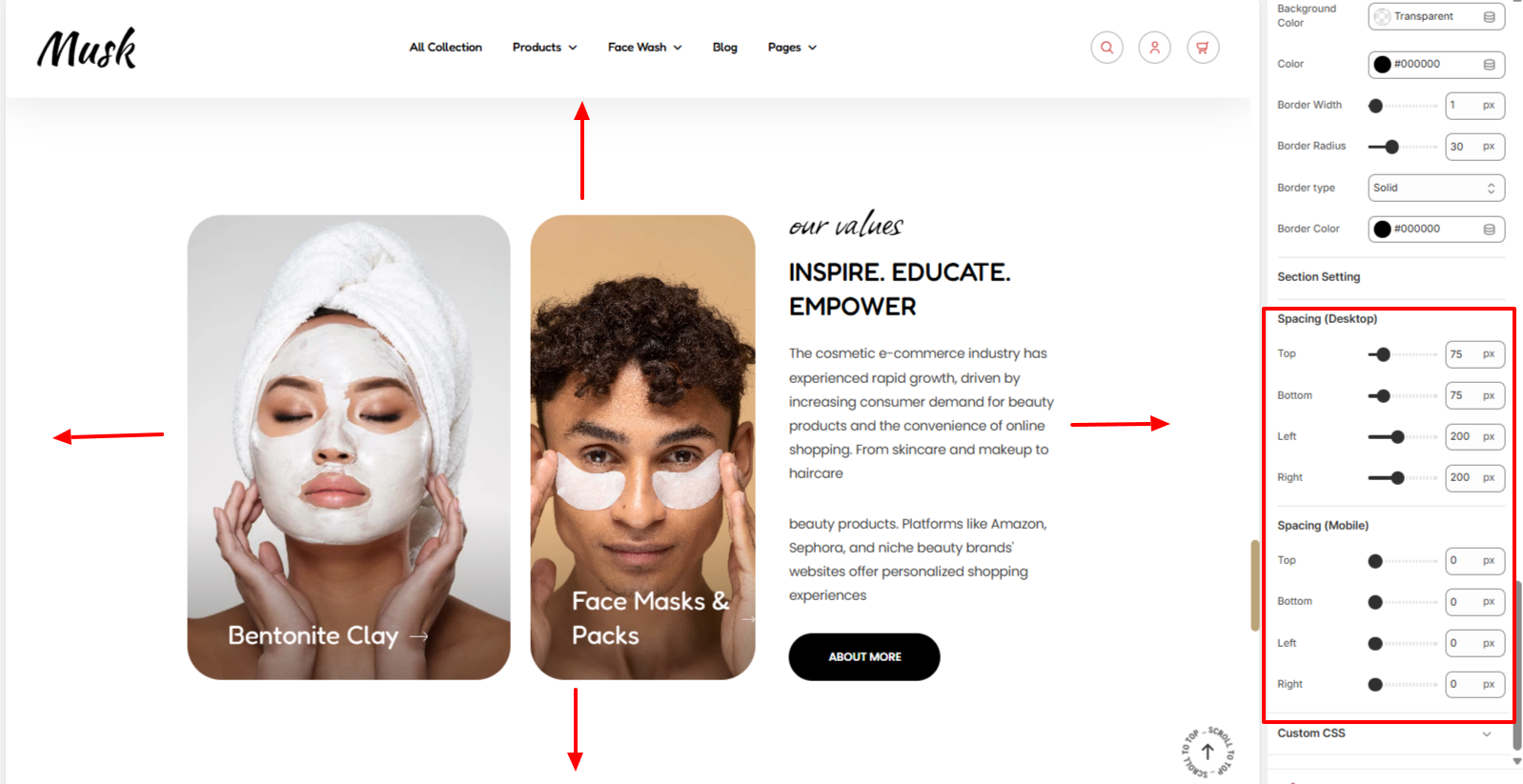
Within the Spacing settings, here you can set your desired padding to the Our Values section in both desktop and mobile devices.