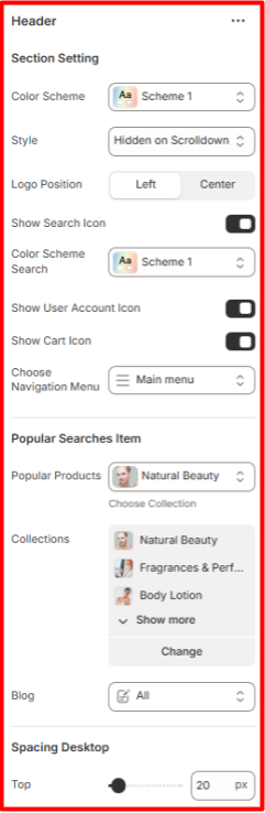
Header
Location- Customiser > Header > Header
Header Overview
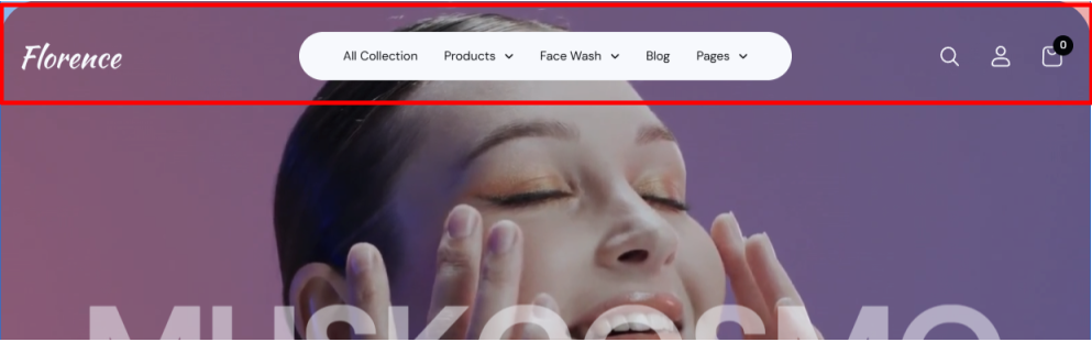
The header section is displayed at the top of your store pages. It is mainly used to render menu navigation items, the search icon, account icon, cart icon, and the logo.
Header Settings
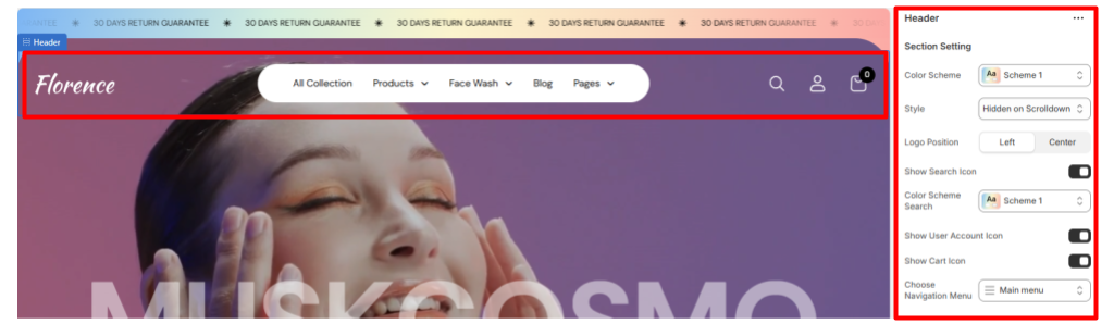
Section Settings
- Color Scheme: Enables you to select a pre-defined color scheme to be applied to your header.
- Style: Determines the behaviour of the Header on scroll.
- Show Search icon: Toggles the display of the search icon within the header.
- Show User Account Icon: Hide/Show the Account icon on the header.
- Show Cart Icon: Enable/Disable the Cart Icon display on the header.
- Choose Navigation Menu: Enables the selection of the menu to be rendered on the header.
Popular Searches Item
Within the setting here, you can choose which collection’s products will appear in the Popular Products section of the search dropdown, as well as select the collections and posts that will be displayed in the Collections and Latest Posts sections, respectively.
Spacing Desktop and Spacing Mobile
Controls the top and bottom spacing of the header section in both desktop and mobile views.
Mega Menu
Location- Customiser > Header > Header > Mega Menu
Mega Menu Overview
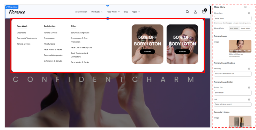
Mega Menu Settings
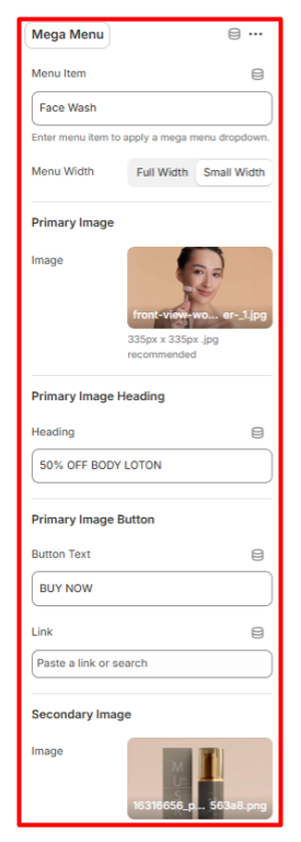
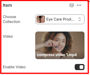
Mega Menu
- Menu Item: Set the menu item where you wish to have the mega menu field displayed.
- Menu Width: Define the width of the Mega Menu that you intend to have in place.
Primary Image
- Image: Enables you to set the image to be rendered as the first image in the mega menu, or rather, the main image
Primary Image Heading
Here, you can set the heading text to be rendered overlaying the primary image.
Primary Image Button
Set the button text and link for the button overlaying the main image.
Secondary Image
- Image: Here, you can set the image to the secondary mega menu image.
Secondary Image Heading
- Heading: Set the heading to be rendered overlaying the secondary mega menu image.
Secondary Image Button
Here, you can set the text and link for the button overlaying the mega menu secondary image.
Hero Banner
Location- Customiser > Template > Hero Banner
Hero Banner Overview
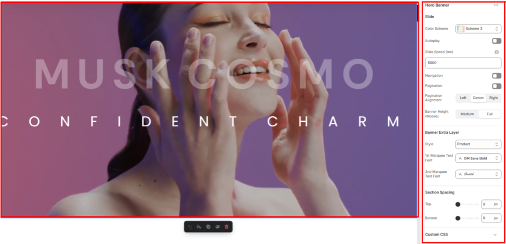
The hero banner helps in rendering visually engaging content in the form of slideshows within your site.
Hero Banner Settings
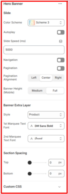
Slide
In this section, you can customize the Hero banner’s color scheme, enable autoplay, adjust slide speed, toggle navigation and pagination visibility, set pagination alignment (if enabled), and choose between a medium or full banner height on mobile devices.
Banner Extra Layer
The setting here is used to display an extra layer of either product or marquee blocks over the Hero banner. You can also set the font of the first and second Marquee fonts.
Section Spacing
Controls the top and bottom padding of the Hero banner section on both Desktop and Mobile views.
Slide
Location- Customiser > Template > Hero Banner > Slide
Slide Overview
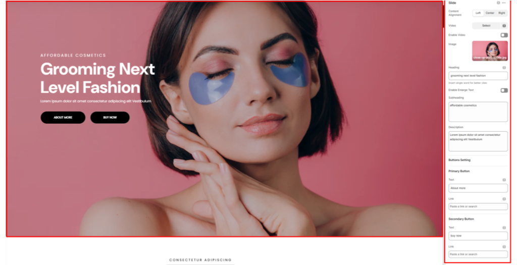
This block allows you to set either an image or a video for the slide, add content over it, and define the content’s alignment.
Slide Settings
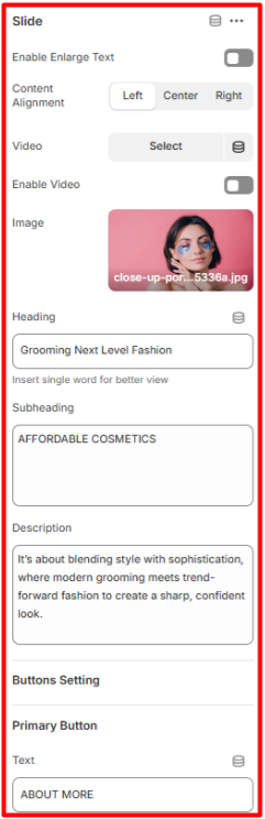
Slide
- Content Alignment: Defines the positioning of the content overlaying the slide.
- Video: Here, you can set a video to be rendered on the slide.
- Enable Video: Toggles the video rendering if a video is uploaded in the Video field.
- Image: Within this field, you can set the slide image.
- Heading: Here you can set the header text to be rendered on a slide.
- Enable Enlarge Text: When enabled, it increases the size of the text rendered on the slide.
- Subheading: Here you can set the text to be rendered beneath the header.
- Description: This field enables you to add descriptive text overlaying the slide.
- Button Settings: Here you can set the text and links for the primary and secondary buttons that appear as an overlay on the slide.
Marquee 1
Location- Customiser > Template > Hero Banner > Marquee 1
Marquee 1 Overview
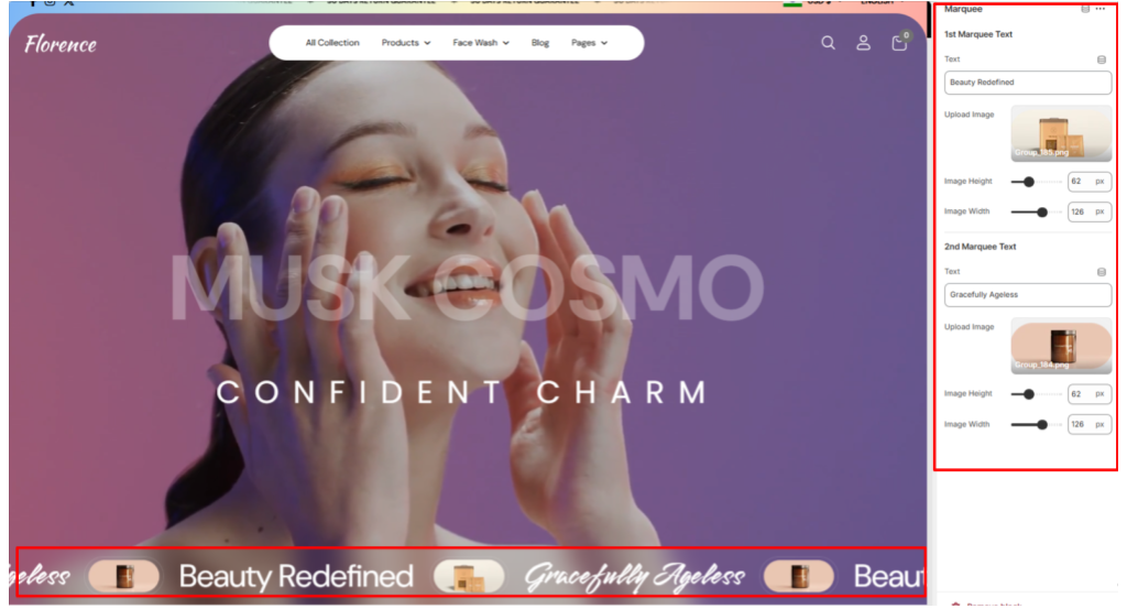
The Marquee block is rendered as an extra layer within the Hero banner when the Banner Extra Layer is set to “Marquee”.
Marquee 1 Settings
Marquee
- 1st Marquee Text: Here you can define the first marquee text and image to display, along with your preferred image size.
- 2nd Marquee Text: The settings here enable you to define your second marquee text and image to display, along with your preferred image size.
Product
Location- Customiser > Template > Hero Banner > Product
Product Overview
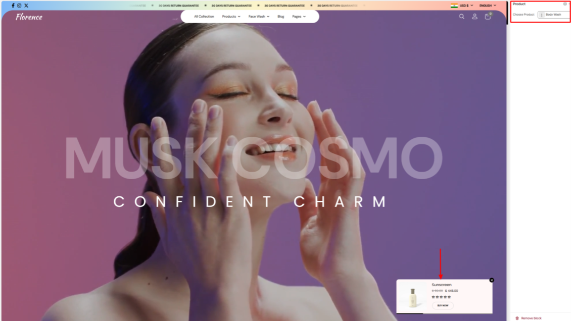
The product block is rendered when selected as an extra layer within the Hero banner. Within the block, you can select the product that you wish to be rendered.
Product Settings
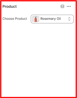
Product
- Choose Product: Here you can select the product you wish to display on the menu
Marquee 2
Location- Customiser > Template > Marquee 2
Marquee 2 Overview
This section enables you to create a dynamic scrolling text/image area designed to highlight key brand messages, slogans, or promotional statements in an eye-catching way.
Marquee 2 Settings
General Settings
- Color Scheme: Enables you to choose the color scheme (e.g., Scheme 1 or Scheme 2) to define the text and background colors of the marquee.
- 1st Marquee Text Font: Sets the font family of the initial text to be displayed in the marquee section.
- 2nd Marquee Text Font: Allows you to set the font family of the secondary text to be displayed in the marquee section.
- Font Size: Enables you to adjust the size of the text within the marquee for better readability and visual impact.
Slider Settings
- Autoplay: Enables or disables the automatic scrolling of the marquee text.
- Slide Speed (ms): Sets the speed of the Marquess contents scroll in milliseconds. Lower values result in faster scrolling.
- Slide Speed (Mobile): Adjusts the scroll speed specifically for mobile devices, ensuring optimal performance and readability.
- Auto Rotate Image: Enables or disables the automatic rotation of any marquee item images.
- Spacing (Desktop and Mobile): Controls the top and bottom spacing of the marquee section on both desktop and mobile views, respectively, to control its vertical positioning.
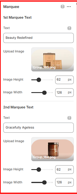
Marquee 2 Item
Location- Customiser > Template > Marquee> Item
Marquee 2 Item Overview
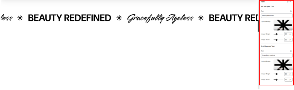
Marquee 2 Item Settings
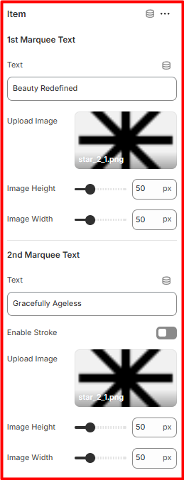
1st Marquee Text
- Text: Here, you can set the initial Marquee text to be rendered.
- Upload Image: Within this field, you can upload an image to be rendered next to the initial Marquee text.
- Image Height and Image Width: Within these fields, you can set the width and height of the initial image uploaded.
2nd Marquee Text
- Second Marquee Text: This option allows you to specify the text to be displayed as the second Marquee entry.
- Upload Image: Use this field to add an image that will appear alongside the second Marquee text.
- Image Height and Image Width: These fields enable you to define the height and width dimensions for the image associated with the second Marquee image.
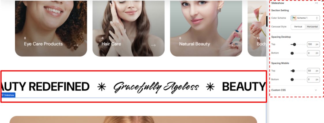
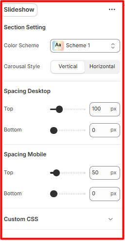
Slideshow
Location- Customiser > Template > Slideshow
Slideshow Overview

The Slideshow section is designed to showcase content on your site in an eye-catching manner.
Slideshow Settings
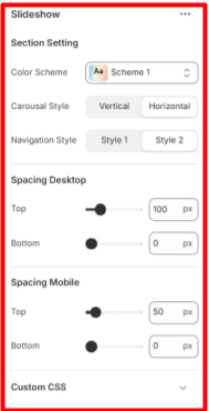
Section Settings
- Color Scheme: Here, you can select the color scheme to define the background and text colors of the slideshow.
- Carousel Style: Within this field, you can choose your desired orientation of the slideshow carousel (e.g., Horizontal or Vertical) to control the direction of slide transitions.
- Spacing (Desktop and Mobile): These settings adjust the top and bottom spacing of the slideshow section on both desktop and mobile views.
Slide
Location- Customiser > Template > Slideshow > Slide
Slide Overview
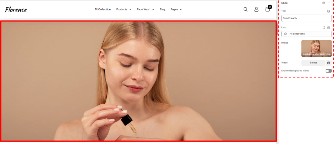
Slide Settings
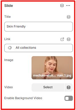
Slide
- Title: Here you can add the text that will overlay the slide image, which is rendered at the bottom of the slideshow.
- Link: Within this field, you can provide a link to the text added to the slide from the content on your site. Image: This field allows you to specify the image to be rendered on the slide.
- Video: Here, you can specify a video to be rendered on the slide.
- Enable Background Video: When enabled, the set video will be rendered on the slide instead of the image.
Featured Collection
Location- Customiser > Template > Featured Collection
Featured Collection Overview
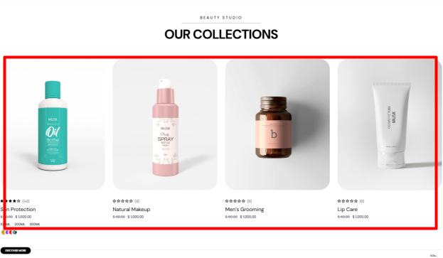
The Featured Collection section displays products from one of your specified store’s collections.
Featured Collection Settings
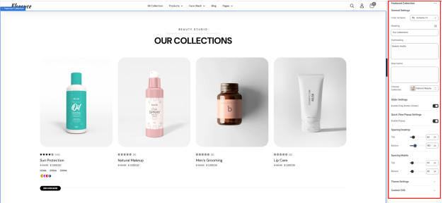
General Settings
- Color Scheme: Enables you to specify a preset color scheme for your Featured Collection section.
- Heading: Use this field to set the header text for your Featured Collection.
- Subheading: Enables you to add a subheading text that is to be rendered above the Featured Collection Heading.
- Description: This can be used to add descriptive text content about your collection.
- Choose a collection: This field enables you to specify the collection whose products you wish to have rendered.
Slider Settings
Enable Drag Button (Slider): Toggles the display of the “Discover more” button used as a slider navigation to reveal additional products.
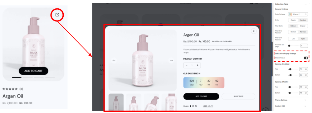
Quick View Popup Settings
When enabled, it displays a quick view icon on products that, when clicked, opens a popup with the product details.
Spacing (Desktop and Mobile)
Adjusts the top and bottom spacing of the Featured Collection section on both desktop and mobile views.
Two Column Grid
Location- Customiser > Template > Two Column Grid
Two Column Grid Overview
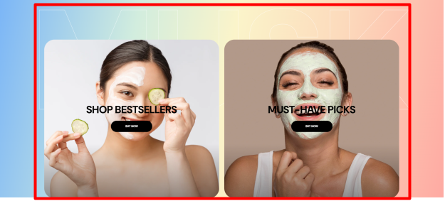
The Two Column Grid section enables you to display key content in two equal columns. It pairs images, text, and buttons to highlight the content.
Two Column Grid Settings
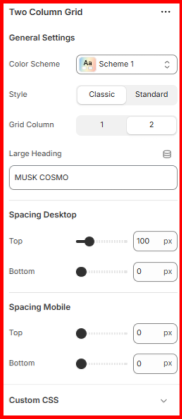
General Settings
- Color Scheme: Use this field to apply a preset color palette to your Two Column Grid section.
- Grid Column: Enables you to specify the number of columns to be rendered by the section. The default is two. Choosing a single column will stack the two grids vertically.
- Large Heading: Enter the header text you want to display as an overlay background behind the section contents.
- Spacing (Desktop and Mobile: Adjusts the top and bottom spacing of the Two Column Grid section on desktop and mobile views.
Two Column Grid Items
Location- Customiser > Template > Two Column Grid > Items
Two Column Grid Items Overview
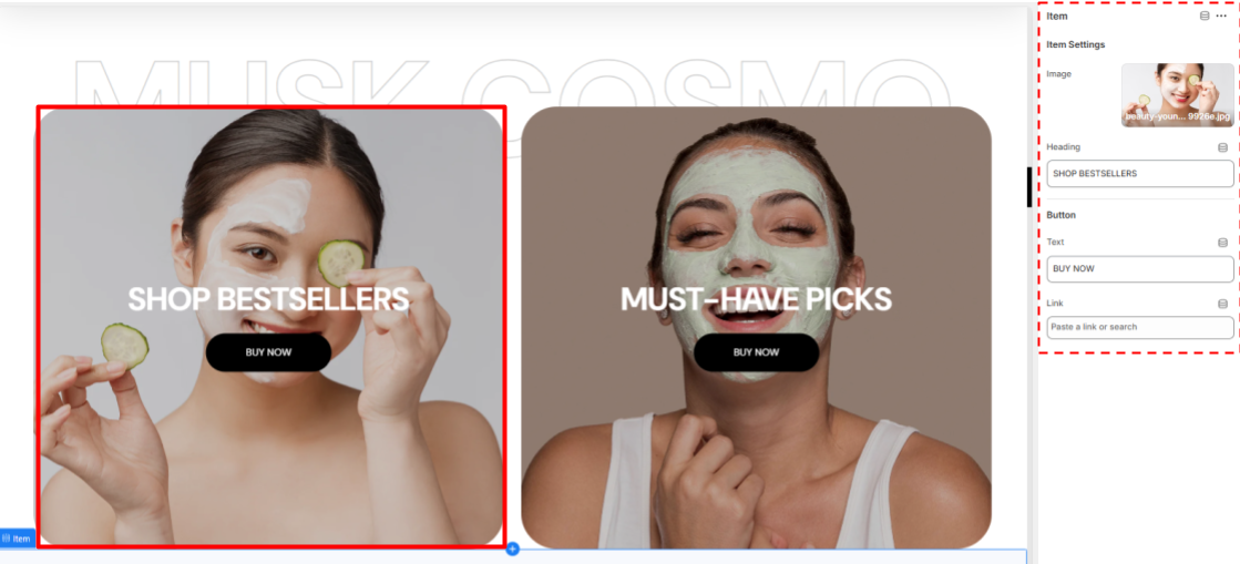
Two Column Grid Items Settings
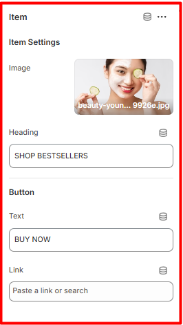
Item Settings
- Image: Choose the image to be rendered in the grid section.
- Header: Add or edit the text that will appear as an overlay on the image in the grid section.
Button
- Text: Set the text to be rendered in the button within the Grid.
- Link: Provide the URL the button should link to.
Featured Product
Location- Customiser > Template > Featured Product
Featured Product Overview

This section enables you to showcase a specific product within your store. It can be used to highlight bestsellers, new arrivals, or promotional items to drive customer attention and sales.
Featured Product Settings

Featured Product Settings
- Color Scheme: Enables you to set a preset color palette for your Featured Product section.
- Heading: Add the header that you desire to be rendered on the Featured Product section.
- Subheading: Here you can add your desired subheader text to be rendered above the Featured Product section heading.
- Description: Enter the description text for your Featured Product section.
- Choose Product: Select the product to be featured in the section.
Spacing (Desktop and Mobile)
Modifies the top and bottom spacing of the Featured Product section on desktop and mobile screens.
Featured Product Blocks
Location- Customiser > Template > Featured Product > Title Price Description
Title Price Description Overview

This block displays the title, price, and description of the featured product.
SizeChart Overview
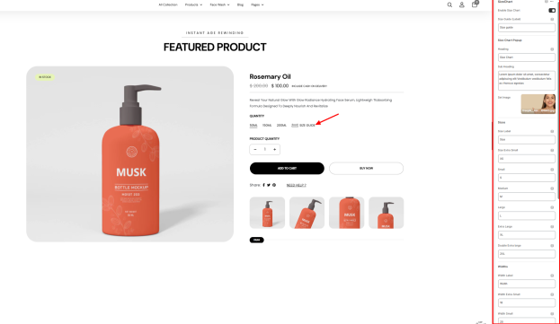
The Sizechart block enables you to display a sizing guide for the featured product, thereby helping customers select their preferred fit.
- Enable Size Chart: Toggles the display of the Size chart in the featured product.
- Size Guide(Label): Enables you to add the clickable text label (e.g., Size Guide) that will appear beside product options.
SizeChart Setting
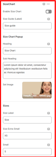
Heading: Here you can add the title to be displayed at the top of the Size Chart popup.
Sub Heading: This field enables providing a short description or instructions for the Size Chart popup.
Set Image: Here you can upload an image to display in the popup (e.g., a model, diagram, or measurement guide).
Sizes
- Size Label: Set the label for your size measurements (e.g., Size).
- Size Values: Enter the available size options, such as:
- XS (Extra Small)
- S (Small)
- M (Medium)
- L (Large)
- XL (Extra Large)
- 2XL (Double Extra Large)
Widths
- Width Label: Here you can define the label for width measurements (e.g., Width).
- Width Values: Enter the width measurements for each size, such as Width Extra Small: 18, Width.
- Small: 20.
Lengths
- Lengths Label: Set the label for length measurements (e.g., Length).
- Length Values: Enter the width measurements for each size, such as Length Extra Small: 28, Length Small: 32.
Button
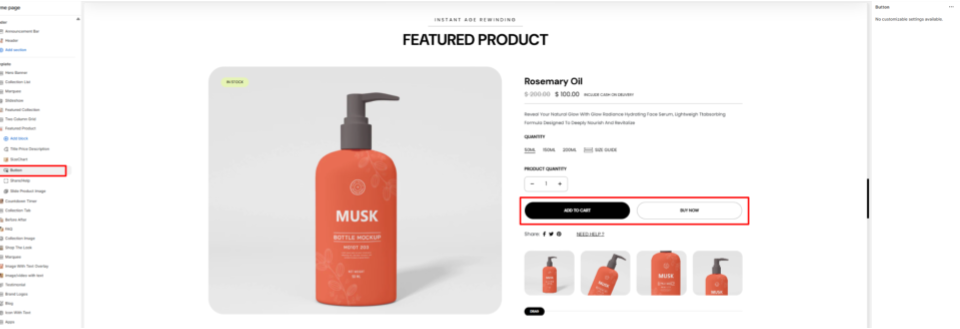
The Button block displays the Add to Cart and Buy Now buttons on the Featured Product.
Share / Help
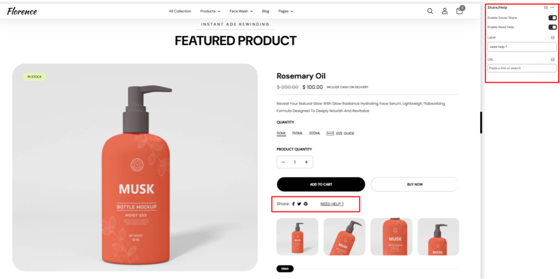
- Enable Social Share: Enables or disables the feature rendering on the featured product.
- Enable Need Help: Toggles the display of the Need help link within the featured product.
- Label: Enter the text label for your help area (e.g., Need Help).
- URL: Provide the link that will redirect users to your help area.
Slide Product Image
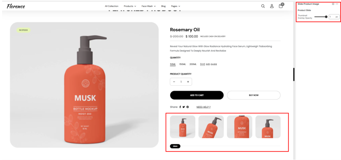
Displays clickable thumbnails of the product in a slider, allowing customers to view different images of the product.
Countdown Timer
Location- Customiser > Template > Countdown Timer
Countdown Timer Overview
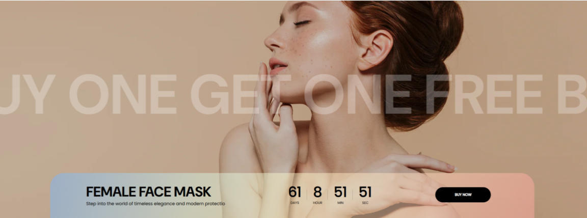
The Countdown Timer section enables you to display limited-time offers, sales, or promotions, prompting users to take an action to avoid missing out.
Countdown Timer Settings
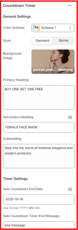
General Settings
- Color Scheme: Enables you to select a predefined color pattern for the Countdown Timer section.
- Background Image: Here, you can set a background image for the Countdown Timer section.
- Primary Heading: Set the main promotional headline here, which will be displayed in a large size and overlaying the background image.
- Secondary Heading: Within this field, you can add a supporting title that will be placed at the bottom of the section.
- Subheading: Enables you to add descriptive text to be rendered beneath the secondary heading.
Timer Settings
- Sale Countdown End Date: Enables you to set the end date of the countdown timer.
- Sale Countdown Timer End Message: Set the message to be displayed when the countdown expires.
Button
The button adds a call to action element to the section.
- Text: Set the label to be rendered in the button within the Countdown.
- Link: Provide the URL the button should link to.
Spacing (Desktop and Mobile)
Controls the padding around the Countdown Timer section on both desktop and mobile screen sizes for proper positioning.
Collection Tab
Location- Customiser > Template > Collection Tab
Collection Tab Overview
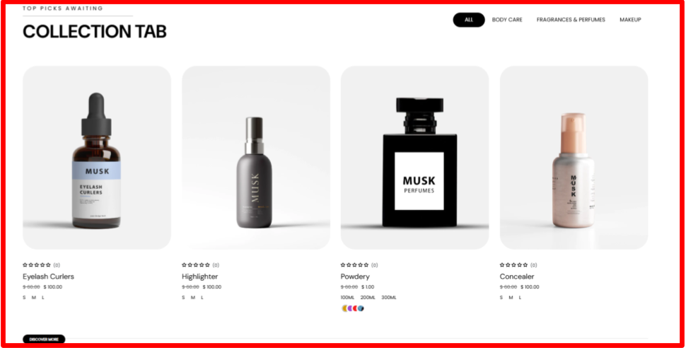
The collection tab enables you to display products related to different collections within a tabbed display.
Collection Tab Settings
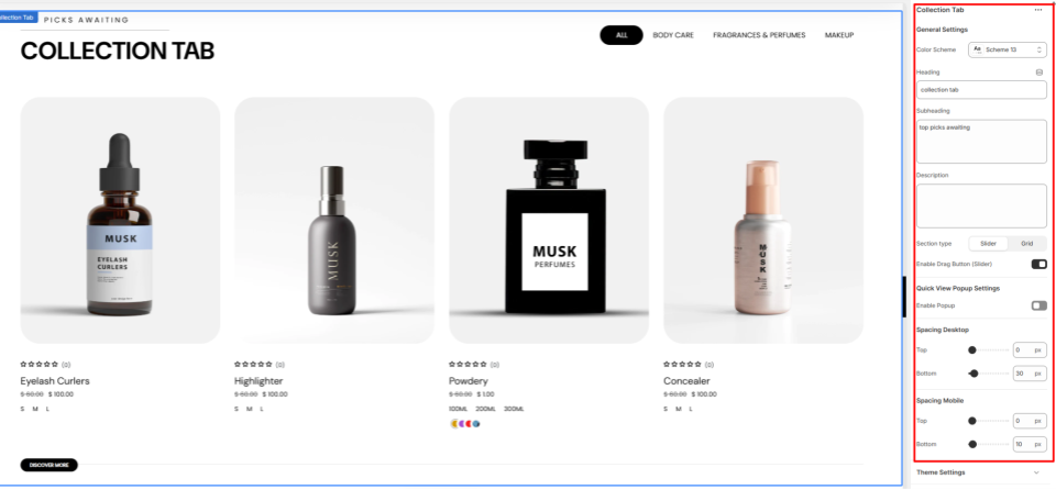
General Settings
- Color Scheme: Enables you to select a color palette to be applied to the Collection Tab section.
- Heading: Enter the text you’d like to display as the main heading of the section.
- Subheading: Within this field, you can add the subheader text content to be rendered above the section’s Heading.
- Description: Provide a description for the section to give customers more context.
- Section Type: Set whether to render the Collection Tab as a Grid or Slider.
- Enable Drag Button: Enable this option to show a drag button beneath the products when the section type is set to slider.
Quick View Popup Settings
- Enable Popup: When enabled, a quick view icon appears on products. Clicking the icon opens a popup displaying the product details.
Spacing (Desktop and Mobile)
Controls the top and bottom spacing of the Collection Tab section on both Desktop and Mobile views.
Collection Tab Items
Location- Customiser > Template > Collection Tab > Items
Collection Tab Items Overview
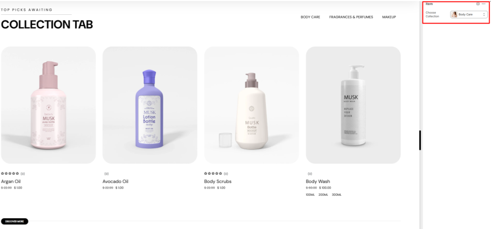
The Item block enables you to add a collection whose products are to be rendered on the Collection Tab section.
Collection Tab Items Settings
Item
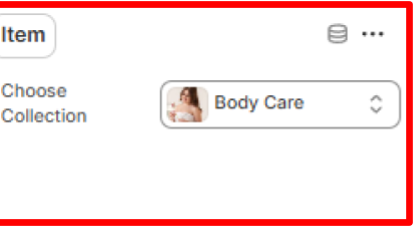
Choose Collection: Select the Collection of the products that you want to show in this card
Before After
Location- Customiser > Template > Before After
Before After Overview
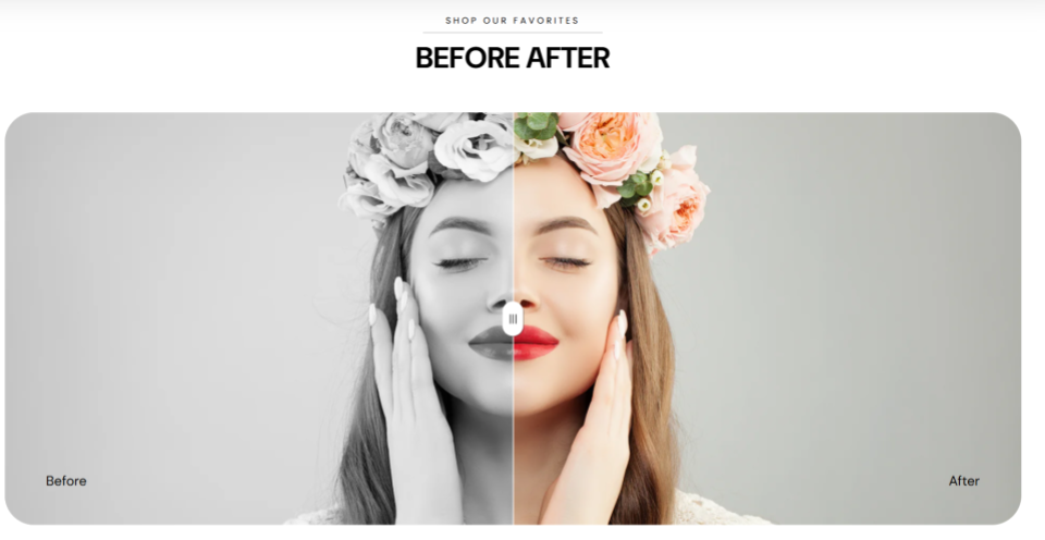
The Before After section allows you to showcase two images side by side with a draggable slider, making it easy for customers to compare changes, transformations, or product effects.
Before After Settings
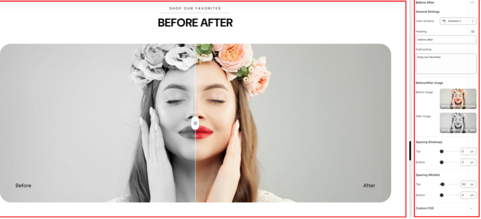
General Settings
- Color Scheme: Choose a predefined color palette to apply to the Before After section.
- Heading: Fill in the main header text within this field.
- Subheading: Here you can add supporting text that will be rendered above the main heading.
Before/After Image
- Before Image: Within this field, you can upload the image to display on the left. It signifies the image in the previous state.
- After Image: Here, you can upload the image to display on the right. It signifies the image in the after state.
Spacing (Desktop & Mobile)
Defines the top and bottom spacing of the Before After section in both desktop and mobile screens.
FAQ
Location- Customiser > Template > FAQ
FAQ Overview
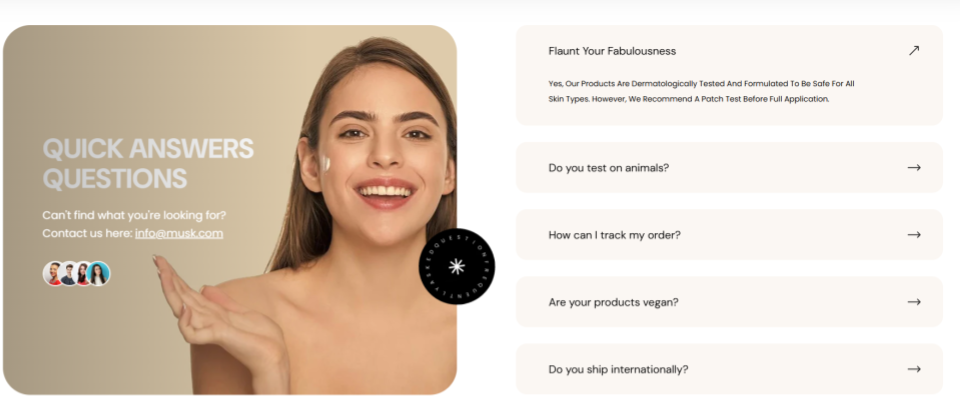
The FAQ section allows you to add frequently asked questions along with their answers directly within your store.
FAQ Settings
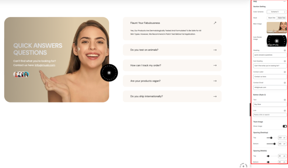
Section Setting
- Color Scheme: Enables you to select a predefined color palette for the FAQ section.
- Style: Set the preferred rendering of the contents overlaying the main image in the FAQ section.
- Main Image: Upload the image that will be displayed on the left side of the FAQ section.
- Auto Rotate Image: Auto Rotate Image: Upload an image to be used as a rotating overlay element in the FAQ section when Style One is selected.
- Heading: Enter the main header text for the FAQ section.
- Subheading: Add a subheading to appear above the main heading in the FAQ section.
- Contact Label: Provide text to introduce the contact information.
- Contact Email: Specify the email address customers can use for assistance.
Button (Style 2)
This button is rendered on the FAQ section if the style selected on the FAQ section settings is style two.
- Text: Add the label to be rendered on the button.
- Link: Specify the URL that the button links to.
Team Image
Show Image: When enabled, it renders thumbnail images of team members’ images added to the section.
Spacing (Desktop and Mobile)
Controls the top and bottom spacing of the FAQ section on both desktop and mobile views.
FAQ Item
Location- Customiser > Template > FAQ > FAQ Items
FAQ Items Overview
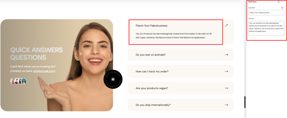
This section allows you to add the questions and answers that are frequently asked by the customers.
FAQ Items Settings
FAQ Items
Question: Add a commonly raised question.
Answer: Provide the corresponding answer to the question.
Team Members Image
Location- Customiser > Template > FAQ > Team Members Image
Team Members Image Overview
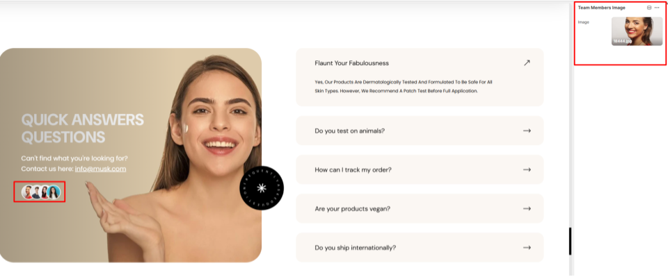
You can show the images of your team members here.
Team Members Image Settings
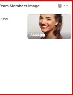
Image: Within this field, you can upload an image of a team member within your store.
Collection Image
Location- Customiser > Template > Collection Image
Collection Image Overview
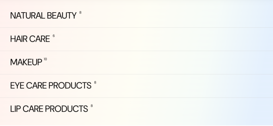
This section is used to render different collections added to the section, and their respective featured images upon hover, thereby enabling customers to visually identify the collection on your page.
Collection Image Settings
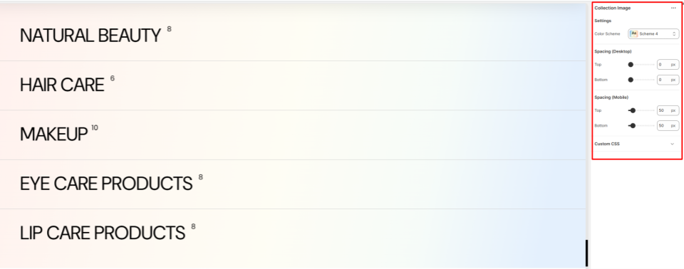
Settings
- Color Scheme: Within this field, you can select a pre-defined color palette to be applied to the Collection Image section.
Spacing (Desktop and Mobile)
Defines the top and bottom spacing of the Collection Image section in both desktop and mobile views.
Collection Image Items
Location- Customiser > Template > Collection Image > Items
Collection Image Items Overview
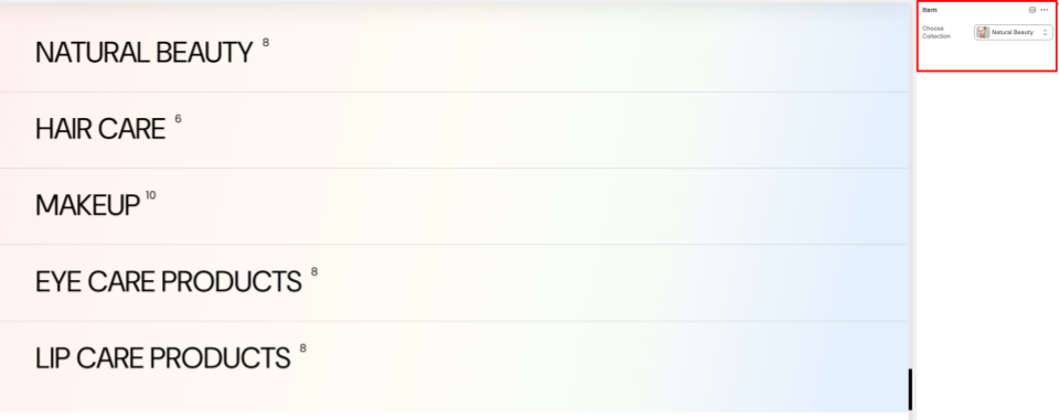
Within the item block, you can specify the collection to be rendered in the Collection Image section.
Shop The Look
Location- Customiser > Template > Shop The Look
Shop The Look Overview
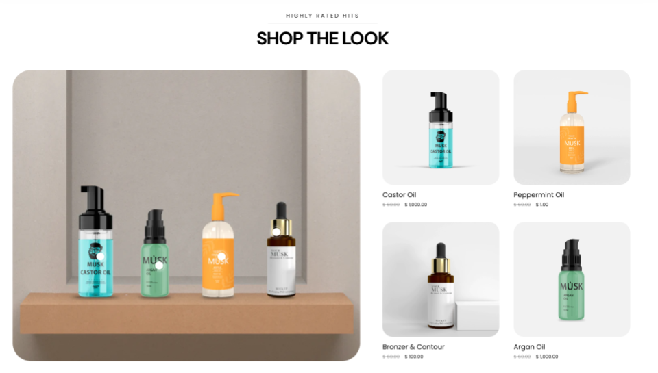
The section enables you to showcase a styled image alongside shoppable products. Customers can view a curated “look” and purchase individual items directly.
Shop The Look Settings
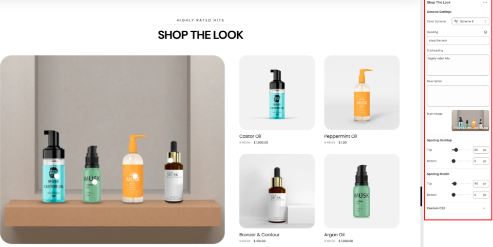
General Settings
- Color Scheme: Choose a predefined color palette to style the section.
- Heading: Within this field, you can add the main heading text for the section.
- Subheading: Here you can add supporting text to be displayed above the heading.
- Description: Include a short description to give customers context about the featured products.
- Main Image: Here, you can set the primary image that represents the styled look and is rendered on the left side of the section.
- Spacing (Desktop and Mobile):Controls the top and bottom padding of the Shop The Look section on both desktop and mobile device screens.
Shop The Look Blocks
Location- Customiser > Template > Shop The Look > Product
Product Overview
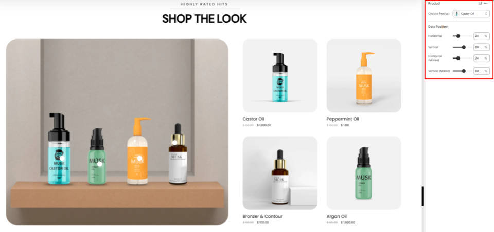
This section allows you to add some product cards here to show to your customers.
Product Settings
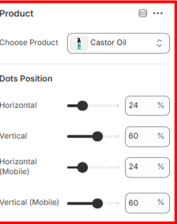
Product
- Choose Product: Enables you to select the product to be rendered in the Shop The Look section.
Dots Position
- Dots Position: Helps in defining the positioning of the dots both horizontally and vertically within the main image. When hovered, a dot highlights the corresponding product on the right side.
Image With Text Overlay
Location- Customiser > Template > Marquee > Image With Text Overlay
Image With Text Overlay Overview

This section is used to display an image or video with descriptive text layered over it.
Image With Text Overlay Settings

General Settings
- Color Scheme: Enables you to select a predefined color palette to be applied to the section.
- Style: Specify whether to render the image within the section as a boxed or full-width layout.
- Video: Here, you can upload a video to be rendered in the section.
- Enable Video: Toggles the video display on the section instead of the image.
- Heading: Within this field, you can add the main heading to the section.
- Subheading: This field enables you to add supportive text that is rendered above the main section heading.
- Description: Here you can add descriptive text, such as details about your store products.
Button
- Text: Add the label to be rendered on the button.
- Link: Set the URL that the button is to link to once clicked.
Spacing (Desktop and Mobile)
Defines the top and bottom padding of the Image With Text Overlay section in both Desktop and Mobile views.
Image/Video With Text Overlay
Location- Customiser > Template > Marquee > Image/Video With Text
Image/Video With Text Overview

This section displays a video together with descriptive text and a call-to-action button. It’s ideal for showcasing product features or highlighting key brand messages.
Image/Video With Text Settings

General Settings
- Color Scheme: Enables you to select a pre-defined color palette for the section.
Video
- Video: Here, you can upload the video that you wish to have rendered in the section.
- Fallback Image (if no video): Set the image to be rendered if the video is not set.
- Rotating Text: Enter the text to be displayed as a marquee overlay across the section.
- Heading: Enter the main header text that appears on the right side of the section.
- Subheading: Add supporting text displayed below the heading as the section’s subheading.
- Description: Provide descriptive text to highlight the content featured in the section.
Button
- Text: Enter the label to display on the button.
- Link: Specify the URL the button should open when clicked.
Section Spacing (Desktop and Mobile)
Controls the top and bottom padding of the section on both desktop and mobile devices.
Brand Logos
Location- Customiser > Template > Brand Logos
Brand Logos Overview
The Brand Logos section enables you to showcase and highlight the logos of partner brands or suppliers directly on your storefront.
Brand Logos Settings
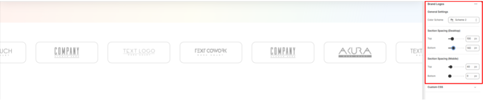
General Settings
- Color Scheme: Enables you to apply a pre-defined color palette to the section.
- Section Spacing (Desktop): Adjusts the top and bottom padding to the Brand Logos section on both desktop and mobile views.
Brand Logos Blocks
Location- Customiser > Template > Brand Logos > Image
Image Overview
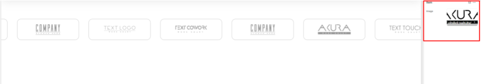
The Image block enables you to set the logo image to be rendered on the Brand Logos section.
Blog
Location- Customiser > Template > Blog
Blog Overview
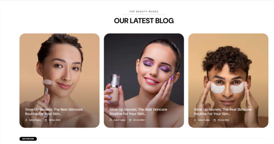
The Blog section enables you to display articles of your preference that you wish to have highlighted within your storefront.
Blog Settings
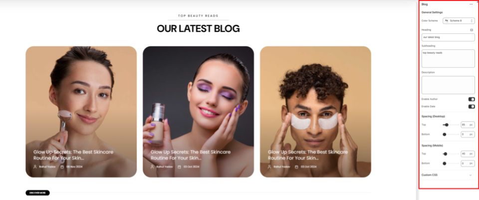
General Settings
- Color Scheme: This setting can be used to choose a predefined color palette to be applied to the Blog section.
- Heading: Use this field to add the main heading text that introduces the Blog section.
- Subheading: Here you can add supporting text that will appear above the heading.
- Description: Within this field, you can provide additional context for the posts being rendered.
- Enable Author: Toggles the author display within the posts displayed on the Blog section.
- Enable Date: Enables/disables the author rendering on the posts rendered within the Blog section.
Spacing (Desktop and Mobile)
Controls the top and bottom padding of the Blogs section on both desktop and mobile views.
Blog Blocks
Location- Customiser > Template > Blog > Item
Item Overview
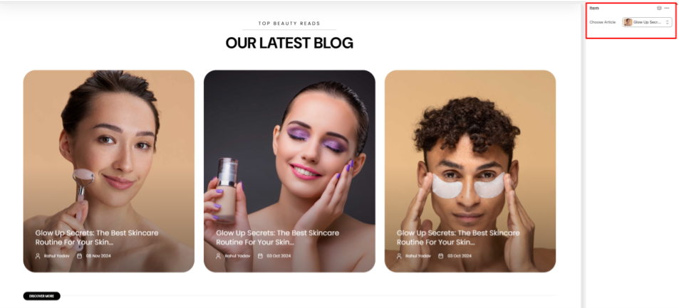
The Item block enables you to select the article to be rendered on the Blog section.
Icon With Text
Location- Customiser > Template > Icon With Text
Icon With Text Overview
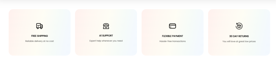
This section is used to highlight important features relating to your store, such as shipping, payments, and refunds, using a combination of icons and text.
Icon With Text Settings

General Settings
- Color Scheme: Enables you to choose a predefined color palette to apply to the Icon with Text section.
- Heading: Here you can add the primary heading text to the Icon With Text section.
- Subheading: Within this field, you can add supportive text to be rendered above the heading text.
- Description: Here, you can add descriptive content to elaborate on the features being highlighted in the Icon With Text section.
Spacing (Desktop and Mobile)
Controls the spacing above and below the Icon With Text section in both desktop and mobile views.
Icon With Text Blocks
Location- Customiser > Template > Icon With Text > Item
Item Overview
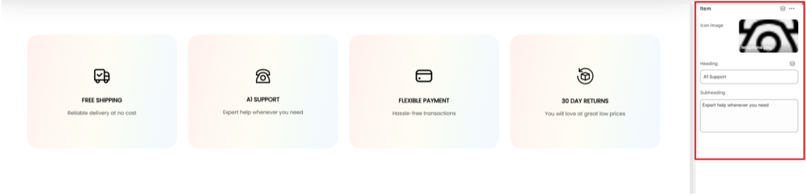
The Item block in the Icon With Text section enables you to add the icon alongside text to be rendered within the section.
- Icon Image: Upload or select the icon image that will be displayed in the section.
- Heading: Enter the main title text that represents the feature.
- Subheading: Here you can provide supporting descriptive text to give more details about the feature being highlighted.
Footer
Location- Customiser > Footer > Footer
Footer Overview
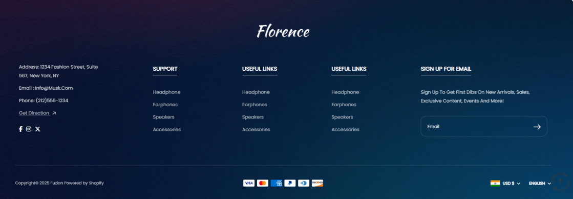
This section is located at the bottom of the storefront and acts as a key area to provide customers with essential links, social info, contact details, and additional resources.
Footer Settings
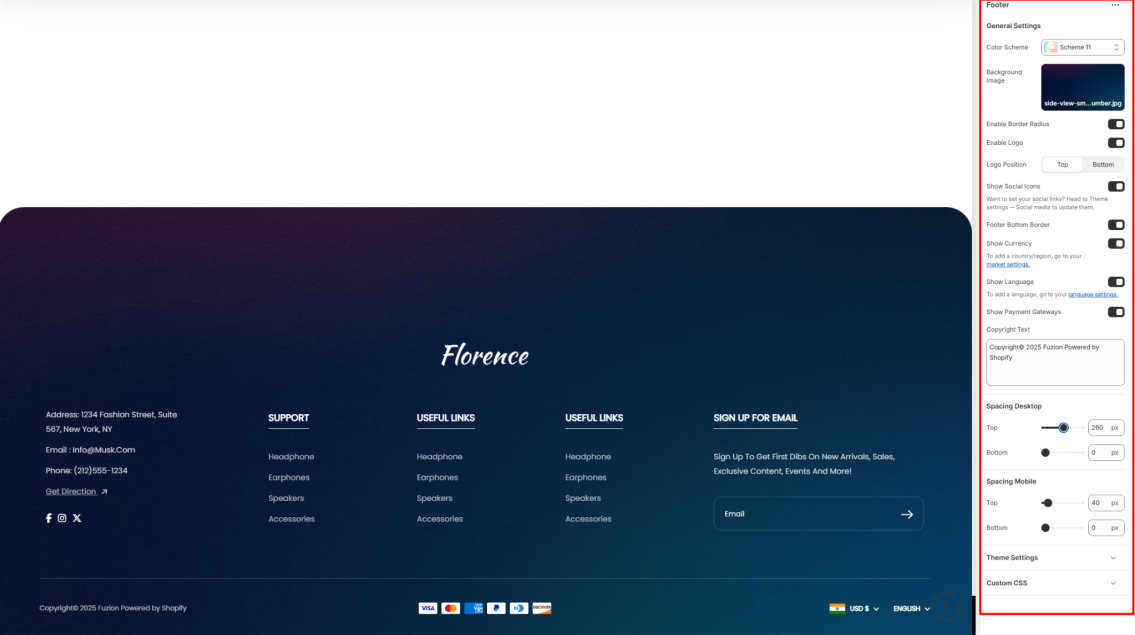
- Color Scheme: Here, you can choose a predefined color palette to style the footer background and text.
- Background Image: Upload the image that will act as the background to the footer section.
- Enable Border Radius: When enabled, it renders round corners around the footer section.
- Enable Logo: This setting can be enabled to display the logo defined in your theme settings within the footer.
- Logo Position: Enables you to specify where the logo should be rendered. Either on the top or the bottom of the footer.
- Show Social Icons: This option facilitates the display of linked social media icons that you have configured in the Theme Settings.
- Footer Bottom Border: Toggles the display of a separating border line at the bottom of the footer.
- Show Currency: Adds a currency selector that customers can use.
- Show Language: Adds a language selector that customers can use.
- Show Payment Gateways: When enabled, it displays supported payment method logos.
- Copyright Text: Here you can add custom copyright text to appear at the bottom of the footer.
Spacing Desktop and Mobile
Controls the top and bottom padding of the footer section within Desktop and Mobile views.
Footer Blocks
Location- Customiser > Footer > Footer > Social Info
Social Info Overview
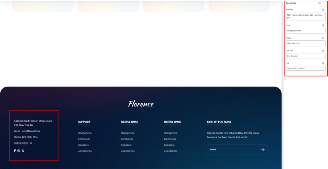
The Social Info block displays contact information specified in the block, as well as social media information defined within the theme settings.
Social Info Settings
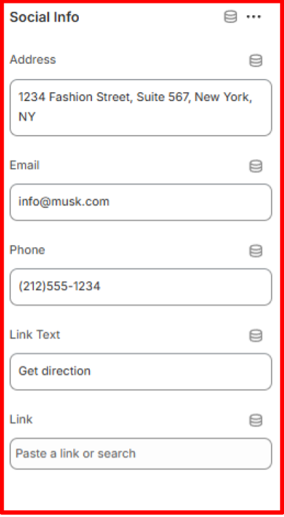
- Address: Specify the physical address of the store.
- Email: Enter the designated contact email address for the store.
- Phone: Provide the store’s contact phone number.
- Link Text: Define the text to be displayed as a hyperlink within the block.
- Link: Specify the destination URL to which the hyperlink should redirect upon selection.
Menu List Overview
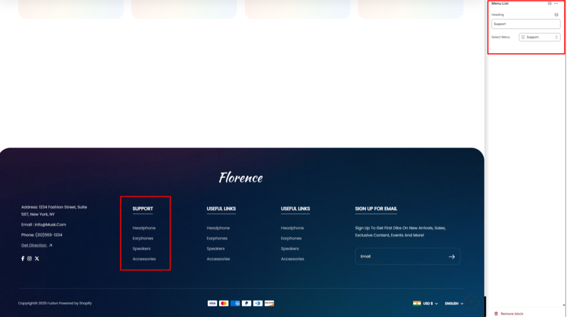
The Menu List block allows you to specify a menu to be displayed in the footer.
Menu List Settings
- Heading: Here you can add the primary header text to the menu that you wish to have rendered.
- Select Menu: Choose the menu that you wish to have displayed.
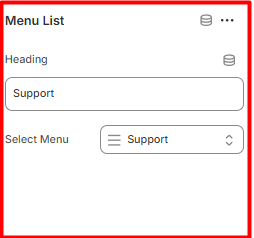
NewsLetters Settings
The Newsletters block enables you to add a Newsletter subscription section to your footer.
- Heading: Specify the main heading text for the newsletter sign-up block.
- Description Text: Provide a brief message explaining the benefits or purpose of subscribing.
- Enable Newsletter: Toggles the display of the newsletter subscription form on the footer.
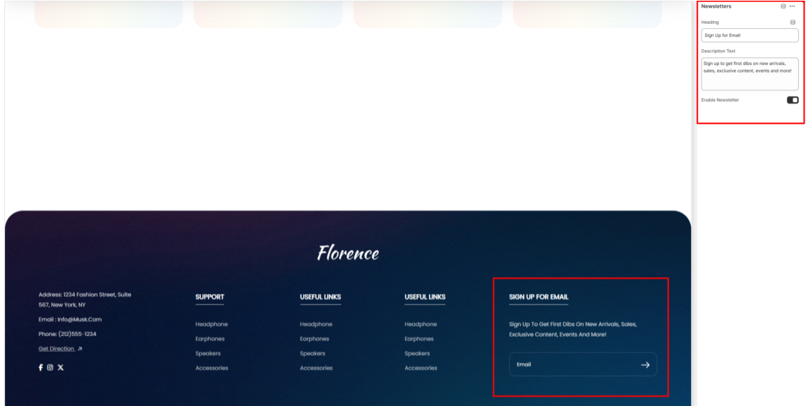
Newsletter Popup
Location- Customiser > Footer> Newsletter Popup
Newsletter Popup Overview
The Newsletter Popup enables you to add a customizable subscription pop-up on your storefront.
Newsletter Popup Settings
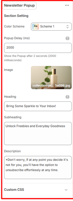
Section Setting
- Color Scheme: Define the color palette to be applied to the newsletter pop-up section.
- Popup Delay (ms): Specify the time delay (in milliseconds) before the pop-up is displayed.
- Image: Upload or select an image to be displayed on the pop-up.
- Heading: Enter the primary heading text for the pop-up section.
- Subheading: Provide a secondary heading to appear beneath the main heading.
- Description: Add descriptive text or details about the subscription offering.
Our History
Location- Customiser > Template > Our History
Our History Overview
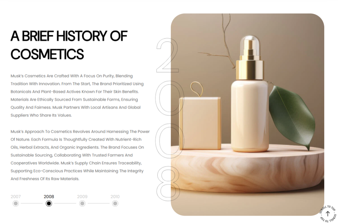
This section allows you to present your brand’s history with descriptive text and supporting images.
Our History Settings
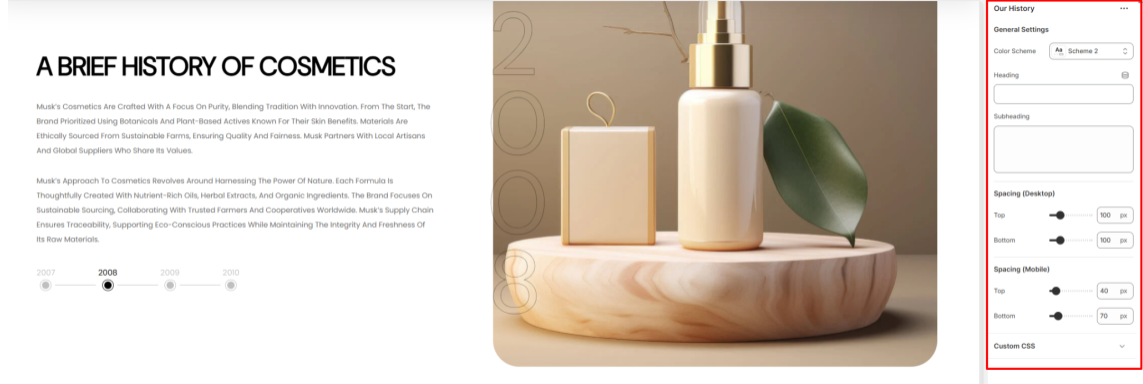
General Settings
- Color Scheme: Choose a color palette to apply to the Our History section.
- Heading: Enter the main heading text for the Our History section.
- Subheading: Add a descriptive subheading to display above the main heading in the Our History section.
- Spacing (Desktop and Mobile): Customize the top and bottom spacing of the Our History section for both desktop and mobile views.
Our History Blocks
Location- Customiser > Template > Our History > Items
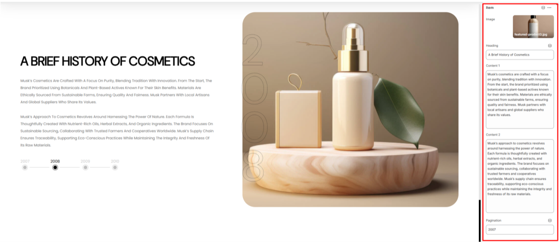
Items Overview
The Item block is used to add detailed content to the Our History section.
- Image: Choose an image to display in the section.
- Heading: Enter a heading to highlight a key part of your history.
- Content 1: Add descriptive text to appear as the first paragraph.
- Content 2: Add additional descriptive text to appear as the second paragraph.
- Pagination: Set a label to use as a pagination element, such as a year or another marker, based on the historical content you are showcasing.
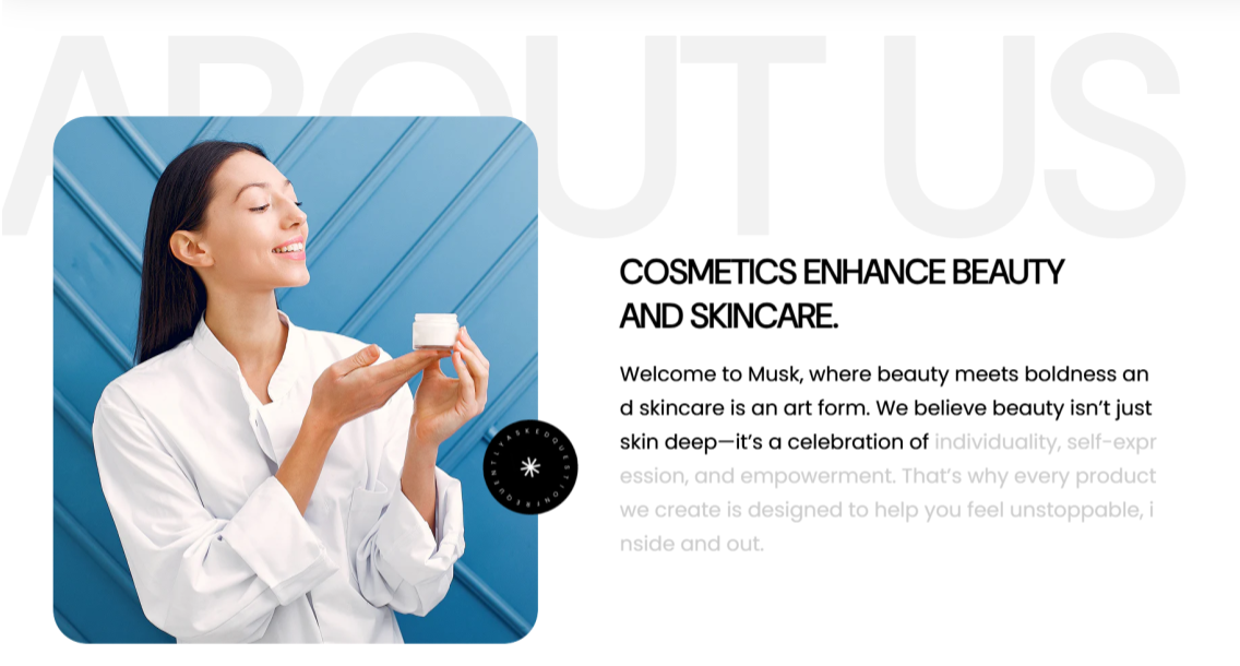
Teams
Location- Customiser > Template > Teams
Team Overview
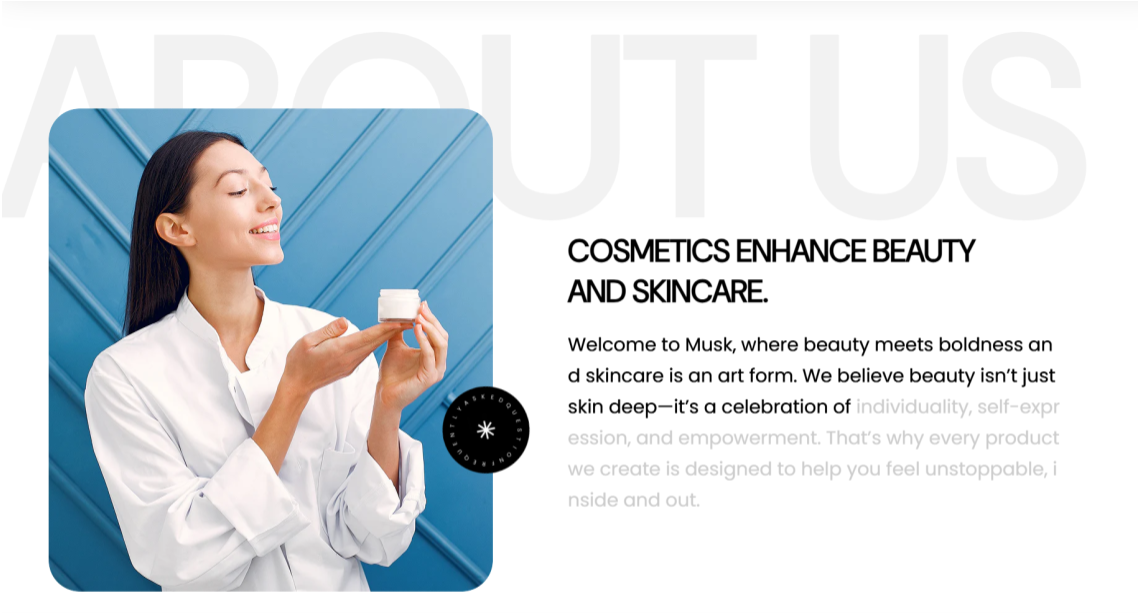
The Team section enables you to showcase team members, clients, or key personnel in a clean and visually engaging layout.
Team Settings
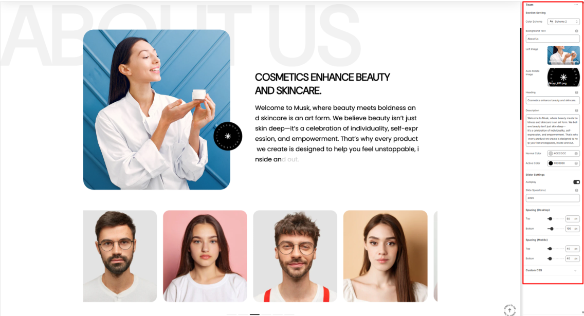
Section Setting
- Color Scheme: Choose a predefined color palette to style the Team section.
- Background Text: Add a background text label that is to be displayed behind the Team section content.
- Left Image: Select an image that is to appear on the left side of the Team section.
- Auto Rotate Image: Upload an image to be used for auto-rotation next to the left image within the Team section.
- Heading: Add a main heading for the Team section.
- Description: Here you can add descriptive content to introduce your team.
- Normal Color: Set a default color for text on the Team section.
- Active Color: Choose a highlight color for active text on the Team section.
Slider Settings
- Autoplay: Enable or Disable automatic rotation of team member slides.
- Slide Speed (ms): Set the interval between slide transitions in milliseconds.
Spacing (Desktop and Mobile)
Adjusts the top and bottom margins of the Team section in both desktop and mobile views.
Teams Blocks
Location- Customiser > Template > Teams > Item
Item Overview
The Item block within the Team section enables you to add Team members, or rather, the individuals you wish to have displayed in the section.
Item Settings
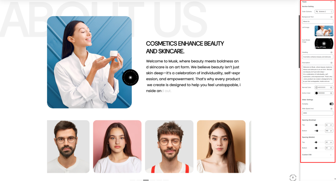
Image: Upload an image of the individual to be rendered on the section.
Client Name: Set the name of the person. This will be displayed upon hovering over the image.
Client Role: Specify the role of the individual. This will be rendered beneath the Client Name upon hovering over the image.
Best Sellers Slider
Location- Customiser > Template > Best Sellers Slider
Best Sellers Slider Overview
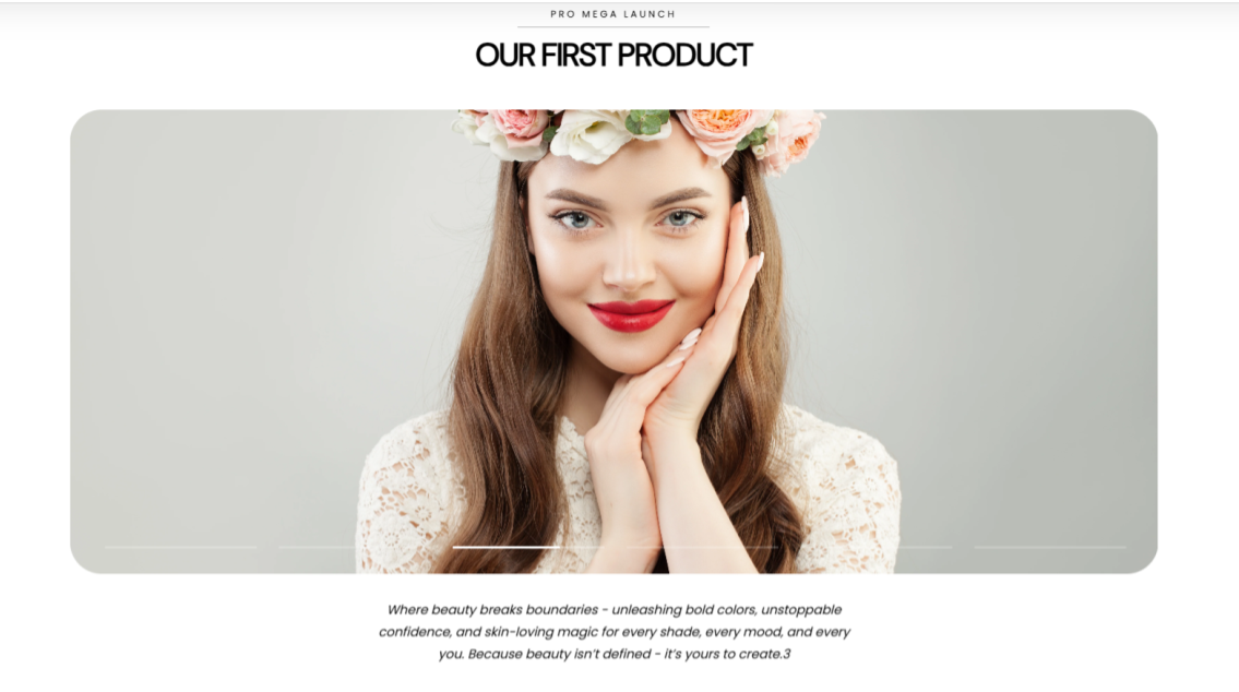
The Best Sellers Slider enables you to highlight information about the best-selling products within the store.
Best Sellers Slider Settings
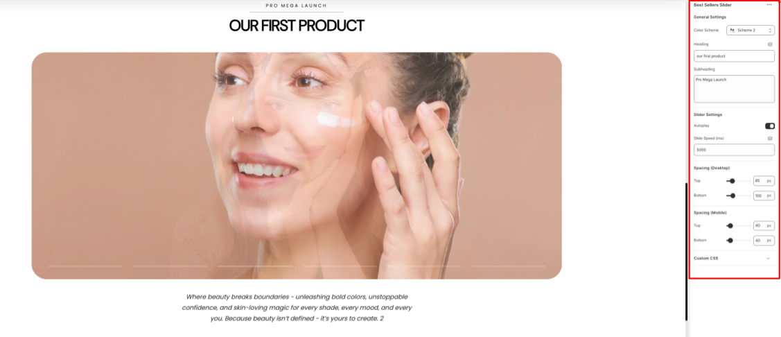
General Settings
- Color Scheme: Select a colour palette to be applied to the Best Sellers Slider section.
- Heading: Here you can add the title to the item being highlighted.
- Subheading: Add a tagline to support the heading.
Slider Settings
- Autoplay: Enable or disable the automatic sliding of the best-selling items.
- Slide Speed: Set the duration (in milliseconds) for how long each item is displayed before moving to the next when autoplay is active.
Spacing (Desktop and Mobile)
Adjusts the top and bottom spacing on the Best Sellers Slider section.
Best Sellers Slider Blocks
Location- Customiser > Template > Best Sellers Slider > Item
Item Overview
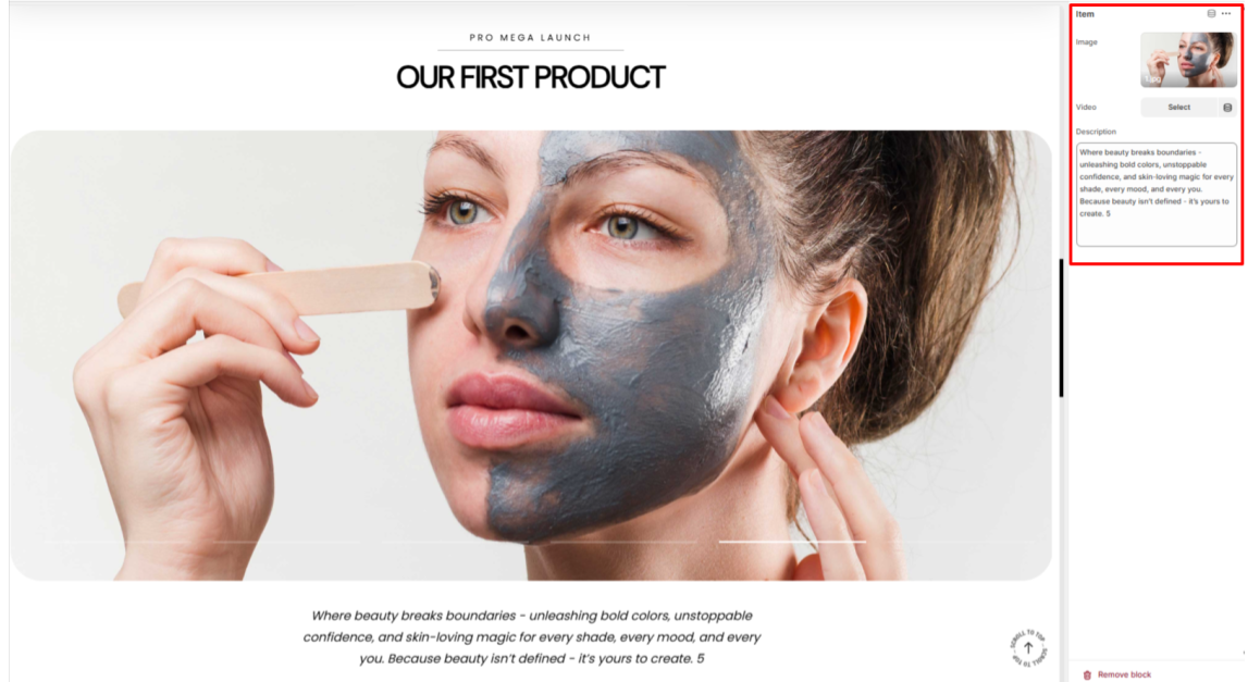
The Item block in the Best Sellers Slider section enables you to add the best-selling items to the section.
- Image: Select the image of the item that you intend to be displayed.
- Video: Optionally upload a video to showcase the item in place of an image.
- Description: Add descriptive text about the item being featured.
Fun Fact
Location- Customiser > Template > Fun Fact
Fun Fact Overview

The Fun Fact section enables you to showcase key achievements within your store, such as product sales or brand highlights, to enable you to build trust with your audience.
Fun Fact Settings
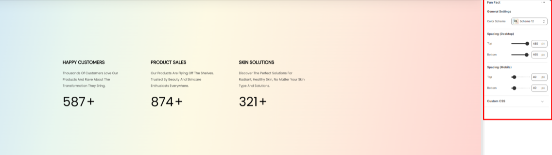
General Settings
- Color Scheme: Select a color palette to be applied to the Fun Fact section.
Spacing (Desktop and Mobile)
Adjusts the top and bottom padding on the Fun Fact section within both desktop and mobile device screens.
Fun Fact Blocks
Location- Customiser > Template > Fun Fact > Item
Item Overview
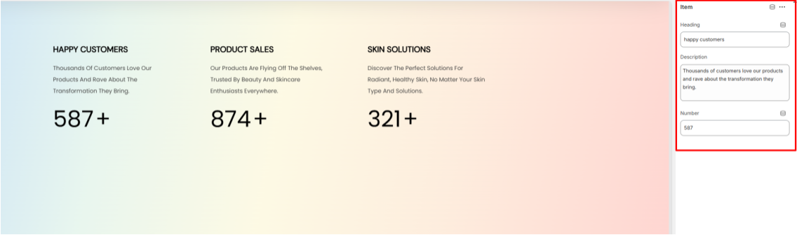
The Item block in the Fun Facts section is used to add the achievements that you want to showcase to the section.
- Heading: Add a title to the achievement that you wish to highlight.
- Description: Here you can add information about the achievement.
- Number: Set a numerical value based on your achievement score.
Page Header
Location- Customiser > Header > Header
Page Header Overview
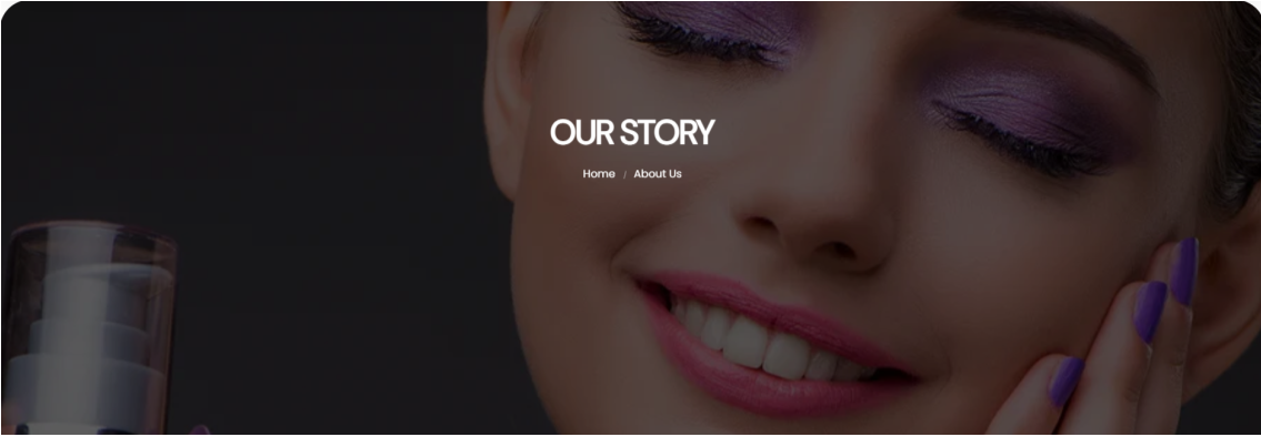
The Page Header section enables you to create a visually appealing introduction to your store page. In it, it renders the page title to the page as well as a Breadcrumb navigation.
Page Header Settings
General Settings
- Color Scheme: Choose a color palette to be applied to the Page Header section.
- Image: Upload or specify the image to be used as a background to the Page Header section.
- Heading: Add your desired title text, or rather, the page title to be displayed prominently in the header section.
- Show Breadcrumb: Enable or disable the breadcrumb navigation, which helps users see their current page location.
Spacing (Desktop and Mobile)
Adjusts the top and bottom padding of the Page Header in both desktop and mobile device screens.
Main 404
Location- Customiser > Template > Main 404
Main 404 Overview
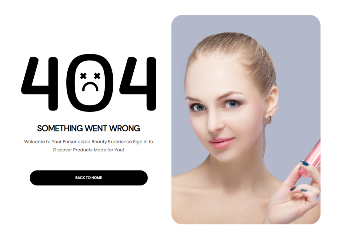
The Main 404 section is utilized on the 404 page, which acts as a fallback page displayed whenever a visitor tries to access a page, product, collection, or blog post that does not exist.
Main 404 Settings
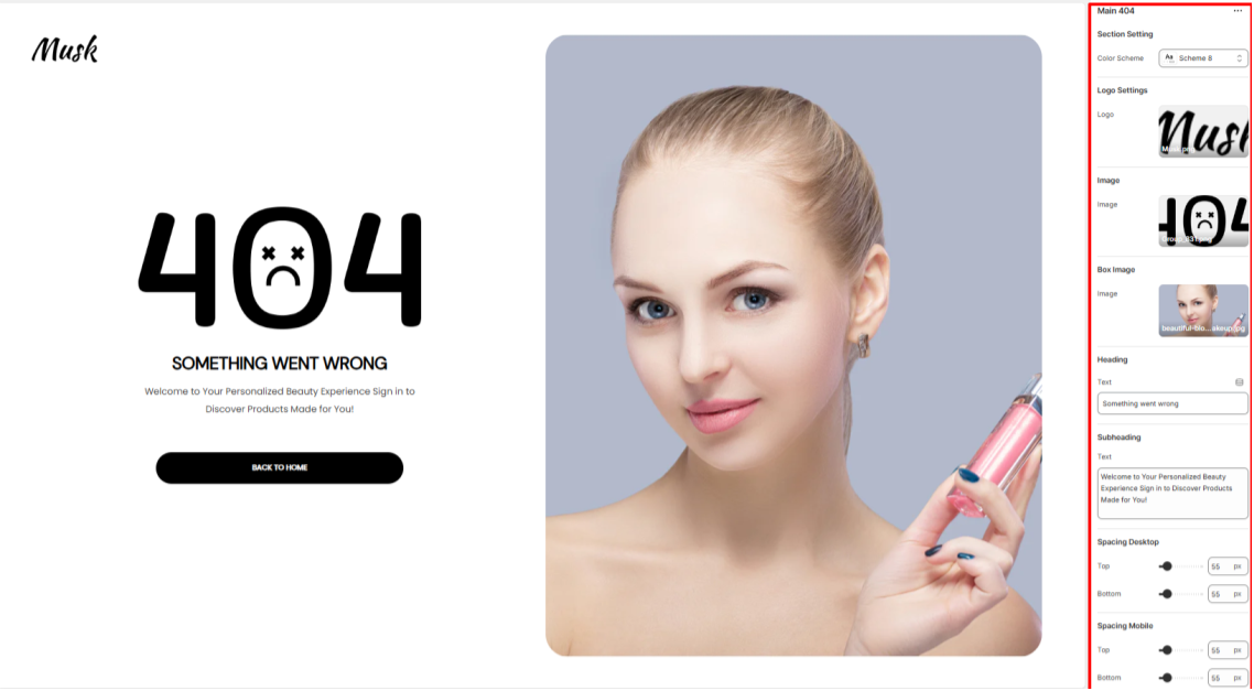
Section Setting
Color Scheme: Select a predefined color palette to control the background, text, and accent colors of the section.
Logo Settings
Logo: Set your brand logo image here.
Image
Image: Upload a primary error image to be rendered.
Box Image
Image: Upload a secondary image to be rendered on the right of the section.
Heading
Text: Customize the main heading message here.
Subheading
Text: Here you can add supporting context text to the main heading.
Spacing (Desktop and Mobile)
Adjusts the top and bottom padding within the section on both desktop and mobile device screens.
Search Banner
Location- Customiser > Template > Search Banner
Search Banner Overview
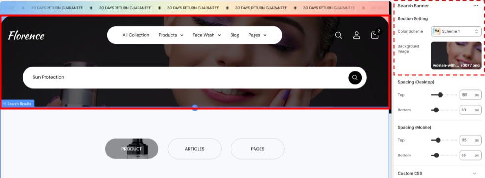
The Search Banner section is the minimal Banner for the search Page, Consisting two customisable items first is the background image and second is the search bar.
The user can search items that are known to them from here.
Search Banner Settings
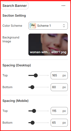
Search Setting
- Colour Scheme- Select the Desired colour scheme you want to reflect on this section.
- Background Image- Select the image you want to add in the background of the banner.
Search Results
Location- Customiser > Template > Search Results
Search Results Overview (Product Category)-
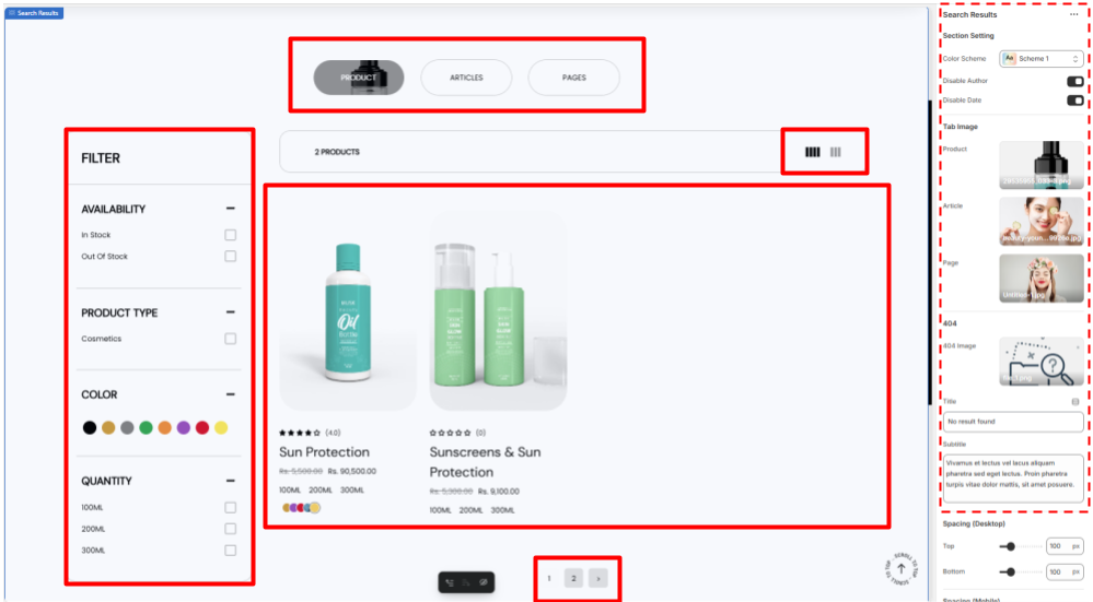
The search Result section (Product Category) is the section where the search results would appear this section can be divided into 5 sub sections
- Search Category- Here the USer can select the category of the search (Product, Articles or Pages)
- The images inside the Categories can be changed.
- Filter- The user can select the filters that are compatible with their desired search from here.
- Information Bar- This bar has the cont of the search results on one side and on the other it has the option for the user to show 3 or 4 columns of results at once
- Result section- This section has the search results of the query (Either Product, Article or Pages)
- Pagination- This allows the user to explore more results that are not visible in the first or present page.
Search Results Overview (Articles Category)-
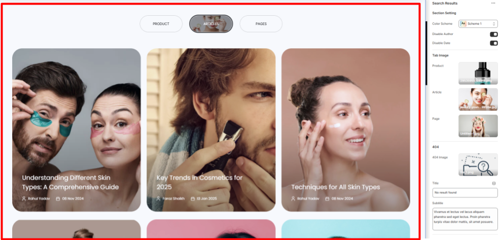
The search Result section (Articles Category) is the section where the search results for the articles that the users want to read would appear.
The Posts are in the form of cards where there is a thumbnail image of the Article, Name, Author, Publishing Date.
Search Results Overview (Pages Category)-
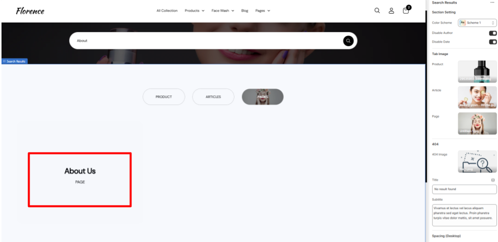
This option allows the user to select the page that they would like to explore.
Search Results Settings
General Settings
- Color Scheme- Select the color scheme you want for this page.
- Disable Author- Select either to enable or disable the author name on Articles.
- Disable Date- Select either to enable or disable the publishing dates on Articles.
Tab Image
- Product- Select the image you want to appear when the user hovers over the Product category.
- Article- Select the image you want to appear when the user hovers over the Article category.
- Page- Select the image you want to appear when the user hovers over the Page category.
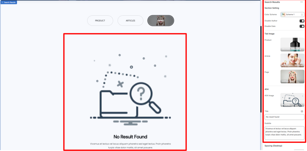
404
- 404 Image- Select the image that will appear when there is no result for the search query.
- Title- Select the short message that will appear when there is no result for the search query.
- Subtitle- Select the Brief message that will appear when there is no result for the search query.
Collection Page
Location- Customiser > Template > Collection List
Collection Page Overview
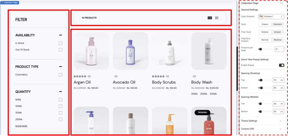
The Collection Page Features all the products related to one particular collection in one page its a collection of some smart features like filters
- Filters- This allow the user to filter out their desired product from the collection, very useful when the product count is high.
- Control bar- A bar above the product list that shows the total count of the products, allows the user to switch between either 3 or 4 columns.
Also allows the user to close or open the filter bar if in Drawer style.
- Product List- All the products in the collection are listed here as cards with their Image as the thumbnail, Their Review stars, Their Name and their Prices, The cards shows quick add or Add to cart option when hovered over.
- Quick View Popup- Allow the user to view the product in a popup window without leaving the current page. Works when enabled only
Collection Page Settings
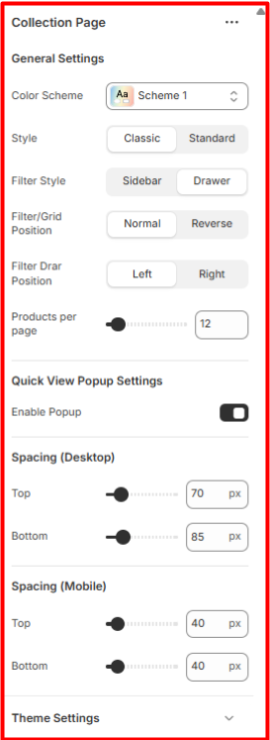
General Settings
- Color Scheme- Select the color scheme you want for this page
- Style- Select the style for the page at classic or standard as per your preference.
- Filter Style- Select how you want the Filters to be there either fixed sidebars or the drawer style triggered from the above Control bar.
- Filter/Grid Position- The Control bar has 3 Visuals when the filter style is in drawer style,
- The More filter option to trigger filter bar.
- The product Count.
- The Column switch for users (3 or 4).
From the filter grid position you can select either to keep the position normal or reverse it.
- Filter Drar Position- Select on which side you want the filter to appear left or right when on Drawer style.
- Products per page- Select the number of product you want to show in one page. (5 minimum)
- Quick View Popup Settings Select either to enable or disable the quick view pop up window
List Collection
Location- Customiser > Template > List Collection
List Collection Overview
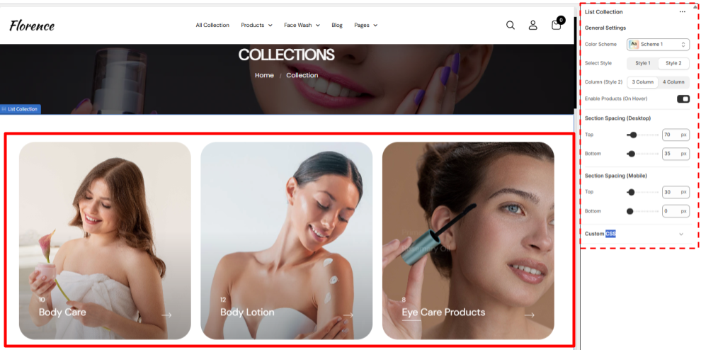
This is a dedicated page to all the collections in your inventory with the format of cards all the collection have their own Thumbnail that appears as the main pic and name in the bottom left corner, with the count of the product above it,
This also have a feature to show the names of the products that falls under the collection that enables when someone hovers over the card (you can either enable or disable it)
The names are clickable and allow the user to redirect directly to the product information page if clicked on the product or if the user clicks on the collection card he will be redirected to the collection page.
All the features here are dynamic except the theme setting and products that appears on hover.
List Collection Settings
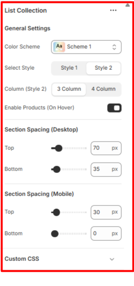
General Settings
- Color Scheme- Set the colour Scheme you want for the section
- Style- Select any of the 2 already given styles for your collection page.
- Column (Style 2)- Select how many columns / cards you want to show on the page in one row at once this only enables for style 2.
- Enable Products (On Hover)- Enable or disable the appearing of product list when you hover on the collection card.
Collection List
Location- Customiser > Template > Collection List
Collection List Overview
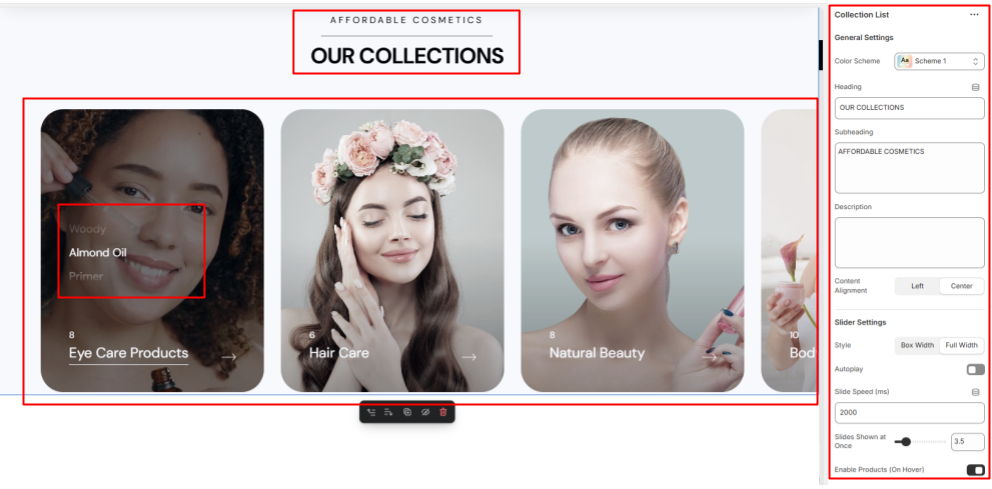
- Heading - A Section for the users to add the title for their collection
- Subheading- A quick introduction section for your collection
- Latest Articles- Additional section to further elaborate your collection
- Slider- A slider section to showcase your collection categories in cards with customised slider settings
Collection List Settings
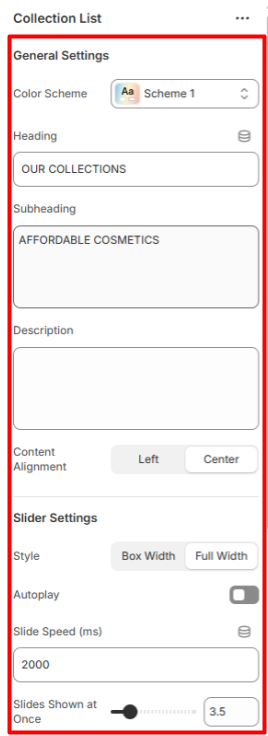
General Settings
- Color Scheme- Set the colour Scheme you want for the section
- Heading- Add the Heading / Title for the collection section you want
- Subheading- Type the Subheading you want the user to read.
- Description- Add further Description about your collection.
- Content Alignment- Set the alignment for the Heading , subheading and the Description text either left or centered. The cards allows the user to either directly visit the particular category of products or directly to the product that are enabled while hovering over the card you can enable or disable it from settings
Slider Settings
- Slider Settings Set the Width of the slider either Boxed width or full width.
- Autoplay- Set the Autoplay of the collection cards on or off as per your ease.
- Slide Speed (ms)- Set the duration of the autoplay to change the slides.
- Slides Shown at Once- Select the number of the slides / Cards you want to show on the screen at once (suggested 3.5)
- Enable Products (On Hover)- Set the products to show over the card or not while hovering over the card.
Collection Items
Location- Customiser > Template > Collection List > Items
Collection Items Overview
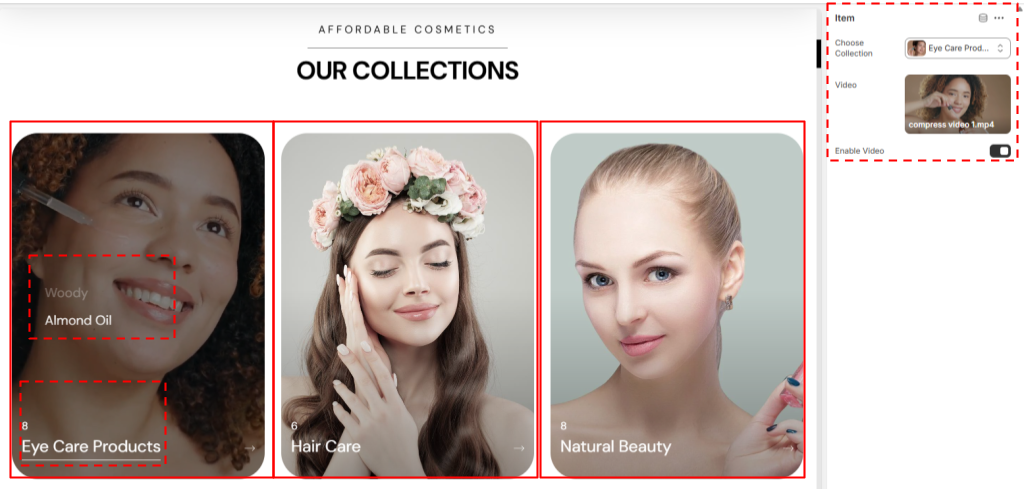
- Thumbnail- The Thumbnail Section of the item is automatically taken from the collection the one you have set for it at its original location.
- Product List- The products that fall under the collection that is selected are shown (Are Clickable) when someone hovers over the card.
- Collection Name and Product Count- The name of the collection will be shown here along with the number count of the products that are in the collection.
- Video- The items have another feature of an automatic video in the card.
Collection Items Settings