General Settings Documentation

Location: Customizer → Theme settings → General Settings
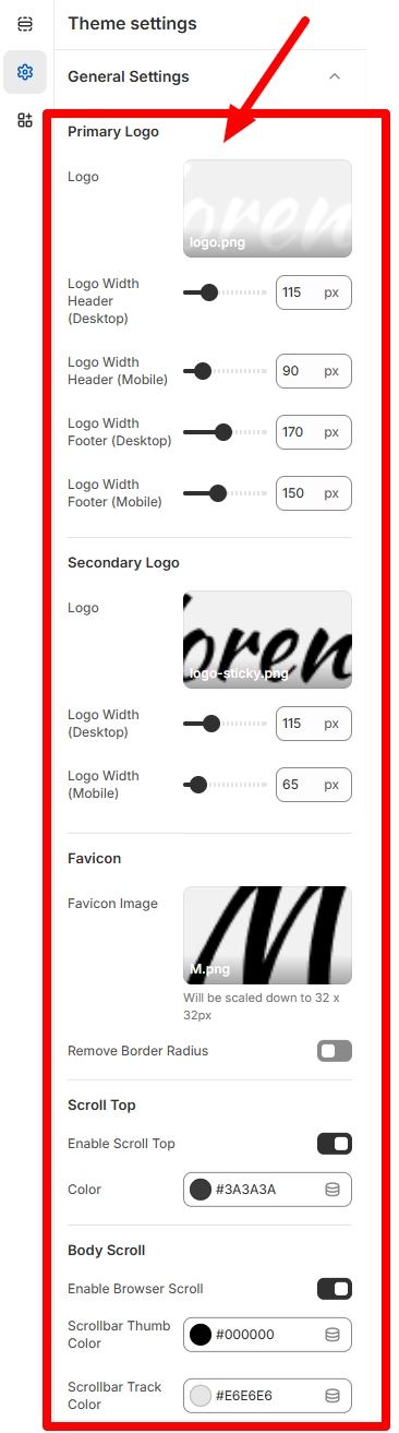

General Settings Screenshot
  • Logo: Upload the main logo image for header and footer.
  • Logo Width Header (Desktop/Mobile): Set custom width for the logo in the header.
  • Logo Width Footer (Desktop/Mobile): Set custom width for the logo in the footer.
  • Logo: Used for sticky headers or alternate modes (dark/light).
  • Logo Width: Set width for desktop and mobile view.

Favicon

  • Favicon Image: Upload a favicon (scaled to 32×32 px).
  • Remove Border Radius: Toggle to remove rounding from favicon edges.

Scroll Top

  • Enable Scroll Top: Shows a button to scroll to top.
  • Color: Set button color.

Body Scroll

  • Enable Browser Scroll: Toggle custom scroll styling.
  • Scrollbar Thumb Color: Draggable scroll thumb color.
  • Scrollbar Track Color: Scroll path color.

Global Color Settings Documentation

Location: Customizer → Theme settings → Global Color


Global Color Settings Screenshot

Schemes

Color schemes define the visual style of sections and can be applied site-wide.

  • Primary / Secondary / Tertiary Background: Core color layers for backgrounds.
  • Gradient Background: Replaces the primary,secondary,tertiary background with a gradient.
  • Heading / Body / Extra Text / Inner Heading Color: Customizes all color types.
  • Background Overlay (Normal / Hover): Applies a layered visual effect.

Buttons (Color Roles)

  • Primary Button / Hover: Text, background, and border settings.
  • Secondary Button / Hover: Text, background, and border settings.
  • Tertiary Button / Hover: Text, background, and border settings.

Badges

  • In Stock Badge Text / Background: Text, background color settings.
  • Trending Badge Text / Background: Text, background color settings.
  • Out of Stock Badge / Background: Text, background color settings.

Typography Settings Documentation

Location: Customizer → Theme settings → Typography


Typography Settings Screenshot

Headings Font

Controls font family for all headers (h1–h6) site-wide.

Body Font

Sets the font for general content, descriptions, blogs, etc.

Button Settings Documentation

Location: Customizer → Theme settings → Button


Button Settings Screenshot

Default Button

  • Border Width: Thickness of button border (px).
  • Border Radius: Rounding of button corners.
  • Border Type: Style: solid, dashed, etc.

On Hover

  • Border Width: Hover border thickness.
  • Border Radius: Hover border rounding.
  • Border Type: Hover Style: solid, dashed, etc.

Social Media Settings Documentation

Location: Customizer → Theme settings → Social Media


Social Media Settings Screenshot
  • Facebook
  • Instagram
  • LinkedIn
  • Twitter
  • Pinterest
  • TikTok
  • YouTube

Add platform URLs for social icons used across the storefront.

Cart Settings Documentation

Location: Customizer → Theme settings → Cart


Cart Settings Screenshot

Color Scheme

Apply a global color scheme to cart appearance.

Cart Type

  • Drawer: Slide-in side cart.
  • Page: Traditional full cart page.

Empty Cart

Set an image to show when the cart has no products.

Product Cards Settings Documentation

Location: Customizer → Theme settings → Product Cards


Product Card Settings Screenshot

Product Thumbnail Slider

Toggle slider for product thumbnails.

Quick View Popup

  • Enable Countdown (Popup): Adds a timer for flash sales.
  • Thumbnail Overlay Opacity: Adjust overlay transparency.
  • Sale Countdown Heading: Custom heading before timer.
  • Sale Countdown End Date: Enter in YYYY-MM-DD format.
  • End Message: Text to show after countdown expires.

Custom CSS Documentation

Location: Customizer → Theme settings → Custom CSS


Custom CSS Settings Screenshot

Custom Code Editor

Add custom styles using valid CSS syntax to override or extend theme styles.

Example:

.card {
								border-radius: 30px;
								}